While Excel’s charts are excellent tools for displaying complex data in more understandable ways, sometimes, you might want to quickly visualize your numbers in a simpler way that also takes up less room in your spreadsheet. Here’s how.
2
Use Data Bars Instead of Bar Charts
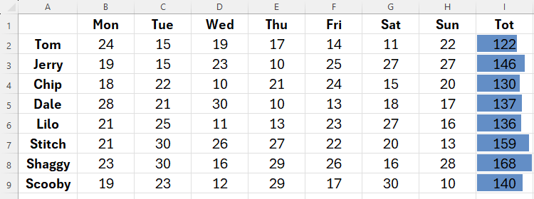
Excel gives you the option to create mini bar charts—also known as data bars—within cells to compare values. These are a simpler and more compact alternative to Excel’s bar chart tool.
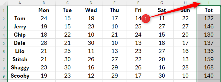
First, select the range containing the values you want to visualize. In my case, I’ve selected the whole column, as I anticipate adding more numbers to my data.
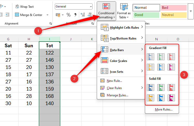
Now, in the Home tab on the ribbon, click “Conditional Formatting,” hover over “Data Bars,” and choose a data fill type that works for you. I prefer using the Solid Fill options, as they are clearer for data comparison.
And it’s as simple as that! In just a few seconds, you’ve created bar-chart-type illustrations that don’t take up any extra space in your workbook. They’ll also adjust to any changes in your data.
How to Hide the Values Behind the Data Bars
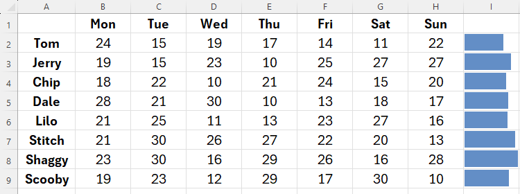
If you want to hide the numbers to display just the data bars on their own, select the cells again, and press Ctrl+1 to launch the Format Cells dialog box. Then, click “Custom,” and type ;;; (three semicolons) into the Type field box, before clicking “OK.”
This makes your data bars even easier to interpret.
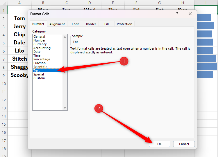
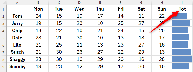
Notice how my header in cell I1 has also disappeared, meaning I need to unhide the value in that cell. If you need to do the same, select the relevant cell or cells, press Ctrl+1, choose a different number format, such as “General,” “Number,” or “Text,” and click “OK.”
My Tot column header has now reappeared.
1
Use Sparklines Instead of Line Charts
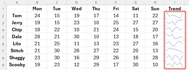
Sparklines are a great way to visualize trends over time and a simplified alternative to fully-fledged line graphs.
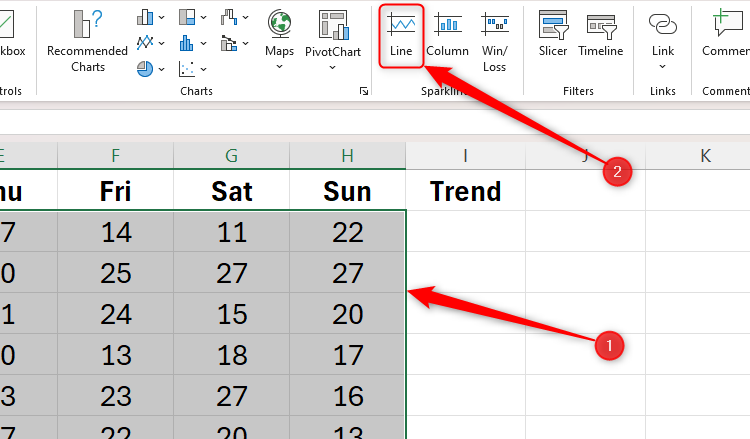
Select all the data for which you want to create the sparklines, and click “Line” in the Sparklines group of the Insert tab. You could choose another type of sparkline here, but the Line sparkline is the best way to create a mini-line chart showing a linear trend.
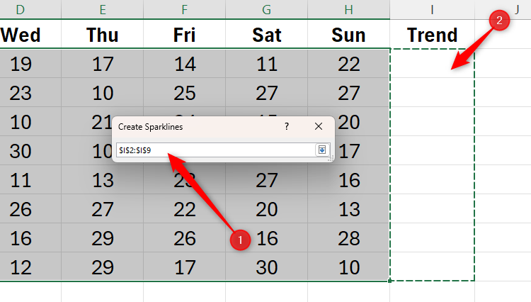
The Create Sparklines dialog box will already contain the Data Range, as you selected this in the previous step. However, you need to tell Excel where you want the sparklines to sit. The quickest way to do this is by placing your cursor in the empty Location Range field and selecting the cells directly on your spreadsheet. The Create Sparklines dialog box shrinks while you do this.
Now, click the down arrow next to the Location Range field box to re-expand the Create Sparklines dialog box. Then click “OK” to see the trendlines visualize the changes over time in the selected data without taking up valuable additional space in your spreadsheet.
To increase the sizes of the sparklines, thus making them clearer to interpret, increase the relevant row heights and column widths.
If you’re keen to go the next step and visualize and scrutinize your data in more depth, use some of Excel’s more comprehensive data analysis features, or learn how the program’s commonly used charts help you understand your figures.


