


The home-workout sector is hot right now. Amazon recently announced Halo Fitness, Peloton have rereleased their treadmills after some controversy, and Apple released Fitness+ late into 2020.
On paper, there’s never been a better time to work out at home. But are these subscriptions actually any good? For example, what’s the experience of Apple Fitness+ actually like?
That’s what I’ve been working on this month: Reviewing Apple Fitness and demonstrating where the experience fails to reach its stride.
This TechCrunch+ exclusive is a more detailed conversation around this article, which you can read on Built for Mars.
1. The “jump in” fallacy
“It’s wrong to assume that showing ‘options’ quickly is always good UX — this is often under the guise that it’s allowing the user to ‘jump right in.’ There’s a nuance that’s seldom considered: Can the user actually engage with all of this content or not? If they wanted to, could they actually use all of these options (or results)?”
This is something I see all the time, and it’s hugely misunderstood. Imagine if you went on Rightmove (or Zillow) and the homepage just showed you a selection of houses all over the world — it’d be useless. It’s rare that someone is looking to relocate anywhere, so instead, their first action is to apply a filter. It’d be wrong for Rightmove to think: “Well, we’ve shown houses immediately, so it only takes one click to find your dream home.”
This is essentially what happens with Apple Fitness+ — they show you workouts on the homepage, despite many (if not most) being unsuitable for you, and then don’t provide any obvious means to filter the options.
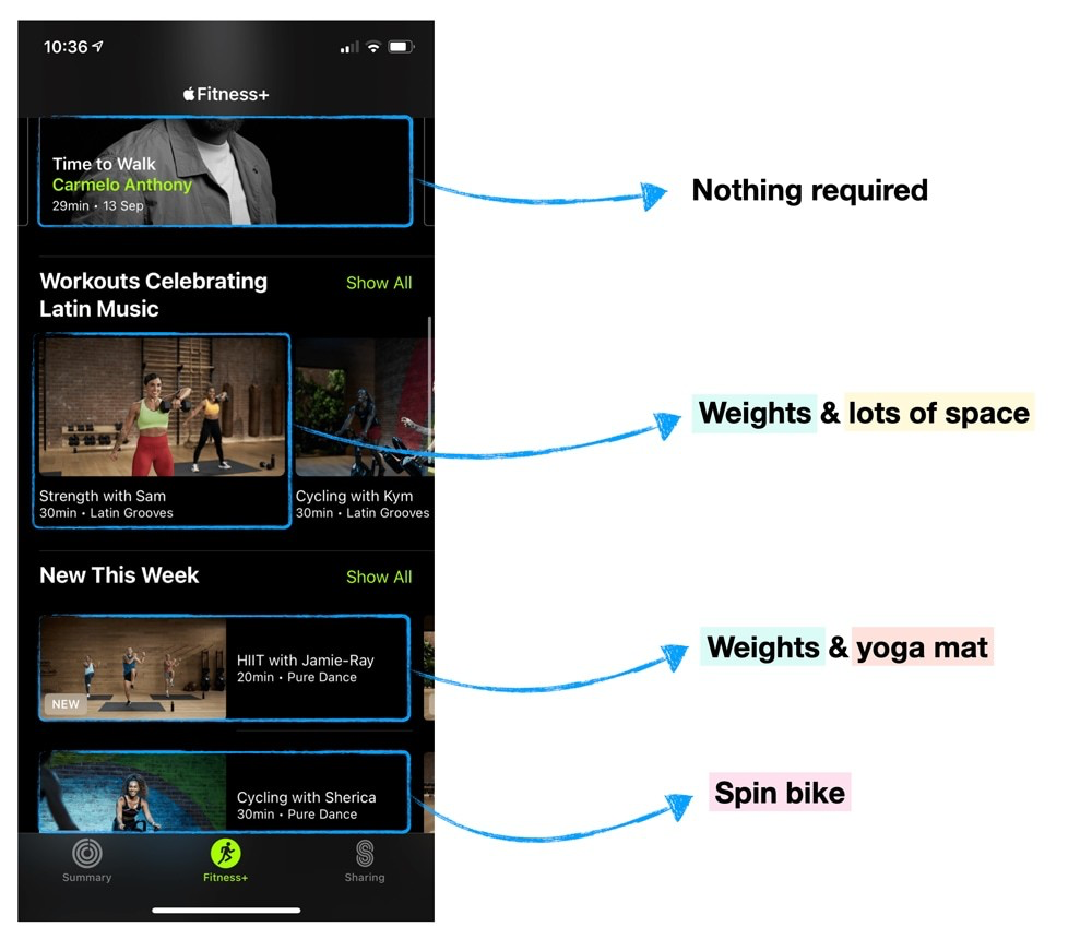
Image Credits: Peter Ramsey
Tip: It’s not always a good idea to display results immediately. You need to consider if everything you’re showing the user is useful.


