Many people know about the different functions in Excel, but fewer know the cool tricks that will help you save time and visualize data more effectively. In this article, we’ll show you five tips you can keep in your armory for the next time you use Microsoft’s spreadsheet program.
Select Arrays Quickly With a Keyboard Shortcut
There’s nothing remarkable in knowing the Ctrl+A keyboard shortcut—it’s one of the most well-known shortcuts out there. However, a lot can be said about knowing exactly what it does in different circumstances in Excel.
First, select any cell in your spreadsheet. If that cell is independent of any other cell (in other words, it has no data to the left or right, above or below, or isn’t part of a formatted table), pressing Ctrl+A will select the whole spreadsheet.
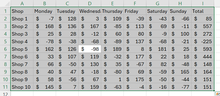
However, if the cell you select is part of a range of data, such as an unformatted column of numbers or a formatted table, pressing Ctrl+A will select that array only. In this example, we selected cell D6, and pressed Ctrl+A.
This is useful for formatting only that data range (rather than the whole sheet).
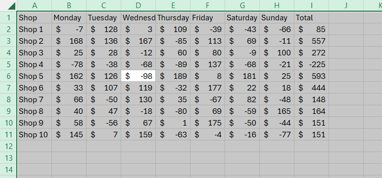
Then, if you press Ctrl+A again, Excel will select the whole spreadsheet.
This is great for formatting the whole sheet at the same time.
Use this memorable tip to work quickly, as it means you don’t have to use your mouse to click and drag to select a range of data.
Add Slicers to Filter Data Quickly
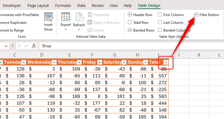
When you format data into a table in Excel, you will automatically see the Filter Button at the top of each column, which you can remove or re-add by unchecking or checking “Filter Button” in the Table Design tab.
However, an easier way to create filters for your table is by adding Slicers, especially if a particular column is more likely to be filtered than the rest.
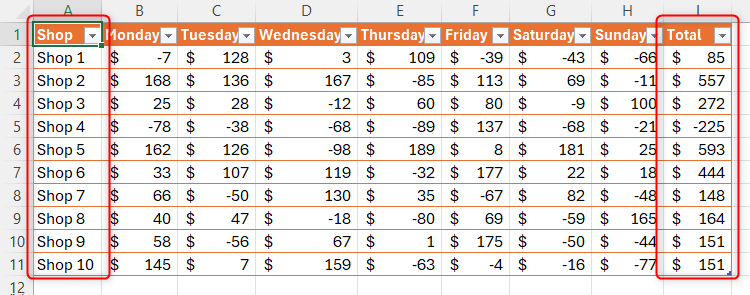
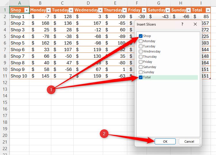
In our example, we anticipate often filtering the Shop and Total columns, as these are prominent columns in our table, so let’s add a Slicer for each.
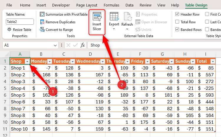
With any cell in the table selected, click “Insert Slicer” in the Table Design tab on the ribbon.
You can then choose the columns for which you want to add Slicers, and click “OK.”
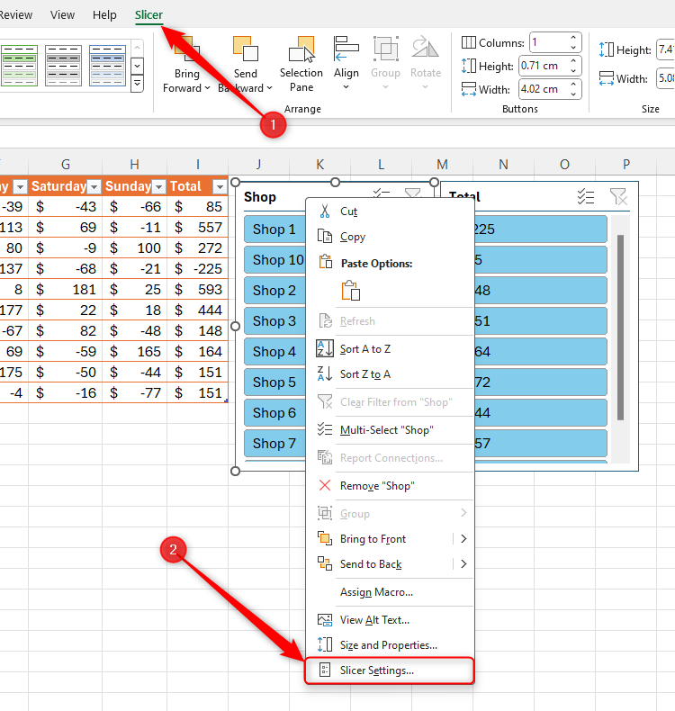
Now, click and drag to reposition or resize your Slicers, or open the “Slicer” tab to see more options. To go one step further (such as removing the Slicer’s headings), right-click the relevant Slicer, and click “Slicer Settings.”
Because the Slicers automatically present their data in order (as opposed to the order as it is presented in your original data set), you can analyze the data in an instant.
Hold Ctrl when selecting elements in your Slicer to display them all at the same time, or press Alt+C to clear all selections in the Slicer.
Create Sparklines to Visualize Trends
Yes, you can create highly formatted charts to visualize data in graphic form, but sometimes, you might need something a little less complex that takes up less space in your spreadsheet. This is where Sparklines come into play, and there are three types you can employ in your spreadsheet.
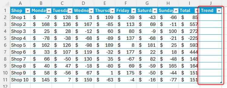
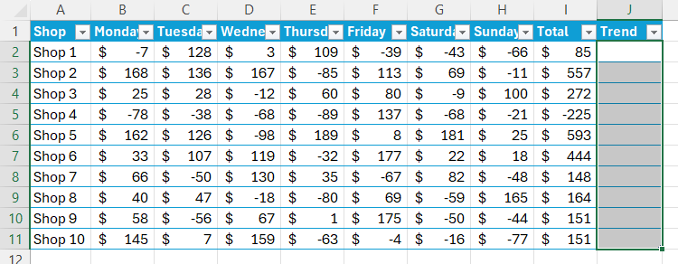
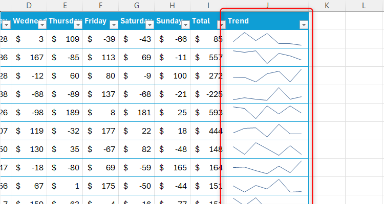
In the example below, we have a week’s profit and loss data from various stores, and we want to add a visual representation of the trends for each shop in column J.
First, select the cells in column J where you want the trend visualization to appear.
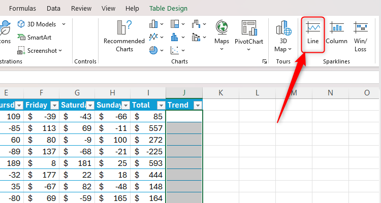
Now, in the Insert tab on the ribbon, go to the Sparklines group, and click “Line.”
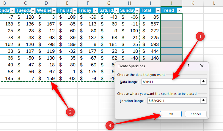
Place your cursor in the “Data Range” field, use your mouse to select the data from the table, and then click “OK.”
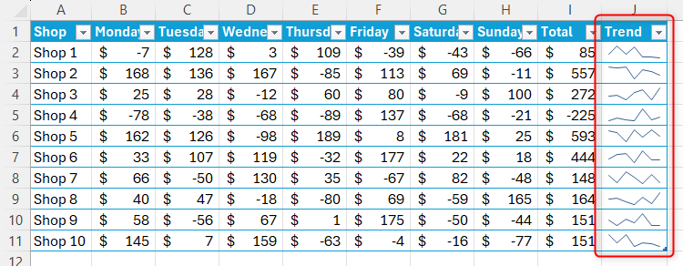
You will then instantly see your numbers presented in the form of a trend line.
If the line is too small to analyze comprehensively, simply increase the cell and column sizes, and the Sparkline will automatically fill to their cells’ dimensions.
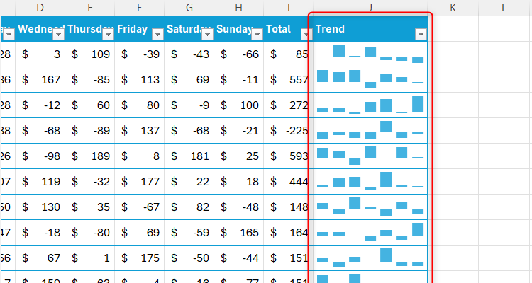
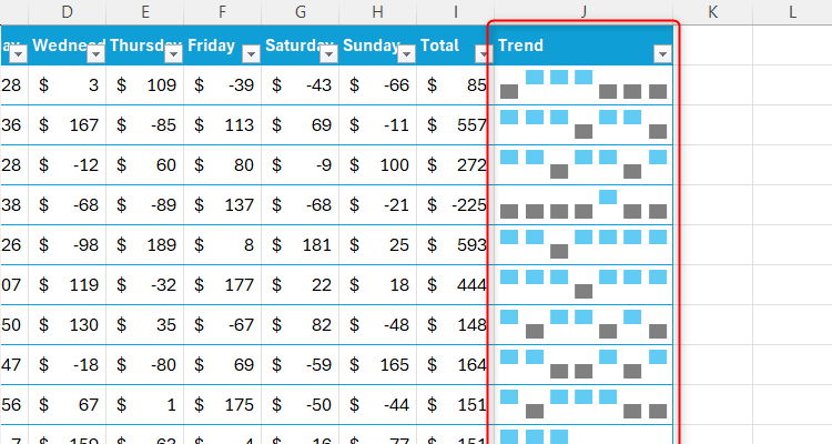
Depending on the type of data you’re looking to visualize, there are two other types of Sparklines to use.
Column Sparklines present the data in mini-column charts:
And Profit/Loss Sparklines emphasize positive and negative values:
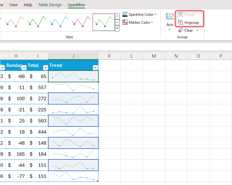
Once you have chosen and created your Sparklines, select any of the affected cells, and use the Sparkline tab on the ribbon to make any formatting or detailing changes you require. Since they were added together, they will all be formatted in the same way at the same time. If, however, you wish for them to be formatted separately, click “Ungroup” in the Sparklines tab. In the example below, we ungrouped every other Sparkline to format them alternately.
Make the Most of Preset Conditional Formatting
Another way to instantly visualize and analyze data is to use Excel’s preset Conditional Formatting tool. Setting up Conditional Formatting rules can take time and cause issues if they overlap or contradict one another, but using the default formats is much easier.
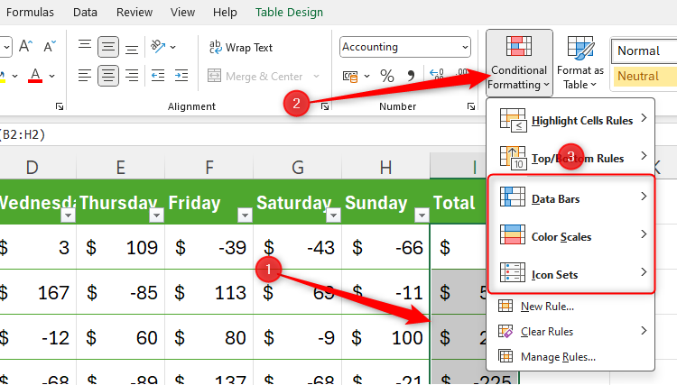
Select the data in your spreadsheet that you want to analyze, and click the “Conditional Formatting” drop-down menu in the Home tab on the ribbon. There, click “Data Bars,” “Color Scales,” or “Icon Sets,” and choose a design that works well for your data.
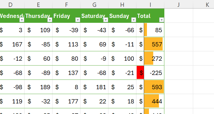
In our example, we’ve chosen an orange Data Bar, as this helps us to compare the totals at a glance. Handily, since there is a negative number in our data, Excel has automatically formatted the Data Bar to emphasize the number differences.
To clear Conditional Formatting, select the cells in question, click “Conditional Formatting” in the Home tab, and click “Clear Rules From Selected Cells.”
Screenshot Data for Dynamic Use
This is a great way to capture cells on one sheet and duplicate them in another location, such as on a dashboard. Then, any changes made to the original data will also be reflected in the duplicated data.
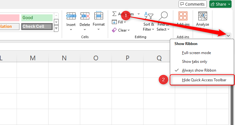
Start by adding the Camera tool to your Quick Access Toolbar (QAT). Click the down arrow on the right-hand side of any tab on the ribbon to see if your QAT is enabled. If the Hide Quick Access Toolbar option is available, it means that you already have it showing. Likewise, if you see the Show Quick Access Toolbar option, click it to activate your QAT.
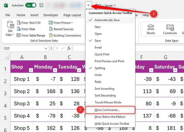
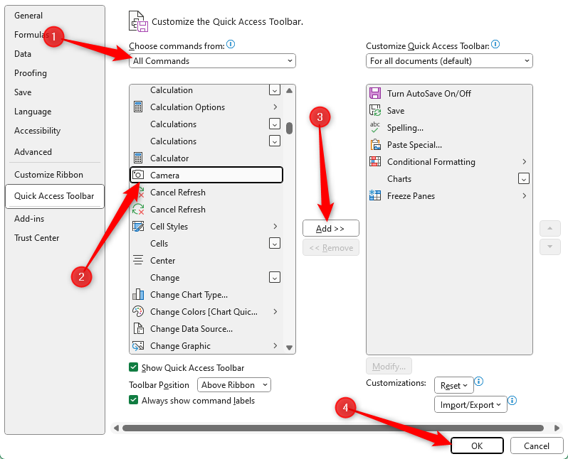
Then, click the QAT down arrow and click “More Commands.”
Now, select “All Commands” in the Choose Command From menu, and then scroll to and select Camera, before clicking “Add” to add it to your QAT. Then, click “OK.”
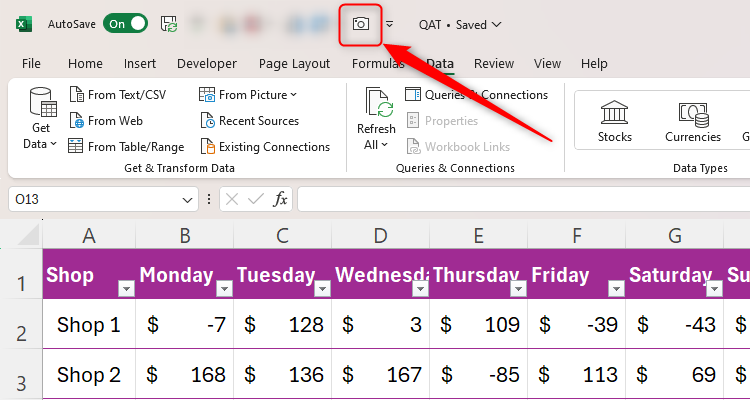
You will now see the Camera icon in your QAT.
Select the cells you want to duplicate on another sheet or workbook, and click the newly added Camera icon.
If you want to duplicate something that is not attached to cells, such as an image or a chart, select the cells behind and around the item. This will copy the selected cells and everything in front of them as an image.
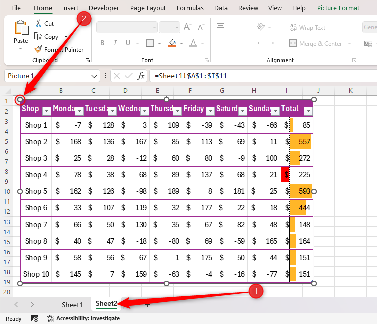
Then, go to the location where you want the data copied (we’ve used Sheet 2 in the example below), and simply click once in the appropriate place (in our case, cell A1).
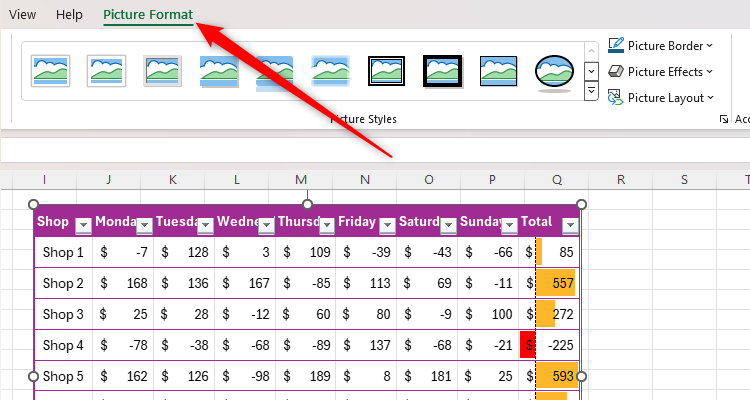
Excel treats this as a picture, so you can use the Picture Format tab on the ribbon to present the snapshot exactly as you want it.
Consider
removing the gridlines
before capturing the data as a picture, as this will help the image appear tidier in its copied location.
Despite this being a picture (usually an unchanging element in a file), if you alter your original data, this will reflect instantly in your captured version!
Another way to increase your efficiency in Excel is to learn some of its most useful keyboard shortcuts, as they save you from having to switch between using your keyboard and your mouse.


