‘Tis the season for developer conferences–Apple’s WWDC (the one we care about the most) is in June, Microsoft has theirs later this month, and Google’s I/O conference kicked off this week. Developer conference keynotes are fun because you get to see what the companies are working on and what new products and features are in the future. And sometimes we get a bunch of cool new stuff that non-developers care about too.
That was the case with the Google I/O keynote, which was held Wednesday and brought numerous new products and features—several of which we hope Apple paid close attention to. Here are five Google I/O announcements that we wish had come from Apple instead.
Magic Editor in Google Photos

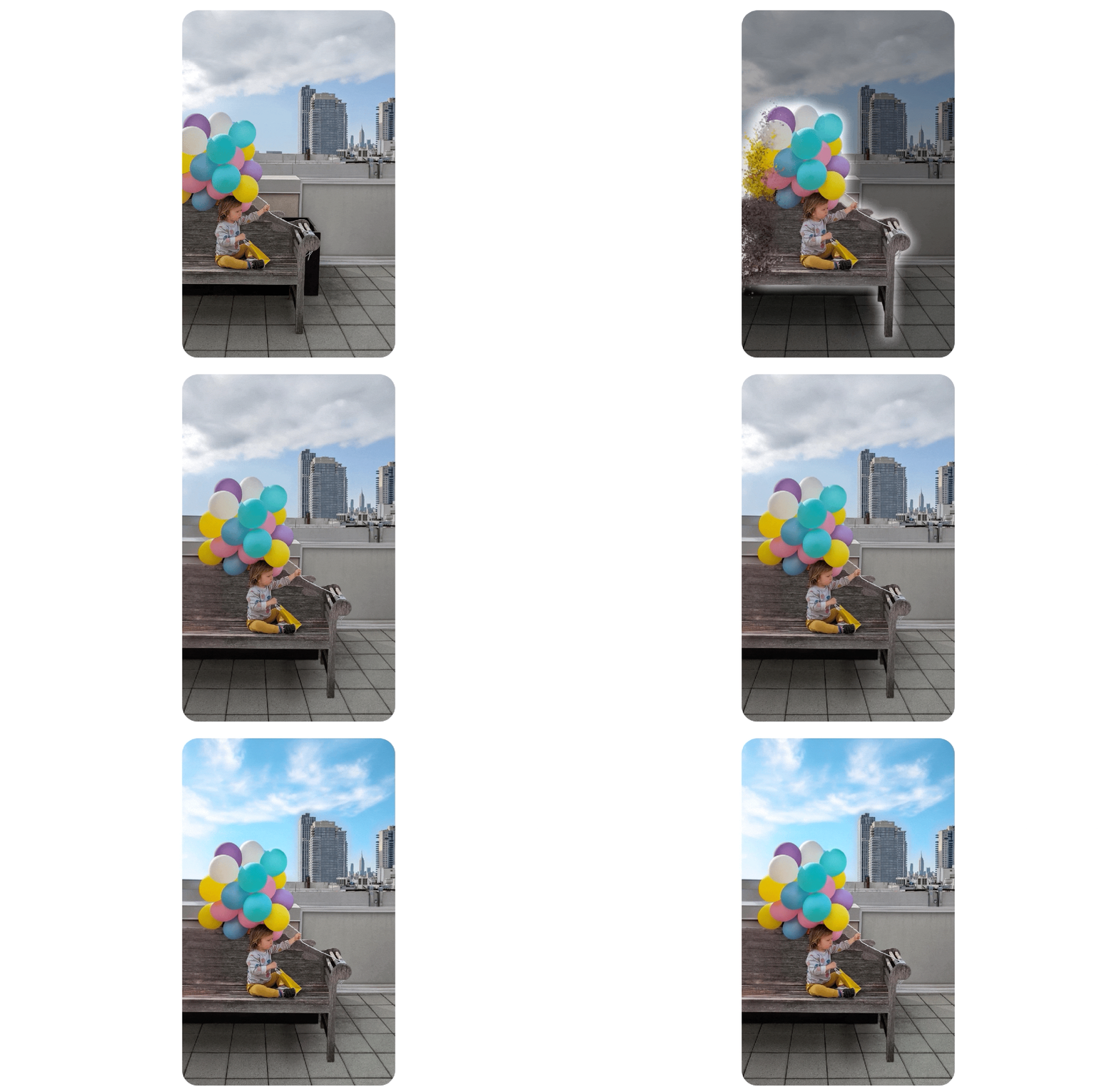
Magic Editor can fill in the gaps that can prevent certain types of image edits.
Google uses its AI research to make some cool features for its Google Photos app. Last month, it brought Magic Eraser, a previous Pixel exclusive which lets users easily remove unwanted people and items in a photo, to Googe One subscribers. Now it’s expanding the feature in a big way.
At Google I/O this year, the company revealed its next AI photo tool, Magic Editor. This feature uses outpainting, which is the use of AI to create an extension of an image that maintains the style of the original. It’s another way of filling in an image gap during an edit, but it allows for more editing flexibility than Magic Eraser.
One example Google demonstrated involved a photo of a child holding balloons while sitting on a bench. With Magic Editor, the child, bench, and balloons were selected and moved, and the software created extensions of the items that were cut off by the photo’s edge.
Magic Editor will be coming to “select Pixel phones” later this year, but it’s certainly possible (and likely) that they’ll bring Magic Editor to the Photos app at some point. But for those of us who are fully invested in Apple’s ecosphere, these are the kind of features we wish Apple would announce for its own Photos app.
Pixel Tablet dock

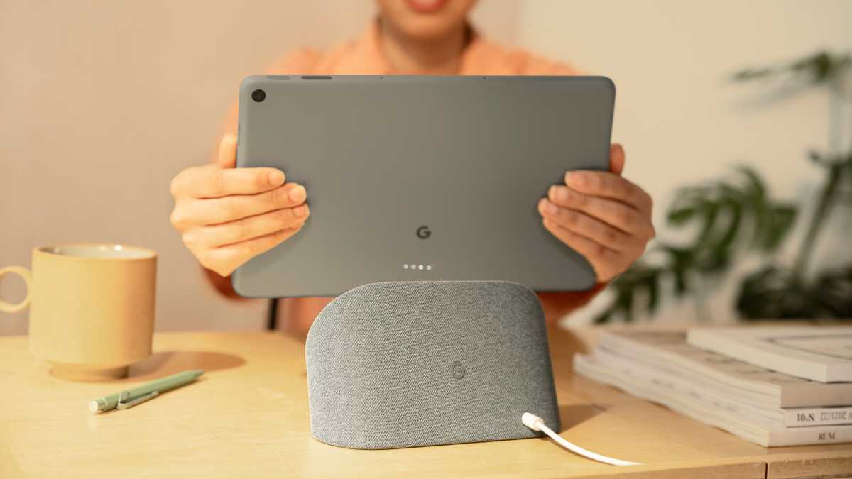
Google is including the Charging Speaker Dock with the Pixel Tablet at no extra cost.
Google announced a new Pixel Tablet that will compete with the iPad, but it’s not the tablet we’re envious of–it’s the Charging Speaker Dock that comes with it. A docked Tablet enters “Hub Mode” and becomes a control center for smart home devices, streaming media, video calls, and more, making the Pixel Tablet a true two-in-one device.
The dock has a 15-watt speaker with a 43.5mm driver and Google claims that the dock produces “four times the bass than the Pixel Tablet alone.” The tablet magnetically attaches to the dock, which also charges it like MagSafe.
Rumors have been floating around for a while now about an Apple HomePod with a screen, and this is exactly what we have in mind. Perhaps Google’s announcement will give Apple the encouragement it needs.
Multiple user accounts
Like other Android tablets, the new Pixel Tablet will allow for multiple user accounts. So if it’s in a shared environment–say, a family household–each person using the device can have their own user account and they don’t have to worry about the preservation of their settings, the privacy and security of their files, etc.
To this day, the iPad–outside of a school setting–does not support multiple user accounts. That means everyone can see the files on a device, and users either must adapt to the settings or constantly change them. iPad users have been wanting this feature for so long now, that hope for it has been lost, but maybe we’ll get lucky this year and Apple will reveal multi-user support in iPadOS 17.
Google Pixel Fold

The Google Pixel Fold looks like the foldable phone that Apple would make.
When folding Android phones started to hit the market, I scoffed, thinking that there was no need for them. Then I took a few flights and realized how nice it would be to have a screen bigger than the iPhone Pro Max for watching videos on long trips. Another time, I used iTranslate to try to communicate with someone who didn’t know English and I wished I had a larger screen to show both sides of the conversation. A bigger screen would also be useful when recording videos so I can see more of what I’m shooting. Other times I just want a bigger screen without reaching for my iPad.
The foldable Android phones available now don’t look like they’ll last very long. But Google’s new Pixel Fold looks like it’s taking the proper approach–granted, I’ve only seen online photos and videos, but it appears that the design, display, and construction have been carefully considered based on what the user wants and expects. The bezels leave a bit to be desired and we don’t fully trust Google to deliver a folding experience that isn’t riddled with bugs, but the approach seems solid.
If there’s any company that can do a foldable phone the right way, it’s Apple. We’ve seen some evidence that Apple is working on one, based on rumors and a few patents the company has filed, but that doesn’t mean a folding iPhone will ever see the light of day. As much as I’d love to see it.
Immersive View for Maps

Google Maps’ Immersive View for routes sure is pretty.
Apple Maps has come a long way since its introduction, but Google Maps is still king–mainly because Google continues to innovate and add new features.
The latest is Immersive View for routes, which provides a rich, digital model of your route with “bike lanes, sidewalks, intersections and parking” as you follow the turn-by-turn directions. It gives you a better idea of the environment around you than the typical flat diagram that you see in Apple Maps directions, so you get a better sense of where you’re going and where you’re at.
Th closest thing Apple offers to Immersive View is the satellite view, but it’s not that close. We can’t wait to try it out on Google Maps—and we’d love to have something similar on Apple Maps.


