How is Windows 11 different than Windows 10? Our hands-on look at a leaked early build of Windows 11 begins to answer that question.
Simply put, and based only on what we’ve seen in the leak, Windows 11 appears to update the user interface of Windows 10 without changing the underlying infrastructure of Windows 10 by all that much. These cosmetic changes are nonetheless significant.
Our leaked build shows changes in the Windows taskbar and Start menu, leveraging the UI tweaks that Microsoft made to Windows 10X before it put that operating system on ice earlier this year. There’s also a massive Widgets drawer that’s entirely new, though we’d expect it to evolve between now and when Microsoft will likely launch Windows 11 in the fall.
Microsoft may certainly add or subtract features to Windows 11 between now and its launch. But for now, here are the major changes to Windows 11 from the perspective of a Windows 10 user.
The Start menu: simple icons, no Live Tiles
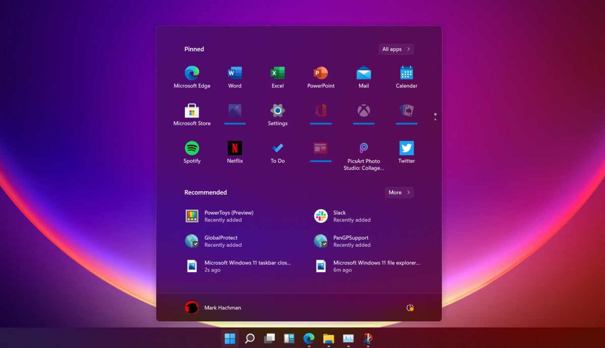
The Windows 11 Start menu is certainly a major change from Windows 10’s legacy of tiled app shortcuts, which began with Windows 8. By default, the Start menu lives in the center of your PC’s desktop, in much the same way the Windows 10X Start menu would have behaved had it ever launched. In Windows 10, you launch the Start menu by clicking the left-hand corner of your screen. In Windows 11, the Start icon is simply the left icon on a list of small app icons on your taskbar. And instead of the angled Windows icon from Windows 10, the new Start icon is flat and symmetrical.
 Mark Hachman / IDG
The Windows 11 Start menu.
More profound changes appear once you’ve opened the Start menu itself. In Windows 10, Live Tiles allow app developers to cycle through photos and provide dynamic information to you. That’s all gone. Again, Microsoft is taking its cues from Windows 10X and providing an array of small, static icons. Below, a list of “recommended” files appear to be shortcuts to either frequently-used files, or at least recent documents you may have opened. Small buttons (“All apps,” for example) offer shortcuts to any other apps that may be hidden away.
The Start menu may not be as friendly as in in years past, but it’s more functional than ever.
Windows Snap has been enhanced with FancyZones
One of the great additions that Windows 8 and later Windows 10 brought to Windows was the ability to organize your windows in such a way that they could be snapped to each side, or even each corner, of the screen. In Windows 11, Microsoft has taken this scheme to the next level.
 Mark Hachman / IDG
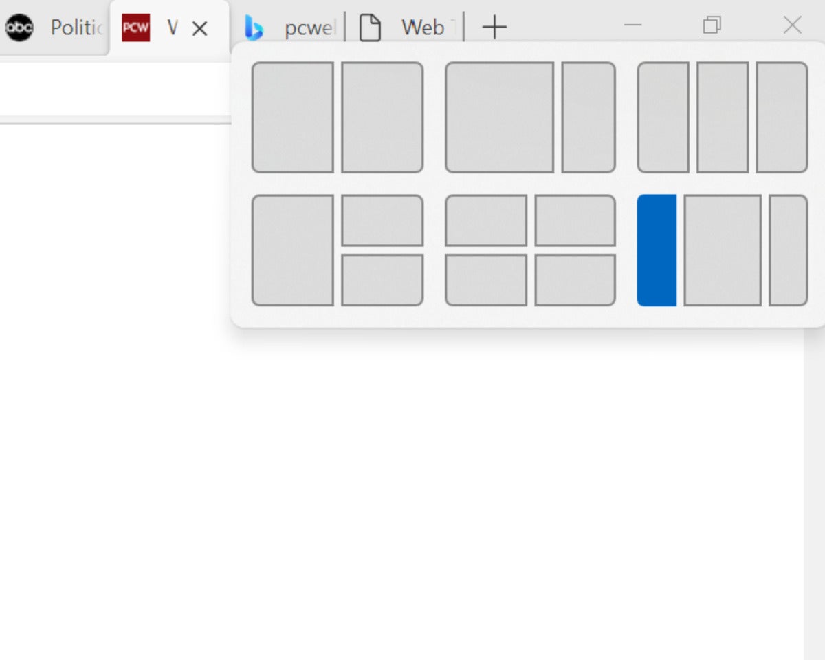
Windows 11 appears like it’s implemented FancyZones right in the operating system.
On a window within Windows 11, hovering your cursor over the “maximize window” icon in the upper right-hand-corner of a window does more than just fill the screen with the selected window. It allows you to select from a variety of configurations to organize that window, from a “four corners” orientation to a narrow strip along one corner of the screen. It’s very reminiscent of the ”FancyZones” portion of the Power Tools suite which Microsoft implemented on 2020. All you need to do is highlight which windows configuration you want, then select one of the available alignments for your selected window.
A simplified Taskbar
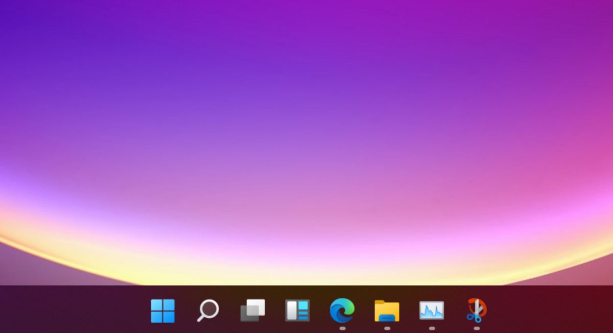
Part and parcel of the Start experience is the new Taskbar, a collection of small icons that lives at the bottom of your screen. In Windows 10, the taskbar is dominated by the Search box, which takes up a great deal of space. In Windows 11, those icons cluster together. The upshot is that in Windows 11, there’s a great deal more space on your taskbar. It’s not clear what exactly Microsoft plans to do with that space, but there’s a great deal more of it.
 Mark Hachman / IDG
A closeup of the Windows 11 taskbar.
Bye-bye, Cortana
Yes, bye-bye Cortana—well, from the Windows 11 Taskbar, anyway. One of the ways in which Microsoft has slimmed down the Windows 11 taskbar has been to fold the Search bar into a simple search icon, and to do away with the Cortana icon entirely. Cortana lives on as an app within Windows 11, but you’ll have to manually launch the Cortana app, then interact with its limited functionality. Cortana has improved from when she didn’t know the answer to 2+2, but she’s still limited in her functionality.
What in the world is Widgets?
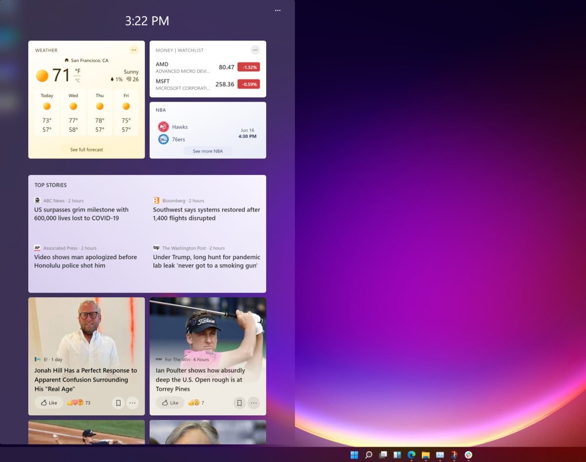
While Microsoft may have stripped Cortana from the Windows 11 taskbar, there’s a new addition: Widgets, an icon that opens a mammoth sidebar that opens from the left side of the screen. It’s not clear what Widgets will eventually become, but for right now Widgets is simply a giant implementation of News & Interests, the somewhat controversial addition Microsoft made to Windows 10 in April.
 Mark Hachman / IDG
We’re not sure what Widgets will end up as, but for right now it’s a showcase for News & Interests within Windows 11.
We have to assume that Widgets may end up as a repository for Windows gadgets or other tools. For now, however, it just takes up space. At least it won’t intrude upon you unless you click on the Widgets icon.
New icons and other UI tweaks
One of the new additions that was expected to be part of the “Sun Valley” Windows refresh was a slew of small UI upgrades: rounded corners and new icons among other tweaks. The new icons are there, but the rounded corners are barely perceptible. Microsoft does offer new wallpapers under the Windows 10 Settings > Personalization tab, however, several of which are truly stunning.
 Mark Hachman / IDG
Some of the new icons within Windows 11.
No changes to apps
So far, what we haven’t noticed are any changes to the traditional app model: no limits on 32-bit versus 64-bit apps, and nothing locking you to apps within the Microsoft store. Again, the leaked version of Windows 11 seems to be a visual reskin of Windows 11, implying that you’ll be able to do the same things with Windows 11 that you’d be able to do with Windows 10.
