Your Mac has many native apps that are underutilized, and Apple’s Keynote presentation software is among them. So let’s look at what Keynote does better than its biggest competitors, Microsoft PowerPoint and Google Slides.
1 Keynote Is Free for Apple Users
One of the main reasons why you might find that using Keynote as a Mac user feels easy is because it is a native app. Keynote settles in well with the rest of your Mac apps and the rest of the iWork productivity suite (Pages and Numbers). It is also free to use if you use a Mac, iPhone, or iPad, saving you the hassle of a subscription or installation.
Microsoft PowerPoint requires either an Office 365 subscription (starting from $6.99/month) or a one-time Office purchase ($179.99). Google Slides, while free to use, is still a web app that does not provide the same user experience that a native app like Keynote does.
2 A Simple, Uncluttered App
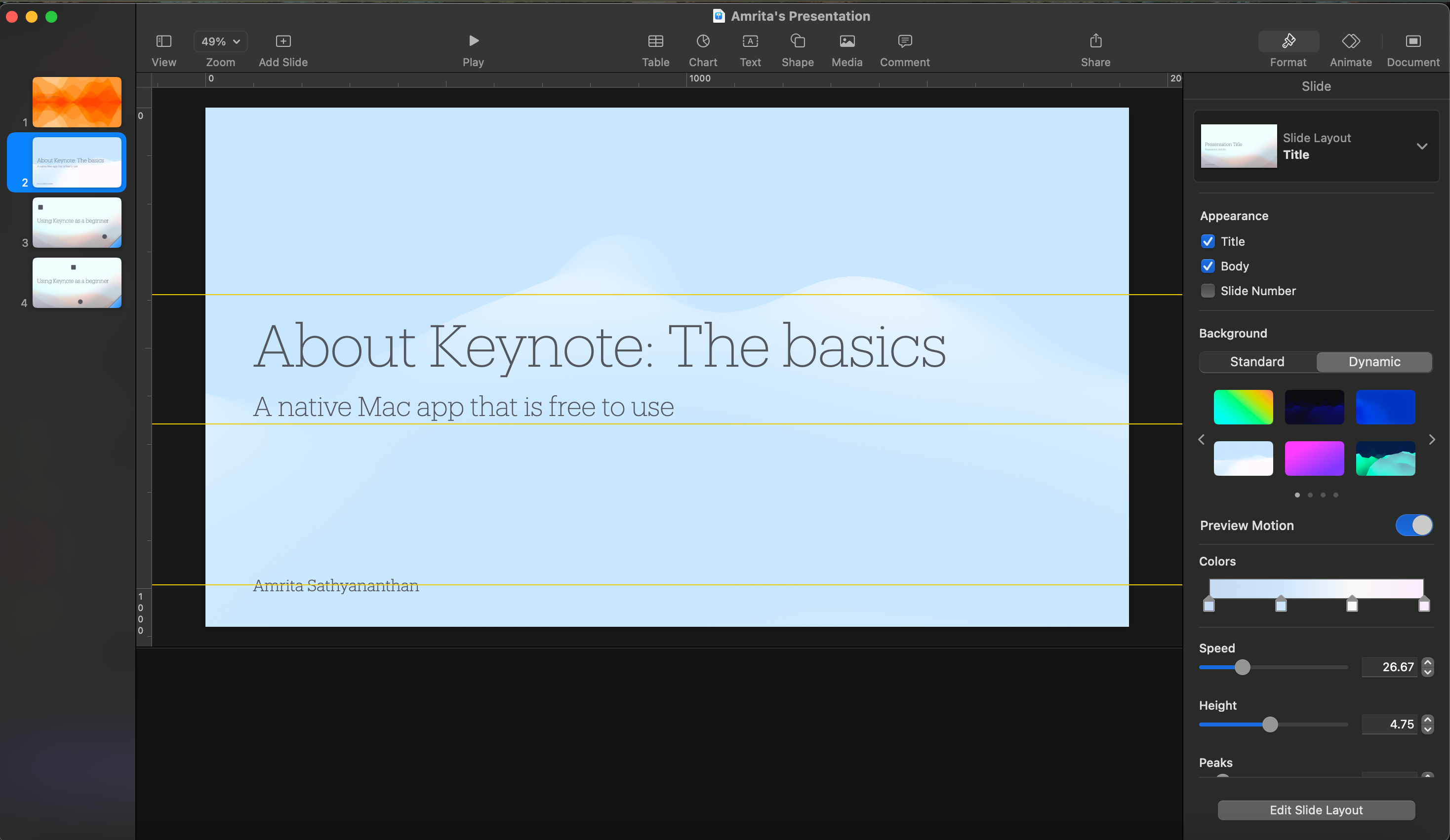
Keynote’s interface is a sleek and uncluttered one. You can easily access important controls from the toolbar, and finding what you are looking for is easier than you might think. The sidebar that appears when you start working on your presentation is a one-stop destination for all actions related to formatting and arrangement.
Compared to PowerPoint and Google Slides, Keynote’s layout is more beginner-friendly, and given that it is a native app, your desktop menubar options and controls at the top of the screen are also easy to navigate and control.
3 Beautiful Templates That You Can Modify and Use Again
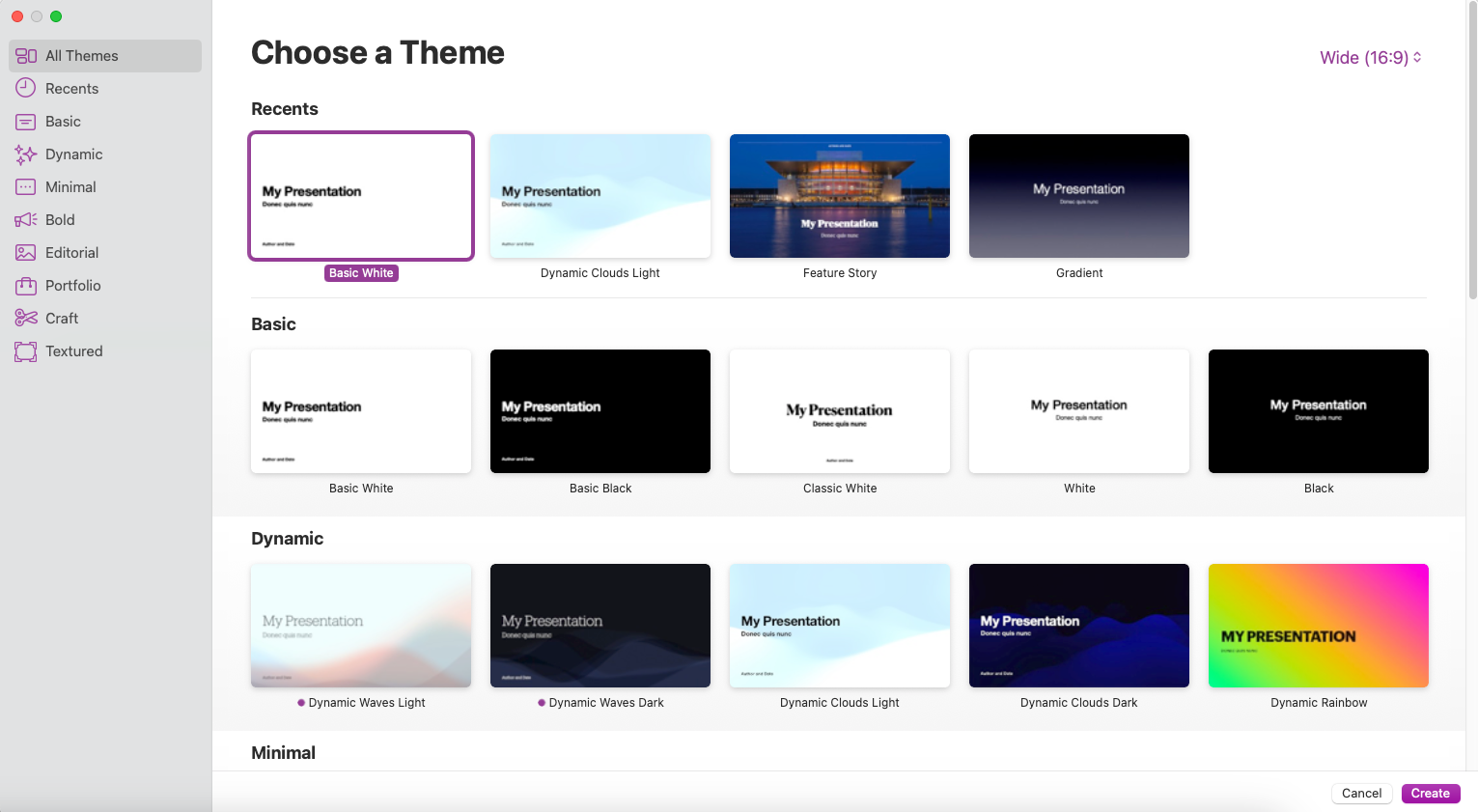
If you have used an iWork app like word processor Pages or spreadsheet app Numbers, the first thing you might have noticed while getting started is the surprisingly versatile (and stunning) templates that you get to choose from. Keynote also has more than 50 templates to pick from, which Apple refers to as themes.
My favorite part of using Keynote’s templates is that I do not have to worry about designing the perfect presentation: Keynote does it for me. This comes into play when you are short on time or just don’t want to design a presentation from scratch. With Keynote, you can take advantage of professional, personal, and creative templates to build your ideal presentation.
Keynote’s templates are superior by design and choice compared to PowerPoint and Google Slides. While both counterparts offer a good library of templates, I have often found myself downloading templates from third-party websites when using PowerPoint or Google Slides. Keynote’s interface also makes it easier to tweak and redesign your chosen template, which strips away the effort needed to make your deck presentation-ready.
If you get particularly creative you can save your modified template and use it again in the future using the File > Save Theme menubar option.
4 Better Integration Across Apple Products
Being an Apple app, Keynote works well regardless of which device you use it on. Thanks to native Mac, iOS, and iPadOS versions, you can use Keynote seamlessly on your Mac, iPhone, or iPad. Use AirPlay to cast a presentation on Apple TV, and take advantage of iCloud integration to sync files.
Device integration also means better control over your presentations. You can, for instance, use your iPhone or iPad as a remote control to change slides on Keynote during a presentation. You can even change your slides by using Keynote on your Apple Watch.
Another advantage of Keynote’s integration into the Apple ecosystem is how easy it is to present and collaborate on other apps, such as Messages and FaceTime. While Keynote may not provide the same breadth of collaboration as Google Slides, it is still an easy way to collaborate with Apple and non-Apple users alike.
Collaborators can even access presentations without signing in with an Apple account, a feature that can persuade those who do not use Apple devices to still hop onto Keynote presentations.
5 Keynote’s Visuals Are Stunning
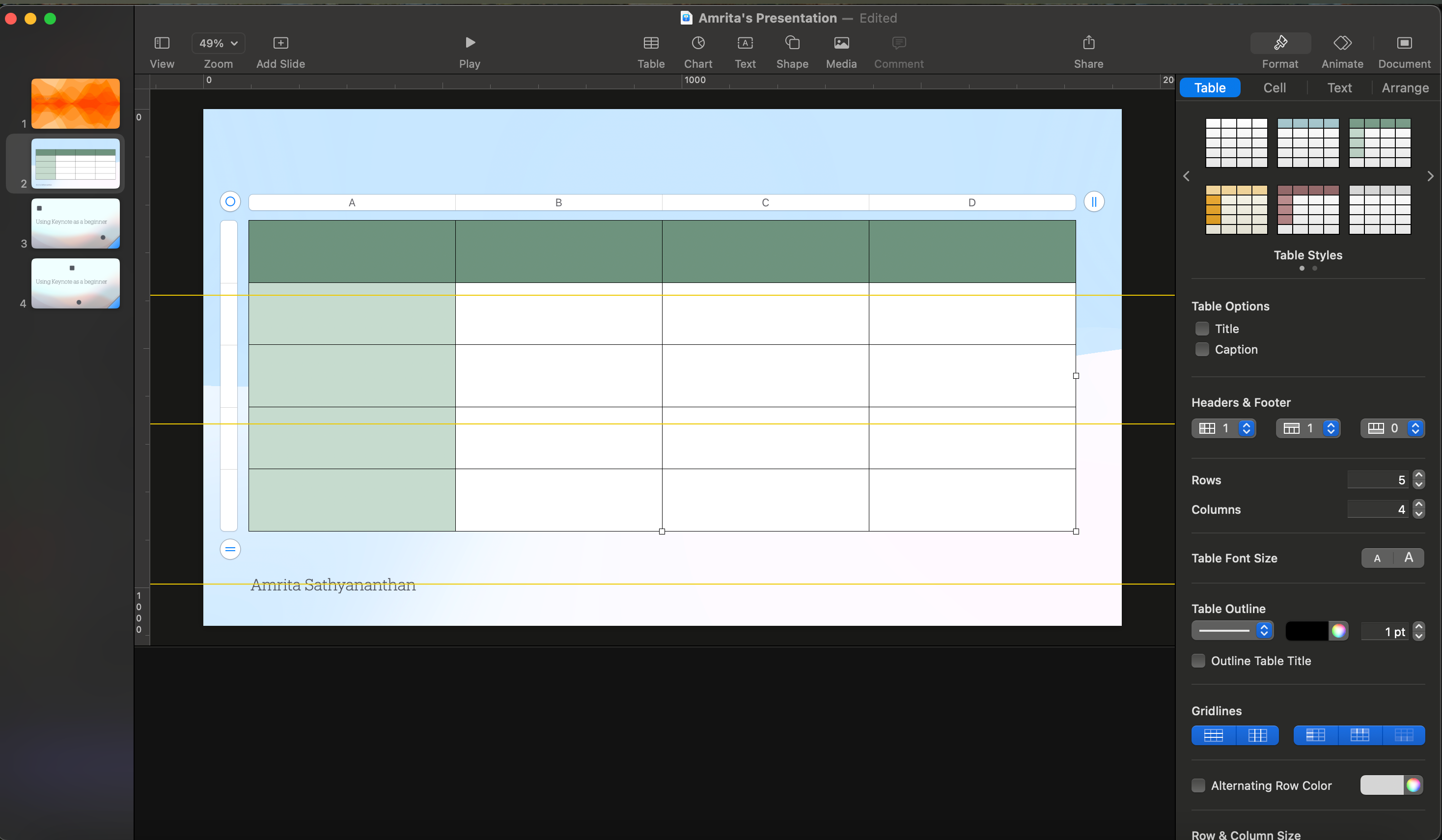
Apart from templates, Keynote comes with a collection of elements that elevate the most basic designs to stunning slides. These include shapes, media, charts, and tables that offer flexible customization. The formatting options for elements like tables feels intuitive, and compared to Google Slides, I find that tables on Keynote are easier to design.
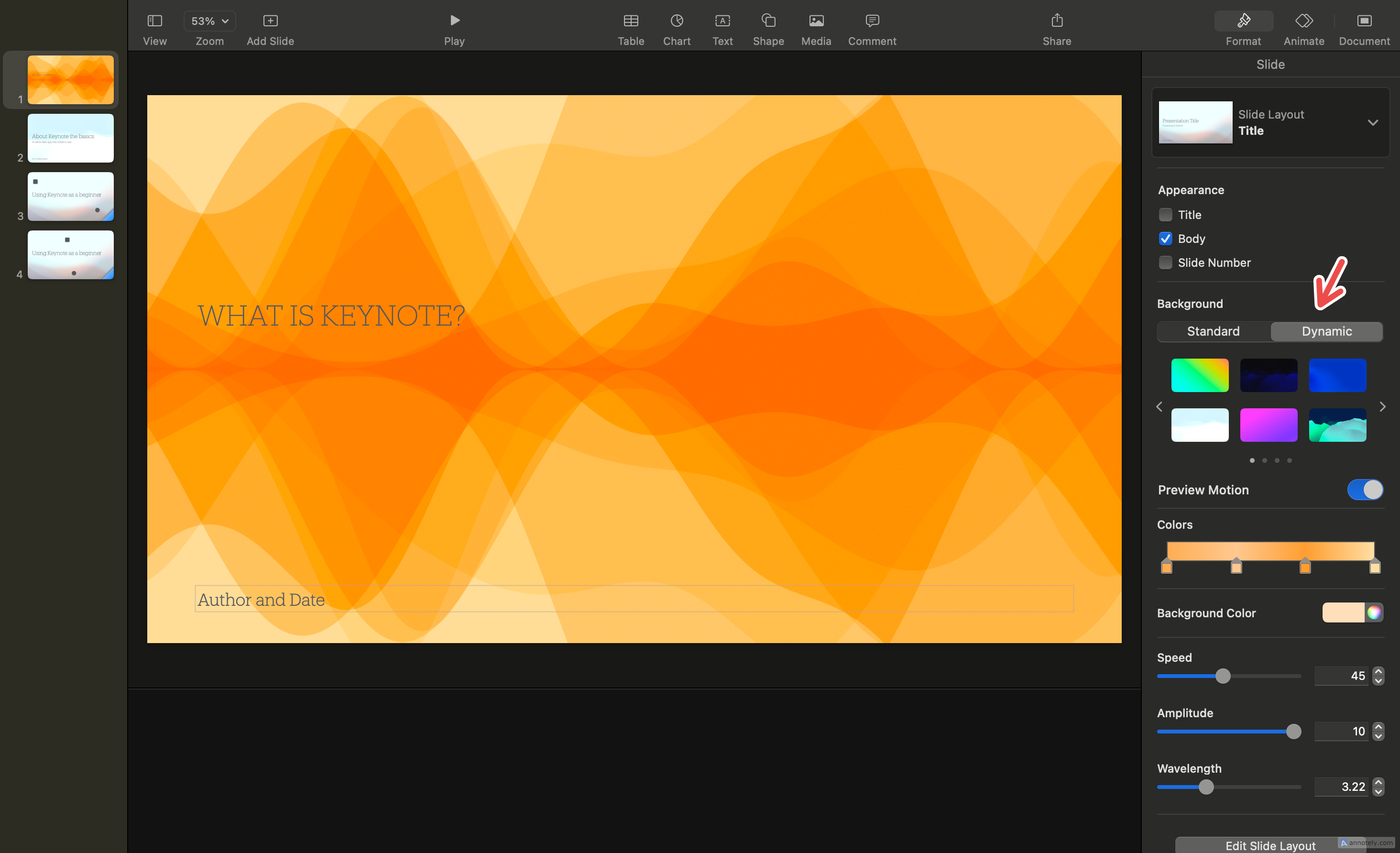
Features like Dynamic Background, which adds motion to your slides through animations, also help elevate your presentations. Slides with Dynamic Background effects play seamlessly when in presentation mode. Since you get to choose from a small collection of presets, you also save yourself time on the design front.
While there are ways for you to animate slide backgrounds in PowerPoint and Google Slides, Keynote’s presets are far superior in terms of aesthetics.
6 Smoother Transitions
Animating specific objects or elements in a presentation can be tricky, especially if you are looking for a fluid transition between two slides. While PowerPoint and Google Slides have some solid animation and transition options, Keynote’s animations win the race in terms of continuity and smoothness.
Keynote offers many options for you to animate slides and objects, but the standout feature that makes Keynote’s transitions so smooth is Magic Move. This is a transition that simulates the effect of elements moving from their original position on one slide to a different one on the next slide. It’s well worth a try, if you haven’t seen it in action.
7 Simple App Customization
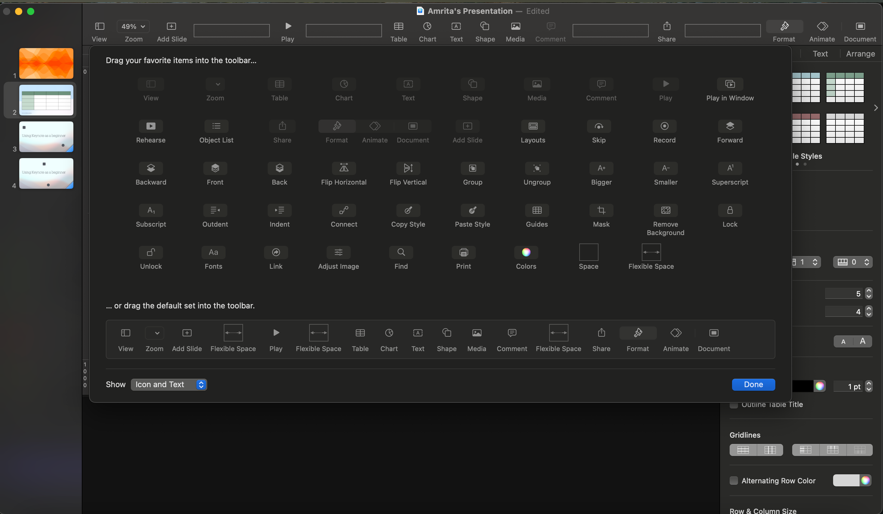
With Keynote, you can work with the controls and actions that you want while hiding the rest. Keynote’s toolbar actions can be easily rearranged and deleted, giving you space to build the toolbar you are most comfortable working with.
While you can customize the PowerPoint toolbar if you have the app installed, the customization that Keynote provides is far easier to figure out. Google Slides does not have many options when it comes to toolbar customization.
PowerPoint and Slides show a lot of tools on screen by default, whereas Keynote takes a more reserved approach that helps prevent it from feeling overwhelming. You can also customize the way your presenter view looks, swapping out elements and changing the way your slides are displayed.
Finally, Keynote elevates the look of your slides by supporting multiple types of high-quality video, audio, and images. You can add a live video feed, insert HDR videos, and add web videos to your slides, which play seamlessly with the rest of your presentation. Attaching an audio recording or importing pictures directly from your iPhone also gives you more integrated options to work with, compared to PowerPoint and Google Slides.
Your affinity for Keynote could depend on several factors, like app preferences and whether you’re comfortable shifting over to an app you are not used to. But if you are an Apple user looking to take advantage of the productivity tools at your disposal, Keynote can be a key tool in your arsenal.


