One of the first things you should consider when designing a PowerPoint presentation is ensuring everyone can access your content. In this guide, I’ll give you some ways to make this happen.
1 Add Alt Text for SmartArt, Charts, and Images
Alternative text—or alt text for short—is a description of any visual content that people with visual disabilities might find challenging to see. As well as text in text boxes, screen reading technology reads alt text you have added, so it’s important to clearly describe what each graphic contains. Alt text should use plain English and contain complete sentences that are grammatically correct.
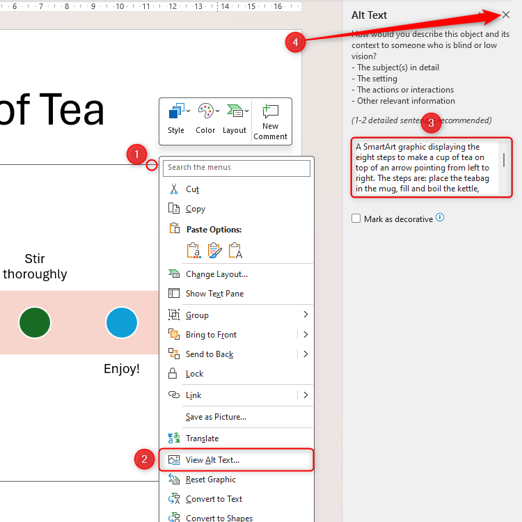
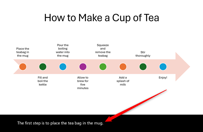
This SmartArt graphic contains instructions for making a cup of tea. To add the alt text, I right-clicked the graphic, clicked “View Alt Text,” and then added my description to the box in the Alt Text Pane. Anything typed here saves automatically, so I can click the “X” in the corner when I’m happy.
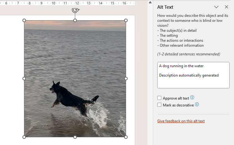
You also need to manually add alt text when you add a chart to your slides. However, when you add an image, PowerPoint will analyze the picture and generate the alt text automatically.
This automation usually works well, but it’s still worth checking that it fulfills the criteria I described above. For example, PowerPoint’s automatic alt text doesn’t include a period at the end of the description, so this needs to be added. PowerPoint also adds “Description automatically generated,” which you can remove once you’ve edited the content.
2 Set the Reading Order
Screen readers use PowerPoint’s built-in Reading Order tool to decide the order in which they will read the slide’s contents. By default, screen readers will read your slide’s elements in the order in which you added them.
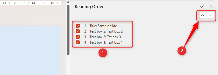
In this example, I added text boxes 2 and 3 after adding text box 1. This means that, even though text boxes 2 and 3 are higher in the slide, they won’t be read until after the title and text box 1, meaning the slide would be confusing to anyone using a screen reader.
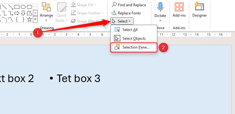
Before I amend the reading order, I need to rename the items. Doing this will make reordering them a lot easier later on. To do this, click Select > Selection Pane in the Home tab.
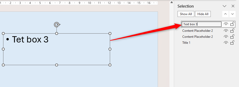
Then, when I select one of the items in the list, the same object becomes active on the slide, so I know which one I’m renaming. Double-click one of these items in the Selection Pane to change its name.
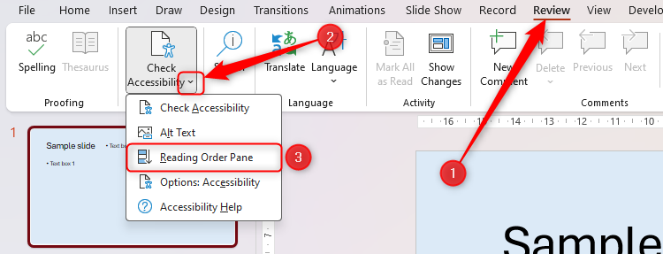
Now, I can change the reading order by clicking the “Check Accessibility” drop-down in the Review tab and selecting “Reading Order Pane.”
Because I renamed the slide’s objects, I can clearly see the order in which they would be read by a screen reader. Simply select an item, and click the up and down arrows to change its reading order position.
3 Follow the 6 x 6 Rule
Having too much text on a PowerPoint slide makes it overcrowded, confusing, and, for some people, overwhelming. As a rule of thumb, try to have no more than six bullet points on a slide, with each bullet point containing six words or fewer.
Of course, there may be times when this is not possible—it’s important you don’t substitute clarity for brevity—but having the 6 x 6 rule in the back of your mind as you construct your presentation will help you to make your content more accessible.
If for nothing else, having less text means your audience is more likely to stay focused on you as the presenter, and you’re also more likely to maintain eye contact with your viewers than read from your slides, making you and your presentation more engaging.
4 Ensure Each Slide Has a Unique Title
If you do stick to the 6 x 6 rule, this might lead you to spread content over two or more slides, when it might have previously been squeezed onto one. In this case, you should think about how you will title your slides, and this brings us back to the topic of screen readers.
First, every slide must have a title, as it helps your readers or viewers to understand the content of the slide within the broader context of your presentation. More specifically, repeated slide titles make it more difficult for people to navigate seamlessly through your work, especially if they’re using screen-reading technology. Even differentiating between similar slides by typing “(1 of 2)” will go a long way to helping your readers.
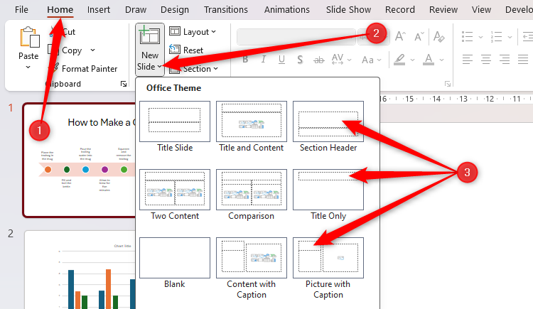
When you go to add a new slide via Home > New Slide, make sure you choose one of the layouts that contain a title placeholder (in other words, avoid adding a blank slide). Then, make sure the first thing you do is give your slide a unique title.
5 Make Your Links Contextual
Many good PowerPoint presentations contain links to other slides or external sources, such as websites. Regardless of where they take the reader, links should provide clear and accurate details about the destination.
For example, having a bullet point on a slide that says “Click here” is useless for people using screen readers. Even those not using a reader won’t know where the link will take them. Instead, create what’s known as a contextual hyperlink, which incorporates the link as part of the sentence.
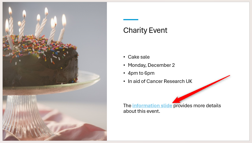
In the example slide below, the hyperlinked text clearly tells the reader where it’ll take them, the link is formatted to distinguish it from the rest of the sentence, and the whole context of the sentence makes it clear that there is a separate slide within this presentation that contains more information.
6 Use Accessible Fonts and Colors
Certain fonts and color combinations will make your presentation difficult for those with visual impairments, including colorblindness, difficult to read. Following these tips will help you optimize your slides’ readability:
- Create a strong contrast between the background and font colors. The best bet is to use dark text and light backgrounds.
- According to Experia, a UK-based multisensory specialist, pale greens and blues have a shorter wavelength than brighter colors, meaning they trigger less stimulation in the brains of people with autism, meaning they can better digest and process the environment.
- Try not to use colors for emphasis, as people with colorblindness might not see the difference as clearly as others.
- Avoid using block capitals, and don’t underline text excessively.
- Choose your fonts carefully. The best choices are sans serif, large enough to be read from a distance, and not narrow or condensed. Aptos, Tahoma, and Verdana are safe options for accessible presentations.
7 Keep Tables Simple (if You Must Use Them)
If possible, you should avoid using tables in PowerPoint. Although they are a good way to present certain types of data, your presentation would benefit from the information being presented in bullet-point form. This is because some screen readers may struggle to process the tabular layout, and some people find tables challenging to process.
However, if you mustuse tables in your slideshow, keep them simple. Try not to have more than a couple of words or numbers in each cell, don’t leave any cells blank, don’t merge table cells, and have easily distinguishable rows and columns, including a clear header row. Above all, avoid nesting tables within other tables.
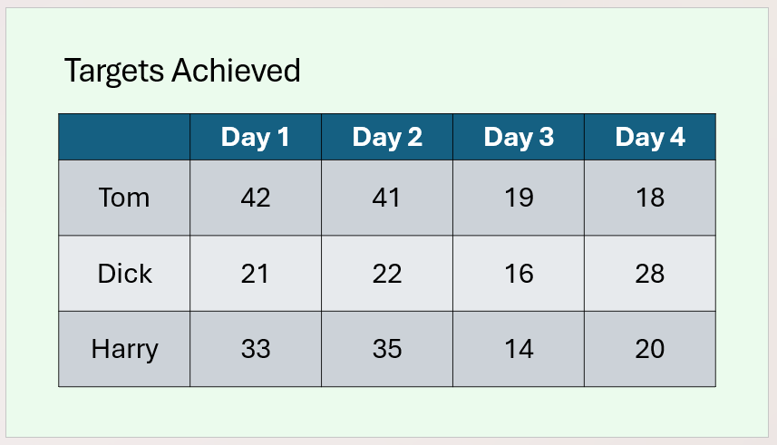
In this example, the data is minimal, there is a clear contrast between the table’s background and text, the banded rows make it easier to scan across, the text is large, and there are clear borders between each cell.
Remember to add alt text to any graphics in your presentation.
8 Enable Subtitles
PowerPoint’s real-time subtitling tool is a great way to raise the accessibility of your presentation. The program picks up your voice through your microphone and adds subtitles to your slides as you speak.
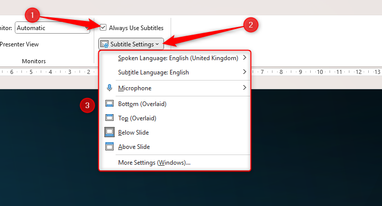
Activate this feature through the Captions And Subtitles group of the Slide Show tab. There, check “Always Use Subtitles,” and click the “Subtitle Settings” drop-down to select your spoken language, the subtitle language, the correct microphone, and where you want the subtitles to appear.
When you press F5 to present your slideshow and start speaking, you’ll see the subtitles appear as if by magic in real time.
When you have finished creating your PowerPoint presentation, click Review > Accessibility Checker. This tool will evaluate your presentation for accessibility and provide helpful suggestions where necessary.


