Google has a wide library of fonts that can turn your document into a pleasure to read and write. We’ve selected the best fonts to make your Google Doc documents look the best they can. We’ll cover some classics as well as some underrated new fonts.
Best Fonts to Use for Google Doc
If you’re a Google Docs user, you probably know that it employs the Arial typeface by default. However, there are also other alternatives offered by Google Fonts that provide similar professional flair and readability.
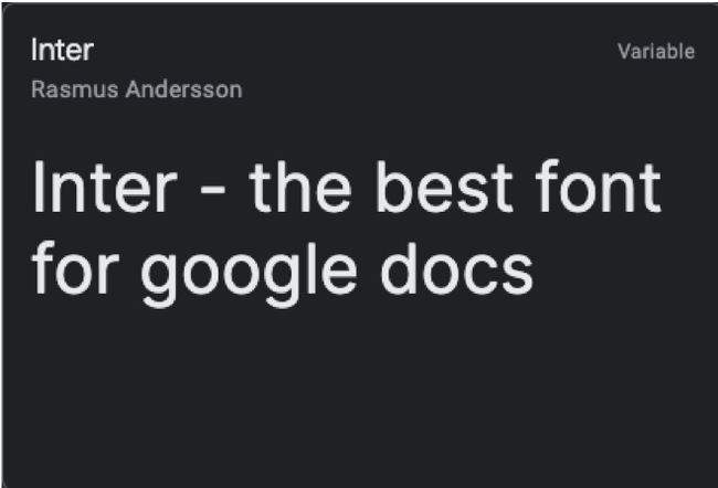
Inter
When it comes to documents, readability will always be a top priority, and Inter excels at this game. There are many types of writings that can be done with this typeface. The font was originally designed to work on the 11px font size specifically. It has a tall x-height that aids in the readability of mixed-case and lower-case texts.
The Inter UI font family has nine different weight styles available on Google Docs. It even has OpenType Features and glyphs if you are looking for more design options.
If you like texts that are carefully spaced out and friendly yet formal, then Inter is your best bet. It’s such a popular pick that you may even want to use Inter as your default font on Google Docs.
Where you can best use Inter:
- Blog or article writing
- Essays
- Personal documents
Open Sans
Clean, sophisticated, and modern—these words best describe this sans serif font. Because of how clear and balanced the typeface is, you will usually see this style being used on the web. In fact, the font is still very readable, even on small screens.
This typeface is considered a humanist sans serif. In simple terms, it means it’s written like a human holding a pen with minimalist contrasting strokes. And because of this, humanist sans serif designs are usually used in education, finance, and the government sector.
Since Open Sans is highly legible, it’s best to use this font for:
- Academic requirements like reaction papers, research papers, or any kind of homework
- Any type of data that you input in a spreadsheet
- Formal letters
Note: Google Docs only offers 30 fonts by default. To see Open Sans in the fonts list option, you’ll need to add it to Google Docs.
Roboto
Roboto is another sans serif font developed by Google, and it has six available weight styles on Google Docs. If we are going to compare it to the default Google Docs font, which is Arial, the former has a more condensed look.
Because of its condensed look, it is the perfect font to use when a lot of content is needed, but there is not a lot of space to work with. When you use Roboto, the typeface appears to be largely geometric since it belongs to the neo-grotesque family of sans serif typefaces. It also has open curves, which makes it a friendly and versatile font to use overall.
Roboto is part of the regular family, and you can also use this font together with the other family type, the Roboto Condensed, and Roboto Slab.
Now, where should you consider using this sans serif font?
- Documents that will be opened using a phone or a small screen
- Documents where you have to condense the content in one page
Bonus fact: Roboto is the system font of the Android operating system!
Merriweather
Another one of our top Google fonts is called Merriweather. It’s a free, open-source serif typeface, and it has a full set of weights and styles available on Google Docs. It also has an interesting set of Glyphs.
RELATED: What’s the Difference Between a Font, a Typeface, and a Font Family?
This font was designed by Sorkin Type, and its signature style balances aesthetics, expression, and utility. No wonder why Merriweather gives off a polished and elegant look, making your documents look more professional.
As for Merriweather’s best feature, it’s the ability to stand out due to its unique flair. However, it also blends in well when paired with other sans serif fonts such as Roboto, Montserrat, and Merriweather Sans.
Merriweather is best used for:
- Resumes
- Paragraph headings
- Professional letters and documents
Inconsolata
Coming from the monospace family, Inconsolata is designed for printed code listings and is favored by programmers. As we’ve mentioned, it is monospaced, meaning the letters occupy the same amount of width. This kind of typeface dates back to the typewriter days.
One drawback for monospaced fonts is that they may be a bit harder to read than the other types. But Inconsolata is one of the few monospaced fonts that does not compromise legibility. While each character has the same width, the spaces in between them are just right. It’s not too condensed but also not too spaced out.
Consider using Inconsolata if you are doing these types of documents:
- Code listings
- Manuscripts
- Screenplay or scriptwriting
Additionally, you can also try to use Inconsolata as paragraph headings and pair it with sans serif fonts.
PT Mono
We have another humanist sans-serif on the list, and it’s PT Mono. This font is part of the Public Type family where they have sans and serif typefaces. But as its name suggests, this is a monospaced typeface. It’s very similar to Inconsolata, except PT Mono is sharper on the edges, making it look more straightforward and more formal compared to the other font.
If you are a heavy user of spreadsheets, this font should be your go-to. Each character has the same amount of width, so it’s easier to calculate the size of entry fields, cells, or tables. To activate PT Mono on your Google Docs, you have to go to the font options list and select “More fonts.”
We recommend you use PT Mono on your next spreadsheet file so you can get a feel of this humanist monospaced font.
In addition to worksheets, this font can also be used for:
- Making work tables
- Creating work forms
Source Sans Pro
Source Sans Pro is Adobe’s first Open Source typeface family, and it’s best for user interfaces.
But what is an Open Source font? These are free fonts that are developed to be used for any purpose, including commercial work. Most designers use an Open Source font because the design is open for modification. The simplicity of Source Sans Pro makes it very pleasing to the eyes. It is sleek and slender, and the style is known for its minimalist approach.
Source Sans Pro makes a good paragraph heading too. The next time you create something on Google Docs, try pairing Source Sans Pro with Roboto or Open Sans for variation.
You can use Source Sans Pro when you are doing the following types of documents:
- Article writing or blog writing
- Journaling
- Note-taking
Nunito Sans
The last on the list is Nunito Sans. It has seven weight styles available on Google Docs. This font is a well-balanced sans serif typeface.
This font’s design looks more rounded than the other sans serif fonts, which makes it more appealing. But it’s not so round to the point that it makes the style look soft. If you look at it carefully, the uniformity of the strokes balances out the roundness of the design. Overall, it gives that professional yet friendly vibe.
Similar to Source Sans Pro, designers like to use Nunito Sans as well because it’s simple yet formal enough. You can use this font to give more personality to your document while still keeping it formal.
Nunito Sans is best used for these kinds of documents:
- Recommendation letters
- Research papers
- Essays
What to Look For When Choosing A Font
Selecting a font to use may look pretty simple, but there are actually many factors to think about. The most essential one to consider is whether the document you’re working on is for print or web. Viewing from a screen and from paper are two completely different experiences, so formatting decisions like what font style to use for each should be distinct from each other.
With that, here are the considerations you should review when choosing a font:
Character Line Spacing
When characters are too close to each other, this can cause your content to look denser and messier. Choose a font with wider character spacing so they’re easier to read regardless of how small the sizes can be.
Serif vs. Sans-Serif
Serif fonts have decorative strokes on them that give your writing a more elegant look. However, choosing consistently readable serifs can be challenging. Sans-serif fonts tend to be cleaner, simpler, and easier to read. Choose according to the mood you’re going for and, of course, the readability.
Degree of Legibility
The way you use typefaces matters. You have to think about the size, range of weights and ligatures, clarity of the characters, and height and contrast ratio standards. Choose was reads best to your target audience.
Choose Your Favorite Google Font
There are over a thousand accessible Google fonts to choose from. All of them are 100% safe to use and can easily be downloaded from their website. In addition, there are no licensing restrictions, as all the fonts listed in their directory are open source and free. You can use them on your Google documents, websites, commercial projects, and even on print.
So, take some time exploring these awesome font options and narrow down your choices until you come up with the ones that can best express your message.


