I know what you’re thinking. For the past five years, we’ve questioned, lambasted, and otherwise reviled the MacBook Pro’s Touch Bar. And now that it’s gone we already want it back.
But the problem with the Touch Bar wasn’t actually the Touch Bar itself, it’s that it wasn’t a Pro feature. The concept of a small touch-screen for common tasks was a good one—and we’ve heard from many people who enjoyed using it. The MacBook Pro just wasn’t the right product for it, and Apple’s flagship laptop is better without it.
But the Touch Bar isn’t without its merits and we’re hoping Apple still has plans for the Touch Bar. Here are three ways Apple could keep it alive.
MacBook Air
The most obvious way for Apple to keep the Touch Bar in its repertoire is by moving it over to the MacBook Air. We assume that the 13-inch MacBook Pro, the only remaining laptop with a Touch Bar, will be unceremoniously retired at some point in 2022. So if Apple has any plans to keep the Touch Bar around, it’s going to have to end up in the MacBook Air.
The good news is the MacBook Air is already in store for a redesign. We’ve heard that the three-year-old MacBook Air will get a dramatic overhaul with new colors, a notched display, and an M2 processor. And a Touch Bar would be a perfect addition to an entirely new MacBook Air. I’ve long asserted that the Touch Bar is a consumer feature masquerading as a professional one, and it would be right at home on the MacBook Air. Here’s how Apple initially described the Touch Bar in the 2016 MacBook Pro press release:
“The Touch Bar places controls right at the user’s fingertips and adapts when using the system or apps like Mail, Finder, Calendar, Numbers, GarageBand, Final Cut Pro X, and many more, including third-party apps. For example, the Touch Bar can show Tabs and Favorites in Safari, enable easy access to emoji in Messages, provide a simple way to edit images or scrub through videos in Photos and so much more.”
Now read it as a feature of the MacBook Air:
“The Touch Bar places controls for common tasks right at the user’s fingertips depending on the app you’re using, like Mail, Finder, Calendar, GarageBand, and many more, including third-party apps. For example, the Touch Bar can show Tabs and Favorites in Safari, enable easy access to emoji in Messages, offer easy access to controls like volume and brightness, and so much more.”
See how easy it is?
Magic Keyboard
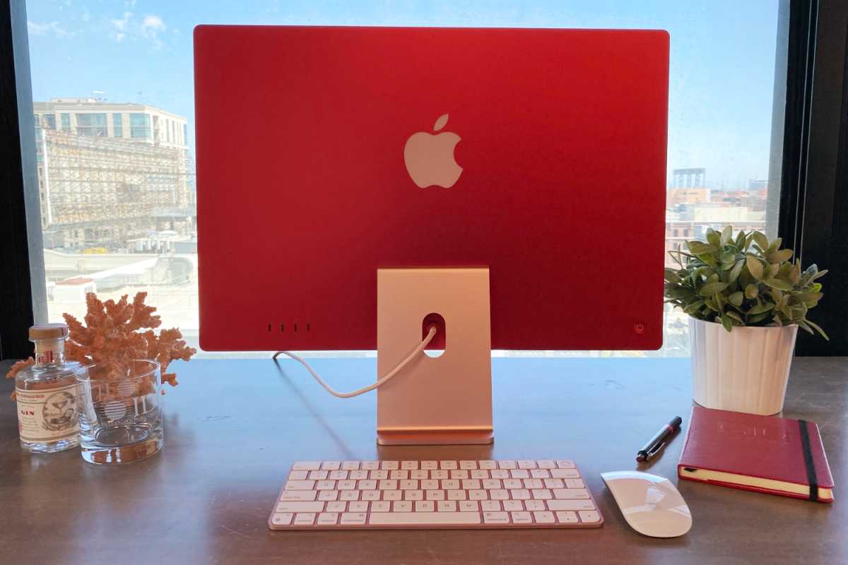
Apple’s standalone Magic Keyboard is a good keyboard but it’s hardly magical. It doesn’t have backlit keys, isn’t all that ergonomic, and you have to buy an iMac to get it in any color other than silver and space gray. But if Apple really wants to add some magic to its Magic Keyboard, a Touch Bar would absolutely do the trick.

IDG
It could be an option for Apple silicon Macs like the Touch ID model and would probably cost $249 for the numeric keypad, but the Touch Bar would be a brilliant addition to Apple’s Bluetooth family. We’d probably have to sacrifice some battery life, but it would be an acceptable tradeoff for one of the coolest features ever to grace a Bluetooth keyboard. A Touch Bar on the Magic Keyboard would truly be a magical feature that finally gives the skinny screen a purpose and puts Apple’s standalone keyboards back on the map.
iPad Pro
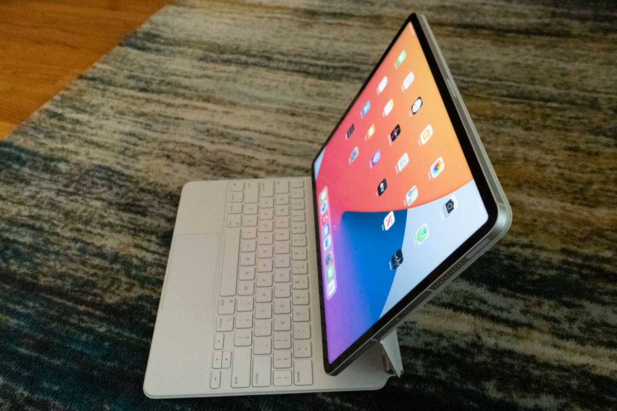
If there’s one place above all where the Touch Bar makes the most sense it’s the iPad. The coolest option would be to add it to the Magic Keyboard by rethinking the current layout. Like the iPhone, the iPad doesn’t need the same keys as the Mac, so the Magic Keybaord could tweak the layout to make room for a Touch Bar. Imagine snapping an iPad Pro into a Magic Keyboard and having a Touch Bar spring to life like a tiny second display.

Michael Simon/IDG
The Touch Bar could also work as an element on the screen. When typing on the magic keyboard, a Touch Bar-style strip could pop up along the bottom of the screen that offers the same menu and contextual options that it provides on the MacBook keyboard. Until we get a touch-screen Mac, that’s probably the most logical place for it—still in a line of sight when typing, but without taking up important screen real estate. What doesn’t make a ton of sense on the MacBook Pro would be perfect for the iPad Pro, which is a different sort of professional machine.
Michael Simon has been covering Apple since the iPod was the iWalk. His obsession with technology goes back to his first PC—the IBM Thinkpad with the lift-up keyboard for swapping out the drive. He’s still waiting for that to come back in style tbh.


