Two minute review
Your smartphone is an anti-sleep device. Its piercing sounds, its bright white light and the fact that you use it to check your emails at inappropriate times makes it a prime candidate for removal from your bedroom.
Cue the Mudita Harmony, an alarm clock with an e-paper display. Hot on the heels of the Polish company’s Mudita Pure (opens in new tab) e-paper smartphone, the Mudita Harmony boasts a 2.8-inch E Ink Carta HD display, a resolution of 480×600 pixels and has a 2,600 mAh battery that recharges via USB-C.
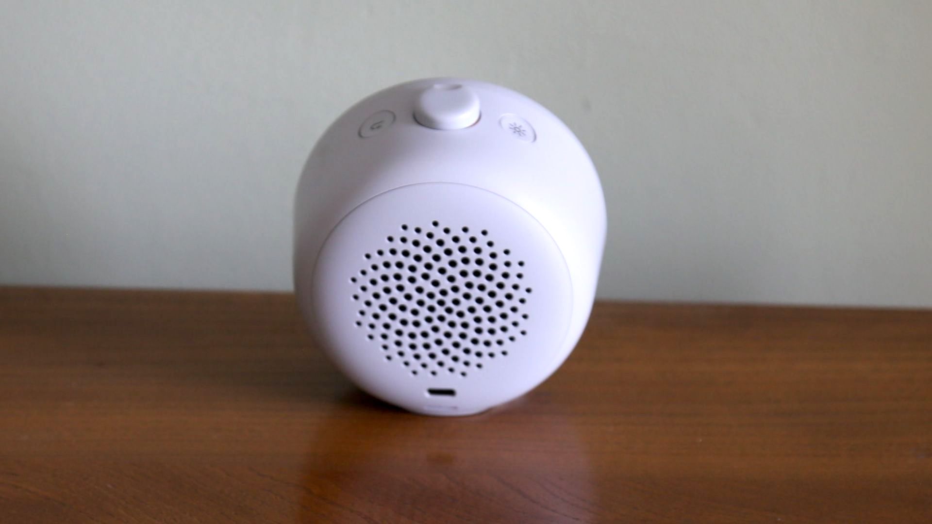
Although its secret sauce is the soothing sounds that come from the speaker on its rear at wake-up, the reason the Mudita Harmony will make a good bedfellow for some is its E Ink display. Just check your best sleep tracker if you don’t believe it’ll improve the quality of your sleep.
Digital alarm clocks whose LED displays leak light into the room have long been rip[e for an upgrade, and it’s a problem not entirely solved by the advent of OLED displays. The Mudita Harmony tries to solve that at a stroke by switching off completely at night. That solution works well, but if you do want to check the time while in bed you have to activate the E Ink display – and even on its lowest brightness setting we found it slightly, err, alarming.
So while it leaks no light at night, it’s not quite the perfect alarm clock for light-sleepers. Overall it’s impressive, easy to use and to live with – with its user interface particularly impressive – but we can’t help thinking the Mudita Harmony could do with a much lower minimum brightness setting.
Mudita Harmony E-Ink alarm clock review: price and release date
- Sells for US$169.99/UK£135/AU$237
- Only available in ‘Pebble Grey’
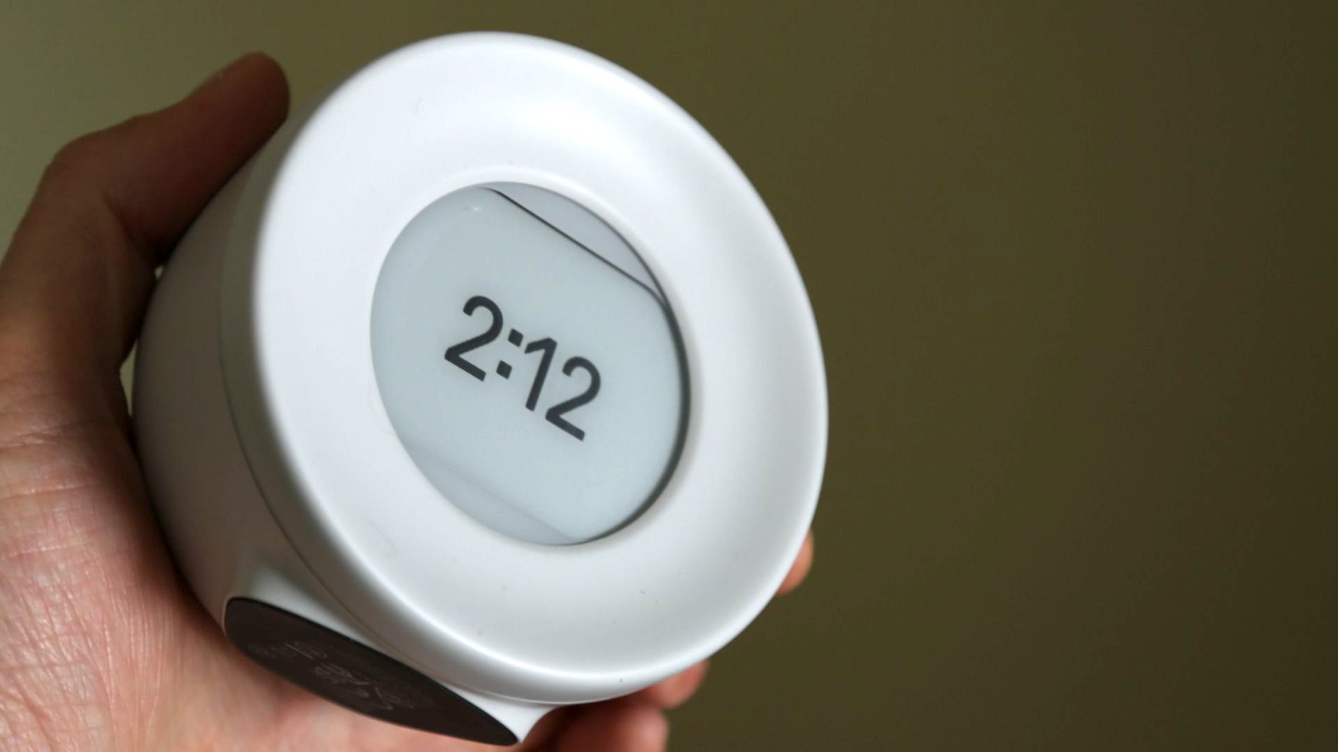
Weighing 240g and measuring 102x100x69 mm, the Mudita Harmony has a rounded edge and an overall very clean, soft and thoroughly minimalist look about it. Not that it looks particularly new; its round clock face design and large button on the top gives it a clear heritage in the world of alarm clocks. We’re guessing it’s used to avoid there being a massive contrast between bright white and the grey of the E Ink display, but the ‘Pebble Grey’ colour is a little drab.
It has a built-in battery, so you can place it anywhere in your home, though it needs recharging every seven days, which may put some off. At least it uses USB-C, which most people now use regularly. Its flat silicon-covered bottom means it can perch on any flat surface with some grip, so there’s no worry about it being knocked over.
The real design flourish on the Mudita Harmony is that single button on the top. As well as turning it on and off, it works as the snooze button and also navigates the onscreen menus. There’s a dedicated button only to control the brightness level.
Although meditative sounds it emits will appeal to some, the E Ink display itself is the biggest reason to buy the Mudita Harmony. Measuring 2.84-inches, it’s got a 600×480 pixel resolution and a dots-per-inch rating of 270. Either way it looks easily sharp enough for the job at hand; it shows the time in numerical characters that takes up about a third of the E Ink screen. It’s completely deactivated at night.

Mudita Harmony E-Ink alarm clock review: Performance
- 17 meditation-style wake-up melodies
- Arm Cortex-M7 600MHz and 4GB memory
- 3.5W speakers
The Mudita Harmony has five modes; alarm, bedtime, power nap, relaxation and meditation. For the alarm its 17 melodies are used to wake you up while for the other three modes they’re soothing background sounds. There are some natural sounds – including birdsong, tides and a stream – as well as some musical tracks created by Canadian musician Nick Lewis using guitar, Tibetan bowls, a guitar, ukulele and koshi bells. They have names like ‘tranquil rainstick’, ‘cowboy chords’ and ‘bubbling brook’. A pre-wake-up alarm can be set for five, 10 or 15 minutes before the main alarm, which has a different choice of four soundscapes. Weirdly the pre-alarm only lasts for a few seconds.
They can be set to be really loud, during which the sound quality is excellent, though we decided to go for a volume setting of 2 (the maximum is 10).
All those choices mean a complex user interface, right? Actually, no. Toggle that main button and all it does is change the time of the next alarm. Ditto the button next to it, which lights-up the screen or kills it. That’s it. Real simple.
Use the top button to set an alarm and a message will be displayed on the E Ink screen letting you know in exactly how many hours and minutes the next alarm will go off. A light press of that top button allows you to delve deeper, navigating lists of options that include those various modes for a power nap etc. as well as a useful settings menu. In there you can change the intensity of the E Ink’s front light (from 1 through 10), set the tone for the ‘bedtime alarm’ (something we’re confused by – why do you need a bedtime alarm next to your bed?).
We love that the display is completely dark at night, but what if you want to check the time when you wake-up randomly? Hit the top button and the E Ink display’s frontlight kicks-in, though even on its lowest setting we found it startlingly bright in a blackout. To really be considered sleep-friendly we think the Mudita Harmony needs some much lower brightness settings.
E Ink displays need to refresh every now and then, something that makes the entire screen go dark grey for a second or so. That occasionally happens on the Mudita Harmony as it changes the minute counter. It’s a quirk of the technology, but it can be distracting if you happen to have the device facing you on a table or desk during the day. If you want full customisation, you’re better off with something like the Lenovo Smart Clock 2.

Buy it if …
Don’t buy it if…
First reviewed June 2022


