Our MacBook Pro review felt strangely incomplete when it dropped roughly two weeks back. In many ways, my experience with the laptop was defined as much by the product I was reviewing as it was by the absence of one I’d only briefly interacted with during a hands-on scrum at WWDC some weeks prior.
In many ways, the 13-inch 2022 MacBook Pro was a casualty of timing, a product of an earlier era, with new brains controlling the same vestigial organs. From the outside, it seemed the cadence of hardware refreshes has had some difficulty matching Apple’s progress on silicon over the past two years. It was something we saw with the first round of M1 systems — new chips in old shells.
For the M2 launch, the Pro has the unfortunate timing of being launched alongside what is arguably the single largest upgrade to the MacBook Air in the ultra portable’s 14-year history. It’s an external facelift to match new internal firepower. The 13-inch Pro, on the other hand, has little to recommend it beyond:
- Very possibly being the last device to sport the Touch Bar and
- A fan
If you’re an Apple user, you almost certainly have strong feelings about that first one. As far as No. 2, well, that’s not likely to be an issue for the majority of users. For those who anticipate pushing the M2 to a point that requires some active on-board cooling, however, might I interest you in the new 14-inch? That device set the stage for the next generation of MacBook designs, including this new Air.
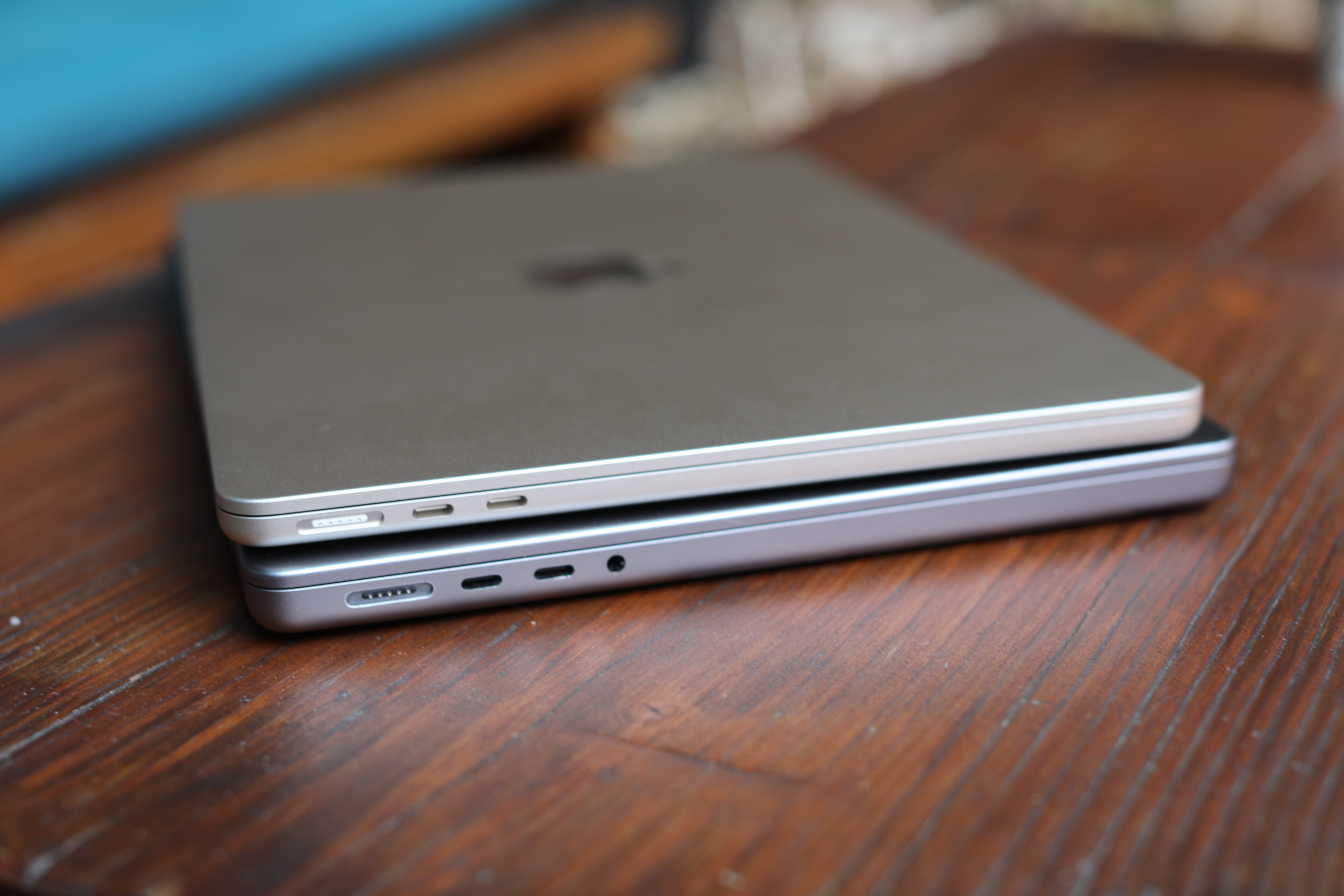
Image Credits: Brian Heater
Here’s the full breakdown of the pluses and minuses of each.
Pro:
- Touch Bar
- Better audio capture — specifically the same three-mic array you’ll find on the 14-inch
- A built-in fan-based cooling system for those occasions you really push the M2 to its limit (which, Apple will happily tell you, are few and far between for most users)
- You’re Devin and you just, like, really hate notches, man
- Longer battery (stated 20 hours versus 18), courtesy of a 58.2-watt-hour battery (the Air’s is 52.6)
- You can buy it now
All right, it’s the Air’s turn. Let’s see:
Air:
- Bigger screen (13.6 inch versus 13.3), with newer display technology (Liquid Retina versus Retina)
- New design and colors
- MagSafe (I would trade the Touch Bar for the new MagSafe in a second, but that’s just me)
- 0.3 pounds lighter
- 0.17 inches thinner
- Upgraded camera (1080 to the Pro’s 780)
- Function keys
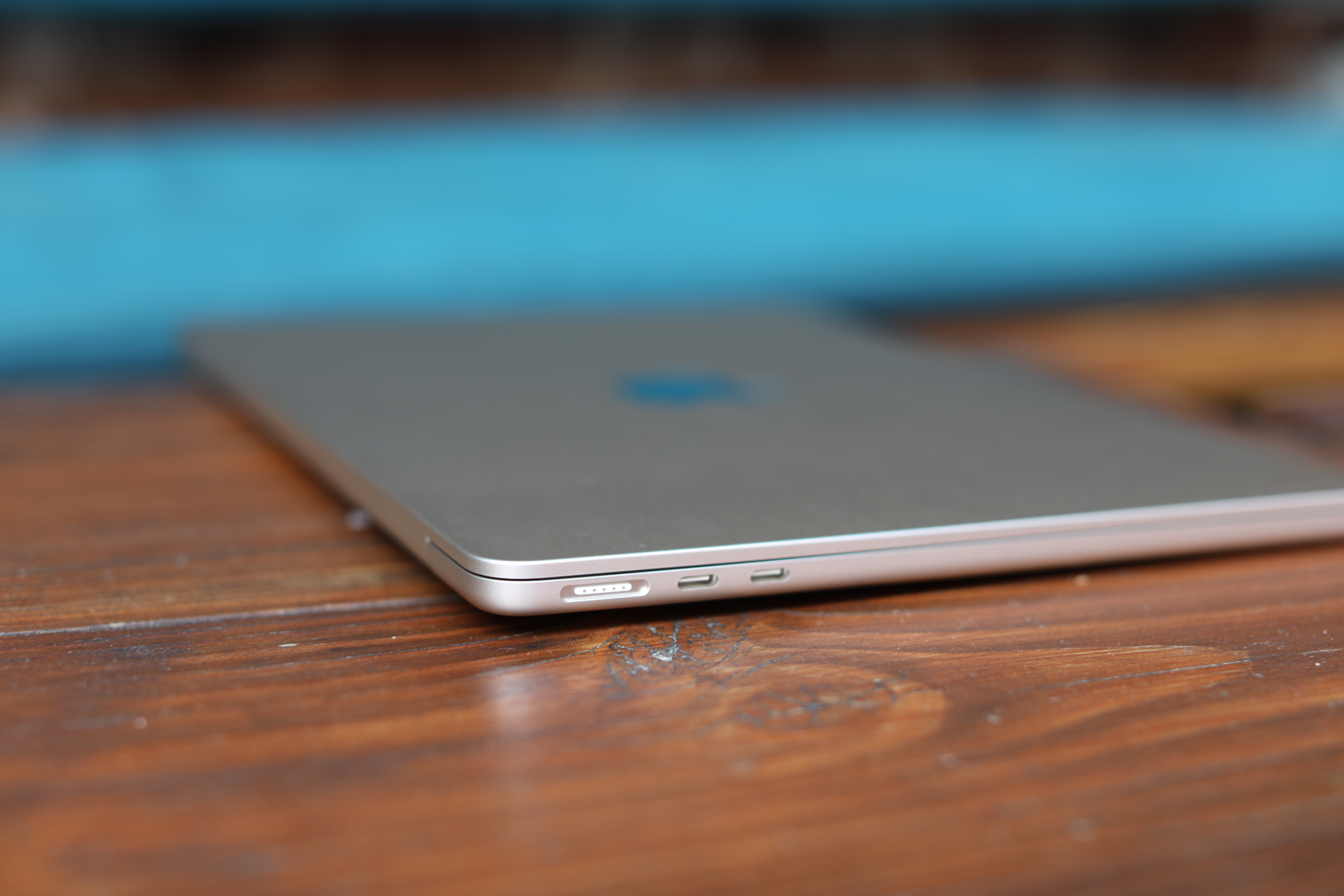
Image Credits: Brian Heater
Seeing as how the Air really sucked the oxygen out of the room on the 13-inch Pro review, it seems only fair the device gets a fair bit of mention here, as well. It didn’t take a Nostradamus to intuit that the Air was going to be the better buy in 90% of scenarios (though I’m happy to still pat myself on the back for that one).
Having used the Air for the past couple of weeks, I can happily report that the prediction was right on, and, honestly, I’d say that — as the lineup currently exists — this is the MacBook I would recommend to a majority of users. The thin and light has long been one of the most popular entries in the line, but in past years, the form factor has — understandably — come with its share of trade-offs, including things like power and battery life. The 14-inch Pro will still edge out the M2 Air, but for most people in most scenarios, the trade-offs are negligible here.
As an owner of one of the earliest Air models, there were times the compromises could be glaring. I edit video and audio, both tasks that could feel dodgy on the system. The laptop was always a good companion in my pre-pandemic travel. The gulf in size and weight between those Airs and Pro was profound, and the system never left my side. But there was a tacit understanding for creative Pros with heavy workloads that you were going to need a more robust system to come home to.
Image Credits: Brian Heater
I’m certainly not suggesting that there isn’t still a gulf between the 8-core M2 Air and, say, the 20-core M1 Max or Pro Studio, but the floor is much higher than it was in those heady Intel days.
Design-wise, the Air has much more in common with the 14-inch Pro than the Airs that came before it. I’m sure some very long, heated conversations happened behind closed, transparent doors at Apple’s Cupertino spaceship, regarding the decision to retire the Air’s iconic tapered design. Apple did, after all, cling to it for nearly a decade and a half (a perhaps longer, if you consider the still-available M1 Air).
The new design is effectively a scaled-down version of the 14-inch Pro. It adopts the same, boxy design, shrinking it down to 0.44 inches thick (versus 0.61) and 2.7 pounds (versus 3.5). It’s a nice weight, with a solid feel that should slip nicely into a backpack and perform well on a seat-back tray table during a long flight.
Apple added two new colors to the mix — Midnight and Starlight. I’m a fan of the darker Midnight, though that finish tends to be a massive fingerprint magnet (though, as you can no doubt detect in some of our photos, our system wasn’t immune). Apple ended up sending Starlight, a finish with a yellowish hue that is far subtler than the almost gold-colored press photos make it out to be. Honestly, I had to doublecheck the box to make sure it was the color the company sent. It’s more pronounced when the system is stacked up against others. The new colors arrive with matching power cables, which is a fun touch.
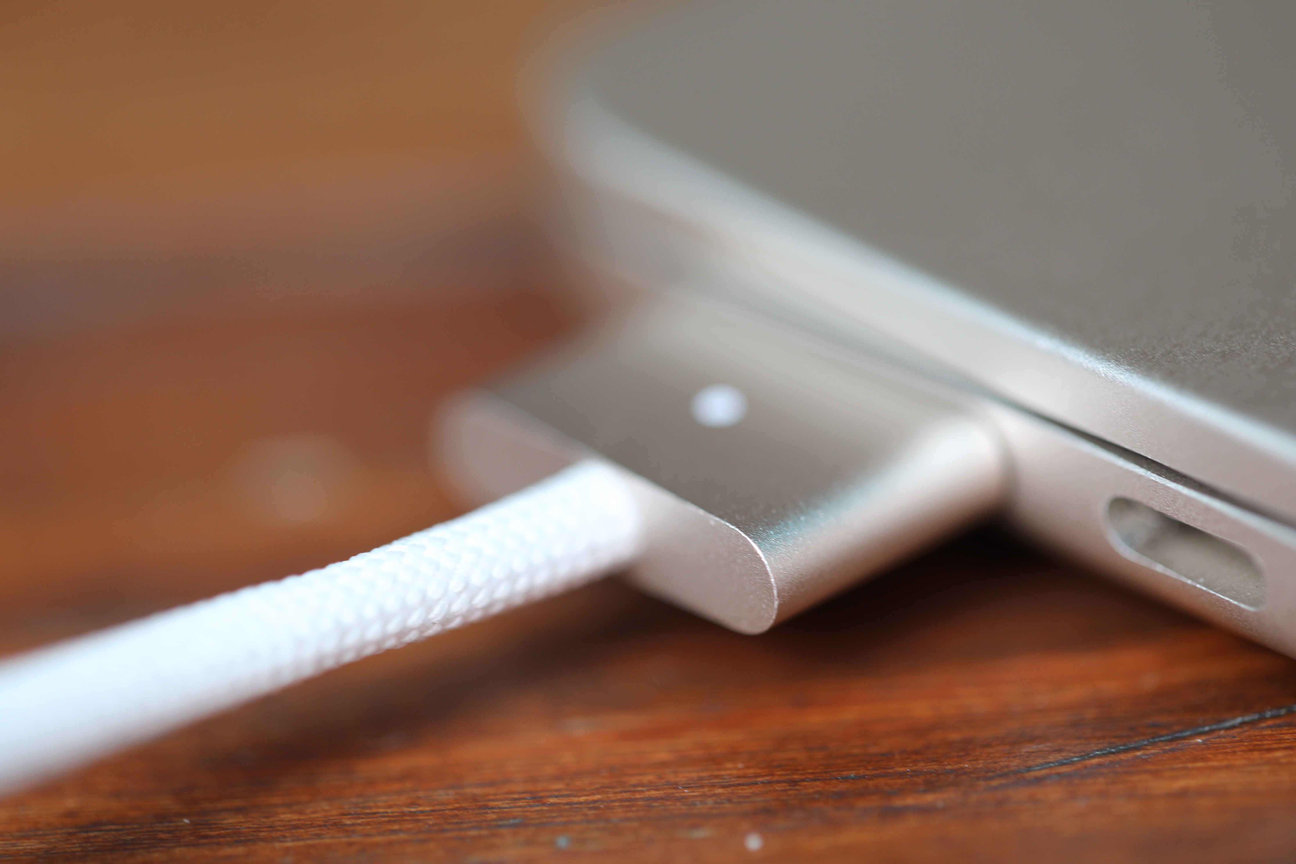
Image Credits: Brian Heater
Said cable is a MagSafe, the much-missed feature the company brought back with the 14-inch Pro. It’s nice to have a robot safety cable back on the product. It frees up the two USB-C ports, even if the difference in charging speeds is more or less negligible. All three of the aforementioned ports are located on the same side of the device, which is a bit of a pet peeve of mine. In general, my preference would be two per side in addition to MagSafe, but barring that, one on each side makes sense when it comes to negotiating cable space.
On the flip side is, mercifully, a headphone jack. There’s a part of me that worries Apple will think better of it with each subsequent release, but as someone who prefers to hard wire for audio editing, I’m grateful it’s still around. Better still, Apple’s added support for high-impedance headphones, which are a bit more power hungry, but provide improved audio qualify — a nice addition for people who use their system for music production.

[Left: M2 MacBook Pro 13-inch, Right: M2 MacBook Air]
The webcam has been upgraded, as well, from 720 to 1080p, a nice addition in this age of remote work. The color and clarity are improved, and there’s overall less noise. As your can see in the above photos, the 13-inch really struggles with backlighting. The ceiling lights cast glare across my face. The improvements come from new sensors, coupled with improved image processing on the new chips.
The quality still isn’t great. I’d be completely fine using it for a work Zoom, but for those times I’m broadcasting to the outside world, I’m going to opt for an external camera every time. In my case, that either means the Opal webcam or docking my iPhone and using Ventura’s new Continuity Camera feature. For the latter, I do have some questions around the long-term viability of sticking the weight of an iPhone atop the Air’s lid, especially with the smaller hinge. I guess we’ll just have to wait and see on that front.
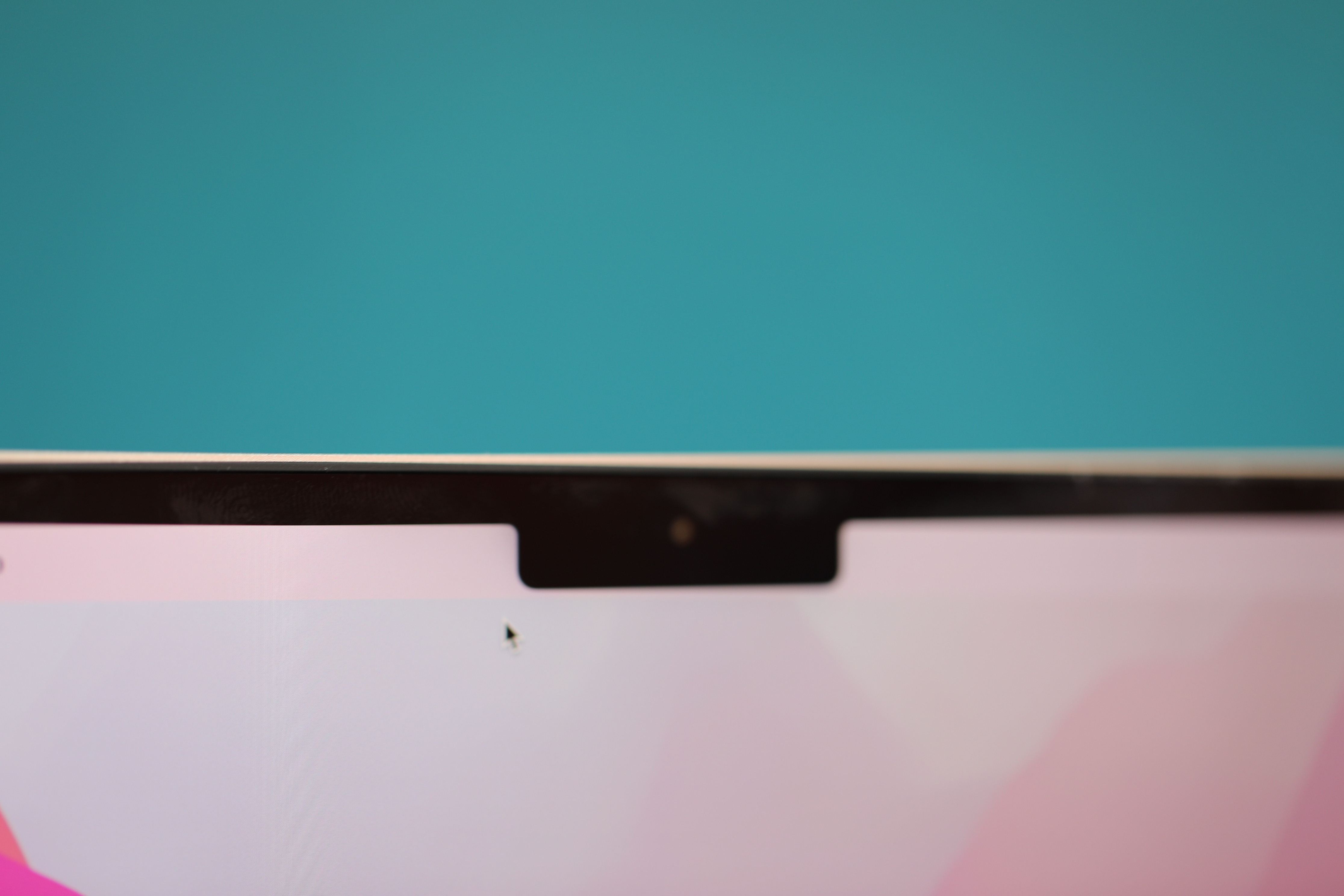
Image Credits: Brian Heater
The new camera comes with a new notch — another design piece borrowed from the 14-inch system. I assumed the cutout would be even more pronounced on a smaller screen, but honestly, I mostly forgot it was there after a while. In the end, the feature means Apple’s effectively able to cram more screen into the same footprint — which is part of the reason the Air can sneak in a few more fractions of an inch than the 13-inch Pro. The device trades a Retina Display for Liquid Retina, maintaining roughly the same pixel density (a 2560 x 1600 13.3-inch screen on the 2020 Air and 250 x 1664 on the new 13.6 system), though the brightness has been bumped from 400 to 500 nits.
The standard side grilles have been swapped out for back-firing speakers, designed to reflect off the bottom of the display. The array has been bumped up from two speakers (on the 2020 model) to four, and Apple has added in Spatial Audio headtracking for connected AirPods. The sound quality is passable, but for music listening, I’d advise investing in a Bluetooth speaker or headphones. I will say for my part, I very seldom rely on my laptop’s built-in speakers, with the exception of hotel rooms or watching something quick in bed.
The redesigned body, coupled with a thinner logic board, allows for more room for battery. The Air gets an upgrade from 49.9-watt-hours to 52.6. Overall, however, the stated battery life remains the same. I was able to get a bit over 17 hours of video playback, streaming video on Apple TV, with the brightness at 50 and the sound on. That should be enough to get you through just about any flight (maybe budget in a 90-minute nap if you’re flying from New York to Singapore). Interestingly, in addition to the new MagSafe colors, Apple’s trying something different with the power brick. Get the standard model with the 8-core GPU and you get the standard 30w USB-C charger.
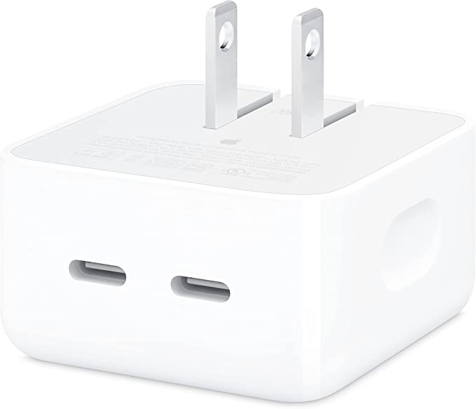
Image Credits: Apple
Splurge for the 10-core GPU, and the company tosses in the new 35W Dual USB-C Port Compact Power Adapter. It’s surprisingly small for a MacBook charger. It’s fully flat on the bottom, with a retractable plug that lies flush when stowed. And, as advertised, you get a pair of USB-C cables to charge two devices at once (though at 35W, I definitely wouldn’t recommend attempting to top off the Pro with the thing).
The keyboard is consistent with recent MacBook models — which is, again, to say much improved from a few years ago. The Touch Bar has been swapped out for a familiar row of function keys — something you don’t realize just how much you miss until you have to go with out. The device does, however, maintain Touch ID, which, let’s be real, was the best part of the Touch Bar anyway.
Image Credits: Apple
Apple sent a unit with 8GB RAM, 512GB of storage, an 8-core CPU and 10-core GPU. That runs $1,499 as configured – $300 above the entry price. That’s considerably more expensive than the M1 Air, which starts at $1,000 and is honestly still a perfectly reasonable choice. It is, however, well below the 14-inch Pro’s $1,999 starting price.
The Air scored 1922 on the single-core and 8974 on the multi-core Geekbench 5 tests. Predictably, that puts its right in line with the 1939 and 8955 scores we got on the 13-inch M2 Pro. It also bested the 14-inch Pro’s 1781 single-core score, but the M1 Max unsurprisingly smoked on multi-core with a score of 12,674. We saw similar results on the Intel test at 1462 and 6955 for single- and multi-core, respectively. Again, that’s right in line with the 13-inch Pro’s 1485 and 6992 for applications that require the Rosetta 2 emulator (I’m looking at you, Audacity).
That’s a good way of thinking about the new M2 chips, really: higher floor, lower ceiling. They’re impressively fast with relatively simple tasks, but when you really push the limits, the M1 Max and Ultra can still do laps around them. The Air’s fanless design presents another bottleneck for truly resource intensive tasks, but most people aren’t likely to encounter that day-to-day.
The GPU gains are quite impressive, as well, falling in line with the M2 Pro, slightly edging out the 14-inch Pro and only being bested by the Mac Studio. The Air isn’t a gaming powerhouse just yet, but the future is starting to look much brighter on that front.
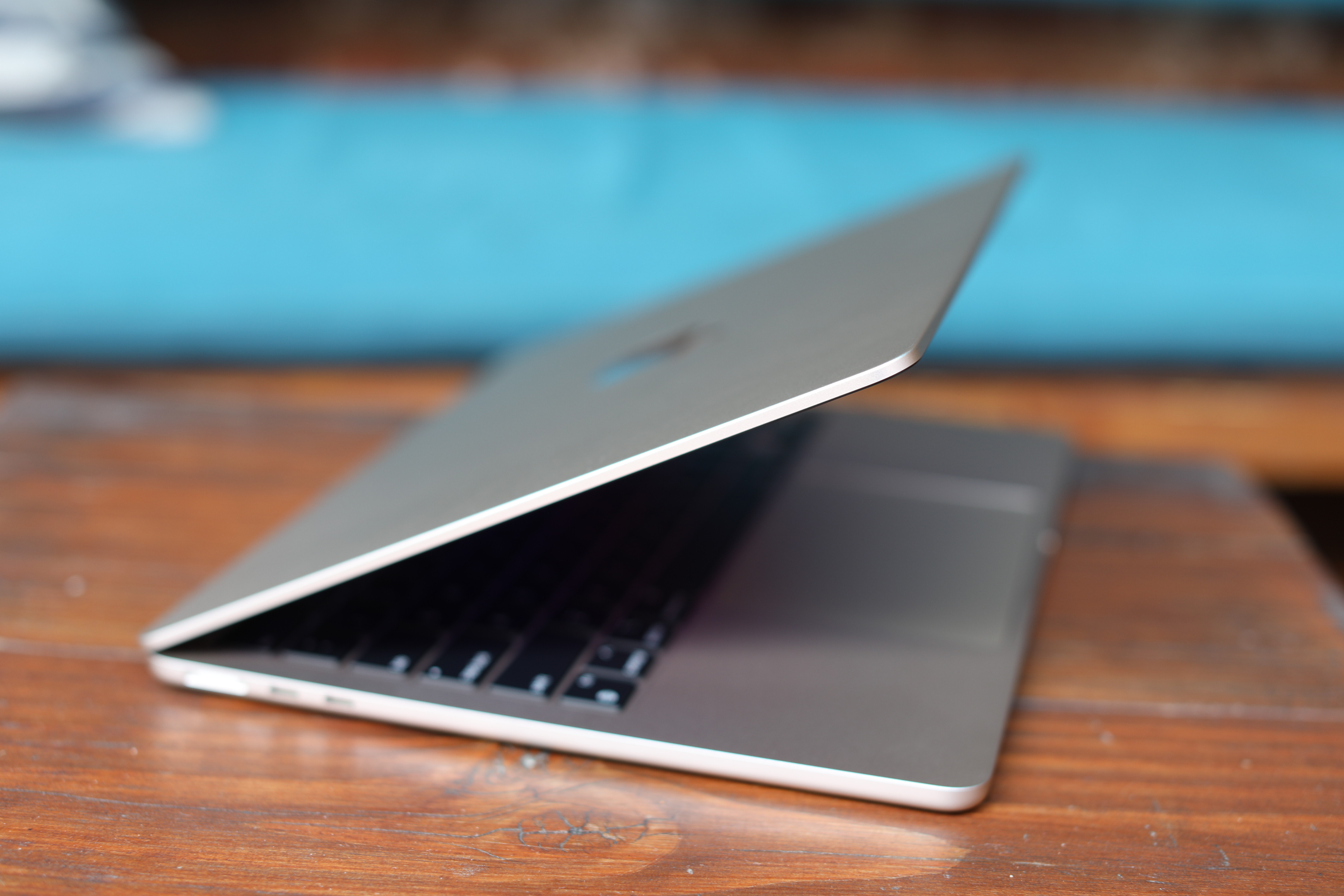
Image Credits: Brian Heater
The 14-inch Pro arrived last year like a breath of fresh air. For the first time in a long time, it felt like Apple wasn’t making unnecessary compromises. It was, perhaps, a new era of truly listening to consumer feedback, rather than assuming a company always knows what’s best for its end users. The line was returning to its creative pro roots, without alienating mainstream consumers.
The Air is like version 2.0, bringing an even more mainstream sensibility to the fore. It’s the power of Apple silicon, improvements to key components like the webcam and charging, all in a smaller, more portable form factor. It’s true there are still compromises – that much might be unavoidable. I’d prefer, for instance, a better webcam and more than two USB-C ports. But taken as a whole, this is a great package.
There’s a good bit of variety in the MacBook line, at present — something you haven’t been able to say at every point in its history. If you’re looking for good performance at a lower price-point, the M1 Air is still a fine choice. If you need more power on-the-go, the 14-inch Pro is great (though I’m admittedly curious what the M2 Max and Ultra will bring). And if you want…I dunno, a Touch Bar, I guess, there’s always the 13-inch Pro vying for your hard-earned bucks.
The M2 Air, meanwhile, strikes a harmonious balance. It’s thin and light, has some of the line’s best new features and boasts enough power for most needs, without going overboard for daily use. It’s the right MacBook for most consumers and a warm reminder of why the Air struck a chord with so many users so many years ago.


