As Android users, mocking Apple for claiming a years-old feature as some revelation is a tradition as old as time. Each September, when the company takes the stage to announce a new iPhone lineup, it occasionally takes something from Android only to hail it as a groundbreaking feature years in the making. As tempting as it might feel to joke about the Dynamic Island this year — the name’s just asking for it — it’s the always-on display that makes Apple look truly late to the party. Unfortunately for anyone considering the iPhone 14 Pro, the always-on display isn’t just bad — it’s a complete misunderstanding of what an always-on display should accomplish.
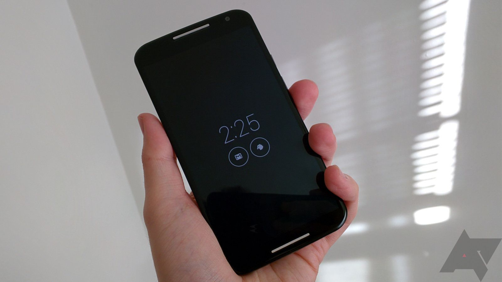
Android phones have supported always-on displays since AMOLED became a popular choice for smartphone displays. Motorola did this nearly a decade ago with the first-gen Moto X, and it was far from the first company to add the feature. As OLED panels became the norm, so did always-on displays. It’s hard to find an Android smartphone today that doesn’t have the tool — even devices with LCD panels often have it as an option.
I don’t have a good shot of the original Moto X, so here’s one of its 2014 successor.
That left Apple as the odd company out, the last major phone maker unwilling to give users a look at incoming notifications without turning on the screen. Although some early rumors surrounding the iPhone 13 suggested it could be the first of the company’s devices to get an AOD, it didn’t arrive until this year’s iPhone 14 Pro and Pro Max. Unlike basic OLED panels, Apple uses LTPO technology to allow the display to drop to 1Hz when inactive, all to protect the phone from battery drain.
In theory, this implementation shouldn’t be necessary. We’ve seen countless Android phones with always-on displays come and go over the years, and thanks to those OLED panels, keeping a handful of pixels lit hasn’t caused much of an issue in the battery department. It’s also far from the first smartphone to use an LTPO display — the Galaxy S22 Ultra shipped with one earlier this year. Once you understand how Apple’s AOD works, though, it becomes clear why LTPO is so important — and why the feature’s so bad on iOS.
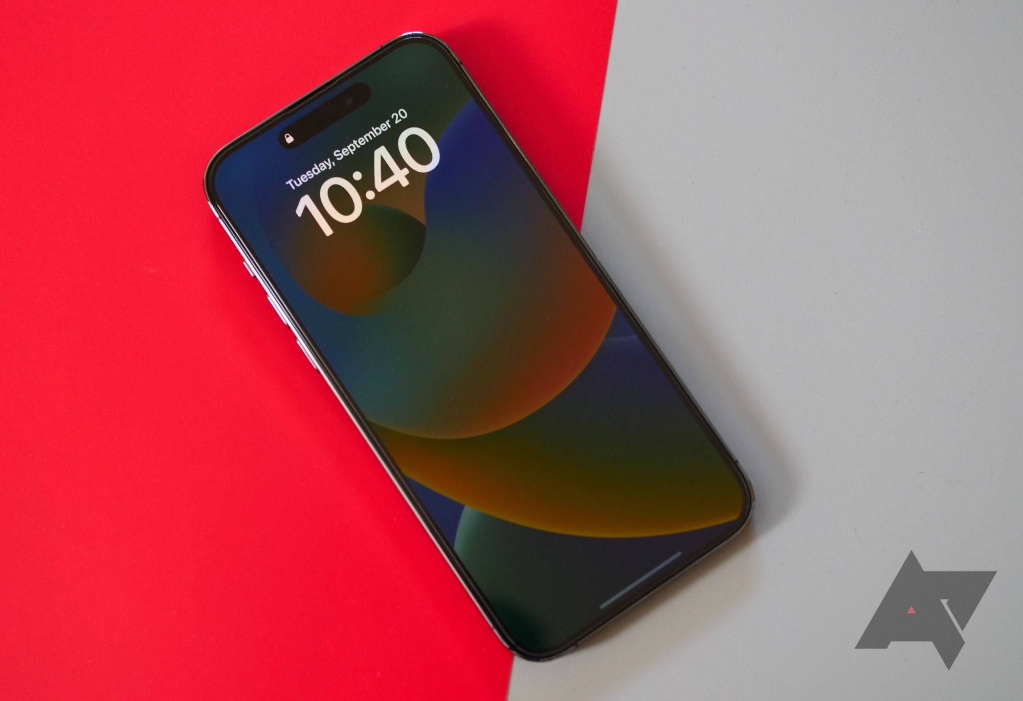
This is dimmed, if you can believe it.
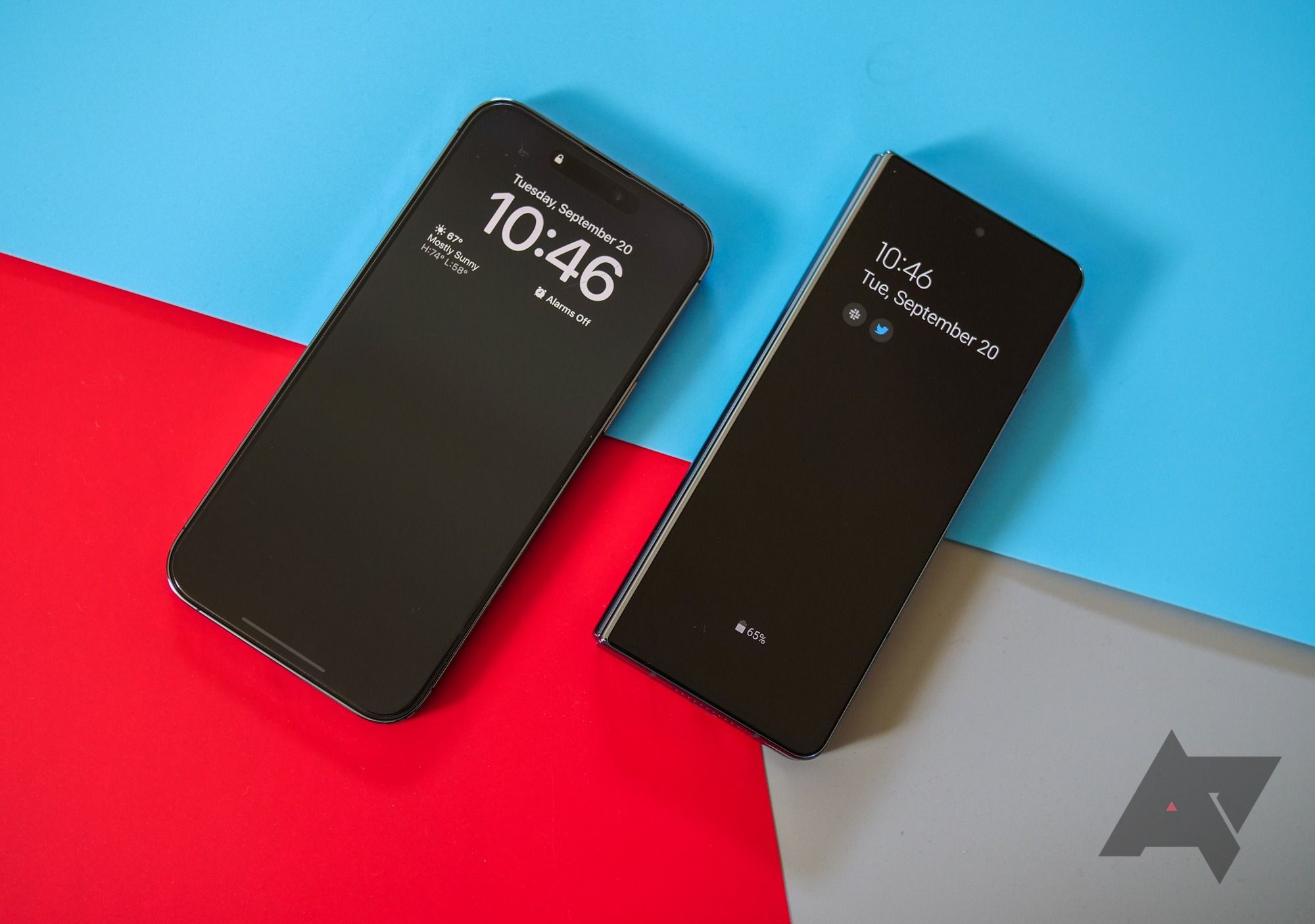
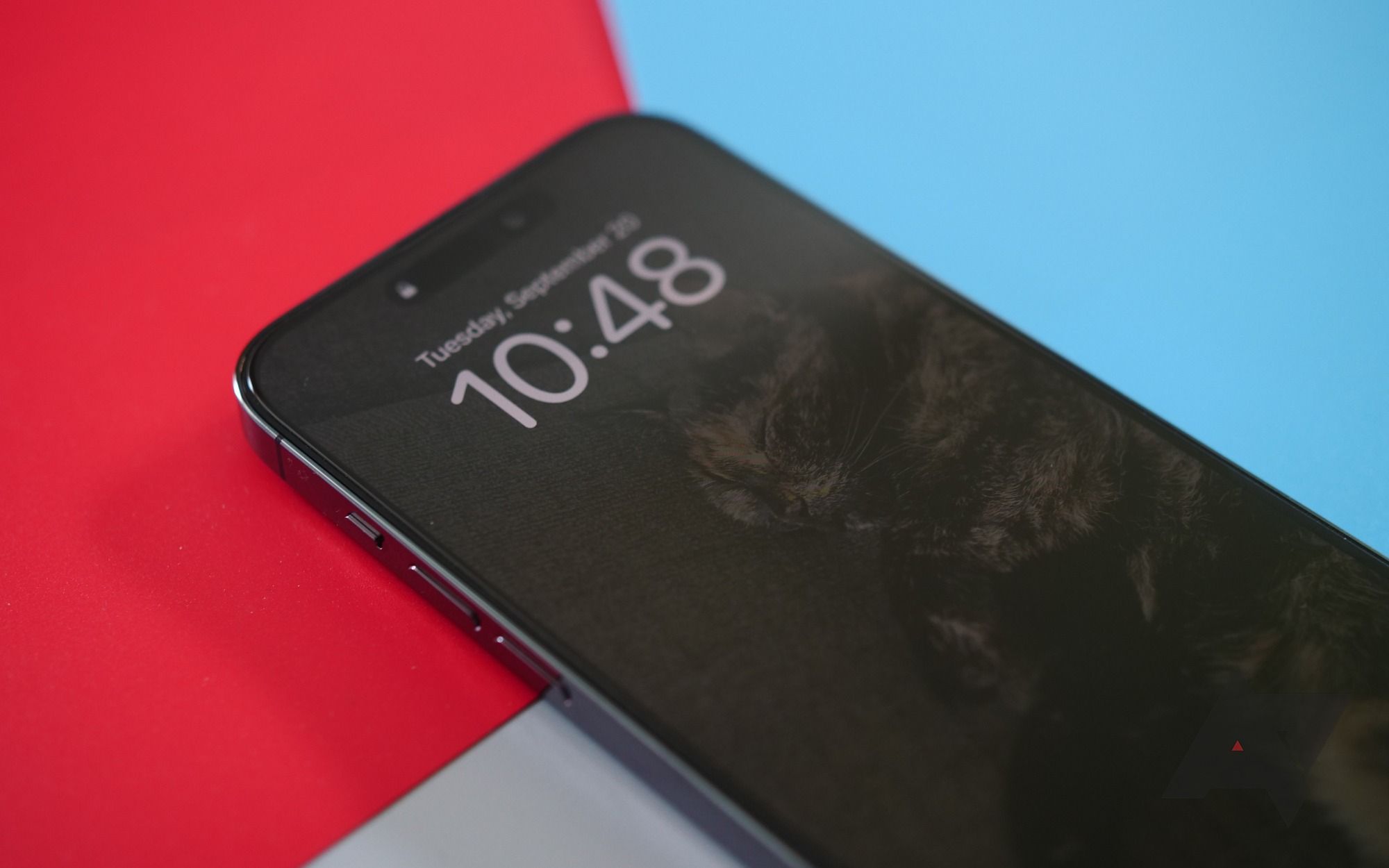
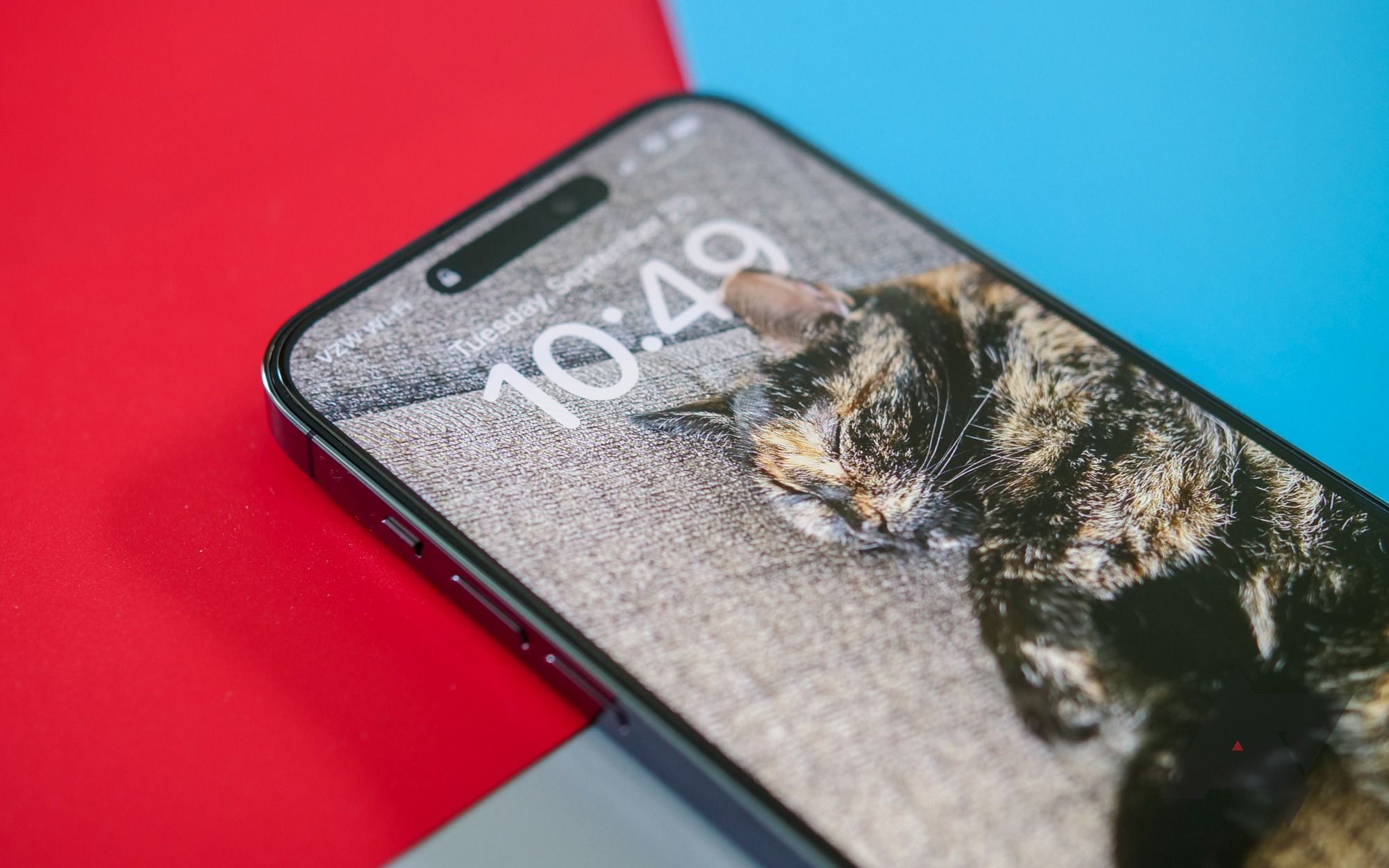
Despite its technical complexity, Apple’s always-on display is relatively easy to understand. Unlike on Android, where the AOD is usually a custom interface, the one found on the iPhone 14 Pro is just a dimmed version of whatever’s on your lock screen: no specialized icons for notifications and no black OLED panel — for better or worse, everything is where you left it when the display was on. It’s why Apple needed to turn to LTPO for battery management; otherwise, keeping all of those pixels illuminated would destroy these devices in just a couple of hours.
I’ve been using an iPhone 14 Pro Max since the phone arrived on Friday, and this feature has been driving me mad. During this time, I’ve been unable to stop thinking about something Daring Fireball’s John Gruber wrote in his review. In the piece, he referred to Apple’s version of the tool as an “actually-on state,” as opposed to the “always-on state” found on Android. It’s a distinct difference, and I think it’s the key to why the iPhone’s implementation feels so half-baked.
Off and on.
The issues with the iPhone’s AOD boil down to two main complaints. First, it’s too bright. If you head into a dark room — like, say, at night, when you’re headed to bed — you’ll need to keep the phone turned upside to reduce the glow coming from your device. It sounds like a small issue, but it’s incredibly frustrating. In nearly a year of owning it, I’ve never turned my Pixel 6 over because of the light it was emitting at night. After just three days, I can’t say the same for the iPhone 14 Pro Max.
Second, it’s too distracting. Always-on displays on Android aren’t simple because of technical limitations; they’re simple because that’s what they should be: a quick way to check the time, view if any missed notifications have rolled in, and return your focus to whatever’s happening in the real world. Apple is really pushing its customizable lock screen — new to iOS 16 — and that means all of your notifications pile up at the bottom of the screen. You can only see a couple of alerts at once, and even then, they overlap with each other.
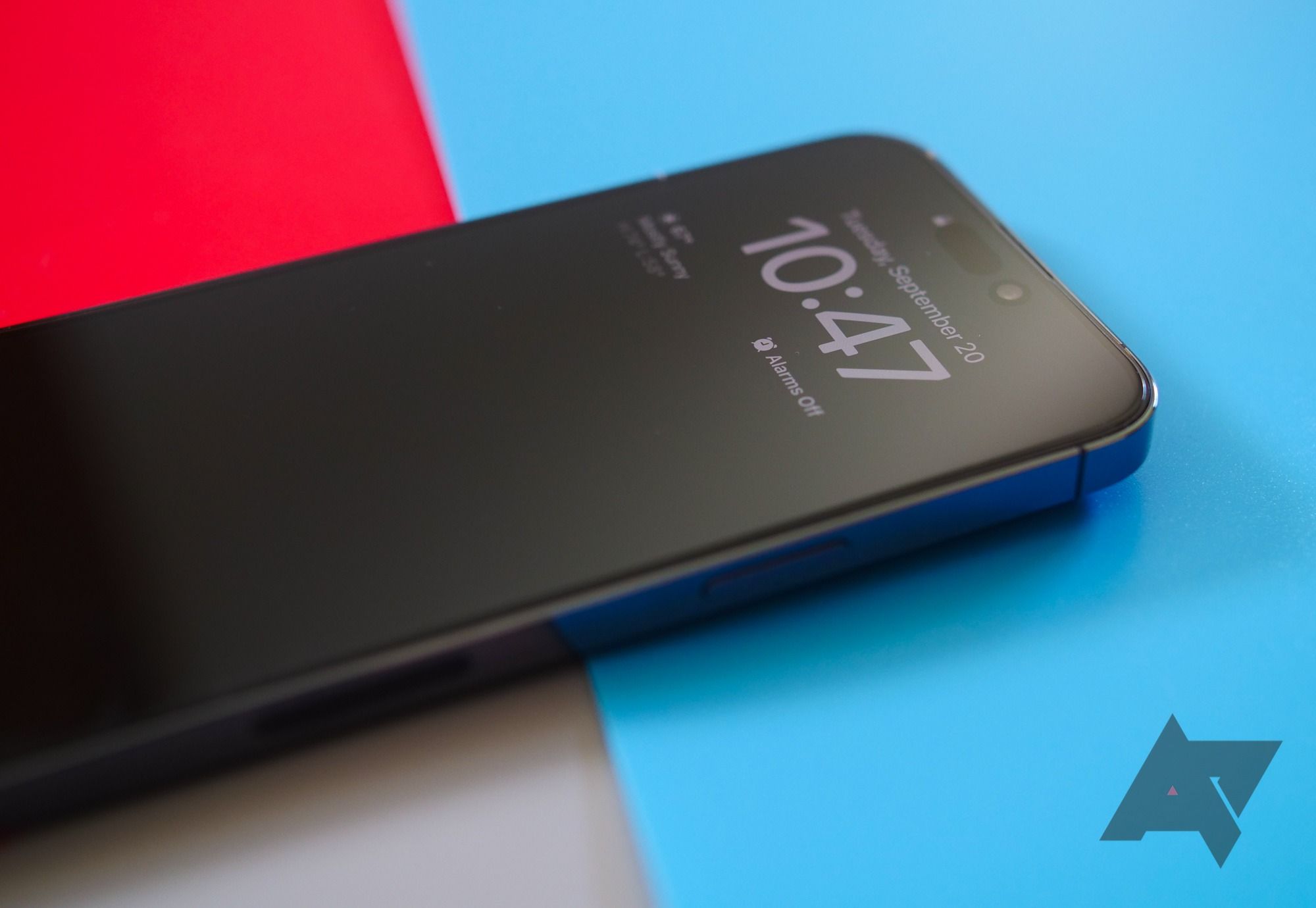
If you look very closely, you’ll notice a very dim, very basic wallpaper on the iPhone.
Despite focusing on keeping your screen “on” at all times, you can’t interact with anything without waking up the display. That’s unsurprising for viewing or swiping away notifications — remember, the screen’s running at 1Hz — but it also means you can’t pause your media without first waking the screen, even though the music player widget is sitting right there. Meanwhile, to fix the brightness issue, you can tone it down by setting a basic wallpaper — specifically one that’s a dark color — but in the process, you’ll lose out on some of those (admittedly cool!) features the company added this year.
As an outside observer, it seems like Apple sees white text on black backgrounds as a technical hurdle, something to be fixed with LTPO displays and variable refresh rates. Instead, it’s clearer than ever that a basic display limited to the most essential information — new notifications, the date and time, weather conditions — is far more useful.
And, of course, Apple can fix this with a software patch. It could add a toggle in settings, allowing you to switch to an all-black mode when the screen is off. It could move its notifications back up the page, as it was on previous versions of iOS, giving you a better glance at what’s happening on your phone. It could shrink those notifications down to simple icons, leaving the text behind altogether for a more streamlined approach. These are all options we’ve seen on various Android phones over the years, and even without an LTPO display, they’ve worked well.
None of this will happen — at least, not anytime soon. In Apple’s view, its always-on display isn’t broken or missing features, but working the way it was intended. It keeps your wallpaper front and center, a massive focus of iOS 16, while presenting you with a minimal glance of whatever else is on your lock screen. The time, the date, a couple of widgets, even some notifications — they’re all there, but in a drastically worse way than every other AOD attempt we’ve seen.
Unfortunately, because Apple insists on doing things differently than the competition, it’s giving iPhone users a far worse experience. And as long as the company refuses to admit other brands have done this before — and better — it’ll continue to be far behind Android’s always-on implementation.

