A new dual-pane option for Spotify and Google Maps has emerged
Google announced a big Android Auto redesign back in May 2022 that would bring a new dashboard view to the car infotainment system, but so far, we haven’t seen the promised revamp in the wild. That’s despite the fact that the redesign was initially expected to roll out “just in time for the summer.” We’ve seen the new three-pane interface activated via root before, but now, a tinkerer was able to activate a new two-pane view on their Android Auto interface showing Spotify and Google Maps side-by-side.
As 9to5Google spotted on Reddit, the new dual-pane view is live for one person using a rooted version of Android on their phone. This allows them to activate the new “Coolwalk” UI that offers the split-screen interface for all display sizes.
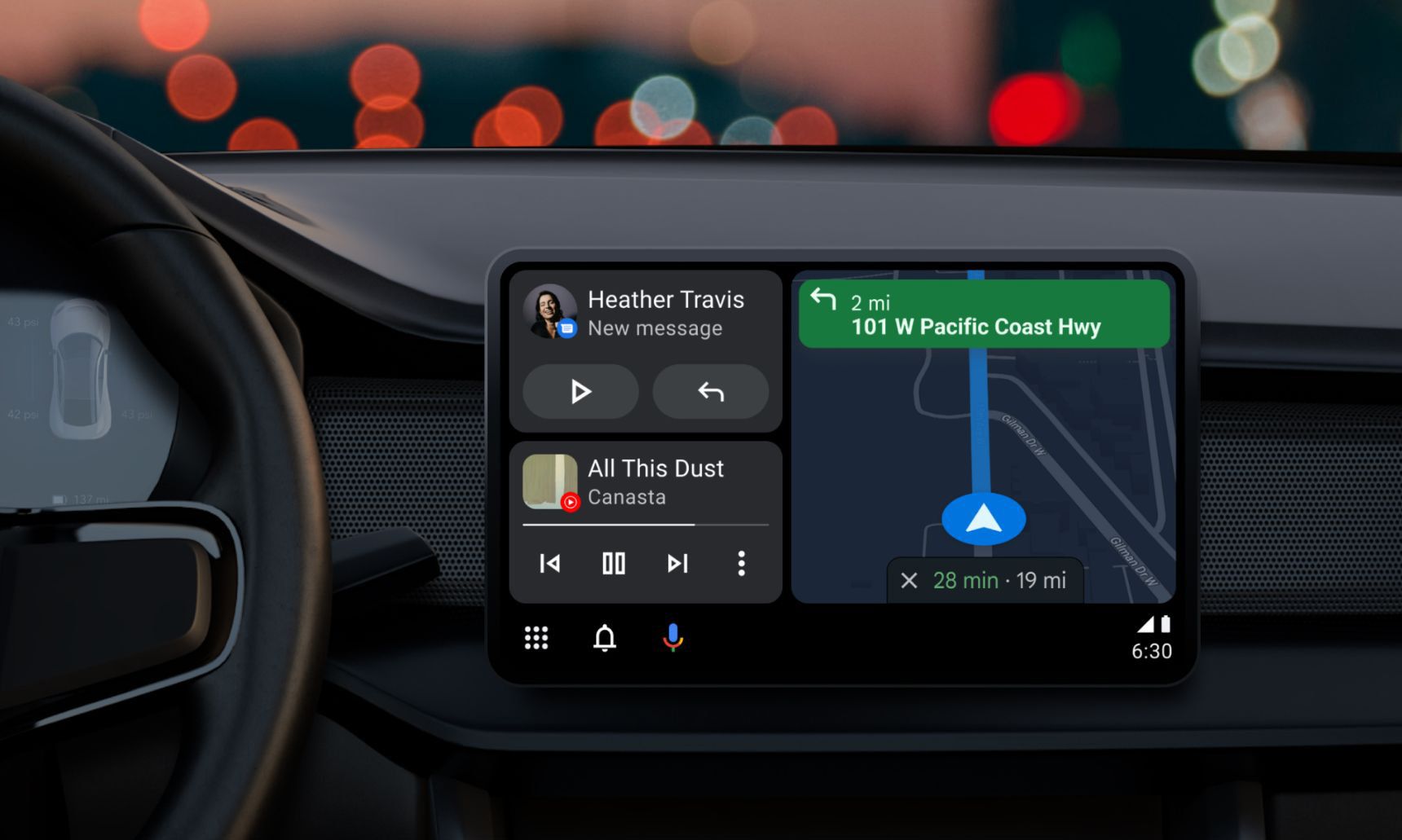
The new interface is similar to what Google first teased during Google I/O in May 2022, which you can see at the top of this article. The layout lets you view three different apps at the same time on the Android Auto screen, much like Apple CarPlay. In the case of the Redditor, we can see Google Maps navigation in the big main panel, Spotify controls and song information in the bottom left panel, and recent searches in the top left panel.
What’s new and more interesting is the fact that it’s possible to expand the Spotify panel to take up all of the smaller left portion of the screen, which makes it easy to access options like shuffle play and recently played songs, albums, and playlists without having to leave Maps navigation. This makes Android Auto more customizable in this regard than Apple CarPlay, which only ever gives you preset layout.
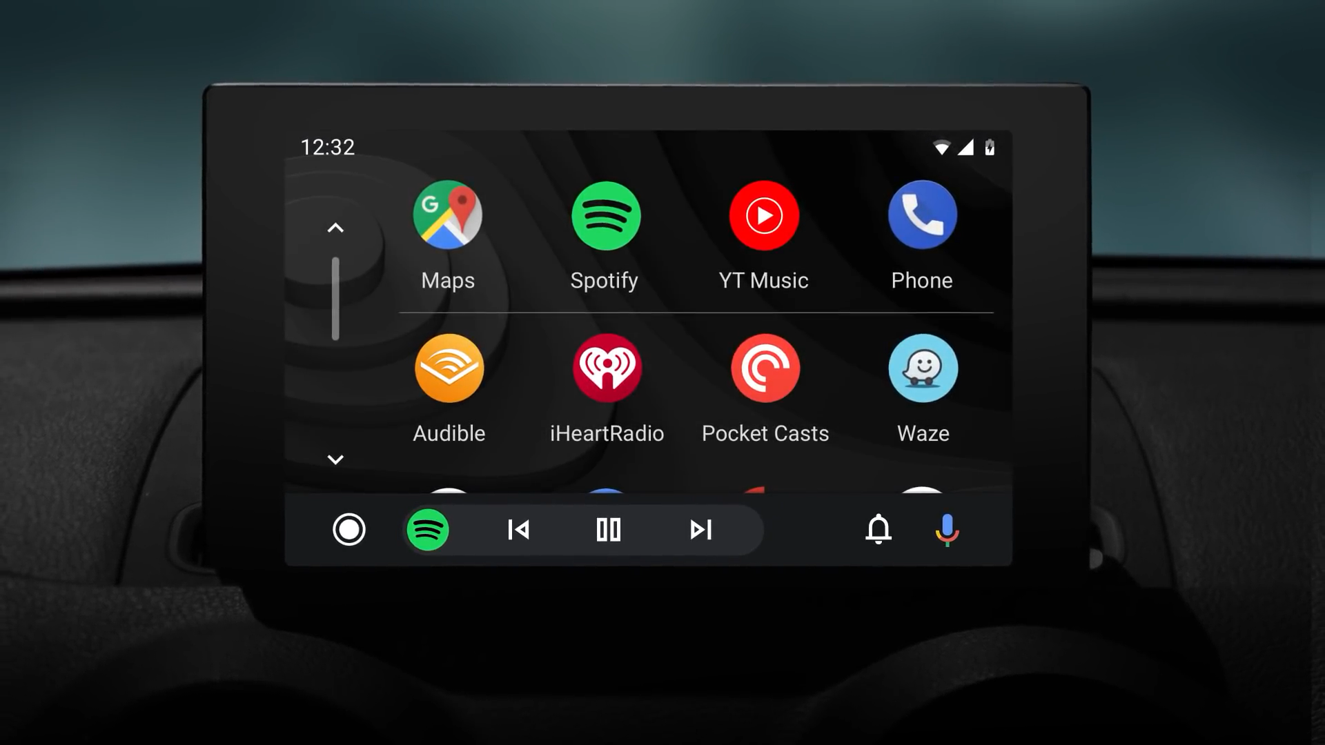
In the current version of Android Auto, you can also access playback controls while you navigate on regularly sized displays, but you will either have to open the audio app itself or access play and skip buttons from the Android Auto bottom bar without seeing song information. Google introduced a dual-pane view earlier as part of the current UI of Android Auto, but that was only an option for extraordinarily wide screens.
Music controls in the bottom bar in the old design
It appears that there is some holdup hindering Google from releasing “Coolwalk” in full. Given that the new dual-pane look was enabled for the Redditor, Google could still be working on some underlying refinements for the interface.
In case you’re curious how the Redditor managed to enable the new “Coolwalk” interface ahead of time, they mentioned that they used a guide from the XDA Forums that explains which variables to change in the Android Auto app. And if you need a refresher what the difference between Android Auto, Android Automotive, and Google Automotive Services actually is, we got you covered in our big comparison of the three things.


