With exclusive access to an upgraded processor, a revamped primary camera, and a new Dynamic Island cutout on the always-on display, the iPhone 14 Pro is a private resort that widens the gap between the regular iPhone and the Pro model. Longtime iOS fans who can’t afford to drop $1,000 on a flagship will have to look on with envy, but for those that can afford the plane ticket, life on Apple’s private island is still pretty sweet.
Apple’s walled garden is nothing new. In Apple’s mind, it separates the iPhone haves from the Android have-nots, and with it comes a sense of superiority — deserved or not. But now, a new set of have-nots are, if not locked outside the walls, at least separated by a towering fence. If you want anything close to the best that Apple has to offer, the regular iPhone isn’t enough anymore — you have to go Pro. Unlike its staid sibling, the iPhone 14 Pro carries a new notch-less, always-on display, the first real camera revamp in years, and is the only iPhone to get truly new silicon in 2022. But are the upgrades worth the price of admission? Let’s find out in our Apple iPhone 14 Pro review.
About this Apple iPhone 14 Pro review: I tested the iPhone 14 Pro over a period of 10 days. It was running iOS 16 for the duration of my testing. The unit was purchased by Android Authority for this review.
What you need to know about the Apple iPhone 14 Pro
Ryan Haines / Android Authority
- Apple iPhone 14 Pro (128GB): $999 / £1,099 / €1,299
- Apple iPhone 14 Pro (256GB): $1,099 / £1,209 / €1,429
- Apple iPhone 14 Pro (512GB): $1,299 / £1,429 / €1,689
- Apple iPhone 14 Pro (1TB): $1,499 / £1,649 / €1,949
You already know how iPhone launches go at this point. The iPhone 14 Pro arrived in September 2022, succeeding the iPhone 13 Pro. It debuted alongside the larger, yet otherwise near-identical iPhone 14 Pro Max, as well as the iPhone 14 and iPhone 14 Plus.
Apple hasn’t let its latest offering fall too far from the tree, at least in terms of the current “Pro” design. The glossy side rails and satin rear glass are back, though Apple removed the physical SIM tray for US models, resulting in a frame that is ever so slightly smoother. That’s right, it’s (dual) eSIM only in the States — other regions get dual-SIM support too, though with a more traditional nano-SIM and eSIM combo.
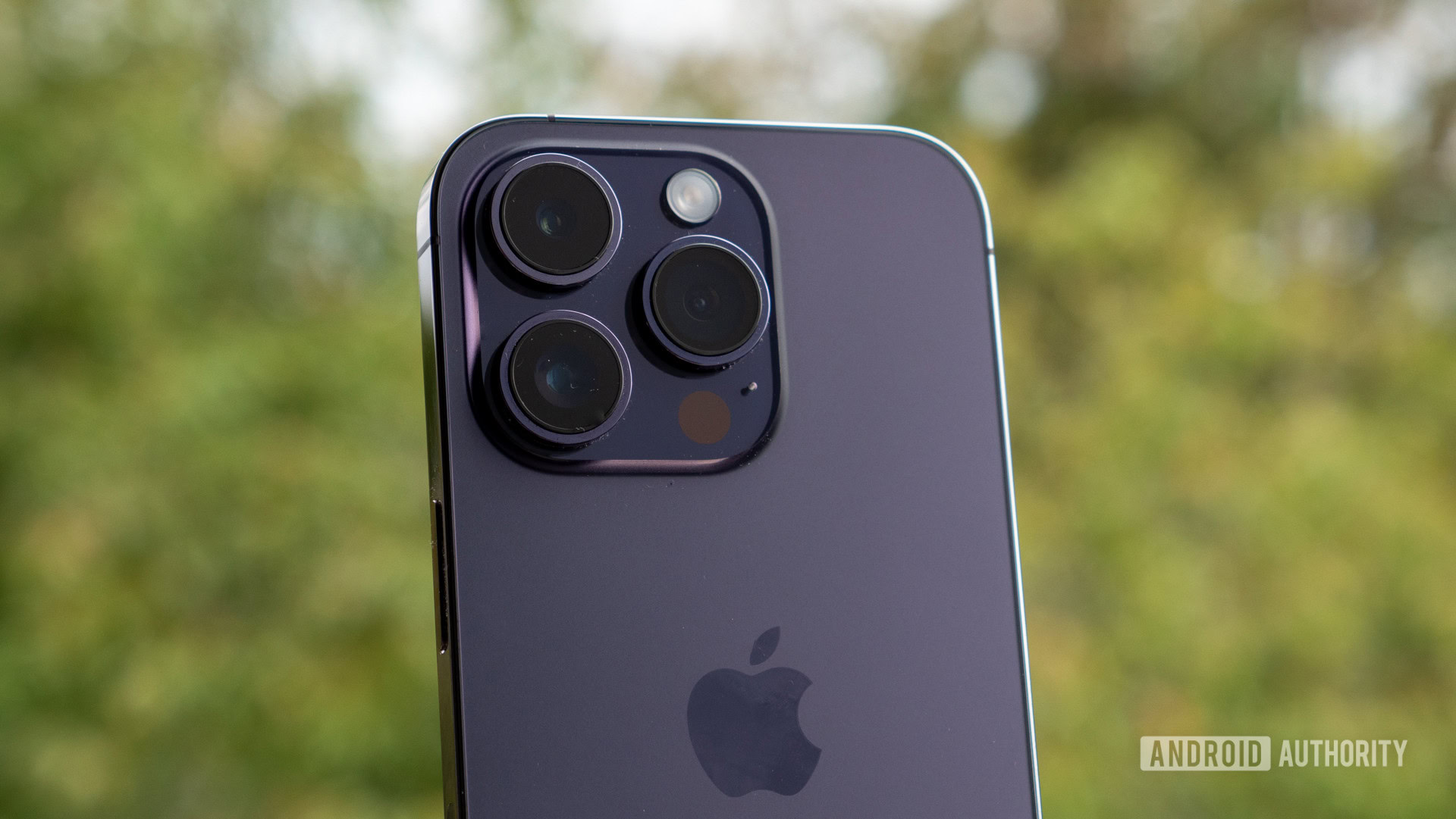
The rear camera bump looks and feels the same as the iPhone 13 Pro, though it demands more space on the back glass than ever before. It also houses one of the most significant iPhone camera updates in years — a new 48MP main sensor. Two 12MP shooters round out the setup, one ultrawide and one telephoto, and a LiDAR scanner takes care of depth information.
Dhruv Bhutani / Android Authority
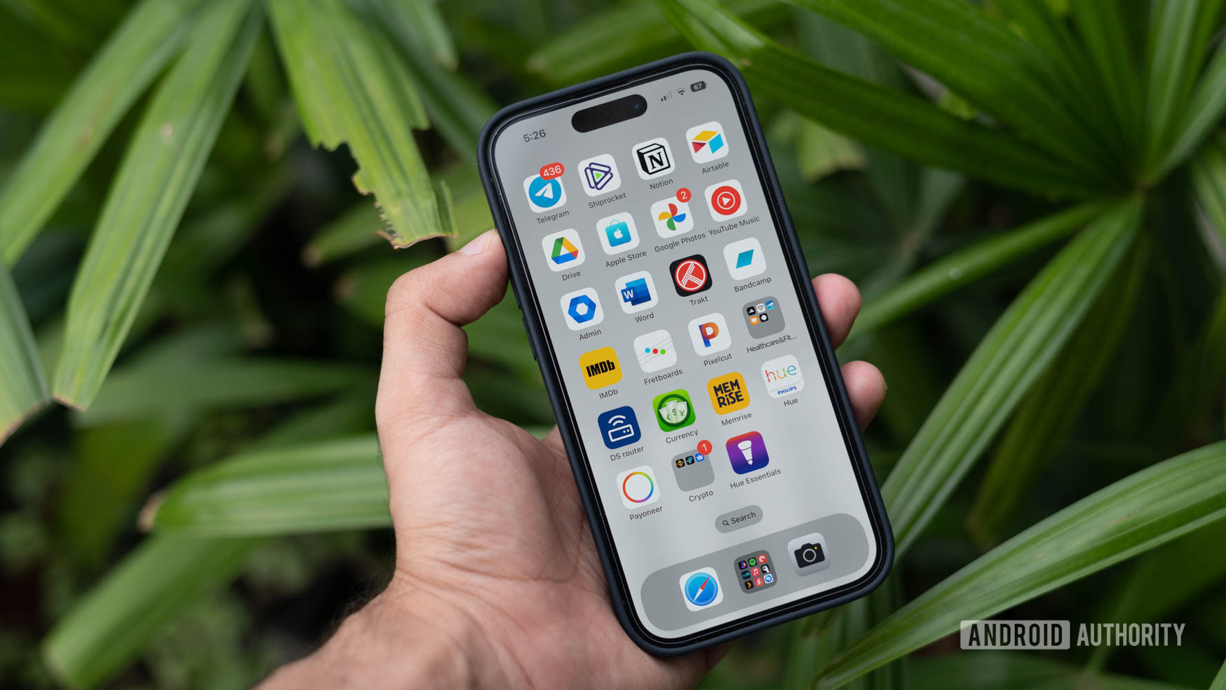
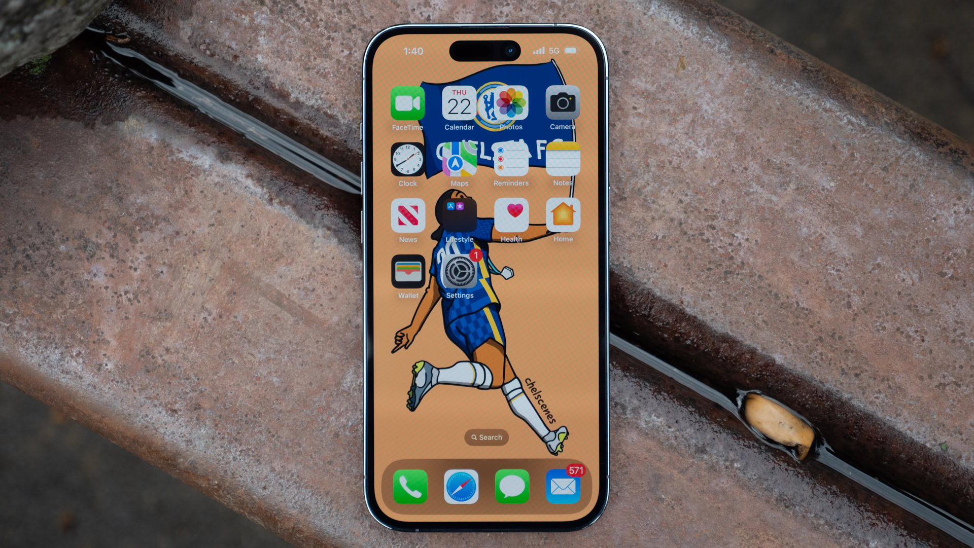
Once you flip around to the front of the iPhone 14 Pro, you’ll immediately notice one key change — there’s no notch. The long-derided notch no longer occupies the center of the 6.1-inch Super Retina display, and what Apple has ostentatiously dubbed the “Dynamic Island” sits in its place. It promises to breathe more life into your notifications and provide in-depth interactions with certain supported apps, along with hiding the pill-and-hole-style selfie setup. Aside from the new camera setup and the novel cutout, the 120Hz panel is generally the same as on the iPhone 13 Pro. It offers a sharp 2,556 x 1,179 resolution with up to 2,000 nits of brightness in certain scenarios.
Also new is the Apple A16 Bionic chipset — the powerhouse, custom silicon that keeps the premium package ticking. It’s exclusive to the iPhone 14 Pro series for now, which also comes with 6GB of RAM across the board. The A16 Bionic resides alongside a small battery of around 3,200mAh (Apple doesn’t like to disclose specifics). It recharges at about 27W through the proprietary Lightning port, or you can tap into 15W wireless MagSafe power as needed.
The iPhone 14 Pro looks almost identical to its predecessor — until you reach the Dynamic Island.
As expected, there’s almost nothing in the iPhone 14 Pro box. It offers enough space for the phone, a USB-C to Lightning cable, and some basic paperwork. That’s it for US models, but international versions will still come with a necessary SIM ejector tool.
The iPhone 14 Pro still starts at $999, which means it squares off against Android’s best without a price hike (at least not in the US — Europe wasn’t so lucky). Samsung’s Galaxy S22 Plus is its most natural rival, with a similar set of cameras and an update commitment that almost matches Apple, though the unique form factor of the Galaxy Z Flip 4 and Google’s imminent Pixel 7 Pro should also give it a run for its money. We’ll also get one verdict spoiler out of the way now: if you already have an iPhone 13 Pro, read on for fun, but there’s no good reason to upgrade.
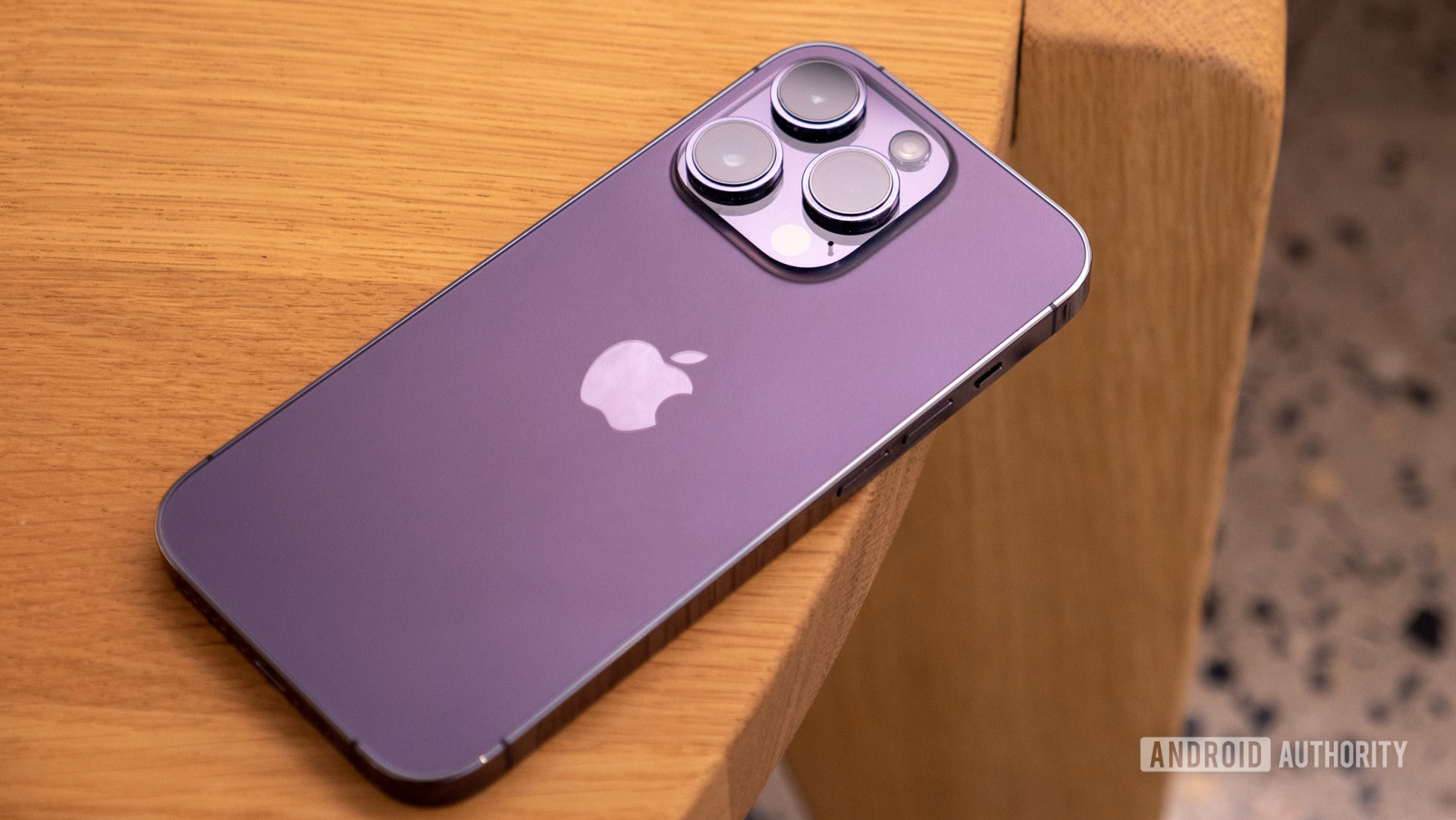
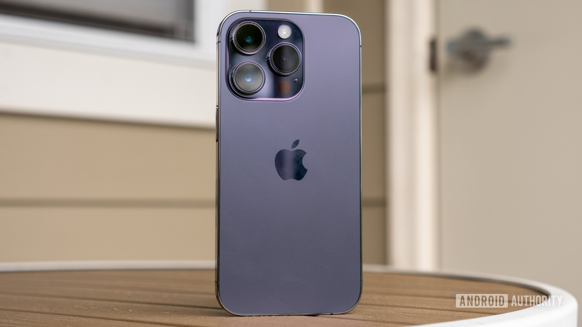
The iPhone 14 Pro’s design is so similar to its predecessor that the best way to tell them apart is with Apple’s choice of colors. Silver and Gold are two iPhone mainstays, but this time they’re accompanied by Space Black and Deep Purple (pictured).
How has the design changed?
Ryan Haines / Android Authority
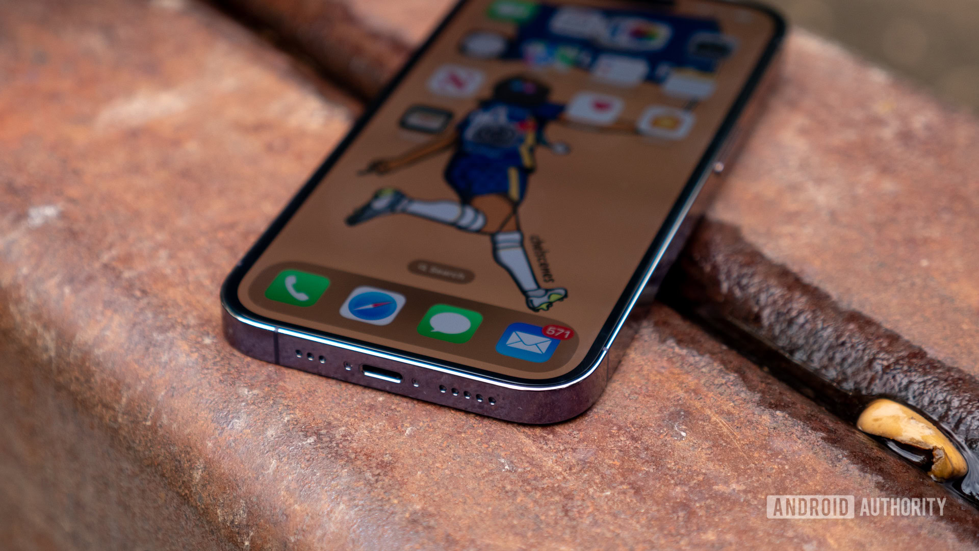
From the minute you open the box, the Apple iPhone 14 Pro feels familiar. The buttons are exactly where you’d expect them to be — volume buttons and silent switch on the left, power button on the right — and stainless steel side rails and a Gorilla Glass back panel that mirrors the iPhone 13 Pro line. However, one feature missing from the right side is the SIM tray — at least on US models. Apple’s proprietary Lightning port — a continued disappointment as the rest of the tech world adopts USB-C — occupies the bottom edge, flanked by the microphone and a down-firing speaker.
You’ll still find a trio of cameras tucked into a square camera bump in the corner, but they keep getting bigger. The iPhone 14 Pro’s bump stretches more than halfway across the rear glass and sticks out slightly further. This can make the iPhone 14 Pro sit somewhat unbalanced when laid on a flat surface, but you can balance it out with a proper case.
If you choose to risk going naked, the satin finish feels as good in the hand as it ever has, though the Deep Purple finish is so dark that it’s almost black in some lighting. Personally, I would have preferred a slightly lighter purple closer to Samsung’s Bora Purple, which always looks purple.
Apple’s choice of Deep Purple is a little too much ‘deep’ and not enough ‘purple.’
Another way to tell the iPhone 14 Pro from the Pros that came before is with the display. The 6.1-inch Super Retina OLED panel is still the perfect size for one-handed use, and the color recreation is still excellent. I had no problems with brightness, as the display tops out at 1,000 nits by default, but it can push to 2,000 nits in direct sunlight. Apple’s 120Hz adaptive “ProMotion” refresh rate is smooth, too, and falls in line with top Android flagships. The Ceramic Shield glass and oleophobic coating should keep scratches and fingerprints at bay, but only time will tell how well these hold up.
The most significant change to the display, however, is that the notch is gone, replaced by a pill-and-hole cutout that houses the front-facing camera alongside the usual suite of Face ID sensors. This so-called “Dynamic Island” relies heavily on enhanced notifications to draw your attention away from the size of the cutout — though we’ll go into more detail on the actual functionality later in this review. By default, the Dynamic Island is hidden in a black bar when you open a full-screen video, but you can always zoom your content to use the full 6.1 inches. You might not always mind the appearance, but it undoubtedly chews up more real estate than comparable Android setups.
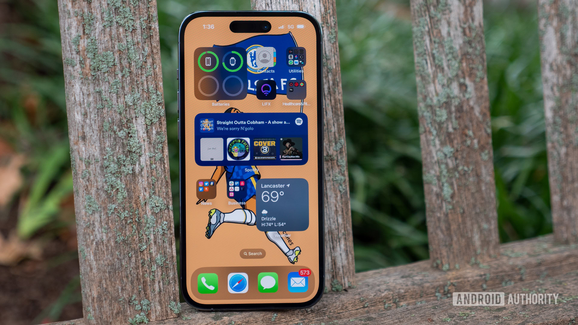
On top of the new selfie camera setup, the iPhone 14 Pro now features an always-on display, which you can see in action above. It’s wildly different from the subtle always-on displays we’re used to seeing on Android devices in that it’s very, very on. The entire display remains lit, albeit dimly, at all times, with the clock and your lock screen widgets fully visible. You might love Apple’s approach if you like to look at your lock screen wallpaper, but I found that it tricked my brain into thinking I had a notification even when I didn’t.
Overall, the iPhone 14 Pro feels excellent in hand, and I never felt like I was straining to reach across the 6.1-inch display. The IP68 rating for water and dust resistance also ensures that you can take Apple’s flagship into almost any condition you might face, and while the Gorilla Glass is technically ungraded, we know from previous iPhones that Corning saves some of its best glass for the Cupertino giant.
How powerful is the Apple iPhone 14 Pro?
No matter the budget, every iPhone finds a way to put up gaudy numbers regarding performance. The iPhone 14 Pro is no exception, giving the rest of Apple’s lineup something to aspire to. Its A16 Bionic chipset goes a long way, plowing through everything I asked of it. It pairs seamlessly with this generation’s slightly larger battery and 6GB of onboard RAM for a smooth experience. I had no issues with lag, even when running navigation and Spotify simultaneously, and it’s more than capable of running some of the most demanding games at the highest possible frame rates on a smartphone. The iPhone 14 Pro can run warm at times if you really push it, though it cools quickly after a minute or two of rest.
The A16 Bionic is another CPU powerhouse, but this time it’s exclusive to the Pro models.
Our standard slate of benchmarks backs up the real-world results. The single-core Geekbench 5 score measures about an 8% improvement over the A15 Bionic processor based on our testing, while the multi-core score jumped by a more significant 14%. Apple’s recent chips share many of the same components, including six CPU cores and five GPU cores, but the A16 Bionic’s 4nm process plays heavily in its favor. The smaller architecture offers space for additional transistors, but the increased memory and higher clock speeds for the CPU cores play a role as well. Essentially, although the number of cores is the same, the cores themselves offer a bit more punch. The result is a CPU score that blitzes the current competition by a wide margin.
As for the GPU, when put through the 3DMark Wild Life test, the iPhone 14 Pro performs even better. It maxes out the standard Wild Life test, which immediately tops the iPhone 13 Pro and 13 Pro Max, both of which returned actual numbers in our testing. The Wild Life Stress Test shows some slowing over time, delivering a maximum loop of around 9,900 but falling to just below 8,700 towards the end of the test. While its peaks aren’t quite as eye-watering as the most performant Android phones, the impressive stability indicates strong sustained performance, albeit with only a gradual overall improvement compared to the iPhone 14’s retooled, year-old A15 Bionic chip.
All configurations of the iPhone 14 Pro pack 6GB of RAM to support the A16 Bionic chipset and start at 128GB of storage. Apple offers up to 1TB of onboard storage, which you won’t be able to expand. If you need the top tier, be ready to shell out $1,500 or more. Most people should be fine with the 128 or 256GB instead.
I have no gripes with Apple’s A16 Bionic chip, though I take issue with its exclusivity. Year in and year out, Apple brought its latest silicon to its entire flagship lineup before abruptly stopping with the iPhone 14. Now, you have to go Pro if you want the updated processor, forcing an extra $200 out of your pocket with no other option. The gains may be negligible in everyday use, but they’re not non-existent and could become apparent years down the line as Apple’s enviable support policy continues to provide fresh updates. Ultimately, this isn’t a problem for anyone buying the iPhone 14 Pro or Pro Max, but it does smack of elitism — a feeling that should perhaps come as no surprise given it expects you to pop out and buy your mom an iPhone instead of adopting RCS for platform-agnostic messaging. But that’s another story.
Is the battery life any good? What about the charging?
Apple’s iPhones have always made the most of their relatively small batteries. We’ve regularly seen iPhones with cells of around 3,000mAh push beyond a day of usage with remarkable screen-on time. Now, things are headed slightly in the wrong direction, however. The iPhone 14 Pro packs a slightly larger battery of around 3,200mAh (the iPhone 13 Pro was ~3,100mAh), yet it doesn’t seem to reach quite as far as its predecessors.
On mornings when I woke up with a full battery, I was able to push the iPhone 14 Pro all day. My average usage consisted of web browsing, social media, answering emails, and streaming Spotify — typical stuff. However, I found it almost impossible to finish a day with more than 20% remaining battery. It’s enough that I didn’t need to reach for a charger until morning, but I always needed it shortly after breakfast. During the first few days of my testing, I averaged about four-and-a-half to five hours of screen-on time, with up to another hour of idle usage. That’s not great for any phone, let alone a device family often celebrated for its longevity.
Despite a slightly larger cell, the iPhone 14 Pro comes up short of Apple’s usually incredible battery life.
Apple did release the iOS 16.0.2 update during my testing, which seems to have improved the battery life somewhat. The day after the update, I hit six-and-a-half hours of screen-on time with another two hours of the screen sitting idle. I’m not sure what changed in the update, as the notes don’t mention battery improvements, though I can rule out the always-on display as a potential culprit for battery drain. I spent a few days with it on and a few off and only noticed a difference of a few percentage points.
I also noticed reduced performance over the weekend, which is when I typically used the phone the most. I’m in the middle of a marathon training block, and streaming Spotify to my headphones for up to two and a half hours at a time had a significant impact on the iPhone 14 Pro’s battery. Using navigation in my car and running Spotify told a similar story — and often pushed me into Low Power Mode.
Ryan Haines / Android Authority
On the bright side, Apple is about as transparent with your battery usage and health as anyone. It offers an hour-by-hour chart of your battery drain and how much you used each app in that stretch. If you’re noticing a particularly fast drain at certain points, it’s easy to retrace your steps and find out what’s happening.
Once you empty the iPhone 14 Pro’s modest battery, you can get back on your feet with equally modest speeds up to around 27W via USB Power Delivery. Apple doesn’t offer a specific rate for wired charging, but that was the top rate I managed to measure. It takes about half an hour to pick up the first 50% of your battery, after which point it slows down considerably. All told, it took about 80 minutes for a full charge — around half an hour more than the Galaxy S22 Plus, for context. With no charging brick in the box, you’ll need to supply your own — check out our guide for the best options.
If you prefer to skip the wires, you can try 15W MagSafe or 7.5W Qi wireless charging. These aren’t particularly speedy, though MagSafe continues to be a delightful addition to the iPhone ecosystem. Want to charge your AirPods wirelessly via your iPhone? Tough luck; Apple still doesn’t offer reverse wireless charging unlike many flagship-tier Android phones.
How good is the iPhone 14 Pro camera?
Ryan Haines / Android Authority
The iPhone 14 Pro’s main camera marks a significant departure for Apple’s flagships. Two (or three) 12MP shooters were the standard year in and year out, almost like death and taxes, but not anymore. Now, Apple’s flagship comes with a sharper 48MP main camera, though it’s worth remembering that megapixels aren’t everything. Thankfully, that’s not the only upgrade. The new sensor is significantly larger than the iPhone 13 Pro’s primary lens, measuring 1/1.28 inches compared to 1/1.7 — a 65% increase.
The updated main lens is flanked by a pair of familiar faces — a 12MP ultrawide camera and a 12MP 3x telephoto. If you take Apple’s word for it, they allow for a 6x optical zoom range (2x out, 3x in), but that’s not really how optical zoom works. Apple also lists 2x telephoto capabilities as part of its rear setup, though it’s just a 12MP crop taken from the larger 48MP sensor.
Speaking of things not being quite what they seem, the 48MP main camera bins down to 12MP images by default just like all the best camera phones with high megapixel counts. It doesn’t make much of a difference in terms of fine details unless you crop the image, but it does lead to slightly better low-light results. When binned, Apple’s tiny 1.22µm pixels become 2.44µm pixels, which is a good jump over the iPhone 13 Pro’s 1.9µm pixels. Also, remember that Apple didn’t invent pixel binning, no matter how exuberantly it talks about it as a new feature. You can punch out to the full 48MP images using ProRAW, but you’ll need enough storage for the massive image files. Still, it’s a nice touch if you want to edit your images afterward in Lightroom or the like.
The iPhone 14 Pro adopts tried-and-tested smartphone camera practices like pixel binning and digital cropping.
I put Apple’s camera trio through its paces, though I relied on the primary camera for most of my shooting. The camera had no issues capturing colors or details when given well-lit, everyday scenarios such as in the image of a red brick building or the yellow gourds in the window box. However, Apple has never been known for a truly neutral color science. Some tones skew a bit yellow, especially in the background of the ultrawide flower sculpture. Other examples, like the pink metal flower, show more accurate colors. The subject looks slightly underexposed, but is actually accurate to what I was seeing given the heavier shadow coverage.
The supporting cast play their roles well, too. The ultrawide lens doubles as a handy macro shooter, as seen in the image of orange flowers, and it easily tops the dedicated, low-resolution macro cameras we see on many budget phones. I also appreciate the ultrawide lens for use on its own, as in the image of a rainbow-colored flower. It switches to 0.5x, though it does so with minimal distortion or stretching around the edges thanks to lens correction. The black gate to the right, for example, looks spot-on in a place where other ultrawide lenses would tend to warp the image.
Unfortunately, one instance of the iPhone 14 Pro not getting it quite right is the 3x telephoto shot of the basketball hoop. The sky is exposed correctly, though the hoop and net are much darker than what my eye could see. Both the backboard and orange hoop should have been brighter, while the white net seems to glow in some places.
The transition from the main camera to the ultrawide camera in daylight is smooth — the colors are consistent across both shots, and there’s minimal distortion. Small details, such as the leaves on the tree to the right, are preserved, though they’re not quite as sharp as reality.
For the most part, the iPhone 14 Pro is comfortable across its full zoom range. It’s capped at 15x digital zoom, which means it’ll stop short of the limits of the very best Android shooters like the Galaxy S22 Ultra, though images beyond 15x zoom are rarely usable on any camera phone. There’s also a noticeable shift in the color profile from the 3x telephoto lens to the 7x digital zoom. The tree to the right is much lighter, and the white of the tower itself has also changed color.
I also much prefer Samsung’s approach to image stabilization over that of the iPhone. You can easily identify when your image is stabilized on a recent Galaxy device, as the viewfinder adds a yellow indicator, but that’s not the case with the iPhone 14 Pro. Instead, stabilization is always active, and you just kind of have to accept that the shake you see in the viewfinder will disappear after you snap the shutter.
While the details of the red church are preserved nicely across the four images in the bottom gallery, the sky is completely blown out in the ultrawide shot in the gallery above. That image was taken on a partly cloudy day, so I would have expected a mixture of clouds and blue sky instead of the flat white result I got. The stones of the church also skew orange the more you zoom in, especially once you reach the 3x telephoto shot.
Portrait mode is another story of hits and misses for the iPhone 14 Pro. When it comes to human-shaped objects, I got mostly hits. The three shots of Benjamin Franklin show good edge detection and excellent depth of field from both the main and telephoto lenses. That said, the color profile is noticeably lighter in the 3x zoom image instead of the more accurate tones in the standard and 2x zoom shots.
However, I got plenty of misses when it comes to other objects. The pool ball is fuzzy along the top, despite having an easily identifiable edge. The figure of Vault Boy suffers a similar fate, with parts of his arms and ear out of focus while his face is sharp.
Apple’s ultrawide lens also struggles with low light images, as seen to the left of the top row above. There’s some severe vignetting around the edges, with only the center of the image lit up. It seems like the problem is most noticeable when there’s some light but not enough for night mode to kick in all the way. The image of an open barn door is an example of the iPhone 14 Pro getting the shot right even without night mode, as it captures details inside and outside on the white wood. Portrait mode also suffers, with the horse’s mane being noticeably blurry but almost nothing else.
When the iPhone 14 Pro’s night mode does kick in, it delivers solid results. The image of the bell above and to the right shows good details and decent color accuracy, especially in the sky. However, Apple seems to put a lot of confidence in its larger binned pixels, as it takes a long time for night mode to decide it’s dark enough before kicking in. I often had to manually activate night mode instead of relying on an automatic adjustment.
Our final category for still images is selfies. The iPhone 14 Pro packs a 12MP lens as part of its Dynamic Island setup, with a slightly wider aperture than its predecessor. However, Apple improved the autofocus, which makes capturing a selfie the first time you click much easier. The exposure in my standard selfie is good, and the slight pink tint to some of my skin is understandable based on my bright shirt. I’ve had better portrait results, as the iPhone cuts off quite a bit of my hair, resulting in odd dents like the one on the left side of my head. Overall though, it’s a solid selfie snapper.
The iPhone 14 Pro continues to push smartphone videography forward.
Of course, we can’t discuss an iPhone without digging into its video prowess. The iPhone 14 Pro is capable of up to 4K or 1080p recording at 60fps from the front or rear cameras and a whole host of extra shooting modes. Apple boasts that its Cinematic mode (up to 4K HDR at either 24 or 30fps) is a top choice for filmmakers, and the stabilized Action Mode is a great option if you’re running around chasing your kids or dog. The downside is it requires a lot of light, is restricted to 2.8K at 60fps, and you can’t tell how well the stabilization works until you finish recording. It’s perhaps not as impressive as Apple’s other videography features, but it’s always nice to have options.
One caveat to the iPhone 14 Pro’s video capture is that you can only record in Apple’s lossy “ProRes” codec at 1080p on the base model with 128GB, likely due to the monster file size. If you want 4K ProRes, you need to shell out for at least the 256GB version.
What does iOS 16 bring to the table?

Ryan Haines / Android Authority
Like the iPhone it runs on, iOS 16 manages to feel both new and familiar. It offers countless apps via the App Store, all of which still float to the top of the display unless weighed down by widgets — which still only come as squares or rectangles. You’ll still find Apple’s first-party options as the default apps and some in-house bloat that you may or may not want.
However, iOS 16 shows its strength once it interacts with the iPhone 14 Pro’s new features. Apple showed off its revamped lock screen controls back at WWDC 2022, with deeper options for customization that builds on iOS 15’s best feature, Focus mode. You can add lock screen widgets, change the style and color of your clock, and even tweak how it interacts with your wallpaper. If your wallpaper features an easily identifiable subject, you can layer said subject on top of the clock for a little extra depth.
The iOS 16 lock screen customizations are good enough that I want Android to steal one or two.
The lock screen controls are pretty impressive, even to the point that Android should probably steal one or two for itself. I usually like to keep a clean lock screen, but I’ve embraced the weather widget when I need a quick glance at the temperature. I change my wallpaper frequently, too, and I’ve yet to find an image where the lock screen struggled to find a subject.
Outside of the lock screen, Dynamic Island is the most noticeable and notable change related to iOS 16. It’s currently limited to the iPhone 14 Pro and Pro Max — the only two devices with the stretched cutout — but it’s hard not to see it becoming a standard feature down the road. The Dynamic Island appears as a single pill most of the time, but it can expand and contract depending on your incoming notifications. For example, in the image at the top, I’m running Apple Maps and listening to a podcast simultaneously. The Dynamic Island shrinks my podcast notification to a small square of artwork, while Apple Maps updates each step of my route in the larger bubble.
Right now, Dynamic Island works best with Apple’s first-party apps. The other two images above show how it handles incoming calls and song changes within Apple Music, but there are times when Dynamic Island could go further. If you tap on an incoming text message, it defaults to iMessage rather than letting you respond through the notification bubble itself.
Right now, the most interaction I have with Dynamic Island is when it opens to scan my face for Face ID. Otherwise, it often sits unused throughout my daily life, which isn’t great for a flagship-defining feature. Hopefully we’ll see third-party developers adapt apps for the feature soon, but until then it’s a novel use case for what might have otherwise been just an unsightly design choice. I won’t be surprised if we see Android OEMs rapidly adopt and build on the feature, though, especially when you consider that smaller punch-hole cutouts will allow more room for interaction with notifications.
Anything else?
Ryan Haines / Android Authority
- Crash Detection: One of Apple’s latest safety features enables automatic crash detection on the iPhone 14 series. It’s designed to identify a severe car accident and contact emergency services after 20 seconds of inactivity. If you’re unable to speak to emergency responders directly, your iPhone will play a message detailing your coordinates and an approximate search radius. I didn’t test this feature as I’m not prepared to risk finding out if my car insurance will take “I crashed it to test my phone” as an explanation. It’s a very welcome addition, but hopefully one you won’t ever need.
- Emergency SOS via Satellite: Another new safety feature on the iPhone 14 Pro is meant to keep you in contact if you get lost without cell service in the wilderness. Emergency SOS via Satellite helps you to form a link directly to a satellite in order to communicate with emergency responders when you have no other connection. You’ll have to hold your phone outside with an unobstructed view of the sky and follow on-screen instructions to maintain your connection. In some cases, you may have to communicate via text messages to operators who can then relay your message to emergency services. Once again, I wasn’t able to actually test the feature, as the full rollout is not until November 2022. It’ll also be
- SIM support: If you’re in the US, the eSIM future is now. You won’t find a physical SIM tray on any US-based iPhone 14, so you’ll have to get set up with your carrier. This might be easier said than done, and you may want to head to a local carrier store to have them do it for you. I decided to activate the eSIM myself prior to getting the iPhone 14 Pro, which entailed moving my physical SIM card from a Galaxy S22 Ultra to an iPhone 13 Pro Max. I then had to update that older iPhone to iOS 16 before I was able to transfer the physical SIM to an eSIM. You may not face any issues if you’re coming from an updated iPhone, but it presents a new challenge for Android converts. On the bright side, you can download up to eight eSIM numbers at any one time and cycle through them as you please. All iPhone 14 models sold outside of the US will offer dual-SIM in the form of a single nano-SIM and an eSIM.
- Audio: The iPhone 14 Pro sports stereo speakers, mixing the earpiece with a single down-firing unit. They’re well-tuned, and I had no problems raising the volume without distortion. As expected, the bass suffers at higher volumes, but that’s not exclusive to the iPhone. There’s no headphone jack — there hasn’t been one for years — but there are plenty of powerful audio features through Bluetooth 5.3. Apple saves its best elements like Spatial Audio for its in-house ‘buds, though you can enjoy Dolby Atmos quality on other headphones with Apple’s proprietary AAC codec.
- Connectivity: Apple’s premium flagship is up to date with Bluetooth 5.3 onboard, though it stops short of the latest internet connectivity at Wi-Fi 6 over 6E. You also get NFC support for wireless payments and ultra-wideband (UWB) for tracking down any possessions with an AirTag attached.
- Updates: The iPhone is still unrivaled when it comes to system updates. We regularly see six or more years of full version support, which tops even the best commitments from Samsung and Google. That means you should expect iOS updates through 2028 — or longer.
Apple iPhone 14 Pro specs
| Specs | Apple iPhone 14 Pro |
|---|---|
|
Display |
6.1-inch Super Retina XDR display
2,556 x 1,179 resolution 120Hz refresh rate 2,000 nits peak brightness Dynamic Island |
|
Processor |
Apple A16 Bionic |
|
Storage |
128GB |
|
Battery |
Video playback: Up to 23 hours
Audio playback: Up to 75 hours Charging: Up to 50% charge in around 30 minutes with 20W adapter or higher 15W MagSafe wireless charging |
|
Cameras |
Rear:
48MP Main (24mm, ƒ/1.78 aperture, sensor‑shift optical image stabilization) 12MP Ultrawide (13mm, ƒ/2.2 aperture and 120° field of view, six‑element lens) 12MP 3x Telephoto (77mm, ƒ/2.8 aperture, OIS, six‑element lens) Front: |
|
Connectivity |
5G (sub‑6 GHz and mmWave) with 4×4 MIMO |
|
Sensors |
Face ID |
|
Software |
iOS 16 |
|
Durability |
IP68 |
|
Dimensions and weight |
147.5 x 71.5 x 7.85mm |
|
Colors |
Space Black |
|
Safety |
Emergency SOS via satellite |
Value and competition

Apple iPhone 14 Pro
Powerful A16 SoC • Excellent software • Upgraded 48MP camera
This resort is all-exclusive.
Apple offers exclusive access to an upgraded processor, a better 48MP camera, and a new Dynamic Island feature with the iPhone 14 Pro.
The iPhone 14 Pro starts at $999 in the US, exactly where its predecessor sat. It offers plenty of bang for your buck, with an upgraded processor, a sharper primary camera, and a reimagined display. However, there’s plenty of competition in the $1,000 price bracket, and the iPhone 14 Pro only grows more expensive as you increase your onboard storage. The iPhone 14 Pro Max reaches even higher above the $1,000 price point, though it also delivers a larger display and improved battery life due to the larger cell.
Apple’s most natural rival at the $1,000 price point is the Samsung Galaxy S22 Plus ($794.99 at Amazon). It’s larger than the iPhone at 6.6 inches, houses a much bigger battery, and has had far more time to hone its rear camera setup. The Galaxy S22 Plus also charges faster, with up to 45W wired speeds from compatible chargers. Samsung’s flagship is built just as tough as the iPhone, with an IP68 rating and premium materials, though Apple’s best still holds the edge regarding software updates, even with Samsung’s outstanding support policies.
Samsung’s Galaxy Z Flip 4 ($999.99 at Samsung) is another option at a high-end price point for those that want something a bit different. It has quite a few trade-offs, like a smaller battery and only two rear cameras, but it’s one of the most eye-catching devices you can get right now. The clamshell-style design is bound to turn more heads than another run-of-the-mill iPhone, and you can always add a personal touch of color customization with the Bespoke Edition. Samsung’s latest Galaxy Z Flip also packs a Snapdragon 8 Plus Gen 1 processor, which is far more efficient than the processor on its Galaxy S22 cousin.
If you’re looking for a top photography rival, it’s tough to beat the Google Pixel 6 Pro ($695.99 at Amazon) and its Tensor chip. Like the iPhone, the Pixel 6 Pro brings Google’s largest camera upgrade in years and a processor dedicated to machine learning. The Tensor delivers remarkable image processing results and impressive editing features like Real Tone and Magic Eraser. The camera bar is also unique to the market, standing in stark contrast to the usual corner-mounted camera array. Google’s flagship is IP68 rated with Gorilla Glass Victus on the front and back, so it won’t lose a step in durability. Of course, the Pixel 7 Pro is just around the corner, so we’ll have to wait and see how it matches up when we finally get our hands on one.
One last Android option to look at is the OnePlus 10 Pro ($780.1 at Amazon). It’s come down in price since launch, making it a more enticing proposition for those with sticker shock from the thousand-dollar category. Like the iPhone, the OnePlus 10 Pro puts its camera bump front and center. The trio of lenses takes up more space than ever, complete with Hasselblad branding. The OnePlus flagship also houses a Snapdragon 8 Gen 1 chipset, a 5,000mAh battery, and blistering fast 65W charging in the US. You might have to weigh how much you like the increasingly Oppo-ified Oxygen OS and the cameras can’t match up, but your wallet won’t complain.
One more alternative to consider is the iPhone 13 Pro. Not only is Apple’s previous flagship still excellent, but it can be had for a more reasonable price these days. It’s technically been discontinued so new inventory will eventually dry up, but in the meantime, retailers will be looking to move on from their stock. The iPhone 13 Pro still offers the same core processor as the vanilla iPhone 14, a trio of very capable cameras, and a high-end design that’s built to last. Plus, it still has plenty of software updates ahead of it and, Dynamic Island aside, will enjoy all of the perks of iOS 16.
If you’re shopping outside of the US, the iPhone 14 Pro is far more questionable. It’s significantly more expensive throughout Europe after a generational price hike, with the base 128GB model coming in at €1,299 or £1,049 in the UK — easily within striking distance of the world-beating Samsung Galaxy S22 Ultra ($1199.99 at Samsung). Samsung’s premium flagship is far better value for the money, with faster charging, more flexible camera options, and S Pen functionality. If you’re already locked into Apple’s ecosystem, you might be ready to upgrade without a second thought, but it’s tough to find a draw as an outsider if your region isn’t so lucky with pricing.
Apple iPhone 14 Pro review: The verdict
Ryan Haines / Android Authority
Apple’s message with the iPhone 14 Pro is clear — you either pay up or settle. The walled garden no longer separates iPhones and Androids, now, it leaves some longtime iOS users on the outside looking in. If you can’t drop $1,000 for the latest and greatest specs, you have to hold onto your current phone for another year or else buy a retooled version of 2021’s standard iPhone.
Ultimately, the iPhone 14 Pro is Apple’s best flagship yet. It delivers innovations on the front and the back, both inside and out. Dynamic Island is one of the most interesting ways to manage notifications we’ve seen in a while and one that Android developers are already scrambling to copy. The new always-on display might be too always-on for some, but marks a step forward for the iPhone as a whole, as do the other welcome customization options in iOS 16.
The iPhone 14 Pro is living on island time, but this resort is highly exclusive.
Exclusive upgrades like the A16 Bionic chipset and 48MP main camera make the iPhone 14 Pro the de-facto pick for iPhone fans who want tangible upgrades from their new handset, no matter the cost. Its stellar integration with the Apple Watch, AirPods, MacBook, and AirTags gives the iPhone 14 Pro the luxury of an all-exclusive resort, but one that’s hard to leave once you unpack your bags. If you can afford the plane ticket, life on Apple’s private island is nothing short of amazing, but there are other destinations you might want to consider before booking your flight.
Top Apple iPhone 14 Pro questions and answers
The Apple iPhone 14 Pro is IP68 rated with protection for 1.5 meters (4.9 feet) of immersion for up to 30 minutes.
The iPhone 14 Pro features a 6.1-inch Super Retina OLED display. Its sibling, the iPhone 14 Pro Max, features a 6.7-inch Super Retina OLED display.
Apple is secretive about its charging power, but the iPhone 14 Pro can reach around 27W wired via Power Delivery and 15W wireless through MagSafe charging.
The iPhone 14 Pro comes in four colors: Silver, Gold, Space Black, and Deep Purple
Yes and no. The iPhone 14 Pro features a sharper main camera and the Dynamic Island cutout, but both phones will receive similar software support and offer the same access to apps.
No, the iPhone 14 Pro does not come with a charger.
No, the iPhone 14 Pro offers Face ID biometrics, but it doesn’t have a Touch ID fingerprint reader.


