As is often the case with Microsoft, we get one step forward and two steps back.
Today, a new dashboard design hit the Xbox Insider Program on the Alpha Skip Ahead ring, and it sort of ignores most of the popular feedback revolving around the dashboard as of late.
Last year, we put out a survey asking Microsoft and Xbox fans what their top feedback for the Xbox platform is, and lo and behold, dashboard design was one of the top complaints. Users have been clamoring for more of a minimalistic design that reduces the footprint of “ads” and “dynamic content” in favor of showcasing the dynamic background themes Xbox fans finally won after years of requests. Microsoft seems intent on hiding those backgrounds, however, with this latest “upgrade” to the Xbox dashboard.
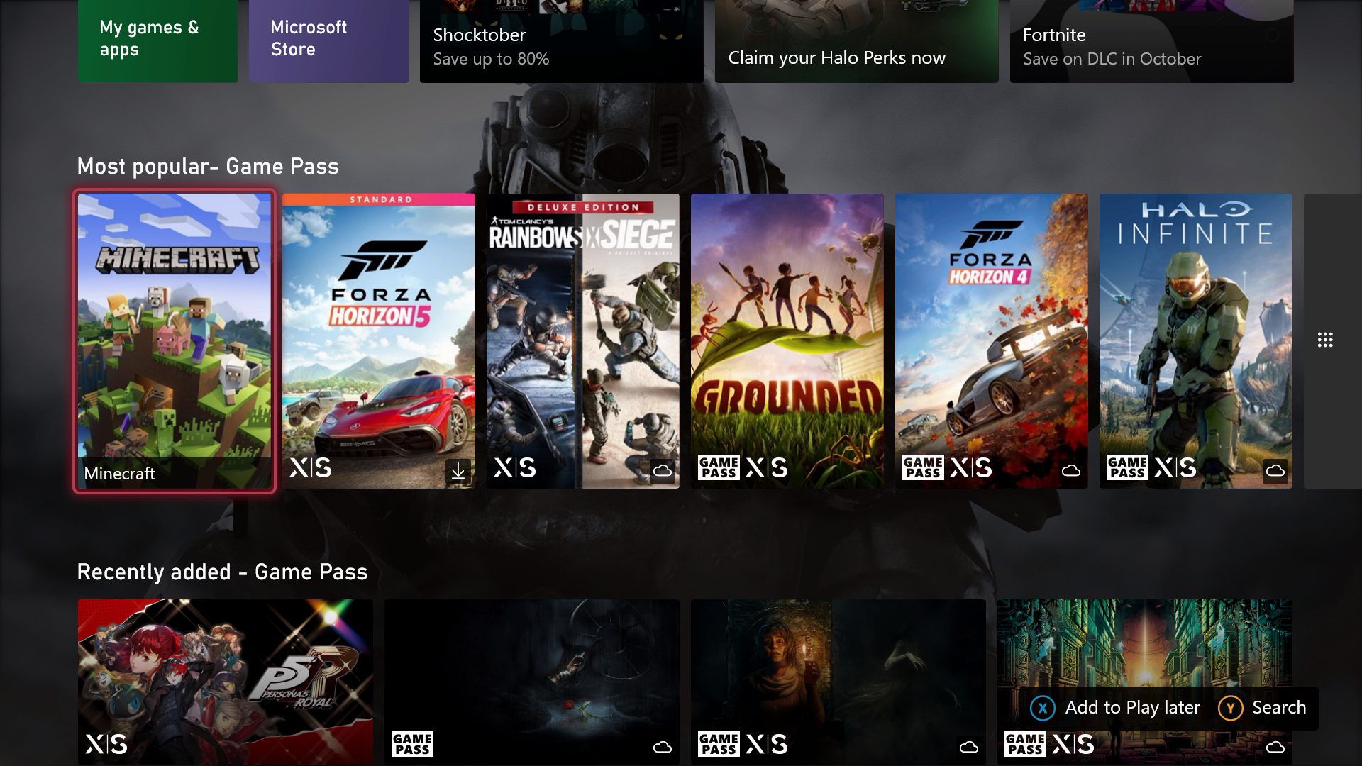
The new Xbox dashboard on the Alpha Skip Ahead basically looks like a mirror of the Game Pass app for TVs. Does Microsoft NOT LISTEN to feedback here? What’s the point of dynamic backgrounds with this design?Microsoft: There exists an Xbox outside of Xbox Game Pass. pic.twitter.com/Y6Q4vqpiY5October 27, 2022
The new design pushes up the tiles layout further to the top of the page, obscuring view of whatever theme you’ve opted for. If that wasn’t annoying enough, just below the fold, we have rows upon rows upon rows of Xbox Game Pass content, which cannot be customized in any way.
In earlier versions of the Xbox dashboard, we were able to tap “X” to interchange blocks of content below the main dashboard. You could pin a friend to see their latest activity, or pin a game to see updates from the developers. It seems all of those features have been stripped out in favor of turning the dashboard into a second storefront.

Microsoft has been listening to user feedback very gradually over the past year. Last week, we got a new Captures app which has vastly improved the Xbox Game DVR both in terms of performance and usability. Microsoft has also continued to add other refinements here and there, including packet tagging for modern routers, improved bitrate on Game DVR clips, and a refreshed design on the power states menu to give you a better idea of how much electricity you can save.
Despite all of these improvements, Microsoft seems strangely resistant to fan feedback that requests a more minimalistic dashboard design that prioritizes our content and our themes in favor of large advertising blocks, and now rows and rows of “suggested” content.

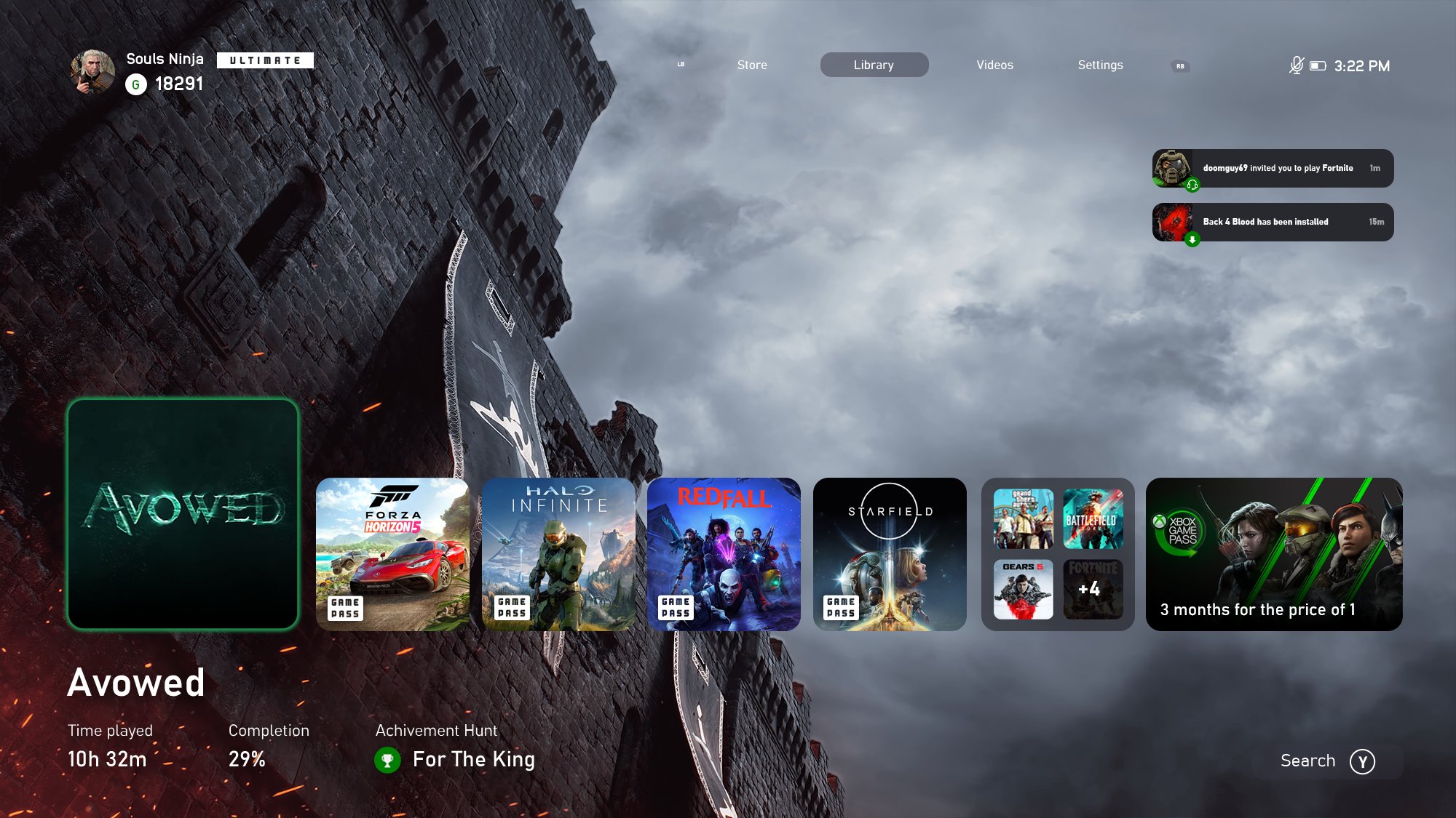
A lot of the fan-made dashboard concepts imagine a world where there’s only one row of content, where dynamic themes and user customization get an opportunity to shine. I’m not sure why Microsoft feels the need to push Xbox Game Pass so hard on users who already have it, and I sympathize with the fact that the dashboard has to subsidize the platform in some way. The console business is all about software sales rather than hardware sales, after all. And I’ve often been told by Microsoft’s partners that the attach rate (and thus, profitability) on Xbox punches above its weight, owing in part to the delivery of store content in the dashboard. That being said, there must be some form of compromise that can be reached here.
The above dashboard concept from @Souls_Ninja on Twitter is among the most popular redesign ideas floating around the web, with many other users building similar ideas in Photoshop and other platforms.
This dashboard design is currently in the Xbox Insider Program on the Skip Ahead Ring, and I suspect that its design will be tweaked before it goes live in the coming months. However, increasingly it seems like the entire Xbox operation is skewing towards Xbox Game Pass over everything else from a platform perspective. It took months for the Xbox Game DVR to start getting the improvements it needed, despite being plagued with various issues for an incredibly long time.
As always, if you are in the Xbox Insider Program, you can leave (respectful, constructive) feedback via the Xbox Insider Hub app on your Xbox console.


