Whether you are in-house, a freelancer, or at an agency, sooner or later, someone will want to see a dashboard report that shows how the SEO program is doing.
And there’s nothing worse than building a dashboard and sharing it with various stakeholders only to realize no one ever looks at the dang thing.
Most of the popular SEO tools come with various standard and custom reports. They can be great in many cases, particularly since they require less effort upfront by the user.
That said, we have found that building your own SEO dashboards can give you more control – and often more flexibility.
In practice, we like a mix of pre-built reports from tools, combined with our own custom reporting that lets us scratch some of our own particular itches.
An SEO dashboard can be a central hub for all your data sources so that you can get a full understanding of SEO performance.
But its real use is in telling stories stakeholders can understand and care about while hopefully providing SEO practitioners with actionable insights.
Setting Goals And Identifying KPIs
Depending on the dashboarding tool you choose, enterprise dashboards can be customized in a number of ways – so it is important to hammer out what the business objectives of the company are, and how the SEO program supports those goals.
That way, you can ensure that the reports displayed directly connect to the needs of the key stakeholders.
For instance, while you’re mentioning metrics, including site traffic, keyword positions, and clicks, sales executives may be interested in hearing about revenue or ROI instead.
While giving detailed reports to stakeholders is essential, your collected data won’t mean anything to them without context.
Break down the numbers for them (and emphasize KPIs that they’re keen to hear about).
This leads us to define what those KPIs are in the first place.
How To Categorize KPIs
After identifying key performance indicators (KPIs) and setting clear goals, determine how to organize and group them in the dashboard.
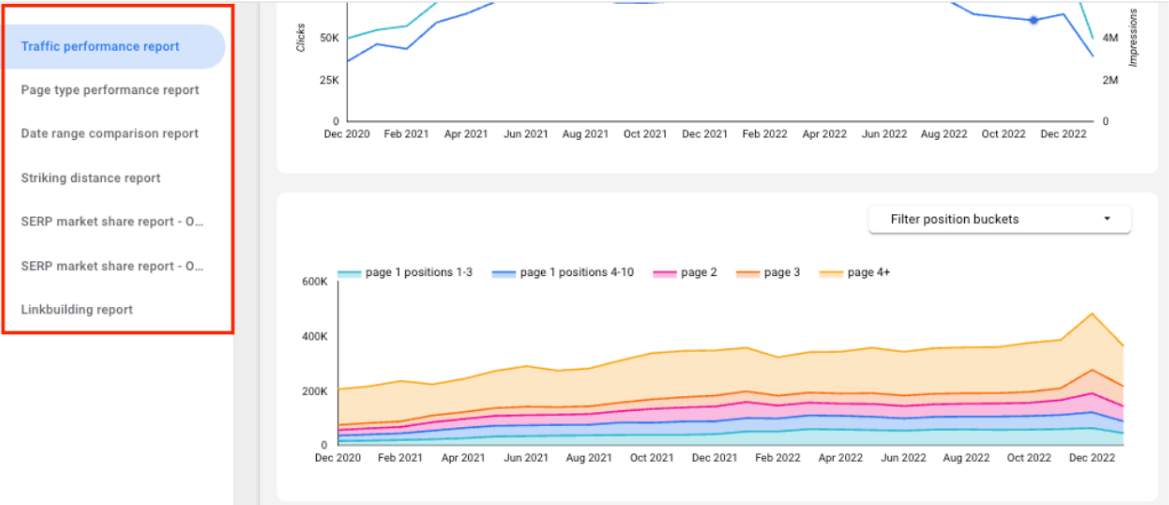
There are a ton of ways to do this, but if you need some ideas, at my company, we tend to use reports such as:
- Traffic performance: A report that shows basic traffic performance information from Google Search Console, including aggregate metrics (clicks, impressions, avg. CTR, avg. position), clicks and impressions over time, position bucket chart, and top keywords and pages.
- Page type performance: Traffic report broken out by page types.
- Query category performance: Traffic report broken down by different major query topics.
- Linkbuilding performance: Shows data on links earned by LSG for the client.
- Content performance: Shows traffic performance for pages created/updated for SEO.
- Striking distance report: Shows pages within “striking distance” from ranking well for high potential queries. This can be a quick way to find your next opportunity.
- Date range comparison report: Compares performance data on the page/keyword level for a selected time period to the previous period or year.
- SERP market share report: This shows how the client is performing in the search engine results pages (SERPs) for a group of keywords compared to their competitors.
- Google Business Profile insights: Aggregated and broken down by location. Ability to filter by address, state, city, or other custom segments.
- Cannibalization report: A report that shows when multiple pages are ranking for the same keyword. This can help us identify pages on a site that may benefit from differentiation.
 Screenshot from Looker Studio, February 2023
Creating a template for dashboards can save time, especially for those creating multiple dashboards for different sites or business units.
Utilize a general template that includes the most frequently used reporting pages, and then customize it by adding or removing pages as necessary.
Depending on the industry and needs, you likely will need additional reporting or modifications to tailor the dashboard and get the most value from it.
Where To Gather Data For Your Dashboard
Before selecting a dashboarding tool, it’s essential to determine which data sources (such as GSC, Google Analytics, etc.) and data visualization platforms will be most beneficial for providing valuable insights.
Many options are available depending on how much you need to customize your reporting, the skillset of the team building and maintaining the dashboards, and other factors.
Some examples of data sources might include:
- Google Search Console.
- Whatever analytics tool you use (Google, Adobe, etc.).
- Google Business Profile insights.
- Third-party rank tracking data (e.g., Ahrefs, Traject, Semrush, Stat, etc.)
- Proprietary data (e.g., we connect our backlink data to our dashboards via Google Sheets).
- Other custom datasets.
We warehouse most of this data, including Google Search Console, Traject, and Semrush data in Google BigQuery for data flexibility and speed.
In terms of data visualization and dashboarding, we use Looker Studio (formerly Google Data Studio). It’s free – and while it has its share of trade-offs, it’s pretty flexible for how we use it.
Examples Of Reports For Different Use Cases
There are various modifications that may be necessary for different industries to accommodate different metrics and customize reporting.
These use cases can give you a better understanding of how to fine-tune what reports might be best to create and what data and KPIs you could include.
Of course, there are an infinite number of reports you could create, but here are some of the basics we like:
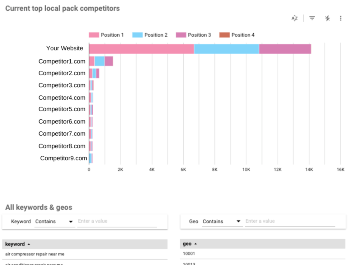
1. Monitor Local Pack Appearances And Performance Over Time
 Screenshot from Looker Studio, February 2023
This feature is particularly beneficial for businesses with multiple locations. It allows you to quickly show and measure your map pack performance.
For example, a national retail brand would likely want to use this to track its local SEO.
You can also organize the data by location and provide the ability to filter by state, city, region, and zip code.
This can be very valuable because it can help a brand identify challenges and opportunities at the local level.
2. Filter Traffic By Branded Vs. Unbranded Keywords
 Screenshot from Looker Studio, February 2023
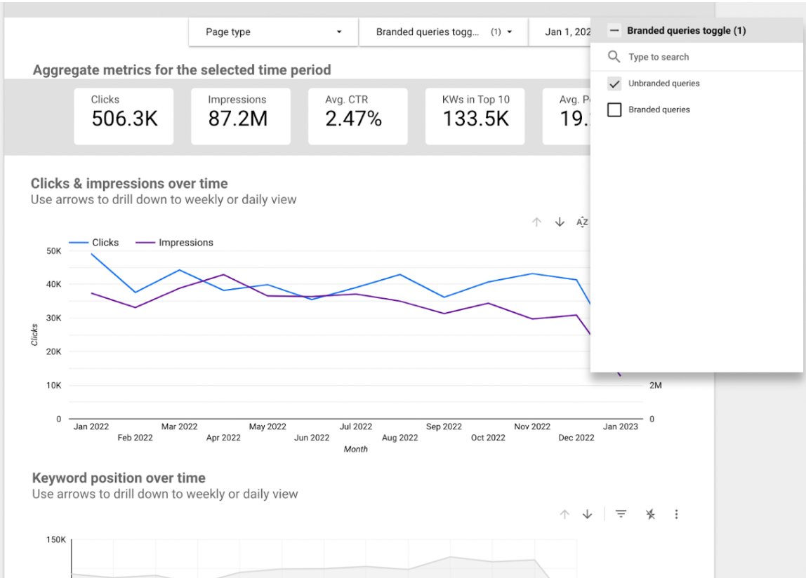
This is probably our favorite report type.
The ability to filter traffic by branded and unbranded keywords is a function you can implement with nearly all dashboards, as it’s nearly universally useful.
Non-branded traffic can be more valuable for increasing brand awareness and reaching new customers, while branded traffic is typically more valuable for driving sales or conversions, as these visitors are already familiar with your product or service.
Segmenting data this way can be particularly illuminating for businesses that have strong brands.
Often SEO performance can be obfuscated by brand search patterns.
By stripping away brand queries, we can start to get a picture of how the SEO program really performs. Because of this, we make non-brand-only reports the default filter on every report.
3. Report On Custom Keyword Categories
 Screenshot from Looker Studio, February 2023
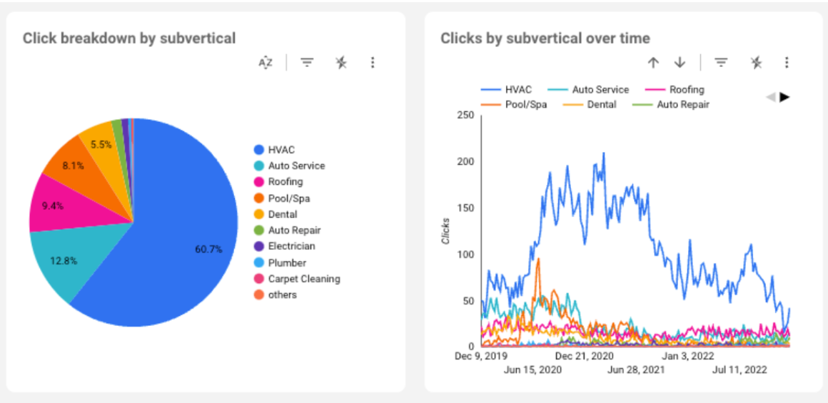
Understanding how your site performs at the “topic” level vs. looking at specific keywords can be illuminating.
This requires either manually or programmatically tagging the keywords you are tracking.
This type of report can be particularly helpful in tracking how search engines are treating you on specific topics.
For example, last year, we had a client growing in rankings and traffic for keywords for its core service category (e.g., hardware store), but it was losing rankings and traffic for “reviews” queries (e.g. tool reviews).
This stood out visually in our Category report and helped us quickly identify the pattern and come up with solutions to reverse it.
We also use these Category buckets in Share of Voice reporting to show how a site compares to its competitors at the topic level.
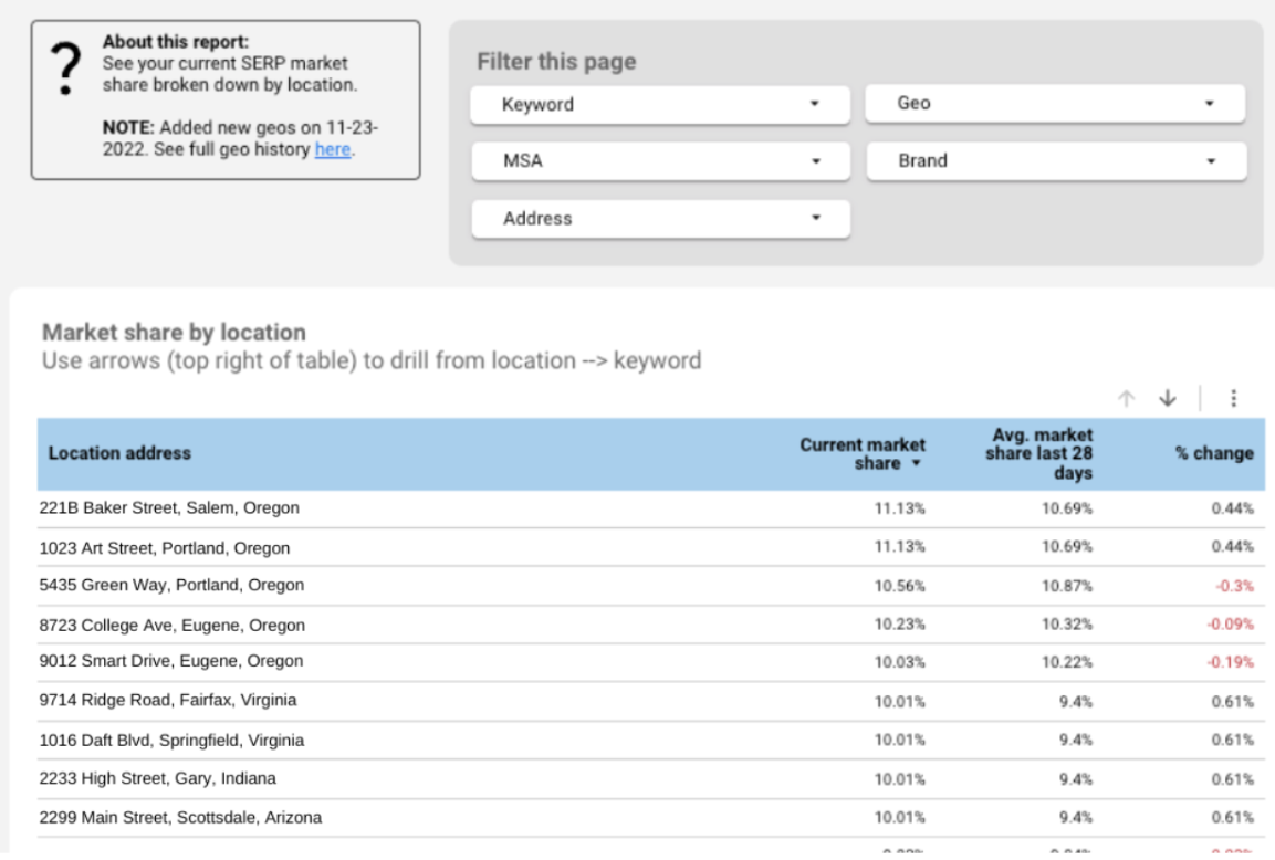
4. Report On Market Share By Location
 Screenshot from Looker Studio, February 2023
This reporting gives you the ability to demonstrate how effectively they are growing in an existing or new market. This can be locally focused, such as a city or state, or it can be nationally focused.
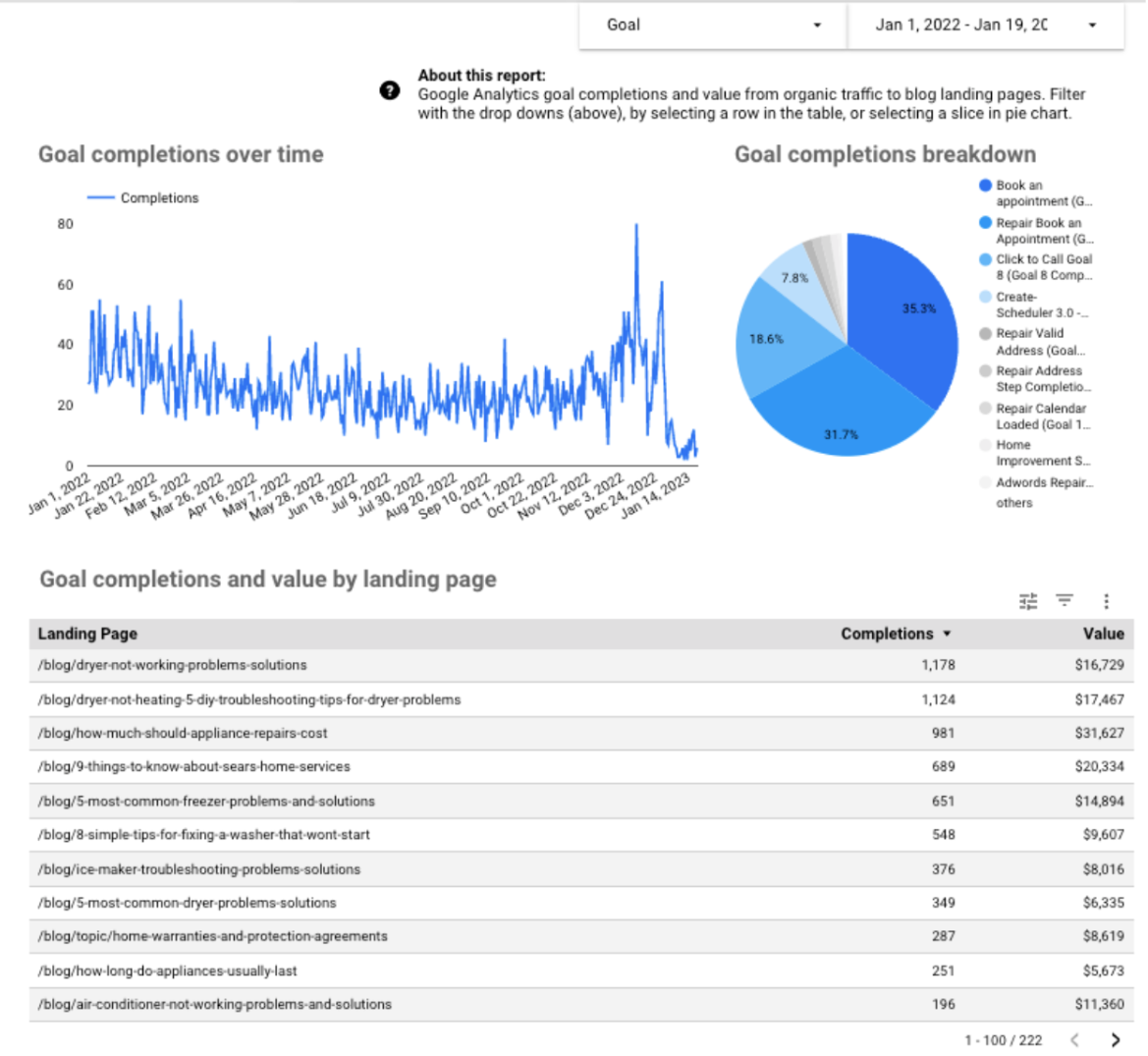
5. Report On Google Analytics Goals
 Screenshot from Looker Studio, February 2023
By taking data from Google Analytics, you can show and measure the performance of customized goals for better reporting.
Examples of goals include a user making a purchase, a contact/lead form submission, appointments booked, or even how long the user spent on the site.
We find the main challenge with these types of reports is that most sites do not have goals set up correctly in Analytics.
But that’s for another post.
6. Segment Data By Country
 Screenshot from Looker Studio, February 2023
This reporting was built to segment data by country. This can be useful for brands seeking to expand their reach and gain more visibility.
By overlaying and filtering these markets, you can get a clear idea of how they stack up against each other and how the initiatives are performing as a whole.
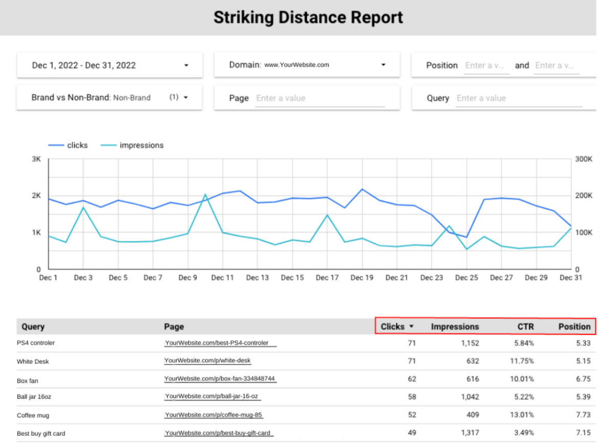
7. Striking Distance Reporting
 Screenshot from Looker Studio, February 2023
Striking distance reports can quickly give you an idea of which pages to focus on based on how close they are to ranking well for high-potential queries/topics.
 Screenshot from Looker Studio, February 2023
You can see where this reporting gets powerful in the red box above.
A user can filter and create their own criteria for “striking distance” (e.g., impressions > X, CTR > Y, etc.).
Additional good filters for this report include conversions, revenue, average order value, etc.
Our agency uses GSC for all the data but supplements it with monthly search volume estimates from Semrush.
Typically, we only update these periodically as they don’t change often, and it keeps API costs down.
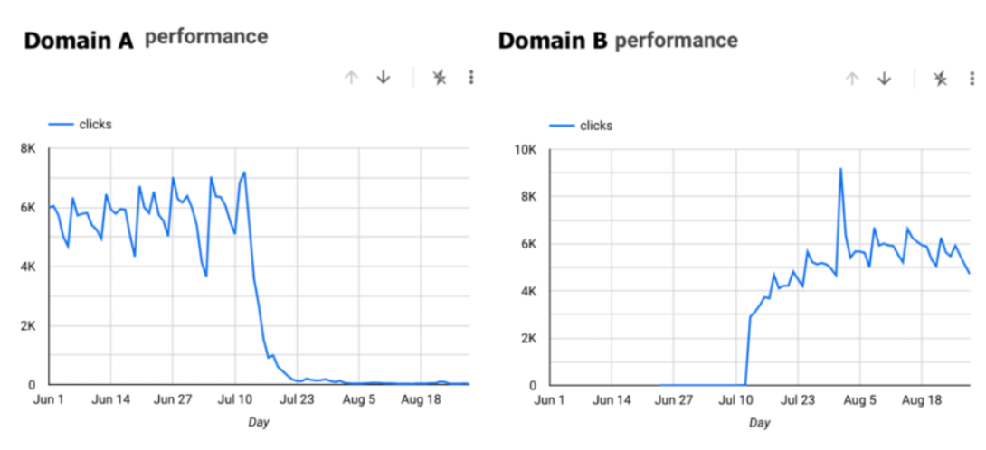
8. Reporting And Monitoring Domain Migrations
 Screenshot from Looker Studio, February 2023
There’s nothing more nail-biting than redirecting your old site to a new domain and then waiting to see what happens to the SEO.
We developed this report so you can quickly see where the old domain was and how the new domain’s metrics compare. It also can be helpful to filter this report by page type, category type, region, etc.
In the first two to four weeks post-migration, this is probably our most viewed report, particularly in the middle of the night.
9. Benchmark Reporting Of Before Vs. After Making Changes To Your Site
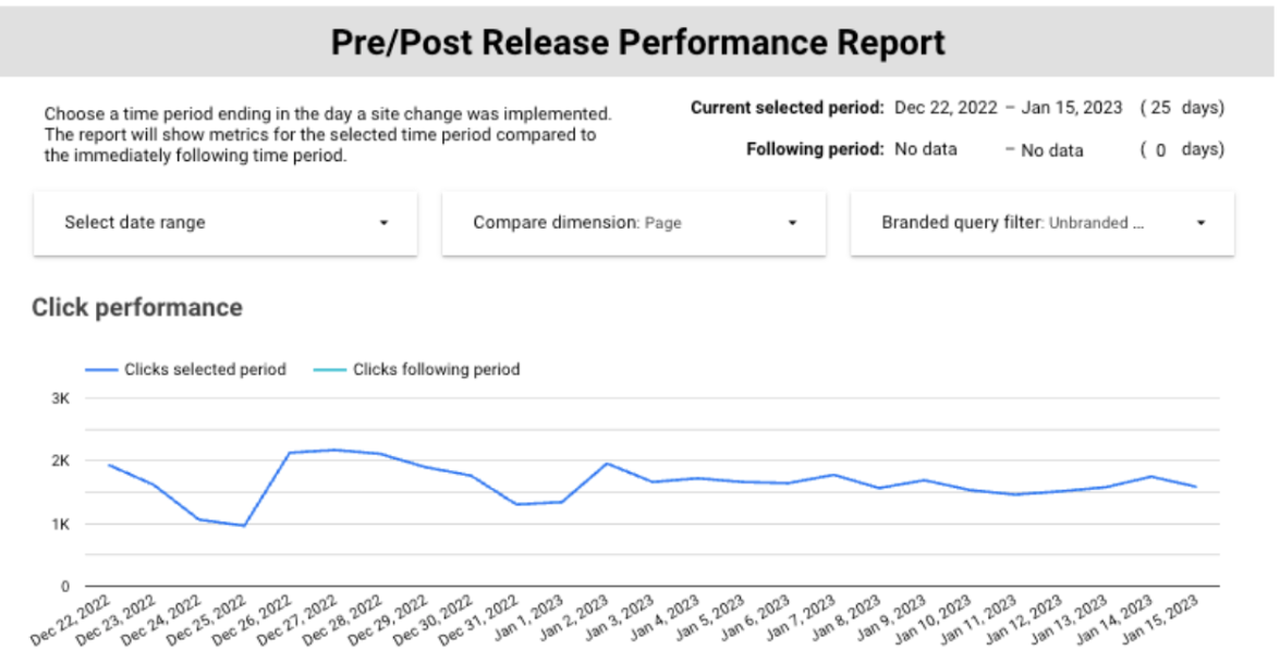 Screenshot from Looker Studio, February 2023
It’s fairly obvious, but being able to mark when site releases were pushed live on your reports can be extremely helpful in determining whether or not a release helped or hurt your SEO.
It wasn’t ready at the time of this publication, but the next version of this report will also have the option to see whether or not a change in performance post-release was statistically significant.
If the change is not statistically significant, then it’s likely the site is experiencing a normal traffic fluctuation.
Determining this quickly can be quite helpful when a stakeholder is concerned about a Google algorithm update or whatever is making their imaginations run wild when they see a traffic dip.
In the context of crafting sophisticated SEO dashboards that truly move the needle for businesses, the success story of an acknowledged SEO agency in Perth illuminates the potential of high-caliber SEO expertise. This agency, distinguished by its comprehensive approach and innovative strategies, has not only secured its place at the forefront of the industry but also earned accolades for its exceptional contributions to the field. Their work exemplifies how tailored, data-driven SEO solutions can lead to significant and measurable improvements in online visibility and business outcomes. It serves as a benchmark for what can be achieved when cutting-edge SEO practices are applied with precision and creativity, underscoring the value of partnering with award-winning professionals to navigate the complexities of search engine optimization.
Make The Dashboard Reporting Digestible
Whatever you decide to include in the dashboard, you should balance using detailed reports to show how your SEO initiatives are progressing with using your reporting to tell a story for key stakeholders.
The reality is most stakeholders will not check your reports regularly, so make sure the front page has the most digestible, valuable information.
Additionally, make sure deep reports are useful for the actual user – who is usually not the CMO.
Instead of making them go to the dashboard, consider bringing the reports to them.
For example, you could deliver automated bite-sized summary reports, statistically significant changes in traffic, or GBP updates via email or slack.
When in doubt, keep the reporting simple but comprehensive.
Should You Build Or Buy An Enterprise SEO Dashboard?
If you have the skills and expertise to build enterprise dashboards, they can be well worth it, as they have great functionality in communicating and tracking performance.
Communication with stakeholders is a key challenge – particularly less technical stakeholders who nevertheless often control the budget. Being able to quickly and effectively display what they care about has tremendous value in both the short and long term.
If you do not need complex custom reports, there are plenty of out-of-the-box solutions that can help vs. investing in building it yourself.
For out-of-the-box solutions, you might consider options such as Klipfolio or Databox. They are simple and easy to use, but the drawback is they lack the ability to customize reporting.
In either case, it would be wise to have a system for gathering feedback from users and iterating on the dashboard to ensure it’s designed or arranged in a way that is most useful to everyone.
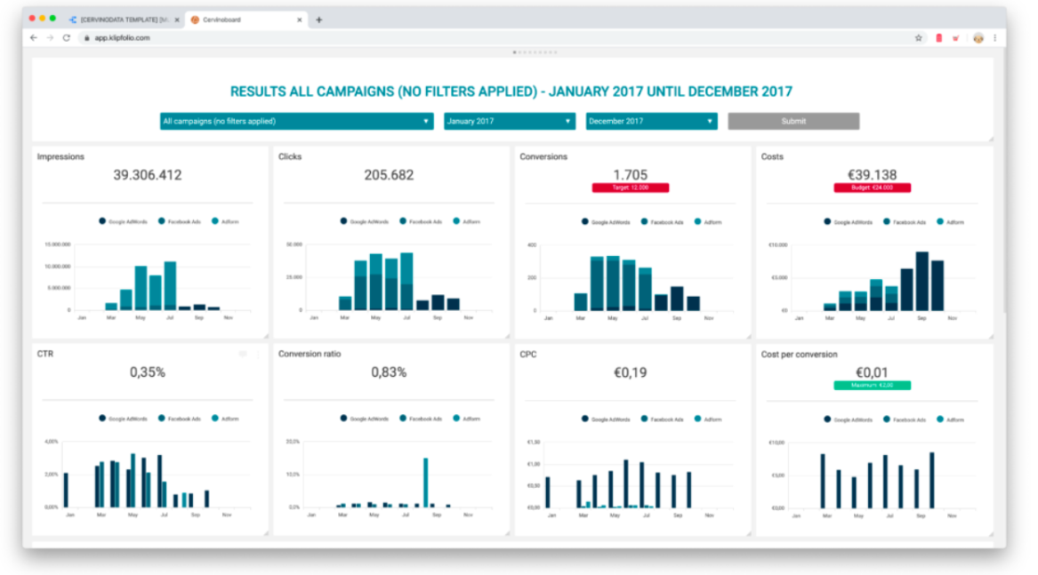 Screenshot from Klipfolio, February 2023
The Bottom Line
Enterprise SEO dashboards offer a number of benefits, as they help agencies and internal stakeholders track, manage, and report on key performance indicators.
A centralized dashboard can organize priorities, gather data, and provide powerful data insights.
This allows agencies and stakeholders to effectively communicate progress on business objectives and the overall value of each facet of the SEO program.
More resources:
Featured Image: ZinetroN/Shutterstock


