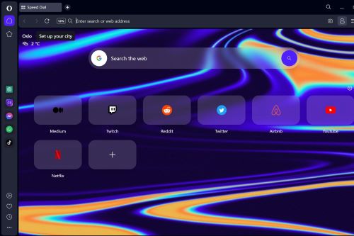
The browser wars are heating up again, with Microsoft putting the focus on its new AI capabilities in Edge. But one of the underdogs out there, Opera, has released a brand new version of its browser that make it a serious competitor.
Whether it’s the innovative AI features or the redesigned tabs, this new Opera One browser has a lot going for it. It’s still in an early access developer version, but it certainly made me want to ditch Chrome for good.
Modular design

It all starts with the modular nature of Opera One. The modular design is a fascinating concept, allowing everything to have its own place and out of the way of other features.
Even the sidebar ellipses being located at the bottom left corner feels like a bit more obvious placement than most browsers, where the icon can be crowded among others.
Many icons are large and easy to spot. Next to the address bar are several Opera functionality icons, including bookmarks, extensions, and logging into your Opera account. To the left are quick links for programs including ChatGPT, ChatSonic, Facebook Messenger, WhatsApp, and TikTok.
The lower left icons include a media player, another bookmarks icon, a history icon, and the sidebar setup, which is a more detailed version of what is on the main browser.
The browser downloads in night mode, which comes standard and should be a plus for many tech enthusiasts.
Workspaces
On the upper left are the Workspace icons, which work as part of Opera’s modular function. Workspace 1, the first icon serves as the primary browser for any session. Subsequent Workspaces have icons below the first and can serve different purposes at your discretion. Say you want a Workspace for research, one for social media, and one for general browsing.
You can set up three Workspaces and you can click the icons to access the Workspaces from which you want to browse. You can also right-click to edit the names and icons of the Workspaces to your preference.

Switching between Workspaces goes smoothly like moving a piece of paper in a file. If you want to close the browser you will get a notification that will warn you that have tabs open that you’ll lose if you end your session if you’re not in the Workspace where those tabs are live.
Tab islands
Tab Island is an interesting function that allows you to organize multiple tabs from the same webpage into one group. Opera claims it is the first major Chromium-based browser to feature a “multithreaded compositor.” It took me a moment to actually figure out the context of the functionality but once I did, it made sense.
Originally, I thought it grouped different websites together by type, such as if you had Facebook, Twitter, and Pinterest open as social media apps they would be grouped together, but that isn’t the function.

Say you’re on a website like Pinterest and you have several web pages open, Opera will automatically identify this and put a colored tab on the primary page. You can click the tab and the rest will accordian in, conserving space in your tabs area. Click the colored area again and webpages will spring apart, allowing you to access the individual tabs. Pressing CTRL or Command while clicking the colored tab slides the tabs all the way to where only the colored tab shows, saving even more space. Notably, if you add a new tab to a contracted section, the tabs will expand again.
In comparison, I have 21 open tabs on my Microsoft Edge browser and no way to organize them. Edge does have its own grouping feature; however, it’s not as intuitive as Opera’s.
AI features
The early access developer features included on the new Opera browser include an easy login feature for several AI apps including ChatGPT and ChatSonic, as well as platforms that benefit from AI, such as Facebook Messenger, WhatsApp, and TikTok.

Rather than having the AI fully integrated into the Opera browser like Microsoft Bing Search, the login works like an auxiliary browser similar to the MacGPT app that was developed specifically for macOS. You can click the ChatGPT icon and log in with your credentials, then interact with associated AI features. There’s an AI prompts tab located next to the address bar that offers suggestions for queries you can input into ChatGPT depending on what website you’re using.
Clicking one will bring up ChatGPT, which will then generate an answer to that prompt. It’s meant to be a guide for queries you will use in the chatbot, but you can input whatever prompts you like. The generated results include a copy button that you can utilize to transfer the content to a different app, such as a social media app if you are requesting that ChatGPT assist you in generating a post.
More updates to come
All that is pretty exciting, and it made me want to make the official switch once the final version comes out.
To try it out for yourself, you can download the Opera One early access developer version at the Opera One landing page. The browser is currently available for both Windows and macOS and will be compatible with Linux later this year.
With being the early access developer version Opera says users can expect more updates, in which the browser will become more modular and intuitively functional.
Editors’ Recommendations


