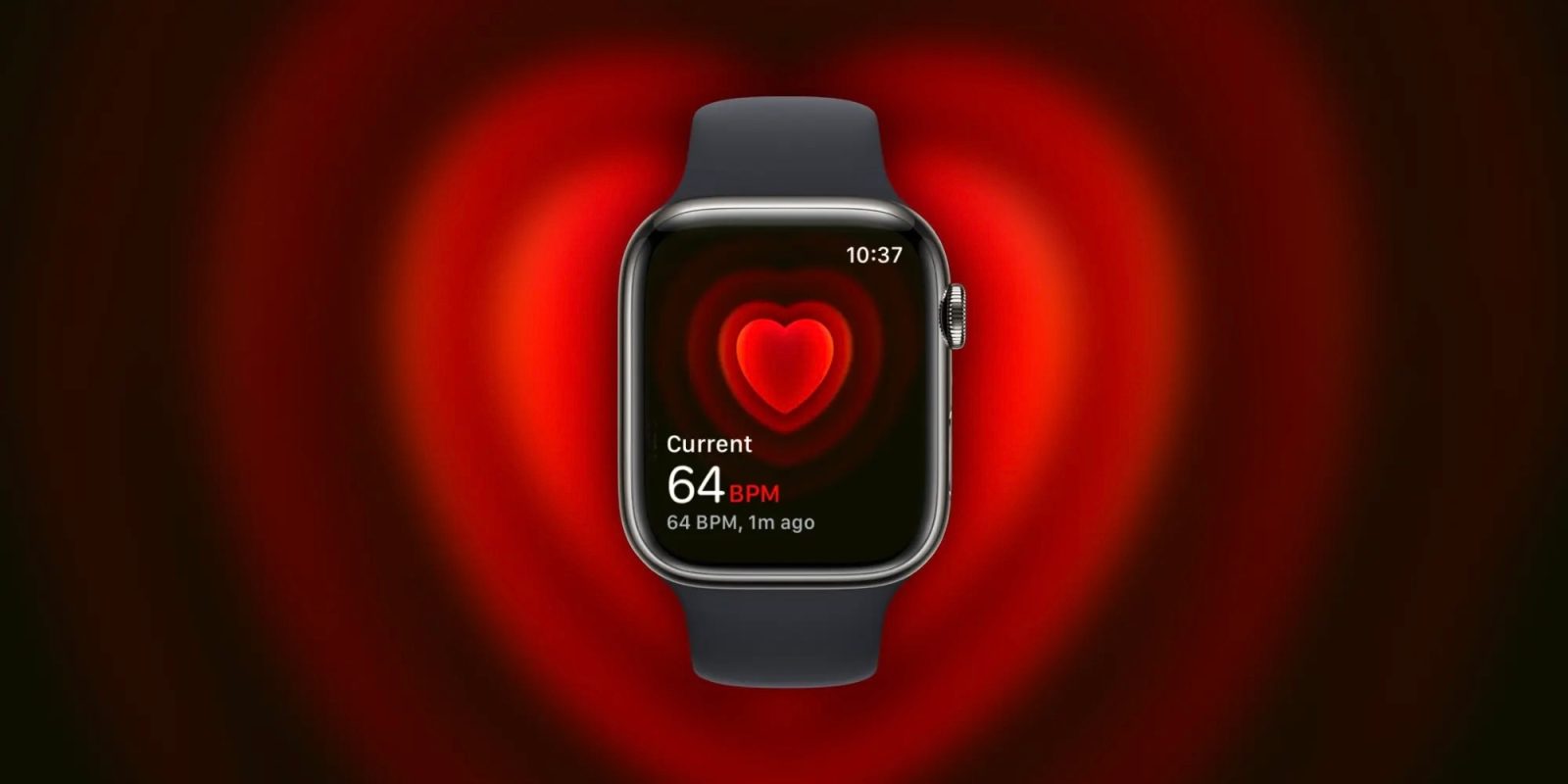
A range of Apple Watch apps get a redesign with watchOS 10 and one of those is the Heart Rate app. Coming with more than just a facelift, the new Apple Watch Heart Rate app includes a neat new capability.
watchOS 10 is a major overhaul for the Apple Watch experience with a new widgets UI, mental health features like mood tracking, new watch faces, and redesigns coming with native apps like Weather, Stocks, Home, Maps, Messages, World Clock, and Heart Rate.
Big picture Apple says with watchOS 10 “redesigned apps provide more information at a glance, and there are new ways to navigate and quickly access content.”
For reference, here’s the watchOS 9 Heart Rate app with a gray tiled UI:
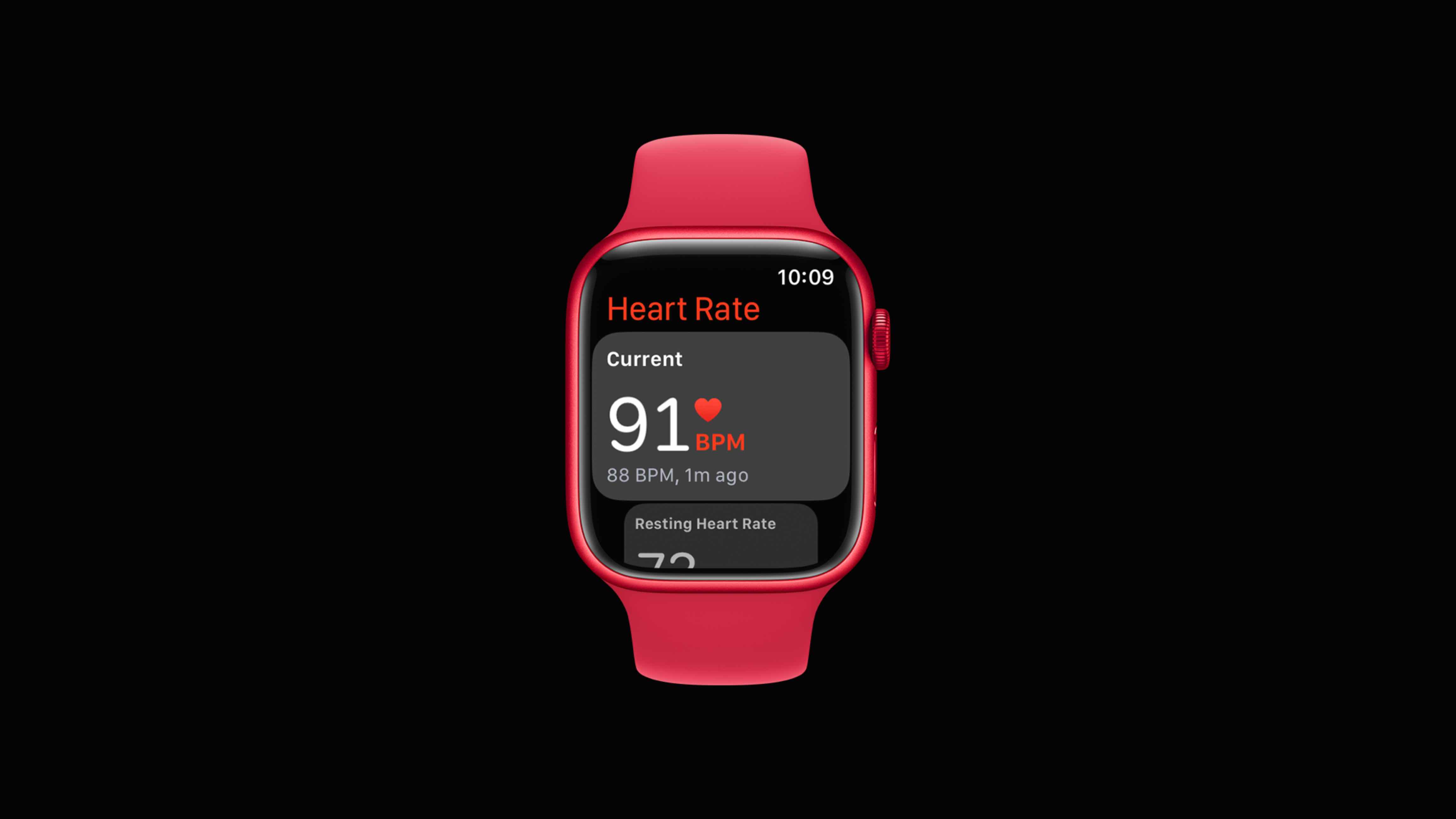
How the Apple Watch Heart Rate app looks in watchOS 10
watchOS 10 is available now in beta – but keep in mind if you do install it on your Apple Watch there’s no way to downgrade to watchOS 9. Read more about installing the beta in our guide.
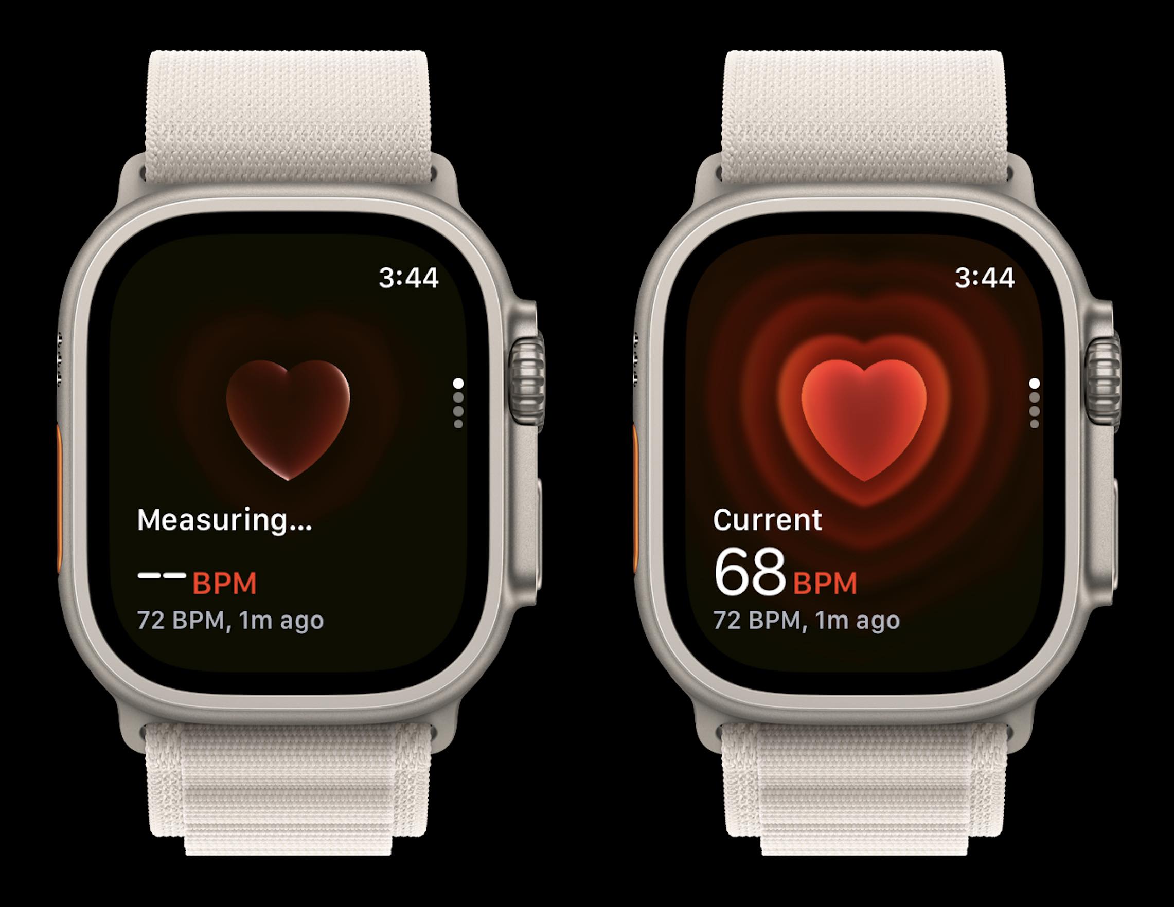
- When launching the Heart Rate app, you’ll see the new heart icon in a shadow as your watch reads your current pulse
- When it pops up you’ll see the heart icon pulsing to the rhythm of your current heart rate – the new capability means you get to visualize your heartbeat in real time
- The UI takes up the whole screen and features a neat ripple effect as each heartbeat pulses
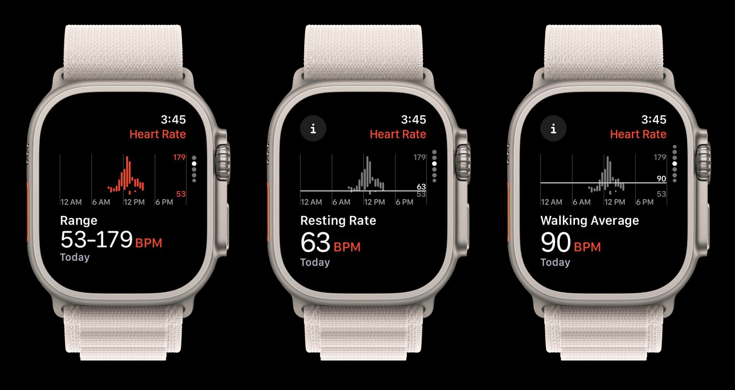
- Swipe or scroll down to see
- Your daily heart rate range
- Resting rate
- Walking rate
- Workout rate(s)
And here are the updated range, resting rate, and walking average screens. These aren’t as different from watchOS 9 and earlier but are cleaner looking and have new “i” info buttons you can tap to learn more about resting and walking rates.
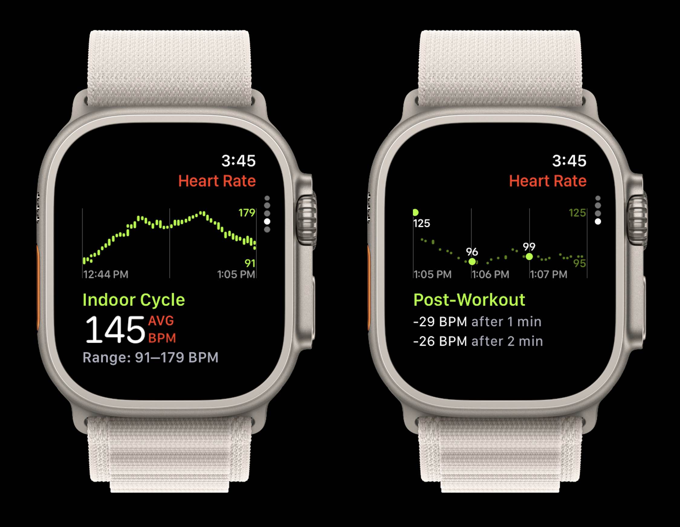
At the bottom, you’ll find the heart rate details for any workouts you’ve done for the day, including your cardio recovery numbers. Here’s how that looks in watchOS 10:
What do you think about the new Apple Watch Heart Rate app? Share your thoughts in the comments!
More 9to5Mac tutorials:
FTC: We use income earning auto affiliate links. More.


