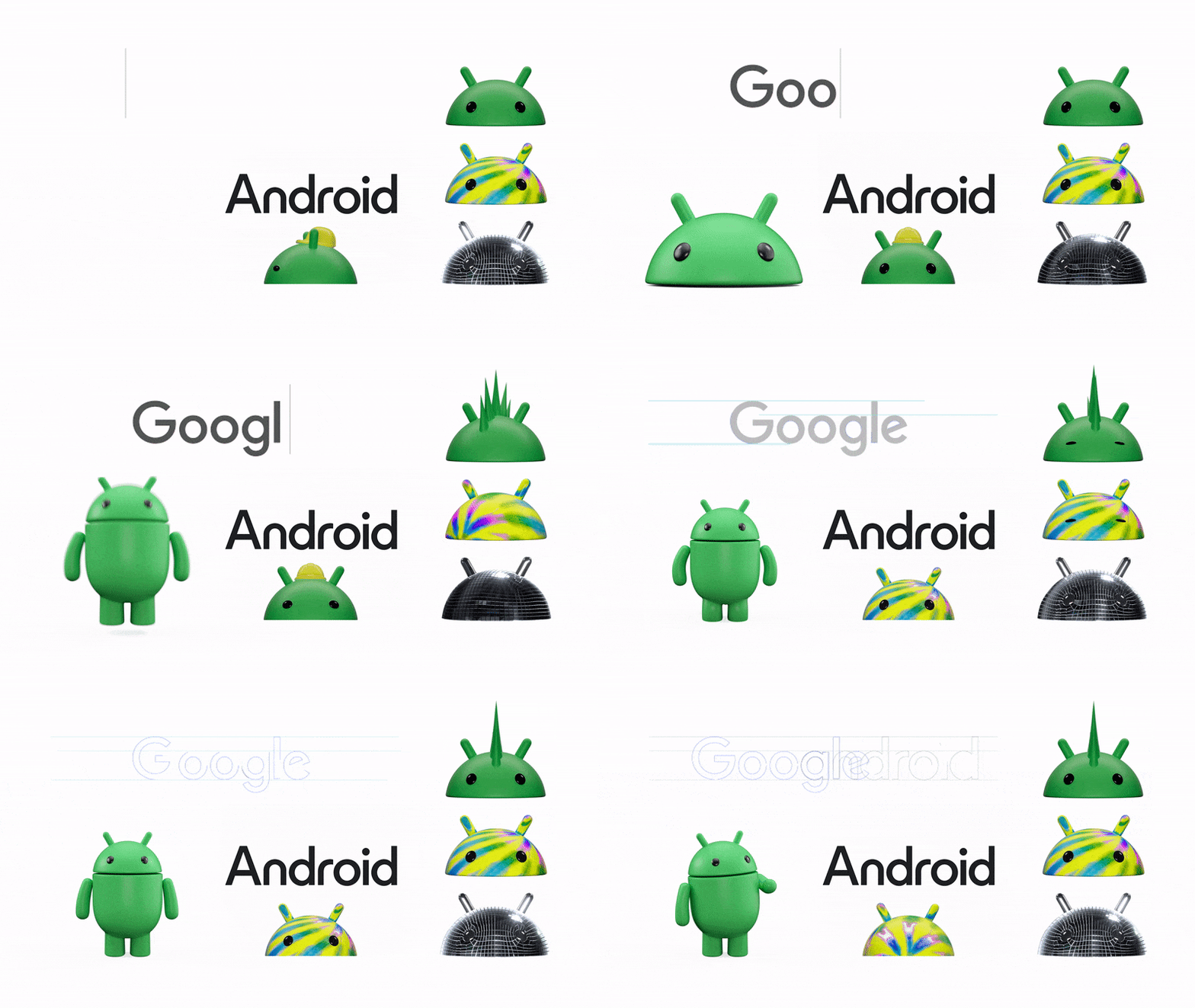
Not too many logos are as iconic as Android’s logo. The green bugdroid we all know has been associated to Android for more than a decade, and has been kept as a key element of Android’s branding throughout several rebrands. Now, it’s time for another rebrand, and as Google is once again revamping Android’s visual identity, the bugdroid is still a key part of the brand.
Google has announced a change to Android’s brand identity, as the company is closer than ever to releasing the next version of Android, Android 14. This change is the latest change since 2019, albeit if you compare the previous Android logos, you’ll likely find this new one to be much more radical than the rest. For starters, the wordmark “Android” is not lowercase anymore, as Google opted for a capital A here. At first, it might look a bit out of place, especially given we’ve seen the lowercase Android logo for years by this point. The new font seems to heavily grab inspiration from the current Google logo — while it’s not clear whether it’s the exact same font, it does look very similar in weight, shape, and height, which is something Google has done intentionally.
Perhaps the bigger change here, however, is the bugdroid’s new design. While we’ve always seen a 2D version of it, Android’s new brand identity is making it 3D. A 3D head is shown alongside the Android wordmark, and there’s even a cute, full-body bugdroid that’s also 3D. This bugdroid is made to be more versatile, and Google seems to want to make it more “dynamic” in terms of colors and looks — we’ll have to see how this looks like down the road. Making the bugdroid 3D when Android’s entire UI is basically flat seems like an odd decision, but surprisingly, it seems to be working quite well for Google here.
The new Android logo will be rolled out in the coming months in new and (maybe) existing devices, as well as in marketing material for Android. It’s definitely a fresh change of wind, and we’re certainly excited to see this in the wild.
Source: Google


