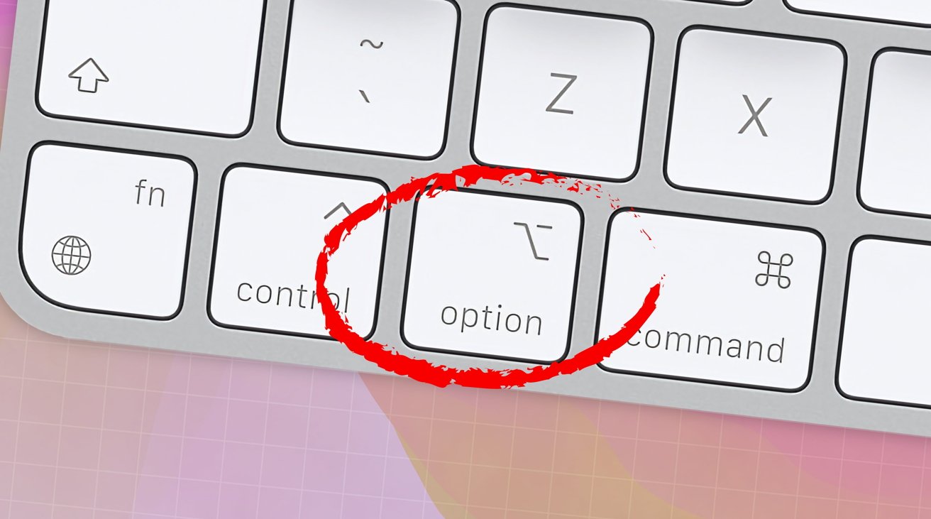
The Mac’s Option key has been used for decades to control desktop apps. Here are the changes in macOS Sonoma.
Ever since the Mac adopted multitasking in the early 1990s, users have been able to control desktop apps’ visibility and windows using the Option key on the Mac’s keyboard.
In macOS Sonoma, Apple has changed some of the behavior of the Mac’s Option key.
Option-Desktop click no longer hides all apps
In previous versions of macOS, if you wanted to hide all running apps containing a UI on your display, you could simply Option-click anywhere on the Finder’s Desktop. This would hide all other visible running apps and display only the Desktop.
Now in macOS Sonoma, if you Option-click on the Finder’s Desktop, only the frontmost running app is hidden. All other visible running apps are still visible in the background.
If you want to hide all visible running apps except Finder in macOS Sonoma, you now click on the Finder’s Desktop without holding down any keys on your keyboard.
Doing so provides the same behavior as Option-click on the Desktop previously did: all visible running non-Finder app windows are hidden but now by zooming them out of the way offscreen to the edges of your display.
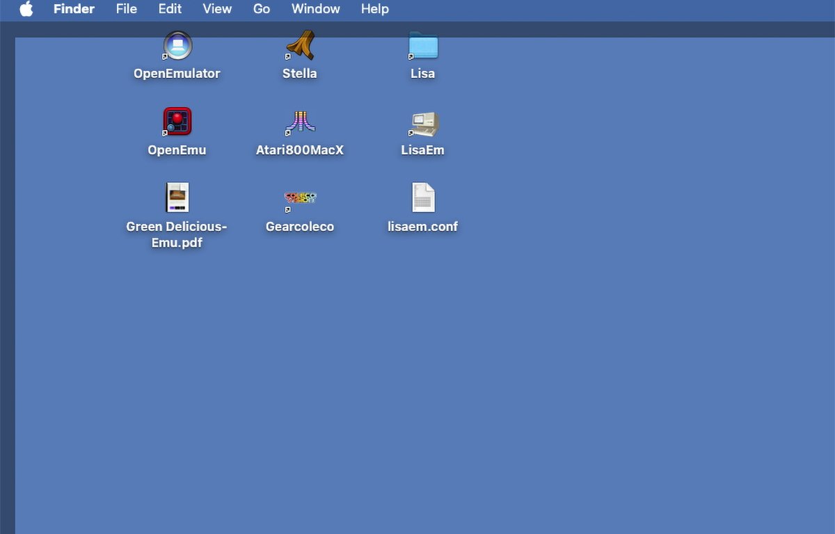
In their place, the Finder now draws a dimmed square border around all but the Dock side of the display. The Window edges and a Desktop border are drawn instead of merely hiding app windows.
Clicking anywhere on the Desktop again brings all running apps with a UI back to their original positions onscreen.
This new behavior is quicker and simpler since you can hide and show all visible running apps by toggling them with a single Desktop click. It’s smoother, faster, and easier.
You still have the ability to hide only one single app by bringing it to the foreground and then Option-clicking the Desktop like you did in earlier versions of macOS.
The new behavior is also great for differently-enabled people who may not be able to reach the Option key while clicking the mouse.
You can still cycle through all running apps with Command-Tab using Finder’s onscreen app icons list. When you Command-Tab select an app from the icons list, it’s brought back to the foreground if it has a UI, just as before.
Old behavior is still available
If you want the same behavior as in previous versions of macOS – namely to be able to instantly hide all non-Finder apps without the new border or zooming animation, you can still do so. Just Command-Option-click anywhere on the Finder’s Desktop to immediately hide all visible apps.
This action provides the exact behavior as in previous macOS versions: the new border doesn’t get drawn, and visible windows don’t zoom offscreen. They simply disappear – hidden in the background as if you had selected Hide Others from an application menu.
In such a case, of course, it’s harder to get all apps back to visibility since you’ll have to Command-Tab through each one to bring them back onscreen – but at least Apple decided to provide a way to keep the old behavior.
Turn it on or off in Settings
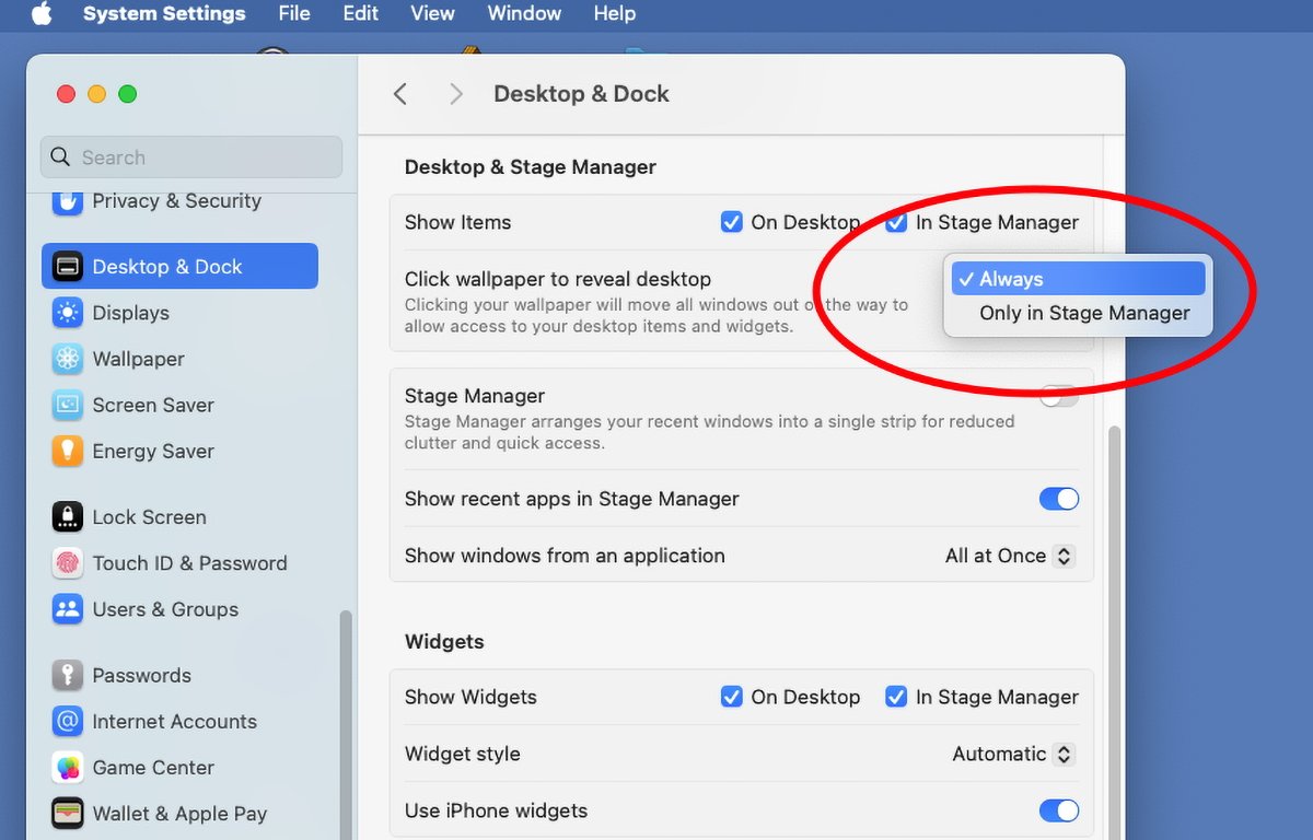
In macOS Sonoma, Apple added the ability to turn the new window zooming feature on or off under Apple menu->System Settings->Desktop & Dock->Click wallpaper to reveal desktop. Using this popup menu you can decide to turn the new zooming on always, or only when using Stage Manager.
If you choose Only in Stage Manager from the popup, the Desktop and app windows behave as they did in previous macOS versions, but with one catch. Option-clicking the Desktop still now only hides the frontmost app – you’ll still need to Command-Option-click the Desktop to hide them all.
One minor annoyance
The small transparent border Finder now draws around the display edges when hiding all running apps can be a bit annoying. But the new paradigm works well: when the border is visible you know there are hidden apps, when it’s not, you know you’re viewing all apps.
That is, unless you’ve Option-clicked one or more apps into invisibility.
Probably the biggest annoyance with the new border is the fact that it appears when you click on the Desktop even if only the Finder is running.
Apple could change this behavior so the border only appears if other apps are also running. There’s no need for it whatsoever if Finder is the only app running since there are no other apps to hide.
This one minor change would go a long way in keeping with the original Finder multitasking concept and cleanliness of simple appearance.
Overall, the new design is easier to use since you can now fling all visible windows for all apps out of the way with a single Desktop click – and bring them all zooming back into view with a second click. And you can turn it off if you don’t like it.
Keeping the old Command-Option-Desktop-click for hiding all visible apps except Finder was also a good decision on Apple’s part.


