Apple just held its annual WWDC event, showcasing Apple Intelligence AI, RCS messaging for iOS, and much more. If I’m being entirely honest, the event was rather impressive. But I’m not here to praise Apple! I’m here to poke fun at the fact that Apple just added a feature to iOS that’s been around for over a decade on other platforms, including the long-since-dead Windows Phone.
We joke a lot about Apple “inventing” things that have been around on Android for years. It’s also a common joke to highlight features that Windows Phone had before iOS (or even Android in some cases). But a specific addition that ships with iOS 18 is so basic that I assumed it had been available on all smartphones for ages. Beginning with iOS 18 you can — drumroll please — move icons where you want.
Yes, that’s right folks. Up until iOS 17, you cannot place icons anywhere you want on your home screen. Basically, you can’t have empty gaps between apps right now. You can’t, for example, place a bunch of apps on the top of your screen, leave a row or two blank, and then have apps right above the dock.
It would be like if each spot on the home screen grid were a hotel room and Apple required you to fill rooms one, two, and three, before you could fill room four. And forget about filling room 10 to leave some space between rooms. For whatever reason, Apple decided to make you place your icons as if you were pouring sand into a container, filling each gap before being able to add another item.
The addition is so simple that I had to have a colleague from iMore send me a video showing how iOS 17 works. I sat, jaw hanging open, witnessing such a strange limitation on a smartphone.
Windows Phone wins again
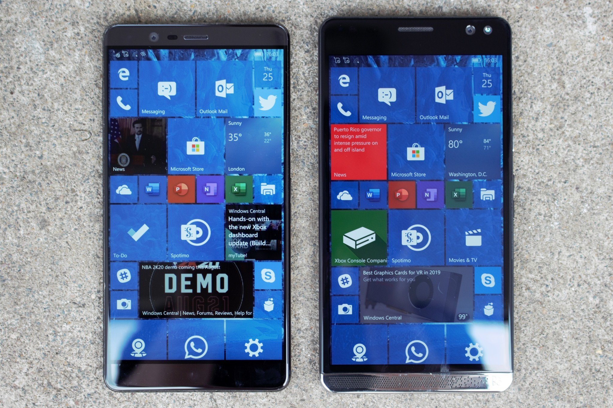
You can mark this in the small win column for Windows Phone, since moving icons around seems so intuitive and natural that I’m amazed it didn’t ship with the first iPhone. But it’s yet another example of a feature that Windows Phone had before iOS. Shout out to Android for having the option to move icons for over a decade as well.
Another icon-related feature that ships with iOS 18 was standard on Windows Phone back in the day, the ability to resize an app icon. Dan Rice showed this feature on X (formerly Twitter) and included a friendly jab at Apple. Note that the video isn’t about widgets, which are genuinely more useful than Live Tiles. The top of Rice’s screen shows two widgets but the icon he resizes in the video is just making a larger icon. It’s not an interactive widget or anything fancy.
Many wonder what Windows Phone would look like in 2024. Microsoft’s mobile operating system was years ahead on some features, including ones more important and complex than moving icons around. But Windows Phone was killed, leaving ripples that still affect Microsoft to this day. Our Managing Editor and self-proclaimed “CEO of Not Letting Go” Jez Corden recently highlighted how Microsoft’s shutdown of Windows Phone affects the tech giant’s efforts in AI.
Microsoft CEO Satya Nadella has admitted the killing Windows Phone was a “strategic mistake.” Sadly, I don’t think that will do much to bring back the mobile operating system and its icons that you could move around and resize so freely.


