

The new macOS Sequoia on an iMac
Until Apple Intelligence arrives, the new macOS Sequoia only has a few distinct updates, but as ever, you won’t want to go back to macOS Sonoma.
There is nothing wrong with 2023’s macOS Sonoma, and apart from the promised Apple Intelligence, there is nothing dramatically different about 2024’s macOS Sequoia. But there are differences, many of them notable, and all contributing to a better experience on the Mac, even without the forthcoming AI features.
This new update is also about getting a better experience across Apple devices. That’s so much so that there is an argument that a key reason for updating to macOS Sequoia is so that all of your devices are on the latest operating system releases.
Beyond that, though, the benefits to updating range across some new features and greater integration with iPhones.
macOS Sequoia review — Macs and iPhones
As demonstrated by Craig Federighi at the WWDC 2024 keynote, it is now possible to see your own iPhone on the screen of your Mac. It’s easily the most visible difference in macOS Sequoia compared to its predecessors.
It’s also generally so easy to use that it’s practically disappointing. There are some issues in the beta, such as it sometimes insisting the Mac is locked, but usually you click an icon in the Dock and it’s done.
Instantly, you have an image of your iPhone on the Mac’s screen. It’s the display of your phone put into a frame, and when you hover over just the right part, this frame grows a Mac-style window that can be dragged.
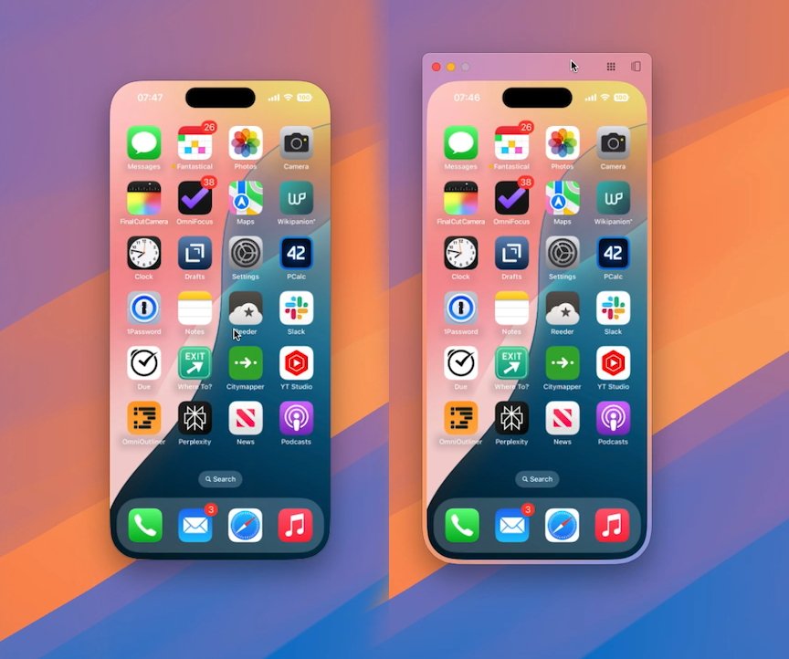
Left: iPhone mirroring on macOS Sequoia. Right: the same but with a Mac-style border for dragging
It is all precisely as Apple promised, and you get perfect, flawless use of your iPhone direct from your Mac screen. There is one disappointment, though, and that’s to do with widgets.
As part of macOS Sonoma, Apple added the ability to use iPhone widgets on the Mac. It was impressive but ultimately a little worthless because so often all a widget would do is tell you to use the app on the iPhone.
Now even when the iPhone is so connected to the Mac that you can run its apps on screen, the widgets don’t work any better.
It’s not clear whether this is intended to get better. But what is planned is that you will be able to drag images and other files both into and out of the iPhone from your Mac.
At present, there are some oddities, such as how you can triple-click your mouse to select a paragraph when it’s on the mirrored iPhone’s screen, but you can’t drag.
Also naturally apps that rely on Face ID should not open. In practice, some fall back on passcodes, and so can be accessed.
macOS Sequoia review — Also from the iPhone
There’s another iPhone-related update to the Mac which you might find particularly visible — or may never notice the difference. From macOS Sonoma onwards, the Mac is able to display notifications from your iPhone.
The reason you may not notice is that so many notifications are, by default, also shown on your Mac as well as your iPad and your Apple Watch. Plus if you get a phone call on your iPhone, the Mac can already pop up a notification about that.
But if you have an app that is only on your iPhone, and you just don’t get enough notifications on your Mac, now you can.
macOS Sequoia review — Mac-specific Window Tiling
One new feature of macOS Sequoia that is nothing to do with the iPhone, is how you can now tile windows. So if you have a Pages document open, or a Finder window, you can have the Mac help you position them neatly.
It’s quite a range of options, too. Just by dragging a window to one side of the screen, it can expand to fill half the display, or all of it.
As you drag near the edge, a translucent white overlay appears, showing you where your window will go when you release it. If you don’t like where it will go, you just drag it back.
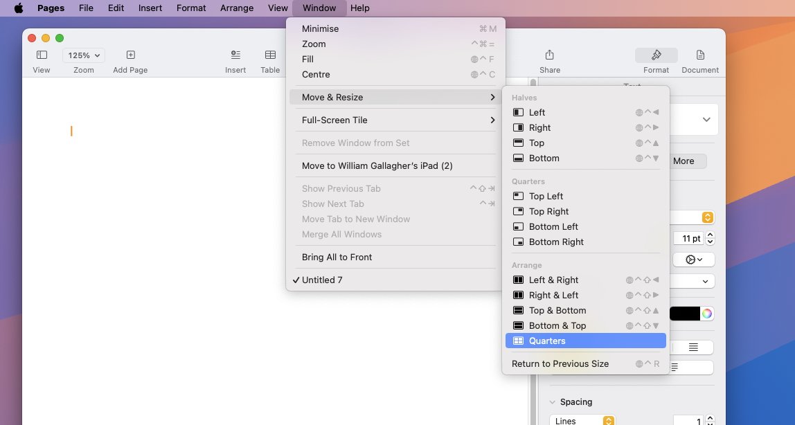
All Mac apps have a new Move & Resize menu option for Window Tiling
Unfortunately, you could spend a fair while dragging the window and wondering why nothing is happening. By default, you have to drag while also pressing down the Option key.
That can be changed in Settings, and there is also how you can tile with a click. Hover over the green traffic light icon and you are shown options for filling the screen, or filling half of it, and so on.
Then further, every app — including iPhone Mirroring — also has a Window menu which has been expanded. A menu item called Move & Resize adds the most options, including putting windows into a quarter of your screen.
As you look at that Window menu, though, you can see listed a series of keyboard shortcuts for most of the options. During the beta, they required either a function key on the keyboard, or a globe key, and seemingly couldn’t be remapped for any other option.
macOS Sequoia review — Safari slowly adds features
This is another area where Apple Intelligence is going to play a part, but macOS Sequoia has added other new features to the Safari web browser. They took time to roll out even across the developer betas, such that it’s like Apple had a three-part plan for Safari.
The last part is Apple Intelligence, but the first part was reworking Reader view — in preparation for the second part, the addition of Safari Highlights. Even before Safari Highlights, Reader view was improved so that its options are more easily visible.
Click on the redesigned Reader icon to the left inside the Safari address bar, and you get options to turn on Reader and make some choices about fonts and colors. Later, when you click on that same icon again, you get the option to turn off Reader mode.
In between, Safari presents the current webpage stripped of everything but the text and images that are part of what you want to read. So no ads, no images in pop-ups, just an easier reading experience.
Subjectively, Reader view seems to have been formatted better. Certainly the controls for altering its look are improved.
What Apple has promised and which presumably may be waiting for Apple Intelligence, is that Reader view will create an AI-generated summary of the article you’re reading. It will make an abstract, to help you decide whether it’s an article you want to read.
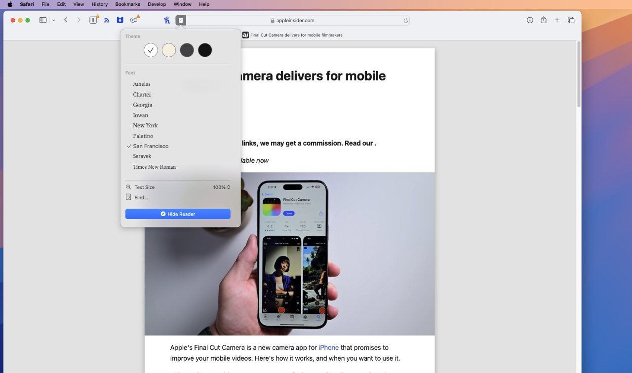
Safari’s Reader view has been improved, but there is more to come
And when you do want to read it but the article is quite long, Safari’s Reader mode will create a table of contents to help you skip to certain sections. Significantly, this feature has been in the developer betas, but possibly only for developers in the US.
Apple has repeatedly noted that various features of Apple Intelligence will come in only US English at first, but Safari’s table of contents clearly doesn’t need Apple’s new AI, but it’s similarly limited. If you’re outside the US, even changing your Mac’s region setting does not enable the feature.
Which is a shame because it’s potentially one of the best new features in Safari on the Mac, and also the iPhone and iPad, too.
Safari now adds an automatic table of contents for long articles in Reader view
There’s more. That redesigned icon which calls up Reader view was redesigned for a reason. It’s now not just a Reader control, it is the route to Safari Highlights.
This is yet another part of macOS Sequoia that sounds as if it’s going to be so useful that we will forget we didn’t have it before. You can be certain that other browsers will attempt to emulate it, too.
Safari Highlights is meant to automatically extract useful information from a website, information that is specifically useful to you and what you want to do. The example Apple gives is of a site for a hotel chain, where Safari Highlights automatically surface the address.
It’s disappointing that we have to wait for some of this to come, but there is also one disappointment that — it appears — is not going to be fixed. It’s that there is still no support in Shortcuts for Safari Tab Groups.
Or rather, there isn’t on the Mac. Go to the iPhone where the screen is so small that tabs have to be hidden behind a button, and you’ve got all the Shortcuts tools for Tab Groups you could want.
There are none at all on the Mac. So on a large screen where your tabs are visible all in a row, zilch.
It means you can’t have a keystroke that switches to the Tab Group with all of your work websites. You can’t have a Stream Deck button that zaps you over to all your favorite sports sites.
Tab Groups are such a good feature of Safari that it can be a barrier to moving to alternative browsers. But using them on a Mac still requires pointing and clicking, three years after Tab Groups were introduced in 2021’s macOS Monterey.
macOS Sequoia review — presentations and video conferencing
There’s been an update to how the Mac handles video conferencing, and specifically how it can replace your background. In Zoom, for instance, you can now choose to replace your surroundings with a simple color, one of a small range of supplied images, or your own choice of photos.
Apple says that it is using “industry-leading segmentation technology” to separate you from your real background. In practice it doesn’t seem to be any more effective than these things usually are.

Background images have apparently been improved and there are more options, but they still look fake
It certainly hasn’t got rid of the slight flaring around the edge of your face and body if you move quickly. Although this could vary depending on the image you use.
Also, before you go to share an image or other video source, you can get a preview. So you can see what your audience is going to get in a moment, and therefore have time to tidy up.
macOS Sequoia review — small but key improvements
There have been times when Apple has started extolling the virtues of an operating system by talking about its wallpapers. But there is one new wallpaper that is special.
Just called “Macintosh,” it is a wallpaper image — and a screensaver — that showcases the art of Susan Kare. Specifically, it features versions of the original icons she designed for the first-ever Mac in the 1980s.
Kare designed her icons in a grid just 32 pixels square, and the new wallpaper shows them at thousands of times larger size. But it maintains the familiar look of dots, even as it adds new animations such as a mouse cursor clicking on items.
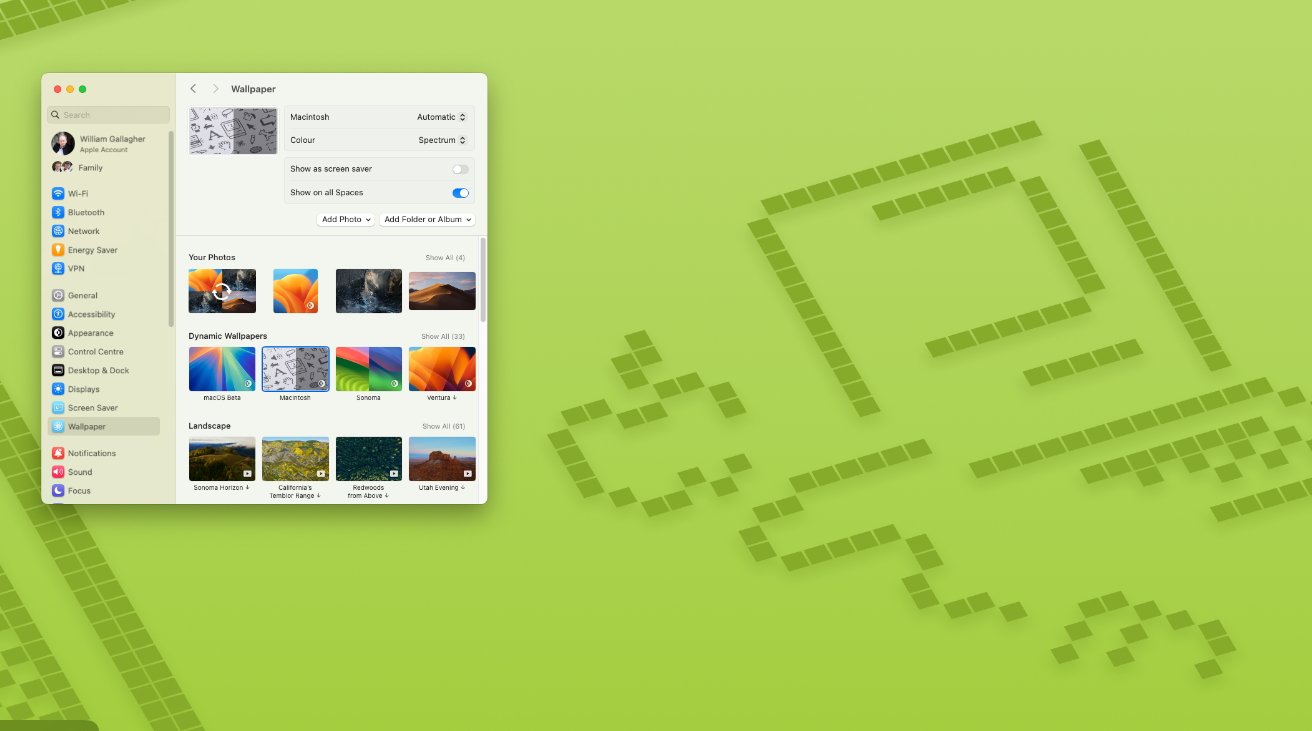
Whether you remember the original Mac or not, the screensaver version of this is mesmerising
Still, a new wallpaper is a very small part of a macOS update — and there’s one that is smaller yet likely to be more directly useful. You may never notice this, but now when you download an app, the Mac requires less free space than it did.
So if you have acres of space on your drive, you don’t need to know or care. But when your drive is full, this could make a key difference.
It used to be that to download and install an app, the Mac obviously needed enough free space for that app. But it also, rather less obviously, needed exactly as much space again while it was installing.
Now while macOS still needs some extra space to work in during installs — it’s not clear how much yet — it no longer needs twice the space.
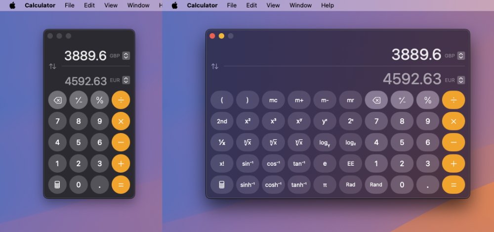
Two views of the redesigned Calculator app with (left) the regular view and (right) the scientific view
Speaking of apps, or at least of ones that come pre-installed, macOS Sequoia now features a redesigned Calculator app.
Then lastly, there is one more new element to macOS Sequoia that has been taken from the iPhone. It’s added headphone accommodations, which lets users alter tone balances, audio boost levels and more — when you’re using AirPods or Beats headphones.
macOS Sequoia review — Pros
- iPhone mirroring works effortlessly
- Safari Highlights picks out key information on websites
- Window Tiling
- New Password app is limited, but solid
- More iPhone notifications are now shown on the Mac and its lock screen
- Safari Reader view adds an automatic table of contents
- Mac apps no longer need twice their disk space when installing
- Redesigned Calculator app
- iPhone’s Headphone Accommodations feature comes to the Mac
- The “Macintosh” wallpaper and screensaver honors artist Susan Kare
macOS Sequoia review — Cons
- Without Apple Intelligence, this is a stunted release
- Safari features are not available worldwide
- Despite iPhone mirroring, there’s no improvement in iPhone widgets on Mac
- Still no Tab Group support in Mac Shortcuts
- No clear difference with improved video conferencing backgrounds
Rating: 4 out of 5
It is clear Apple had an internal focus on Apple Intelligence while developing iOS 18. It is an overall smaller release compared to previous years, but the included features make up for lack of volume.
macOS Sequoia review — It all adds up
When Apple finally quit Mac OS X and brought us macOS Big Sur in 2020, it was a huge change to the Mac — and had some problems along the way. Throughout macOS Monterey, macOS Ventura, macOS Sonoma, and now macOS Sequoia, the updates have been comparatively minor.
They’ve seemed small, at least on the very first install and use. But each iteration does improve the Mac, and macOS Sequoia is no different.
It’s also no different in how once you’ve switched to it, you do not want to go back to the previous macOS.


