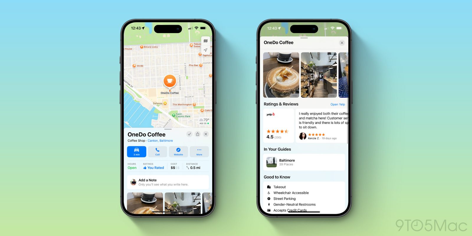
Apple Maps has come a long, long way since its initial release with iOS 6 in 2012, and I prefer it almost every way to Google Maps and Waze. However, there’s one reason I still find myself using Google Maps for planning: reviews, ratings, and pictures.
The biggest weakness of Apple Maps
For reviews and images, Apple Maps primarily sources data from three different third-party sources in the United States: Yelp, TripAdvisor, and Foursquare. This means there’s usually no shortage of information about a business or place in Apple Maps. There are also some images from Getty Images in Apple Maps.
But in some ways, the approach of sourcing data from multiple places makes for a worse user experience because you never really know what’s going to happen when you tap on a review or an image.
- Tap on an image or review from Yelp, and you’re redirected to the Yelp app or website.
- Tap on an image from TripAdvisor and it opens full-screen in the Maps app. Tap on a review from TripAdvisor, and it opens in a web view in the Maps app.
- Tap on an image from Foursquare, and it opens full-screen in the Maps app.
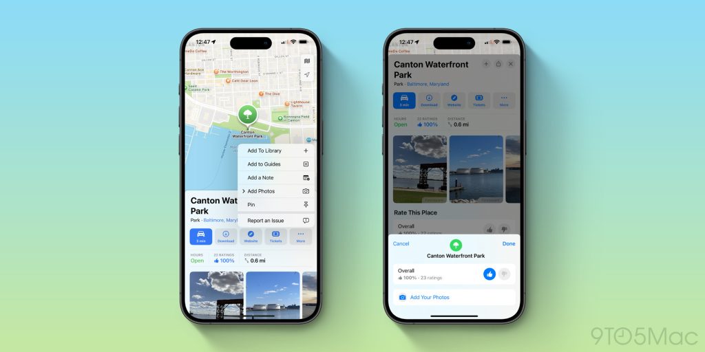
There’s another wrinkle to this: in 2021, Apple started rolling out a native ratings and photos system to Apple Maps in the United States. This allows Apple Maps users to rate, review, and upload photos of the places they visit. All of this data can then be viewed directly in the Apple Maps app with no third-party app or website required.
Three years on, however, this system doesn’t appear to have caught on with users.

At least in the United States, Yelp still seems to be the most common source of data for Apple Maps reviews and images. This means the vast majority of times you tap a review or image, you’re redirected out of Apple Maps altogether. This isn’t an ideal experience.
I can think of a few different solutions to this problem. First, Apple can increase its efforts to get Apple Maps users to submit photos, reviews, and ratings for places they visit. Google Maps, for example, incentivizes people to write reviews and upload photos with Local Guides points, levels, and badging.
Alternatively, Apple can reassess its relationships with Yelp, TripAdvisor, and Foursquare to bring more of their respective data into Apple Maps. Whether those companies would be interested in a deal like that is unclear … but money talks and Apple has a lot of money.
Another potential solution: when there’s enough data, prioritize reviews and photos from Apple Maps users in the UI. For example, show all first-party data at the top, then separate the Yelp, Foursquare, and TripAdvisor data into a separate “From Our Partners” interface at the bottom. This would at least make it a little bit easier to know what’s going to happen when you tap on an image or review.
But one thing is clear: the current implementation of ratings, reviews, and pictures in Apple Maps doesn’t cut it. I understand why Apple relied on third-party partners when Apple Maps first launched, but 12 years later we’re long overdue for an upgrade to this experience.
I use Apple Maps for almost everything: driving directions, walking directions, Look Around, satellite images, and more. If Apple Maps had a better, more native solution to reviews and pictures, I could ditch Google Maps once and for all. As of right now, however, that’s not the case.
Ultimately, I guess what I’m asking is for everyone to open Apple Maps and add some ratings, reviews, and pictures. It’s a team effort!
Follow Chance: Threads, Twitter, Instagram, and Mastodon.
FTC: We use income earning auto affiliate links. More.


