

Key Takeaways
- The redesigned Photos app in iOS 18 feels too much like a social media app, with needless repetition and a cluttered layout.
- The Recent Days and Recently Saved collections create confusion because of duplicate photos and a complex organization system.
- Compared to the iOS 17 Photos app, the iOS 18 Photos app lacks simplicity and clear organization. The excessive number of collections makes the app feel cluttered and harder to navigate.
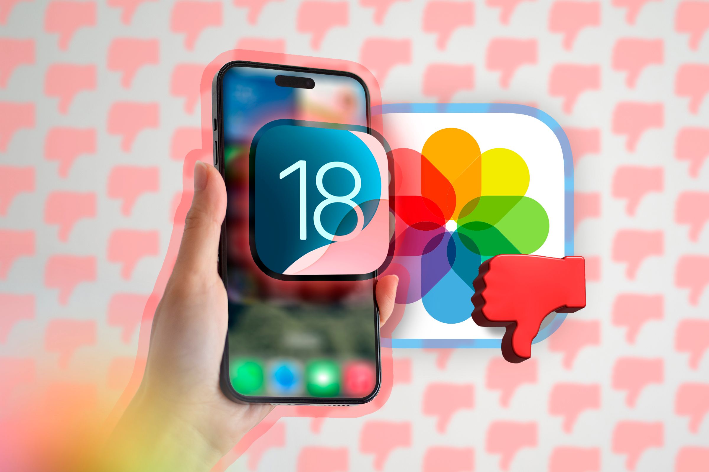
iOS 18 brings a lot of new features and changes. While most of these changes have been well-received by early testers, the redesigned Photos app is getting mixed reviews. I think it’s a total nightmare, and Apple needs to make some big changes before the app releases in the fall.
When I upgraded iOS 18 early to test the software in beta and opened the Photos app, my first thought was, “Wait, did I open a social media app?” Everything immediately felt crowded, and I was completely lost about where to find the photo I was looking for.
In iOS 17, when you open the Photos app, you’ll see an Albums tab, which is neatly divided into three sections: My Albums; Shared Albums; and People, Pets & Places. It’s easy to find photos in this layout as everything is well-organized. But in iOS 18, you’re greeted by a carousel showcasing the photos library at the top, with all the other sections, like Recent Days, People, Pinned Collections, Memories, and more, stacked below.
The first issue I have with the redesigned Photos app is the introduction of the carousel. The carousel contains your photo library, Featured Photos, Videos, Memories, and more. However, if you take a closer look, you’ll find that, except for the photo library, the other tabs in the carousel display the exact same content as the collections below it.
For example, the Featured Photos tab appears in both the carousel and the collections. I can’t understand why Apple included the same things twice in the Photos app. While you do have the option to customize the carousel, there’s an oddity in the customization section as well.
Let’s say you want to remove the Featured Photos tab from the carousel. When you go to the customization options and remove the Featured Photos tab, it also removes the Featured Photos section below the carousel.
Before I sharpen my pitchfork further, I want to clarify that iOS 18 is still in beta. Apple can (and likely will still make changes) If you have iOS 18 installed on your iPhone in this pre-release state and are experiencing performance issues, that’s common with operating systems in their beta phase. There’s no need to worry about it.
“Recent Days” and “Recently Saved” Cause Confusion
When you access your photos library via the carousel, you will notice that you have the option to sort the photos by months and years. For sorting the images by date, Apple has introduced a completely new collection in the Photos app called Recent Days.
In the Recent Days collection, the photos are sorted by date. The introduction of this new collection seems unnecessary as Apple could have provided the option to sort images by day in the Photos library itself, just like in iOS 17.
As you scroll further down the Photos app, you’ll notice a Recently Saved collection. This collection contains all the images and videos you have downloaded from the internet. This means that unlike the iOS 17 Photos app, where the Recent section in the Albums tab included both downloaded and iPhone photos, the redesigned Photos app in iOS 18 keeps these categories separate.
Another thing I found frustrating is that the Photos app shows the same photo in multiple places. For example, if you take a portrait photo with your iPhone, you’ll notice that it appears in the main photo library, the Recent Days collection, and the Portraits collection. Why can’t Apple take a simpler approach like most Android phones, where a photo appears only once in the Photos app?
The Photos App Has Never Been This Crowded Before
By now, you’ve probably guessed that my main concern with the redesigned Photos app is that it has more collections than ever before. On iOS 17, the Photos app is divided into four tabs — Library, For You, Albums, and Search. Simple, right?
However, in the iOS 18 Photos app, Apple got rid of all the tabs. Now, there’s one single, long, scrollable page containing a large number of collections. At the top, you have the carousel. Then, below it, there are different collections. This includes Recent Days, People, Pinned Collections, Memories, Trips, Albums, Shared Albums, Featured Photos, Media Types, and Utilities.
The availability of so many collections makes the Photos app feel more cluttered than before. Also, if you’re like me and don’t care much about Featured Photos and Memories in the Photos app, you now have no choice but to see them (and they get in the way, all of the time).
What Can Apple Do to Fix the Photos App?
First things first, there was no need for all these adjustments in the Photos app. Apple messed up one of its best apps by trying to introduce features that seemingly nobody asked for.
With iOS 18 still a few months away from its public release in September, there’s still a possibility that Apple will roll back the changes they’ve made to the Photos app. The chance that will Apple drop its new design entirely and stick with the iOS 17 version is slim at best. The development team likely poured a lot of effort into this design, so it’s almost guaranteed to be released with iOS 18. Still, there are a few tweaks they can make to improve the redesigned Photos app.
First, they should get rid of the carousel. There’s no need for it, as everything in the carousel except the photos library duplicates information already available in dedicated collections within the app. The second change I’d like to see Apple make is getting rid of the Recent Days collection. If they want to offer the option to sort by date, they can implement that within the photos library itself.
Additionally, they should limit the number of collections and combine some of them. For instance, they can merge the Featured Photos, Memories, and Trips collections under one name to make the Photos app less cluttered.
On top of all that, I’d like Apple to stop showing the same image under different sections in the Photos app. Additionally, they should change the positioning of the Media Types and Utilities collections. It would be better if it appeared slightly above where it is currently, or even better, have its own dedicated tab.
The redesigned Photos app is definitely getting a lot of blowback from users around the world. While many users want to see meaningful changes, others want Apple to continue with the same old Photos app. It will only become clear which path Apple has chosen when iOS 18 is released publicly in September. Who knows if Apple will listen to user feedback on the Photos app or not?


