Apple radically redesigned watchOS last year, marking one of the biggest design shifts since the inception of Apple Watch. With watchOS 10, Apple made two key changes to how you navigate your Apple Watch that I never really loved, and there’s still no option to change them in watchOS 11.
Control Center
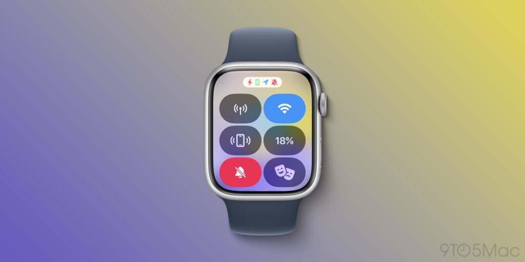
Previously, pressing the side button on your Apple Watch would open the App Switcher, but in watchOS 10, Apple changed that to open Control Center. Prior to the update, you would access Control Center by swiping up from the bottom of the watch.
Apple likely made this change so you could access Control Center from any app, but personally I don’t find myself checking Control Center very often. Occasionally I’ll use it to toggle silent mode, but for the most part I don’t need it. Battery life is the main bit of useful data in there, and I can get that by looking at the widget on my iPhone.
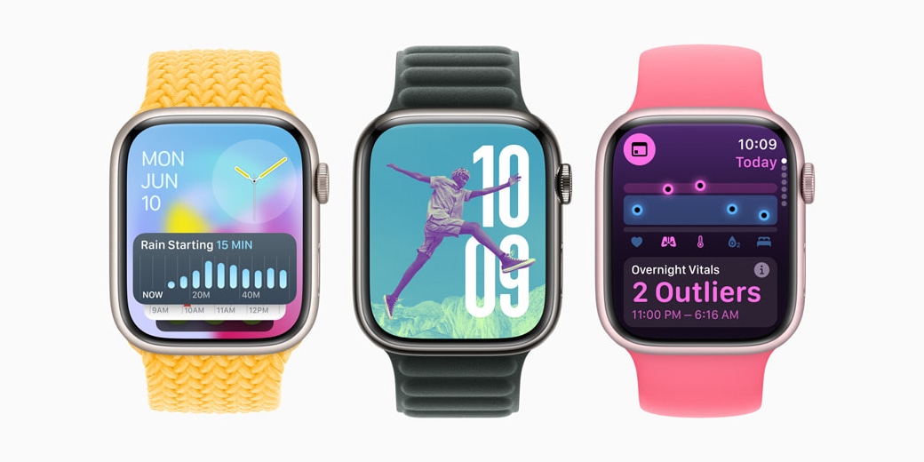
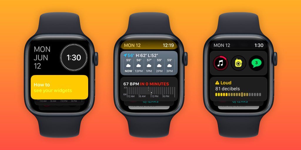
Apple also introduced a new widgets view in watchOS 10, which you access by swiping up from the bottom of your Apple Watch while on the watch face.
This view shows you a bunch of quick widgets such as Weather, Fitness, Stocks, and more. You can also place complications there. With this view, it’s easy to quickly monitor things or bounce into another app quickly, and with watchOS 11 it even has support for showing Live Activities.
I actually like this new interface quite a lot. However, because of how you’re meant to access it, it’s not very easy to integrate into your routine.
What Apple should add in future watchOS
I think Apple should simply add an option to swap these two gestures. While some people might be used to the new navigation methods, I’d still prefer the old ones if they were an option.
That way, you can swipe up from the bottom to access Control Center – as it was in watchOS for many years prior to watchOS 10. This change was a learning curve for many users, and I think Apple is well aware of the fact that its a learning curve, given the fact that they present a gestures tutorial when you update your Apple Watch.
If the gestures were inverted, you’d also be able to open up the widgets view from any app, which could be convenient for getting a quick glance at a piece of information without having to switch out of the app you’re in. And the best part is, it’d just be an option. If you prefer it the old way, you can keep it like that.
What do you think about this navigation change in watchOS 10? Do you still wish Apple would change it, or have you already come to prefer it? Let us know in the comments below.
Follow Michael: X/Twitter, Threads
FTC: We use income earning auto affiliate links. More.