While some are calling it boring, there are lot of great spec updates in iPhone 16 Pro Max with the most impactful being significant improvement to photography workflows that affect everyone.
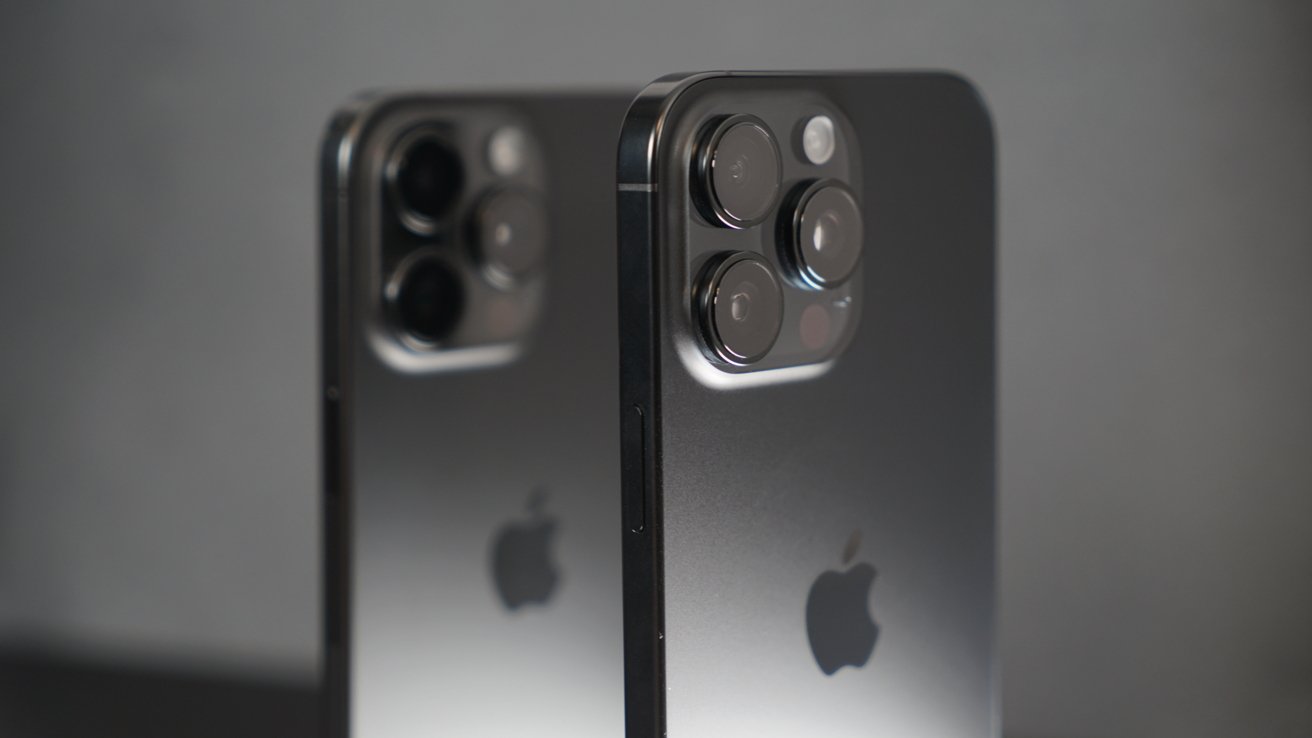
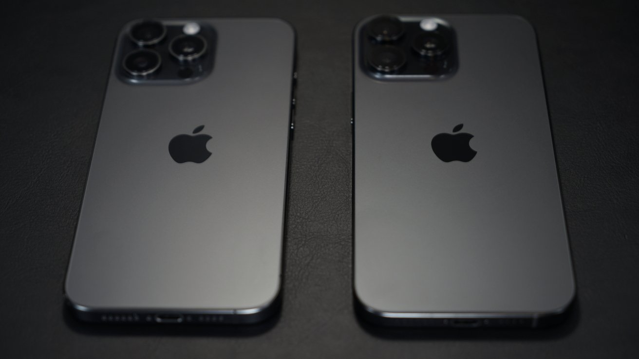
Iteration is only a sin if it isn’t being useful, and iPhone 16 Pro Max manages to be a quiet leap over iPhone 15 Pro Max despite looking nearly identical. The only real giveaway besides color is the incredible size of the device and the new button.
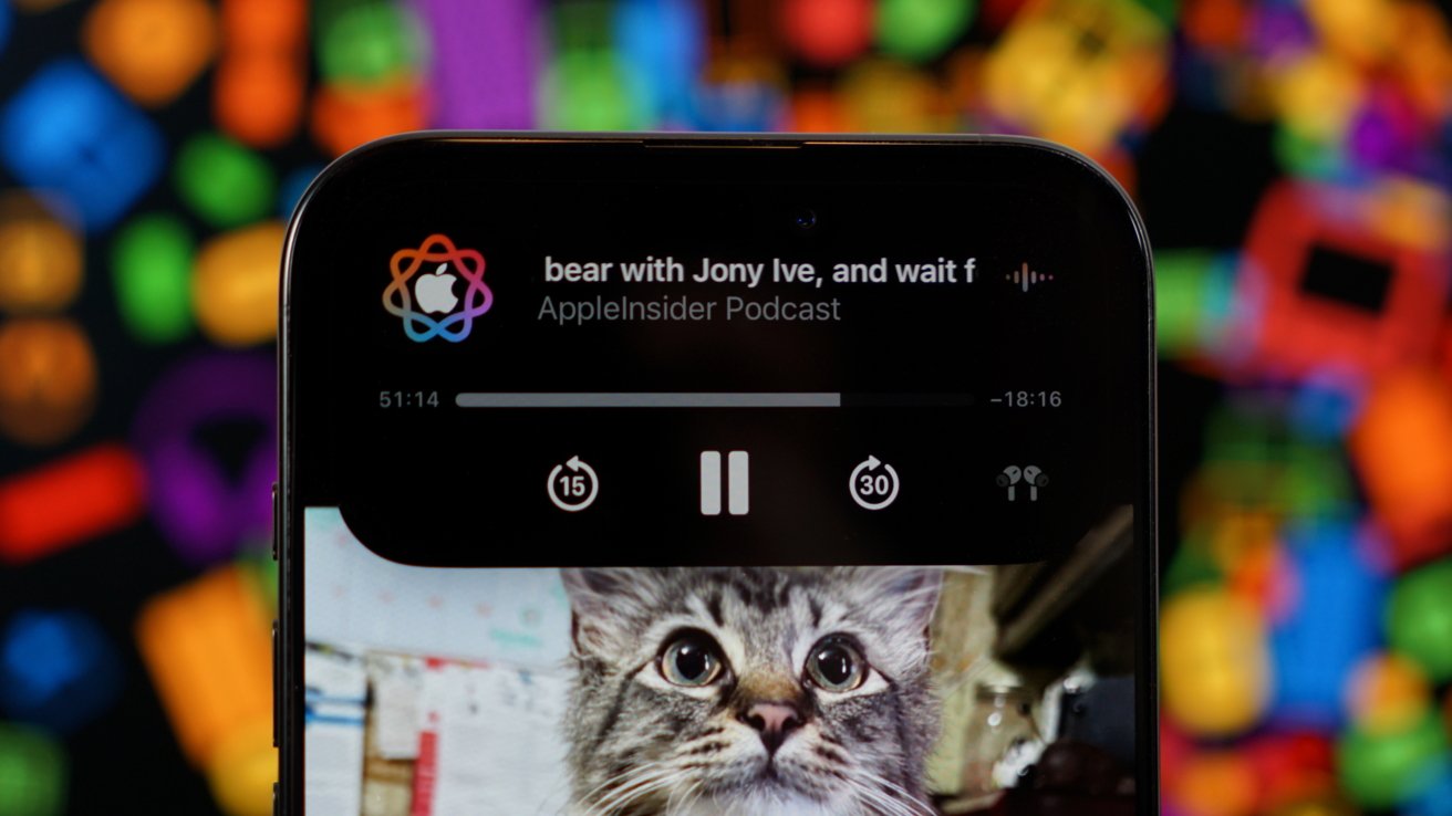
The last few iPhones have gone beyond the usual processor and camera updates by adding in some kind of special feature. iPhone 14 Pro included the Dynamic Island, iPhone 15 Pro added the Action button, and now iPhone 16 Pro has Camera Control.
Apple has spent the last 17 years perfecting the iPhone, and while there is always room for improvement, the rate of change has slowed greatly. Between a lack of space for more components and a plateau in what’s possible for a smartphone, it’s getting harder to truly impress each year.
Apple Intelligence was a big bet, and it may still pay off despite not being in the iOS 18 release. So, this review will focus on everything outside of those features, even though they are available in beta.
I could tell right away this was going to be a tough review to write, not because it was a boring upgrade or lacking features, but much of what makes iPhone 16 Pro Max special is below the surface. The biggest upgrade isn’t even unique to the iPhone 16 Pro Max, but more on that later.
Top of the line iPhones get consistent scores, but for different reasons. My iPhone 14 Pro Max review emphasized the UI shift and real-world use cases provided by the Dynamic Island and brighter display, while my iPhone 15 Pro Max review focused on the impact of “seven cameras in your pocket” and the unique tetraprism sensor.
The iPhone 16 Pro Max didn’t change anything externally, which will make most onlookers call this an undesirable “s” year. However, A18 Pro, the promise of Apple Intelligence, Camera Control, a new photography pipeline, cooler operating temperatures, a larger display, and longer battery life all greatly affect day-to-day use — making this anything but a boring update.
iPhone 16 Pro Max review: Design
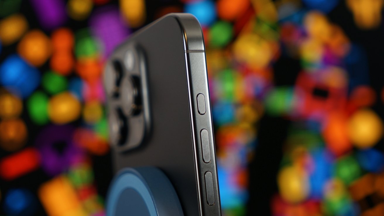
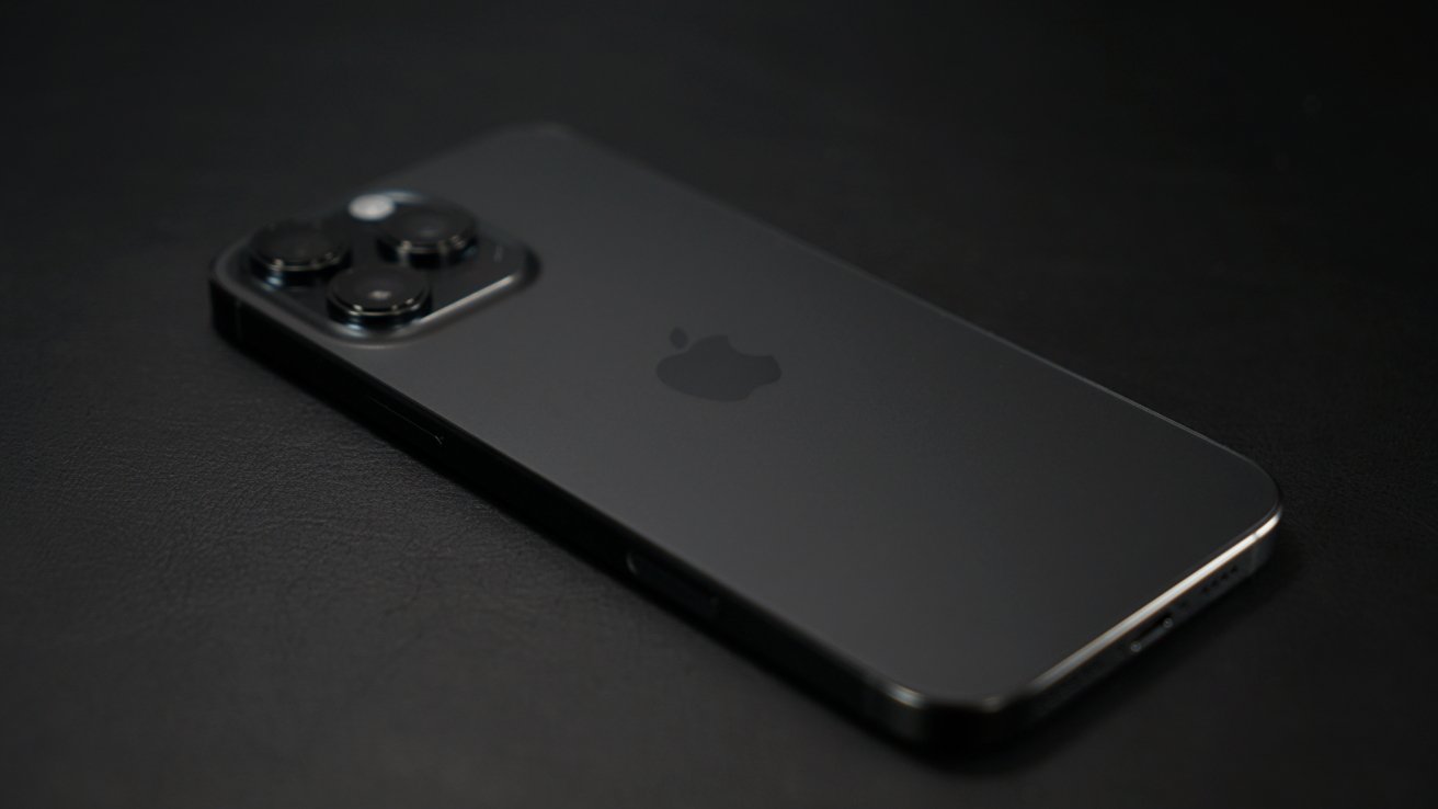
Beyond color and Camera Control, you’d be hard-pressed to find a single external difference between the iPhone 16 Pro Max and iPhone 15 Pro Max. The black titanium is a darker shade on the edges and back, but that’s it.
Yes, the display and device are larger by a smidge, but your eyes won’t see that difference easily with the display off. You’ll notice it most when using apps, like Mail, where the UI stretches ever so slightly more, providing more information, more rows, or bigger images.
Trimming the weight in the iPhone 15 Pro Max set the stage for making the device bigger for the iPhone 16 Pro Max. Incredibly, despite the bigger display and longer battery, it is still much lighter than the iPhone 14 Pro Max — that’s the weight savings from moving to titanium from stainless steel.
The iPhone 16 Pro Max is 7.99 ounces, up from 7.81 ounces for the iPhone 15 Pro Max, but under the iPhone 14 Pro Max, which weighed 8.47 ounces. It’s bigger in height and width, but it maintains the same 0.32-inch depth.
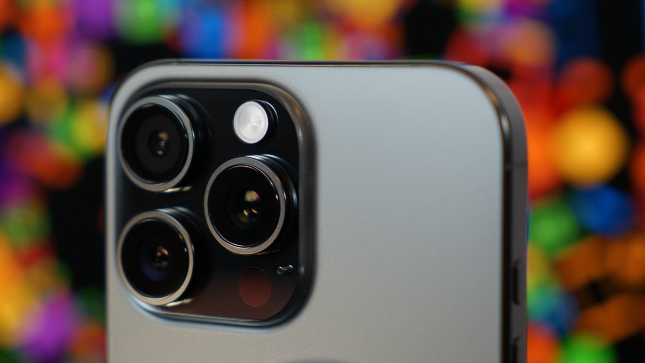
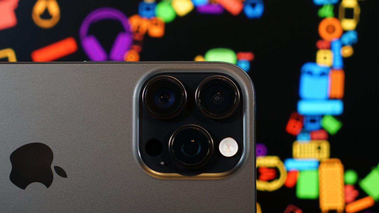
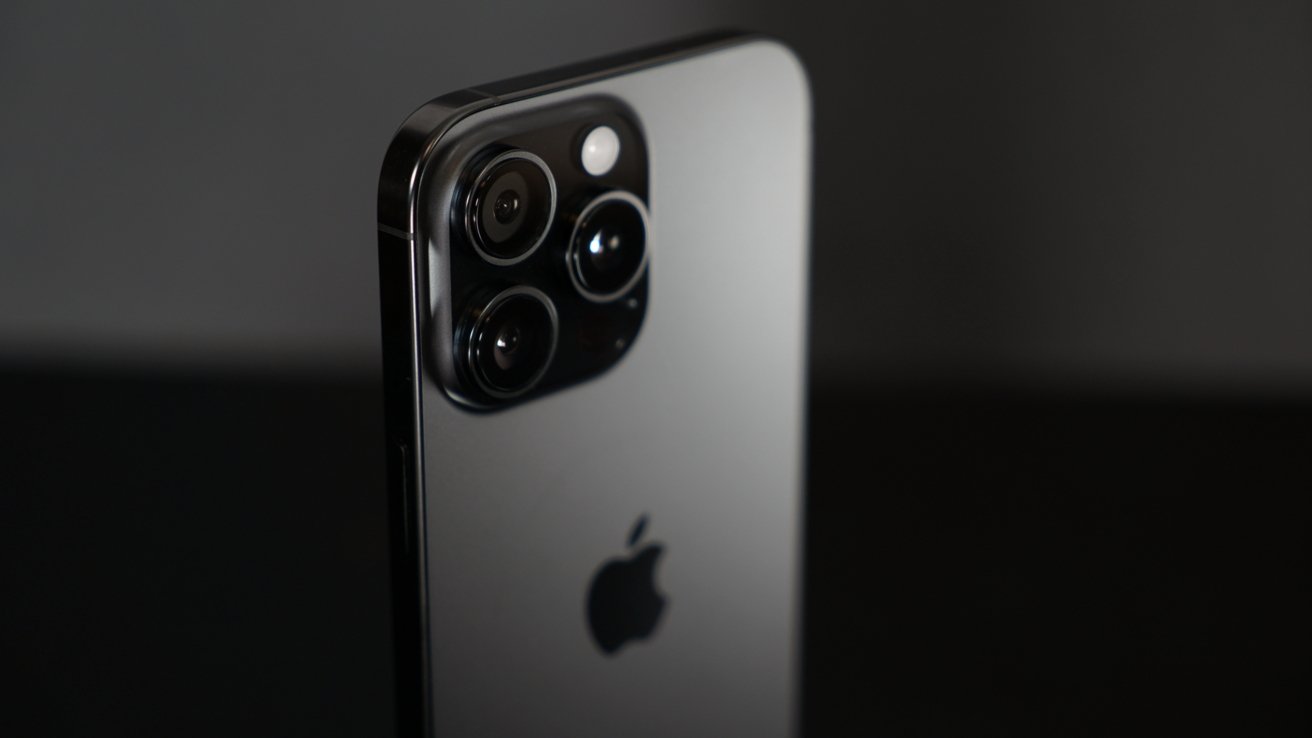
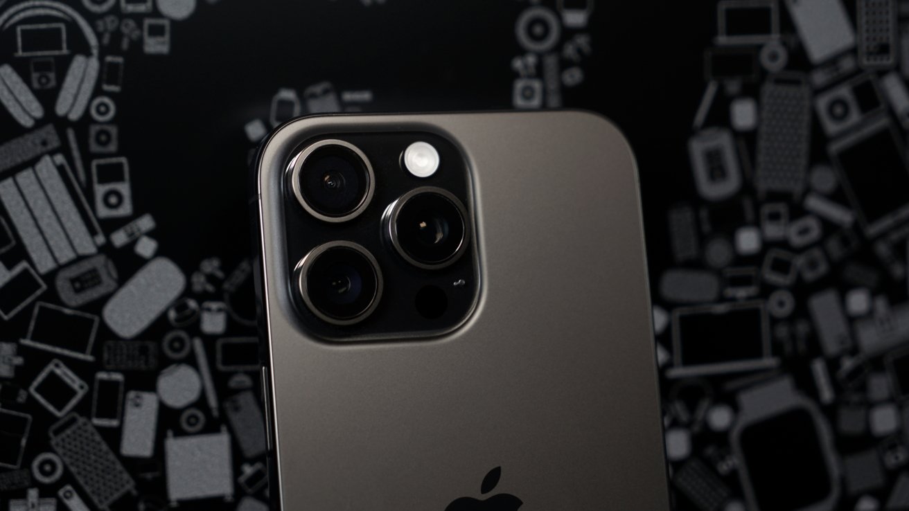
Camera specs are upgraded in some respects, but that didn’t change the layout of the camera bump. It sits at the same height and shape as before.
I will continue to complain about the IP68 water resistance rating until something changes. The rating has existed since the iPhone 12, and we are no closer to intentional submersion for underwater video than before. Though, it seems doubtful Apple would ever promote such a feature even if the iPhone would survive, just for liability reasons alone.
External design is a significant selling point for many upgraders. That’s why new colors like desert titanium will always sell best.
The larger and heavier iPhone 16 Pro Max doesn’t feel that way in the hand. Despite changing almost nothing externally, Apple gave users more screen real estate and battery life with seemingly zero negative tradeoffs.
iPhone 16 Pro Max review: Display
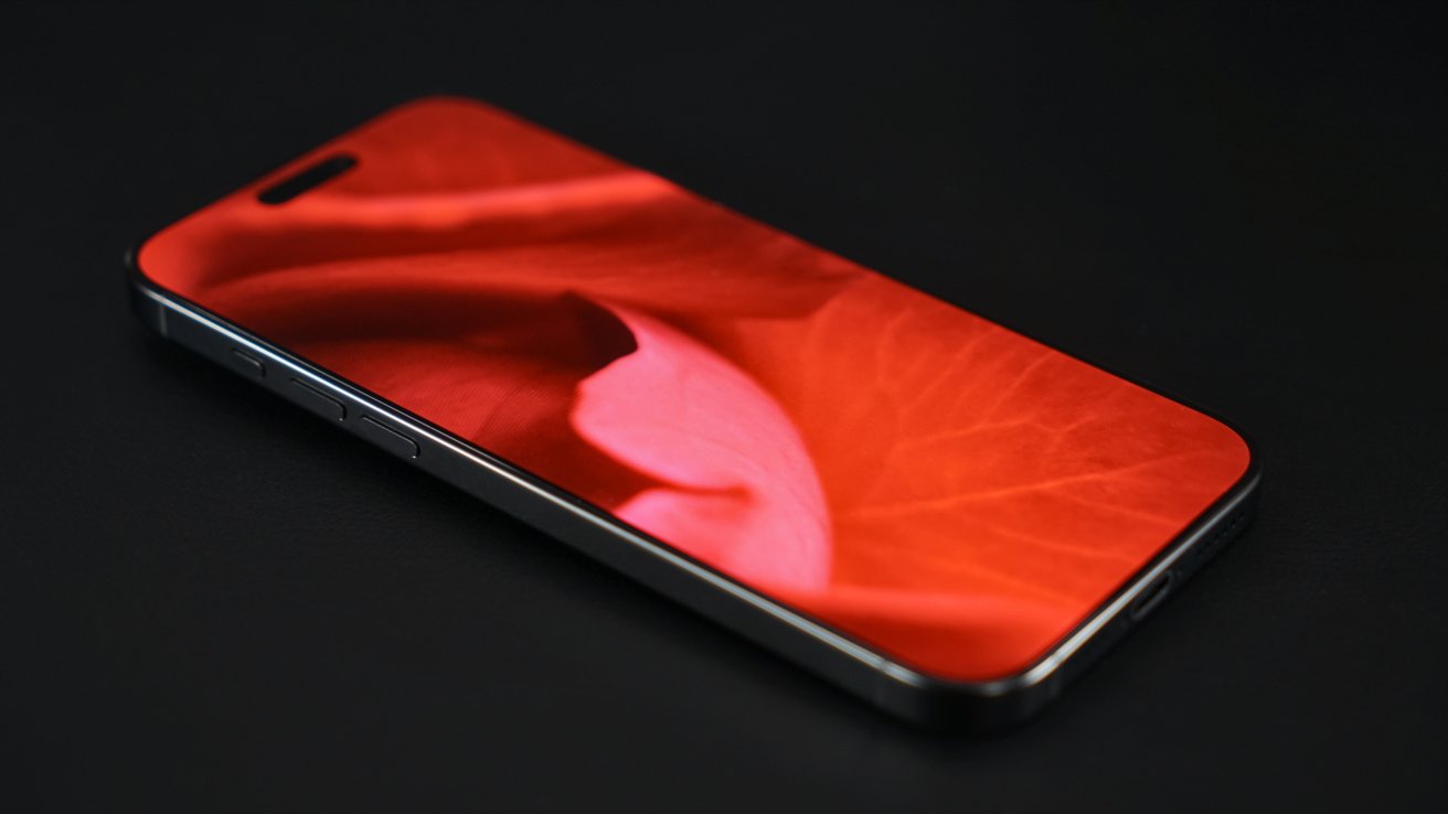
Apple increased the display size from 6.7 inches to 6.9 inches. That’s it.
I wish it were that easy to move along, but I’ll explain what’s actually here. Operationally, nothing has changed for the user year over year.
The Super Retina XDR display has ProMotion, always-on, Dynamic Island, HDR, P3, and 2,000 nits peak brightness. There is a new 1 nit minimum brightness that is handy for dark rooms, and the ceramic shield is improved to be “tougher than any smartphone glass.”
Even though the display increased in size, Apple kept the same 460 ppi that’s been there since iPhone 14 Pro Max. That required a tiny bump to 2,868p by 1,320p.
I’m not going to intentionally scratch my iPhone display or launch it from my bicycle’s handlebars (again), but I trust there’s some work being done to ensure the display doesn’t shatter easily. However, anyone that has studied material chemistry knows that making the glass more shatter resistant means it is potentially more prone to micro scratches.
I’ve never been a fan of screen protectors, but considering my iPhone 15 Pro Max had a few good scratches after a year of use, I may need to get one. Especially if the new model is potentially more prone to scratches.
iPhone 16 Pro Max review: Cameras
I was ready to do an incredibly in-depth camera comparison for the iPhone 16 Pro Max, but as I began shooting photos, I realized the point may be moot. Apple has made the iPhone a consistent camera every year, and this release isn’t any different.
There’s also the new 4K 120 fps video shooting mode, which results in stunning slow motion or crisp video at full speed. I’ve never been one to shoot a lot of video, but I am happy to have this new ability on the camera in my pocket.
The new audio recording options are amazing too. I’ve tested shooting various videos of street performers or people talking and have heard incredible results in the microphone isolation options. It’s not something I can demonstrate in this written review, so give it a try yourself or check out our YouTube channel where Andrew will inevitably test the feature.
OK, let’s talk about photos.
The Tetraprism 120mm camera returns with identical specs to the new ISP and photo pipeline, so I’m not focusing on that camera in this review. Just know that some images captured in some conditions may be slightly improved thanks to that better pipeline, and you get the new reversible Photographic Styles in the Telephoto Camera too.
I’m going to get the 48MP Ultra Wide Camera out of the way first, as it’s the most changed, yet easiest to discuss. It’s a big deal for all iPhone photography.
48MP Ultra Wide and macro
The most significant camera upgrade in iPhone 16 Pro Max is to the Ultra Wide Camera. Increasing the resolution to 48MP means improved detail in regular shots and macro.
Now that the Fusion Camera and Ultra Wide Camera are operating at the same resolution, users don’t need to worry about a loss in detail when taking close-up photos. That range between using macro mode or not is used a lot for pets, food, and nature, and it was never a good experience to see a lower-quality photo as a result.
The photo output from Ultra Wide is 12MP by default unless shooting ProRAW. However, macro mode will always take a 12MP photo.
That doesn’t mean the resulting photo is worse than the Fusion Camera’s 24MP output, it just means it is using twice as much pixel binning, likely for light gathering. The result is macro or ultra wide photos that have more sharpness, color, and detail than what could be captured from iPhone 15 Pro Max regardless of the final megapixel count.
Macro photos are stunning. Landscapes are detailed. You no longer have to worry about shooting with the Ultra Wide Camera, as it is no longer compromised.
Comparing images taken in my dim office, the iPhone 15 Pro Max shot more noisy, less saturated photos whether it was macro or ultra wide. The Ultra Wide Camera is finally as consistent and reliable as the main Fusion Camera.
Fusion Camera
The new 48MP Fusion Camera should result in consistently better images, though Apple kind of skipped over the why. It appears that the photo production pipeline has been reconfigured to result in more natural, crisp images by combining a well-exposed image with a high-resolution sharp image.
That process was happening before, but it appears to be more efficient with the improved ISP in A18 Pro. Most photos taken in bright lighting should look nearly identical between the iPhone 15 Pro Max and iPhone 16 Pro Max, but conditions that were more challenging for iPhone 15 Pro Max will be less challenging for iPhone 16 Pro Max.
Normally, this is where I’d stack a bunch of images taken on both devices for comparison. I believe we’ve crossed a line in iPhone photography where I’m just wasting your time making you slide between two basically identical images suffering from web compression.
Instead, you’ll see photos straight from iPhone 16 Pro Max with different Photographic Styles and edits all performed in the Camera or Apple Photos app. There is nothing to compare to iPhone 15 Pro Max, because without the upgraded Photographic Styles and new image pipeline, you’re just taking a high-quality iPhone photo.
So, while those ISP upgrades and photo pipeline changes will result in marginally better photos year over year, let’s look at what actually makes a big difference. And it’s a feature available in all iPhone 16 models — reversible Photographic Styles.
Photographic Styles make iPhone photography better for all users
The important takeaway is this — if you buy one of the previous two iPhone Pro models, you’ll get natural, consistent, and sharp photos. However, there is a big step up in iPhone 16 Pro Max with the new photo pipeline that implements reversible Photographic Styles.
I believe this is a net positive. When you see dramatic changes in how photos look from generation to generation, that means the smartphone maker either didn’t have confidence in the previous output, or they are chasing trends instead of having an opinion.
Apple very clearly has an opinion on photography, one Android manufacturers seem to be diverging from — reality. Every photo you capture on iPhone should represent that moment as a realistic snapshot, not an idealized dream.
No, that doesn’t mean Photographic Styles contradicts that mentality. Instead, it means users get greater control of the output to achieve an image that represents their artistic vision while maintaining realism.
Apple isn’t fundamentally changing the photo or its contents by adding AI-generated balloons or flowers. It is making professional-level color grading possible with a tool that feels as easy as an Instagram filter, but technologically closer to spending time in Photoshop.
Photographic Styles were introduced as a way to apply a preconfigured and permanent style to every photo you took. The approach was clever — introducing changes to tone and saturation during development rather than after.
However, the process was irreversible and meant most people would never use Photographic Styles except as an afterthought. Now, you can shoot with a style enabled, reverse it after, or apply a whole new style in post.
But these aren’t filters by any stretch. Photographic Styles exist deep in the image development pipeline in a way that changing them is like going back to the dark room and using different processes.
Photographic Styles intelligently account for foreground, background, and skin tone. You’re not going to turn people purple or make the image look over-processed by applying a style.
Some Photographic Styles lean into more surreal grading, while others use natural lighting. Finally, you can take complete control every time you click the shutter and get away from the “Shot on iPhone” default look without needing a complex photo editor or editing skills.
The best part is you can set a default Photographic Style from the original set that is automatically selected when opening the camera. And even though it’s selected by default, you can still reverse it afterward.
Like with capturing Portrait Mode data with every photo, it removes some of the thought process and lets you just take photos. The next logical step in Apple’s camera pipeline will be to enable spatial capture data without being in that mode.
Also, the Photographic Styles data is portable, so you can shoot on your iPhone 16 and edit on your iPad.
Spatial Photos
I’m likely one of the more heavy Apple Vision Pro users that still exist on the market, so of course I’m going to discuss the one specific feature available on iPhone — spatial photos and videos. However, like with the rest of the Apple Vision Pro platform, there’s not much to say.
You’d think that introducing a new 48MP sensor to the Ultra Wide Camera would somehow improve the feature that uses it and the Fusion Camera for 3D photos and video. Turns out, no, that isn’t the case.
Resolution is a useful metric, and Apple could one day target that sensor and produce 4K spatial video by cropping the sensor in a way to ensure both the Fusion Camera and Ultra Wide Camera capture identical fields of view and resolution. But for now, Apple has chosen to replicate the spatial video and photo pipeline exactly in a way that creates identical results across generations.
So, no, for now you’re not getting any benefit from shooting spatial anything on an iPhone 16. However, third-party apps like Spatialify could find a way to take advantage of the larger sensor, but it is too soon to tell.
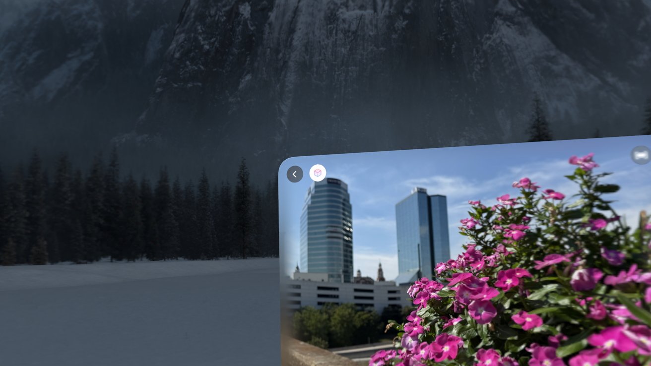
I also wanted to compare spatial photos with converted 2D to 3D photos — a feature of visionOS 2. The results are somewhat inconclusive.
Looking back at old photos taken on ancient iPhones or DSLRs that lack included depth data, the 3D conversion effect is still quite solid. Older photos might run into poorer conversions or artifacts because of that lack of data.
However, new photos bundled with the depth data captured in most recent iPhones provide enough information for near-perfect 3D recreations. Apple Vision Pro still takes better 3D photos due to the perspective and number of sensors, but whatever behind-the-scenes magic occurs when creating spatial photos on iPhone appears to be identical to the process of converting a 2D photo to 3D.
I don’t have unique insight into this process and could be wrong. But I believe there is a significant chance Apple is capturing depth data with the iPhone sensors and converting the resulting image into 3D using the same process as Apple Vision Pro’s conversion feature.
If not, that’s more of a compliment to the 3D conversion process than the limited ability for iPhone to capture depth data. So, I want to know if there is any point in shooting spatial on iPhone.
My conclusion is this — never shoot spatial photos on purpose because you’ll get more usable data by taking a regular photo and can convert it later. If you decide to capture spatial photos, do so only after you’ve taken regular photos as a backup.
Spatial video should be treated somewhat similarly, but note there isn’t a video conversion feature. You need to set out to shoot spatial, but only do so after you’ve captured 4K 60 fps, or 120 fps, of the same event. If you know you only have one chance to capture the footage, always choose the 4K option over spatial.
iPhone 16 Pro Max review: Camera Control
The iPhone has more hardware dedicated to capturing photos and video than it does for making phone calls. If it weren’t for the power behind the brand of iPhone, it would seem Apple should call it some kind of smart camera.
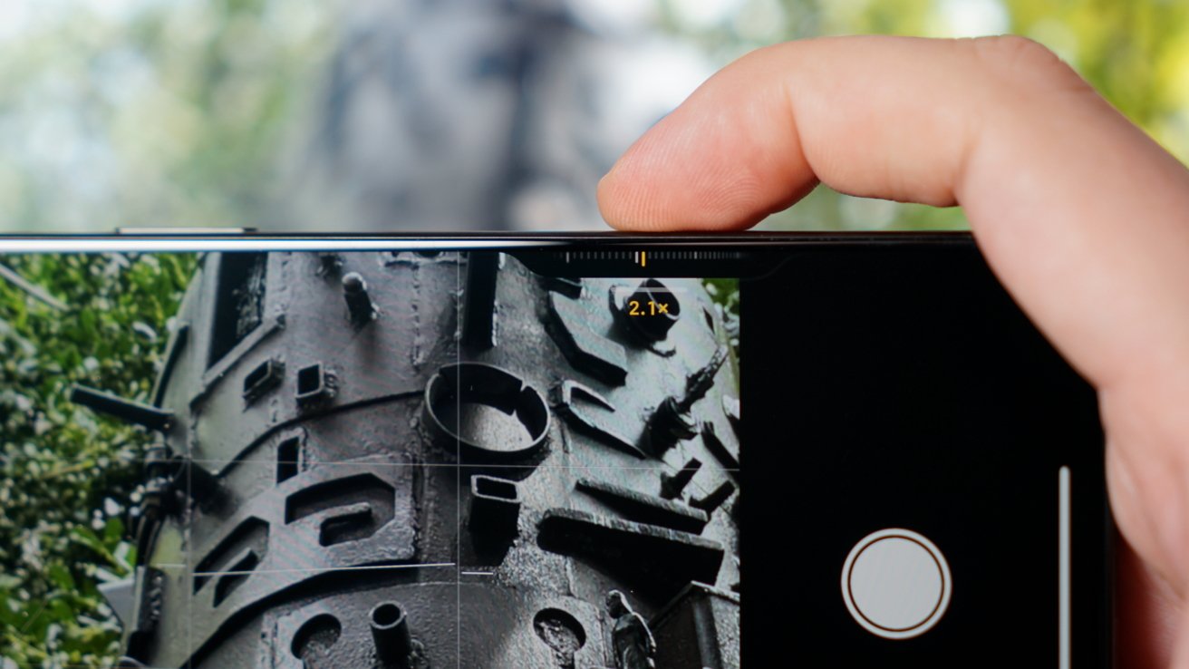
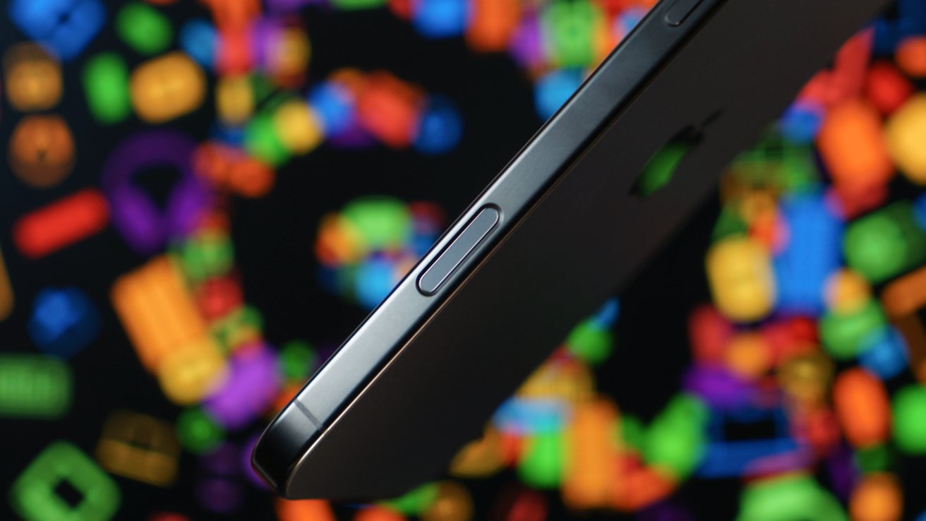
Beyond the seven cameras in your pocket and the improvements to each, there’s even more camera hardware to discuss — Camera Control. The aptly named button that Apple won’t call a button introduces a useful tool in iPhone photography.
I won’t call it a game changer, at least not at this early stage. Camera Control is excellent, but it is going to take an effort to get used to.
There is certainly a learning curve and a danger of having it lie forgotten until it is accidentally pressed, not unlike the Action button. Sure, I use the Action button, but after a year I’ve only just started using it regularly and thinking of new ways to program it.
Muscle memory is hard to break. Every time I want to open the Camera, I have to remember I can press a button on the side, but sometimes I’m already halfway to swiping my way to the App Library to hit the icon when I’ve realized.
None of that is against Camera Control. I’m quite happy it exists and its implementation is completely unique.
Sure, other smartphones have had camera buttons for ages, even since the days of the flip phone. Apple once toyed with the idea of a camera shutter button on its iPhone Smart Battery Case.
Ever since I tried that shutter button, I’ve wanted more hardware camera systems on iPhones. I reviewed the ShiftCam SnapGrip with MagSafe charging and a remote shutter, but it performed like any other Bluetooth-connected shutter.
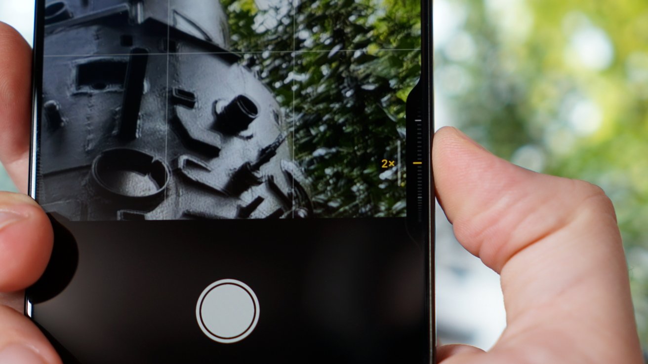
Camera Control is something else. It is three buttons in one that can be pressed, half-pressed, or tapped, and swiped.
If your iPhone is asleep, one press will wake the device, and another opens the Camera app. Rest your finger firmly on the button, and it’ll open the current tool, like Photographic Styles. Firmly press twice in quick succession to bring up the tool selection menu.
Every time I’m using Camera Control, I miss the on-screen UI. I feel like once I get the options memorized, I’ll fly through everything quickly.
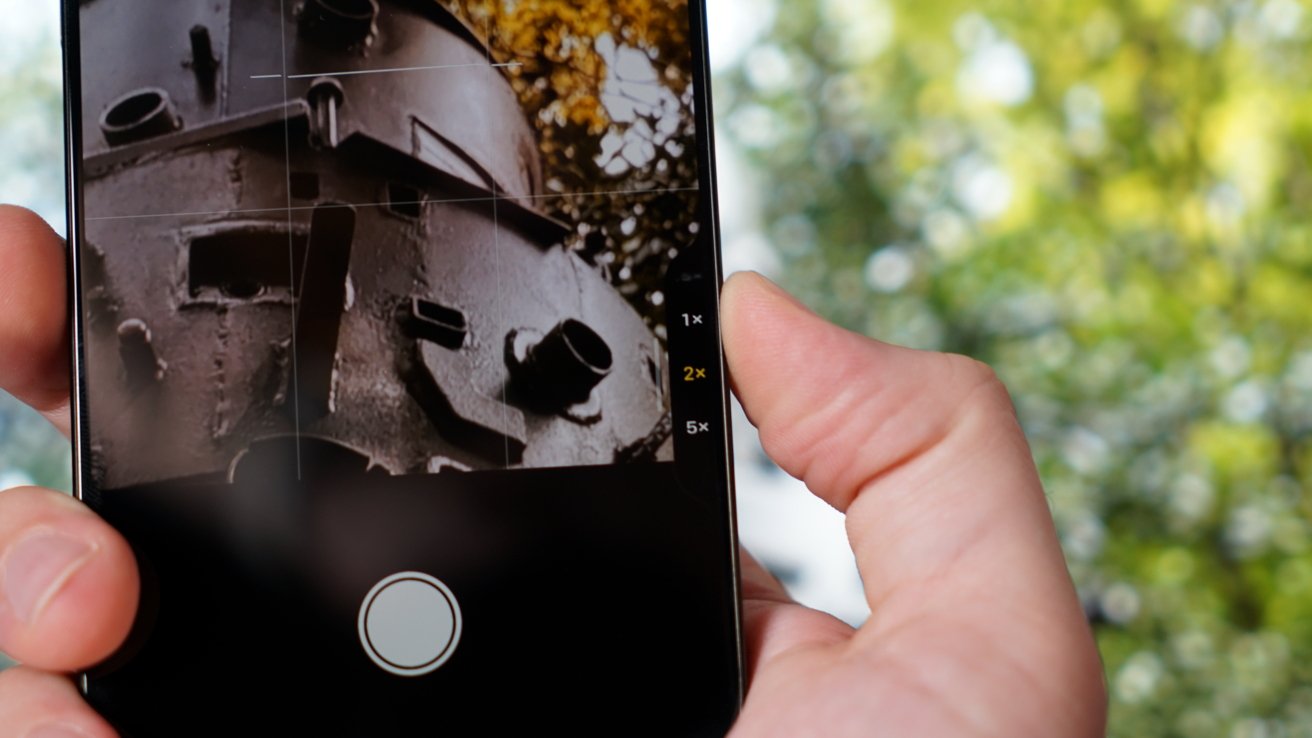
There are some oddities with the system I hope to see updated in future iOS releases. In both the zoom and camera selection tool, you’re unable to select the 1.2x or 1.5x zoom levels without fiddling with the dial.
Now, let me contradict that complaint right off. Apple chose those zooms as part of the “seven cameras in your pocket” because they create effective focal lengths of 24mm, 28mm, and 35mm using the 1x, 1.2x, and 1.5x, respectively.
When shooting at these focal lengths, you’re automatically shooting the 24MP “fusion” photos using the photographic pipeline that combines the full 48MP image with multiple exposures into a high-resolution, high-contrast composite 24MP photo.
So, it actually isn’t necessary to have those particular focal lengths as presets in the zoom dial view since anything between 1x and 2x will shoot at 24MP using that pipeline. That said, the “Cameras” selector tool should include those focal lengths as presets to swipe between.
The other tools include Exposure, Depth, Styles, and Tone. They are obvious choices for Camera Control, but you will still need the main Camera app UI for toggling flash, Dark Mode, Live Photos, and ProRAW.
I believe this is the right choice, as burying every option in the fiddly button would get cumbersome very quickly. That said, Apple should rethink the Camera app UI with Camera Control in mind. The disappearing act of the current UI is jarring, and I may get used to it, but I wonder if Apple shouldn’t reshuffle everything since every iPhone 16 and newer will have the hardware.
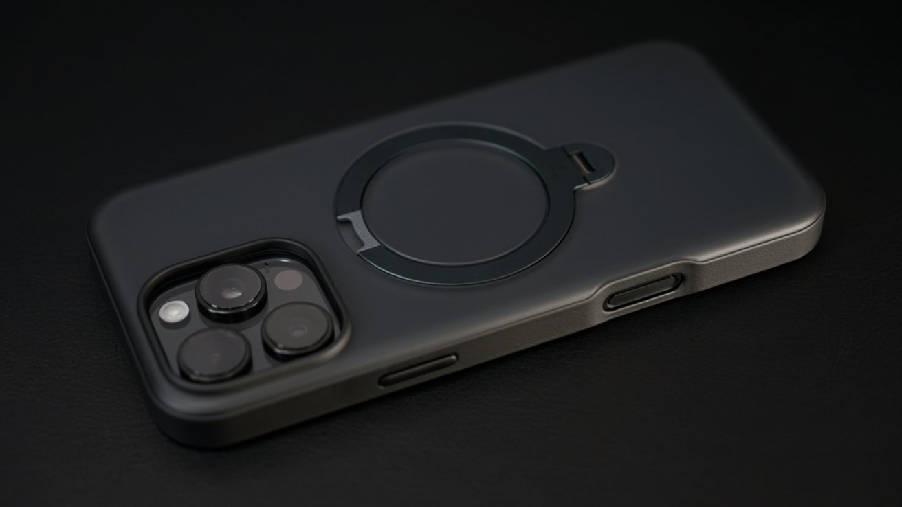
One of the big stories around Camera Control has been how case manufacturers are handling it. Apple’s approach is obviously the most elegant with the sapphire glass cover, while other case makers are going with a cutout.
Depending on the cutout, it is a fine alternative to what is surely an expensive addition from Apple. Swipes, firm presses, and taking photos all work fine with a case, but bulky cases with deep cutouts are likely to be an issue.
I use the Nomad Magnetic Leather Back, which is basically a slab of leather that attaches with MagSafe and leaves the sides exposed. So, I get the full use of Camera Control.
What I’d love to see is third-party case makers build new and interesting interaction options for Camera Control. Perhaps using sapphire glass to get controls through like Apple, but adding grooves or touch points to tell the user where their finger is sight unseen.
iPhone 16 Pro Max review: A18 Pro
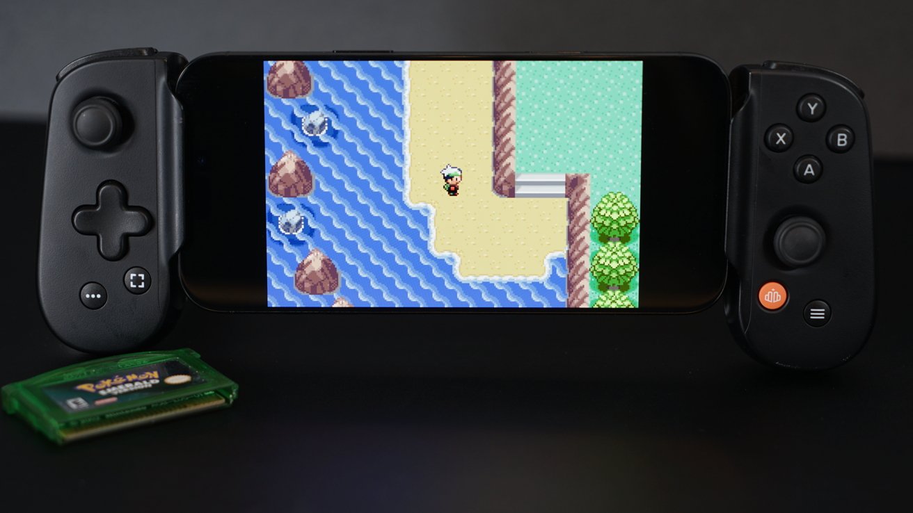
Apple’s gaming promises didn’t come to pass (shocker, I know). The The A17 Pro had everything it needed to make iPhone an attractive AAA gaming powerhouse, yet in 2024 we’re looking at the same lineup as 2023 plus one popular Chinese Genshin Impact-like game.
I don’t want to spend a lot of time on games in this initial review, because frankly, I’ve not spent a lot of time gaming in recent weeks. Sure, Resident Evil 4 runs a bit smoother and Assassin’s Creed Mirage looks as good as ever, but the specs tell us that would be true.
It’s the lack of new and unique console-grade titles on iPhone that have me returning to my comfort games that require little to no processing power. Games like those found in emulators or the never-dying Minecraft.
I want to talk about gaming on iPhone, but there’s nothing to say until Apple does something about it. So, let’s get on to the A18 Pro and its specs.
Benchmarking A18 Pro
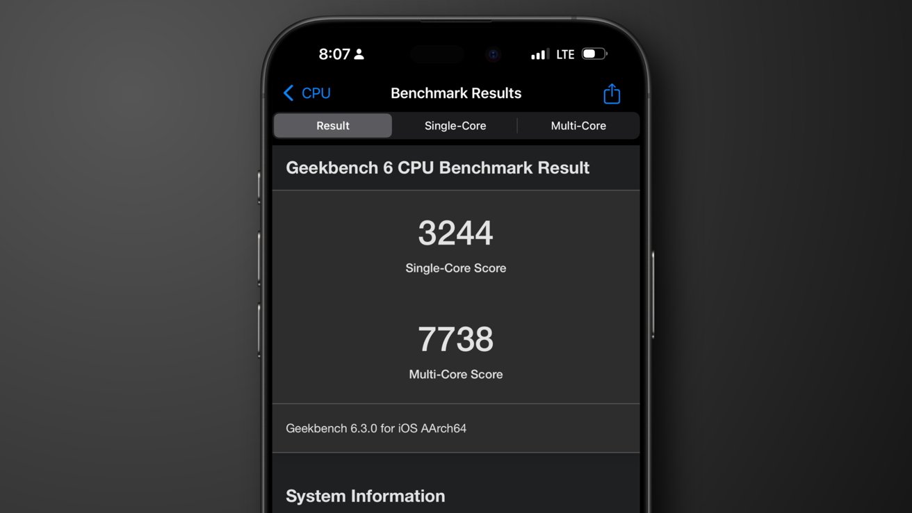
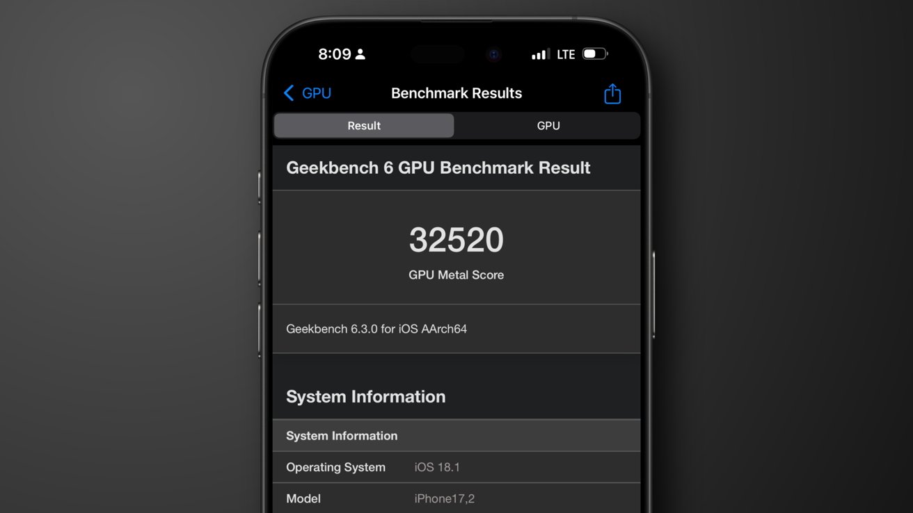
When I ran Geekbench on iPhone 16 Pro Max, it showed the A18 Pro has a single-core score of 3,244 and a multi-core score of 7,738. The metal score is 32,520. These scores were a bit lower than other iPhone 16 Pro Max scores, but likely due to my active apps, room temperature, battery percent, and other factors.
Even so, that’s a step up from the iPhone 15 Pro Max with a 2,864 single-core score and a 7,076 multi-core score. Its metal score is 27,085.
The 6-core GPU is built with what Apple calls desktop-class architecture that results in 20% faster performance over the A17 Pro. Ray Tracing is twice as fast too.
There aren’t any concerns with heat either — none that I’ve encountered anyway. It seems the new cooling considerations have solved whatever problem people had with overheating in the iPhone 15 Pro Max.
The 6-core CPU is 15% faster. Since recent iPhones have never really struggled with running iOS or most apps, these speed gains don’t really translate to regular use, but instead to power savings.
A18 Pro is built on a second-generation 3nm technology, which Apple says is the first smartphone to use. Apple focused on the 16-core Neural Engine, which was designed for Apple Intelligence.
Since Apple Intelligence isn’t available to the public yet, there’s not much to say here. The chip is likely better than the A17 Pro at these AI tasks, but I’m interested in how it performs versus the M4.
iPhone 16 Pro Max review: MagSafe, USB-C, & Action button
Larger displays, longer battery life, Camera Control, the A18 Pro, 48MP Ultra Wide, Fusion Camera with 120 fps 4K video, and several other upgrades make up a solid year for the iPhone. There are a few other less impactful features I wanted to round up here.
The iPhone 16 lineup is upgraded to Wi-Fi 7, which is meaningless to most consumers that likely barely just upgraded their home networks to Wi-Fi 6 or 6E.
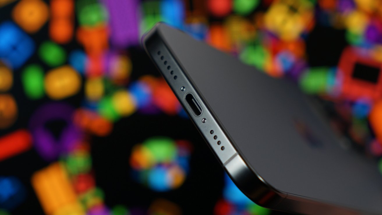
The USB-C port is unchanged and still operates at USB 3.0 speeds. Connecting an external SSD to record ProRes Log is still an option.
MagSafe got upgraded to enable 25W charging, but of course, you’ll need all new charging stands and pucks that support this speed. I’ve never had an issue with 15W, so I’m not going to rush to the store to upgrade the many charging spots in my home.
The Action button still exists, but I’ve struggled to make it a part of my daily routine throughout the year. It was used a lot at first, then forgotten briefly, and in the past few months, I’ve tested different configurations.
It is a muscle memory issue I hope to overcome. I expect when I find something compelling enough to assign to the button, it’ll make me use it more. For now, it is a novelty — very unlike Camera Control.
Finally, I want to mention battery life. The time I’ve spent with the iPhone 16 Pro Max hasn’t been enough to test the battery performance to any extreme, so I can’t speak to it directly. But more is always good, and the iPhone 16 Pro Max is the best rated ever at 33 hours for video playback.
iPhone 16 Pro Max review: not boring, but not perfect
I seriously doubt we’ll ever see the “perfect” iPhone. Each year we’re given new iterations on cameras and processors like clockwork, and if we’re lucky, we’re offered a special new bit.
As I highlighted at the top, Apple has been on a feature addition spree of sorts over the past few years. The Dynamic Island, Action button, and Camera Control arrived one after the other in spite of commentary suggesting Apple is boring and stuck in a rut.
In the 17 years of iPhone, it drastically saw its design change once with iPhone X. Interaction paradigms shifted slowly. But in four years, we’ve seen a ton of upgrades across every system on the product.
I mean, Apple added an entire multi-touch, force-sensitive button. That’s anything but boring.
Compare the iPhone 12 Pro Max to the iPhone 16 Pro Max, and the differences are astronomical. Most buyers are on a somewhat similar scale, and it is important to remember that when reviewing a product.
Sure, the iPhone 16 Pro Max looks nearly identical to the iPhone 15 Pro Max. The number of impactful new features can be counted on one hand, but that doesn’t matter to 90% of people on the market buying these devices because they aren’t upgrading from the 2023 model.
The complaints I had in 2022 with the iPhone 14 Pro Max were mostly addressed last year. The iPhone 16 Pro Max polishes the product further to the point that my only real annoyance is with the ancient and unchanging water resistance rating.
Apple’s iPhone is a mature product, and every useful iteration is an achievement. If the iPhone 16 Pro Max is boring, then I’d love to find a single company on Earth that wouldn’t want such a boring product in their lineup too.
I’ll be back to discuss more of the iPhone 16 Pro Max and how Apple Intelligence affects the product later. For now, I can easily recommend anyone looking to upgrade from an iPhone 14 Pro Max or earlier to make the leap.
iPhone 16 Pro Max review — Pros
- Bigger display, longer battery life, no noticeable adverse effects
- Improved camera systems, ISP, and pipeline
- Reversible Photographic Styles
- Camera Control is a useful addition to iPhone
- Ultra Wide and macro photos vastly improved with 48MP
- 4K 120Hz video provides excellent new option for slow motion
iPhone 16 Pro Max review — Cons
- IP68 ratings are so 2017
- Action button didn’t live up to the hype
- Third-party cases are going to struggle with Camera Control
Rating: 4.5 out of 5
As always, look to the content of the review, not the Google-mandated numerical score, for a nuanced look at how I feel about the product.
Where to buy Apple’s iPhone 16 Pro Max at a discount
Wireless carriers are discounting the iPhone 16 Pro Max, with deals delivering up to $1,000 off at press time.
- Boost Mobile on Amazon: Get an iPhone 16 Pro Max for $0.01, no trade-in required*
- AT&T Wireless: Get up to $1,000 off the iPhone 16 Pro Max with eligible trade*
- Verizon: iPhone 16 Pro Max starts at $15 per month*
- Visible: Get a $360 service credit*
*Terms and conditions apply. Please see site for details.


