Easy-to-access controls and informational widgets have been a core component of smartphones for years, but recent updates to the iPhone and iPad have complicated the situation. It’s time for Apple to re-think widgets.
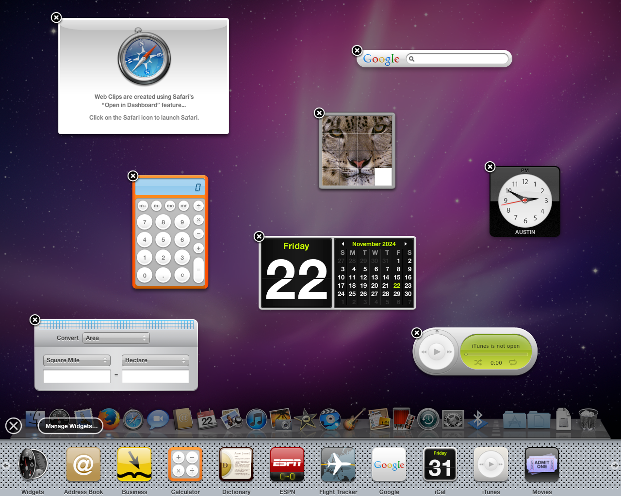
The iPhone, iPad, and Mac all have a long history with widgets. Dashboard, a customizable screen with widgets created by Apple and third-party developers, arrived on the Mac with the release of Mac OS X 10.4 Tiger in 2005. Some of Apple’s Mac widgets became a few of the built-in apps on the original iPhone, like Stocks and Weather.
Eventually, Apple reworked how it handles widgets and status indicators on all its devices. Mac widgets moved to the Notification Center, then Apple added the option to place them right on the desktop with the release macOS Sonoma. The iPhone and iPad received a ‘Today View’ with widget-like information panels, which became full-blown widgets with iOS 14 that could also be placed on the home screen. Apple also introduced a new type of lock screen widgets in iOS 16.
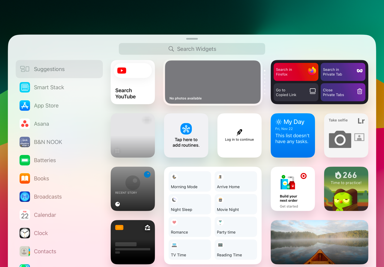
The iPhone and iPad now have standard widgets that can be placed anywhere on your home screen or Today View (the screen visible by swiping to the right from the first home screen). There are some built-in widgets from Apple, and apps installed on your device can provide additional widgets. For example, Apple’s Calendar app has a widget to show upcoming events, and the Weather app has widgets to show temperature and forecast data. Some of them can be resized, too. Widgets on Android phones and tablets work in much the same way.
There are also lock screen widgets, which are still called widgets, but are not the same as the regular widgets. They are smaller and can’t display as much information. Some apps might have regular widgets but not lock screen widgets, some have widgets for both locations but with different options, and some apps don’t offer widgets for either screen.
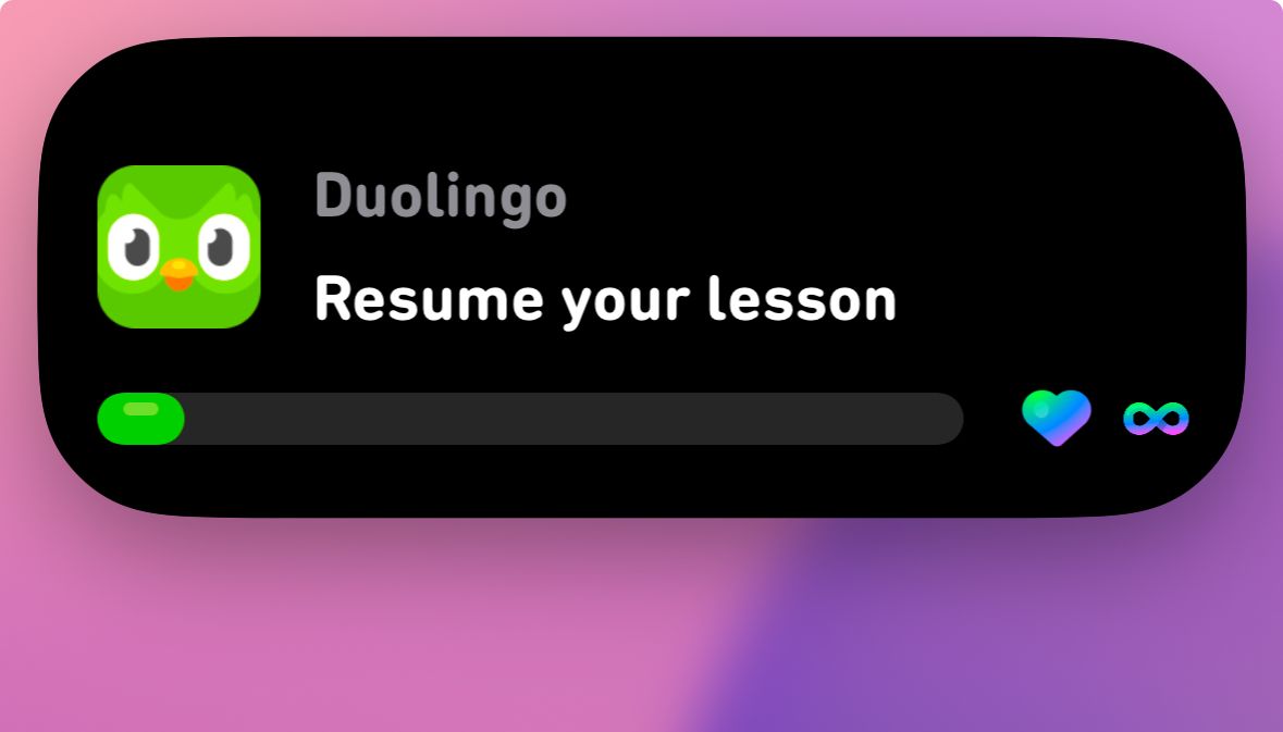
There’s also Live Activities, which are persistent notifications provided by some apps, intended for status updates like sports scores or live delivery tracking. They appear on the Lock Screen, StandBy mode on iPhone, and on top of the ‘Dynamic Island’ screen cutout on some iPhone models.
Even though there is some functional overlap with widgets, they aren’t called widgets, and they can show up on your lock screen along with your actual lock screen widgets. Totally not confusing.
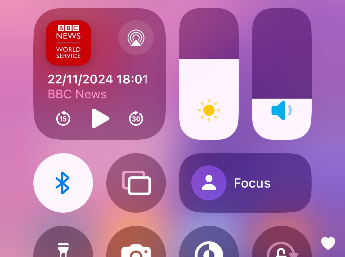
We’re not done yet! The iOS 18 update turned the Control Center into a customizable panel of buttons, menus, and switches. The controls can be added, removed, resized, and reorganized into different scrollable pages. Installed apps can add more controls to the available list. That sounds like widgets, and there is some functional overlap with widgets and Live Activities, but they are not the same thing.
iPhones and iPads now have several different overlapping widget-like functions, and it just makes the entire experience more confusing. The toggle for the flashlight is only in the Control Center, but after it’s on, it also becomes a Live Activity, but also it can’t be placed on the home screen as a regular widget. The ‘Batteries’ widget with battery level information for all my devices can go on the home screen or lock screen, but not the Control Center. There’s a control in the Control Center for creating a new note, but there’s no regular widget or lock screen widget equivalent.
It seems like the Control Center is intended explicitly for buttons and menus, while widgets on both the home and lock screens are more for display information, but many widgets are also buttons. There’s no clear distinction between each interface. Regular widgets, lock screen widgets, Control Center controls, and Live Activities all must be designed and supported separately by apps. Even if a widget or control makes sense in all those places, not all app developers are willing to implement each type of interface.
The situation on macOS is about as complicated, but for other reasons. There are widgets on Mac, which can all go in the Notification Center or on the desktop, but the top menu bar is also used as a location for status ongoing status indicators (just like the taskbar on Windows). However, customizing the location and hiding behavior of each menu bar item is difficult, unless you use third-party apps like Ice or Barbee.
Fixing the Mess
There are a few ways Apple could simplify its mess of widgets and widget-like controls. One option is to allow regular widgets to be placed in the Control Center, in addition to the existing home screen and Today View locations. Ideally, all the controls in the Control Center could also be placed on the home screen and Today View.
If someone wants their Duolingo streak in their Control Center, why not? Apple probably won’t go for that, because the visual design of widgets and controls are different, but it would be the most flexible and customizable option.
Honestly, old Android versions (specifically around Android 4.0) still seem like the gold standard for these overlapping features. You could place widgets anywhere on the home screen, and some devices and third-party apps could add them to the lock screen. The notification panel was just for notifications—the giant clock and optional widgets in Apple’s current implementation takes up space. Tapping one button switched to the quick settings panel with customizable buttons in a grid layout. You could also tell without tapping anything if you had any pending notifications, which Apple doesn’t let you do on iPhone.
I don’t expect Apple to copy Google’s decade-old Android interface design, even if it is better than what exists right now. I do think Apple’s main options here are removing the distinctions that don’t matter between different widget and control types, or making more clearly-defined boundaries.
No matter how it happens, Apple should really solve its widget problem, instead of adding more things that are like widgets.
