One of the issues with formatting charts in Excel is that there are so many menus that it’s sometimes impossible to find the command you want to implement. What’s more, many of the chart formatting options can be accessed in more than one place, adding further confusion.
In this guide, I’ll walk you through the different ways to format your chart, with Excel’s main chart-formatting actions written in bold so you can find them more easily.
If you can’t see some of the tabs shown in the screenshots in this article, right-click any of the tabs and click “Customize The Ribbon.” Then, scroll through the options to add tabs, groups, and commands to your ribbon. Also, I’m using the Excel desktop app as a Microsoft 365 subscriber—if you’re using a different version, your menus may differ.
The Chart Design Tab
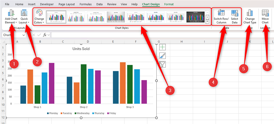
Once you select your chart, one of the extra tabs that appear on the ribbon is Chart Design.
This is where you can make the following changes to your chart:
- Add chart labels (also known as elements), like axis labels, gridlines, or a legend.
- Choose a label layout if you don’t have time to add chart labels manually.
- Change the chart’s style by making your bars have a thatched pattern, changing the colors, adding a shaded background, and more.
- Select the data source for the chart or switch the x-axis and the y-axis.
- Change the chart type altogether, such as switching from a bar chart to a column chart.
- Move your chart to a different or new sheet.
The Format Tab
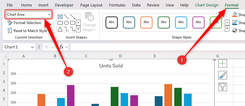
The Format tab—another specialized menu that appears when you click your chart—is where you can personalize your chart’s appearance.
Before you make any formatting changes, however, make sure you have either clicked the part of the chart you want to amend or selected it from the drop-down list in the Current Selection group. The rest of the Format tab then updates to display the formatting settings for the chart part you’ve selected.
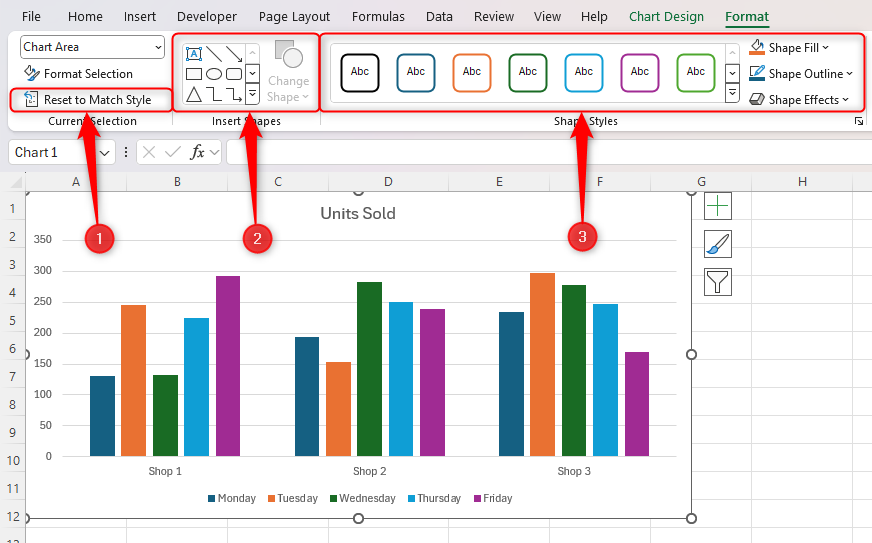
The left half of this tab lets you format your chart in the following ways:
- Reset the chart’s formatting to the style’s default design.
- Add a shape to your chart or change an existing shape. The most useful option in this group is a text box for adding further labels.
- Change the appearance of that part of the chart, like adding an outline, filling it with color, or adding an effect.
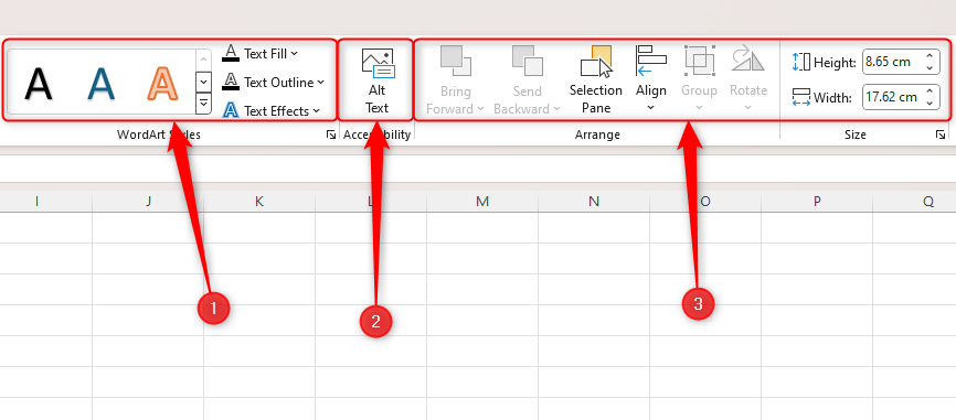
In the right half of this tab, you can:
- Format the text with WordArt, either using a preset style or making your own text formatting tweaks.
- Add alt text for people using screen readers.
- Align or resize your chart or its parts.
The Format Chart Pane
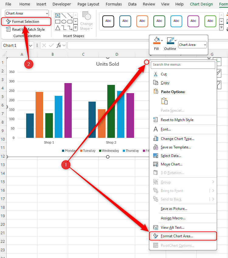
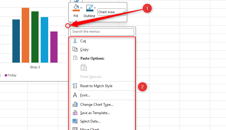
While the tabs give you access to most of the tools needed for formatting a chart, I prefer using Excel’s Format Chart Pane, as it contains even more options for tailoring your chart to your needs. To launch it, either (1) right-click the edge of your chart and select “Format Chart Area,” or (2) select your chart and click “Format Selection” in the Format tab on the ribbon.
If you’ve not used this pane before, spend a few moments clicking through the different options to learn what’s where.
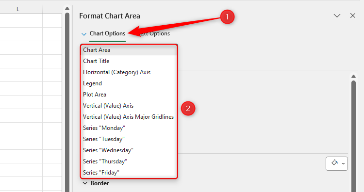
The first thing to look at is what part of the chart you’re about to format by looking at the pane’s top-left drop-down menu. The more chart elements you have on your chart, the more options you will see when you expand this drop-down menu.
For example, if you have gridlines on your chart, the option to format these will appear here.
In my opinion, the names of the items in this drop-down menu are too wordy and sometimes unclear, meaning I’m not always sure which one to select to make a change to my chart.
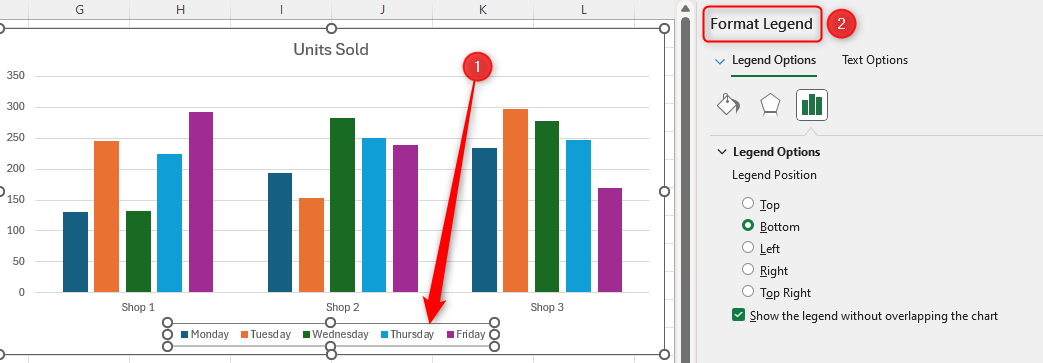
Personally, I prefer to select the different parts by clicking them on the chart itself, and Excel will automatically launch the corresponding formatting options in the pane, ready for me to make my formatting changes. In this example, I’ve selected the legend on the chart, and the pane has automatically launched the Format Legend options.
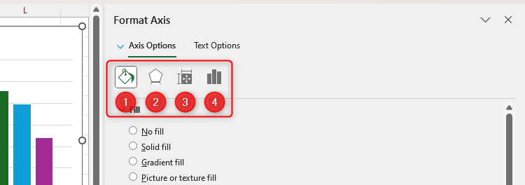
Once you’ve identified the part of your chart you want to format, Excel presents a range of icons for you to click.
Which icons you see depends on which part you’ve selected to format.
- The paint pot icon is where you can format the color fill or border or, if you wish, use a picture background.
- The pentagon icon lets you add effects, like shadows, glows, and soft edges.
- You can adjust the item’s size, alignment, and other properties through the measurement icon.
- The three-column chart icon is where you can change the chart’s parameters, like the minimum and maximum values or increments on an axis or the gap width between bars and columns.
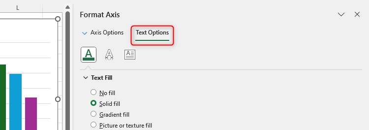
If the area you have selected contains text, you’ll see a second drop-down menu in the Format Chart Pane that lets you format that text.
The Buttons Next to the Chart
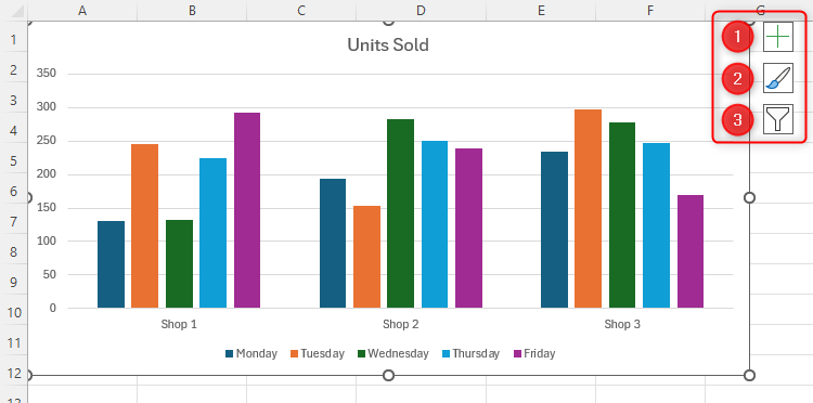
The buttons that appear just outside your chart’s border whenever your chart is selected are a condensed version of the Chart Design tab I discussed earlier.
- The “+” icon is where you can show, hide, or adjust the chart’s labels (or elements), much like through the Add Chart Element icon in the Chart Design tab.
- The paintbrush icon lets you change your chart’s style or colors, which you can also do in the Chart Styles group in the Chart Design tab.
- The filter button, which lets you choose which data your chart is displaying, has the same options as the Select Data icon in the Chart Design tab.
You can also make formatting changes to your chart through the right-click menu.
What you see in this menu depends on where you right-click. Right-clicking the edge of the chart gives you the most options, as this encompasses everything within the chart. For example, clicking “Font” and choosing a different typeface will affect all the text in your chart.
Right-clicking the internal parts of your chart will give you the option to delete and reset individual elements, as well as change the chart type and relaunch the Format Chart Pane for more options.
Formatting Text
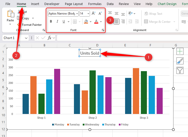
Although you can format text through the Format tab and the Format Chart Pane, I find the easiest way to do this is through the Home tab on the ribbon. Simply select the text you want to format, and use the Font group in the Home tab to change the typeface, font color, and font size, as well as the bold, italics, and underline.
Now that you know the best places to find Excel’s different chart formatting options, explore the program’s most common charts and what they’re used for.


