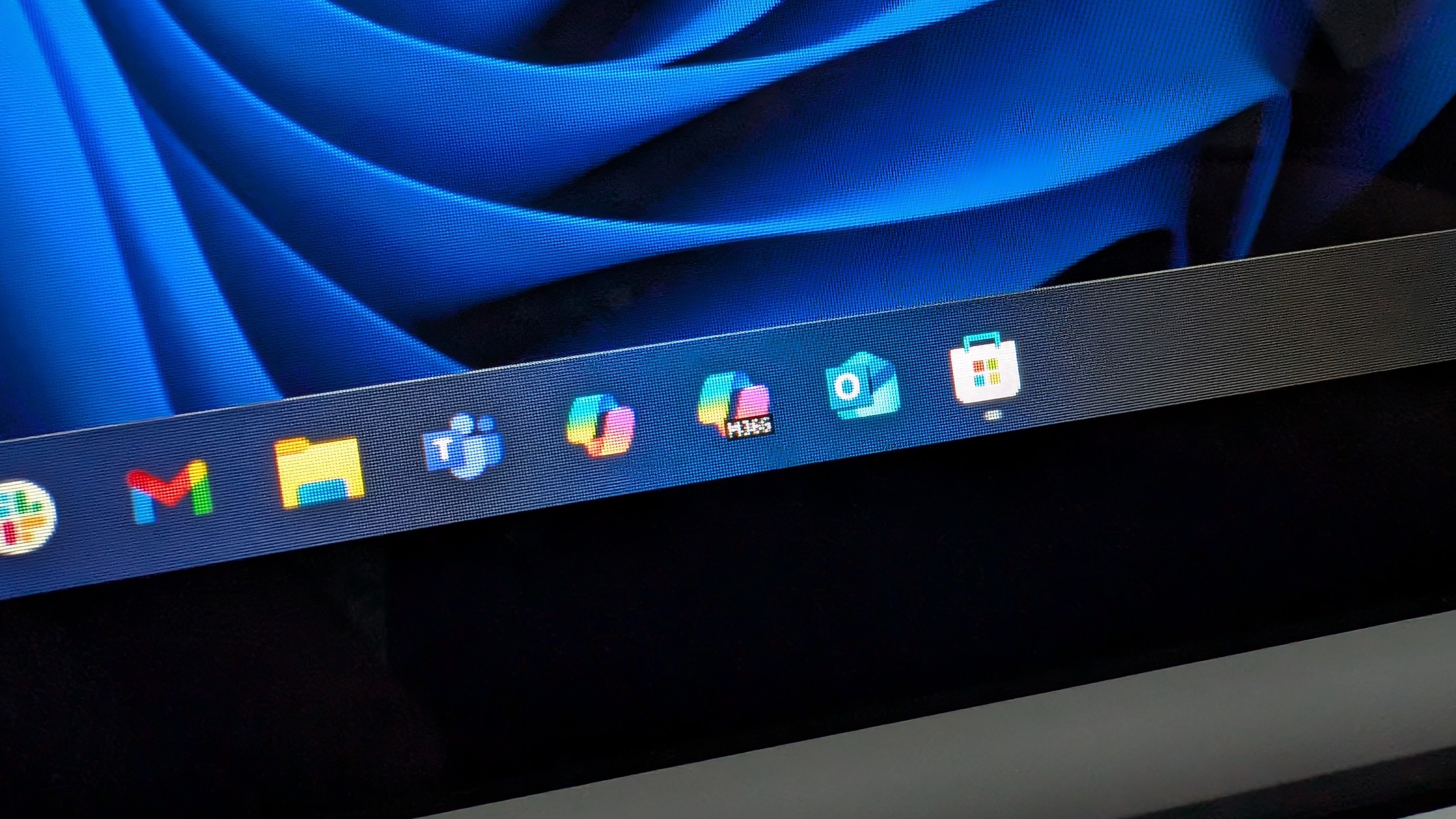
Microsoft 365’s new name and logo are terrible, and it seems many agree. After squandering decades of recognizable brand recognition when the company originally rebranded Microsoft Office to Microsoft 365, it’s now further muddying the waters by rebranding Microsoft 365 again to include the word “Copilot.”
Along with this latest rebrand, Microsoft has introduced a new logo to accompany the shiny new “Microsoft 365 Copilot” branding. So, what has Microsoft cooked up in their design labs? Let me introduce you to this masterpiece:
I promise, this is not a joke.
That’s genuinely the new Microsoft 365 Copilot logo… it’s the normal Copilot logo, with a box of text that says “M365” plastered over the top of it. Not only does it confuse things between Microsoft 365 as a suite of Office applications and the real Copilot chat service, but you probably had a hard time making out the “M365” text in that image as well.
People online have noted that on PCs with a low pixel density display, the text in the Microsoft 365 Copilot icon is barely even readable when pinned to the Taskbar. The lower your pixel density, the more impossible it is to read what the text in the icon actually says. It often looks like M366, M355, MJEG, or any combination in between.
Is it a huge deal? Not really. But it does shine an unflattering light on Microsoft’s terrible touch when it comes to design. It’s clear the company hasn’t given this icon more than a few seconds of thought, resulting in something that is poorly designed from an accessibility and legibility perspective.
On a Surface Laptop Go, which is a Microsoft-made laptop, the text in the icon is really hard to decipher. If you didn’t know it said “M365”, you’d seriously struggle with figuring out what it says. And that’s a problem when the majority of the logo is identical to an entirely different service.
Remember the Microsoft Office rebrand?Well it looks like this on a 1080p 24” monitor. What are you doing Microsoft!! pic.twitter.com/RcMbTgGExKJanuary 19, 2025
Copilot and Microsoft 365 Copilot are not the same thing. Microsoft 365 Copilot is Office, which consists of Word, PowerPoint, Excel, OneNote, Outlook, and many others. Copilot is a generative chat service. Yeah… I can’t figure out the logic behind this rebrand either. At the very least it should have its own distinct icon that doesn’t rely on text to identify that it’s different.
Microsoft seems to have gone a little bit Copilot mad in the last year, and that’s a shame. Copilot is fine, but I can’t see it ever having mass appeal. The company is betting on a horse that’s already competing in a crowded market, and with no Windows mobile or wearable platform, it’s a battle that it’s never going to win. Shoehorning it into the Microsoft 365 brand isn’t going to change that.
It may be controversial to say, but I don’t think people care all that much about Copilot. It’s handy every now and then, but it’s not strong enough of a tool to bet the entire Microsoft Office suite on.


