You may have heard that Python is great for data analysis. Are you looking for a way to visualize data that’s easy to use and produces good-looking charts? Seaborn may be just what you’re looking for.
Why I Chose Seaborn
I chose Seaborn, a data visualization Python library created by Michael Waskom because it seemed easy to use.
I wanted to explore data analysis and statistics in Python because it’s a popular language for data science and analysis, and I was familiar with it. I’d taken a basic statistics and probability course back in college, but over 20 years later, there might have been a few things I was rusty on.
I’ve never been that good at hand calculations, but there’s a lot of good open-source statistics and math software that lets me explore concepts without getting bogged down in equations and calculations.
Related
11 Science and Math Apps for Linux to Master Your Classes With
These Linux apps give you the same tools math and science professionals use.
Matplotlib is popular for making data visualizations with Python, but it can be difficult to pick up. Seaborn can create some beautiful-looking plots and has a simple syntax. I’m also armed with the Schaum’s Outlines book on statistics.
Installing Seaborn
If you’re already using Python, one good way to install Seaborn is through PIP:
pip install seaborn
I have a Mamba environment called “stats” containing other popular libraries like NumPy, SciPy, and Pandas.
I activate it with this command at the shell
mamba activate stats
I can run the Python commands in IPython or Jupyter.
Finding and Importing Datasets
To start Seaborn, import it using the standard Python import command
import seaborn as sns
The convention is to use “sns” as an abbreviation for “seaborn” as its shorter to type.
You can import data from spreadsheets like Excel, but “comma-separated values” or CSV files are also common, especially for datasets you’ll find online. You can read in these files with the Pandas library. To load a CSV file in the current directory:
        import pandas as pd
data = pd.read_csv("example.csv")
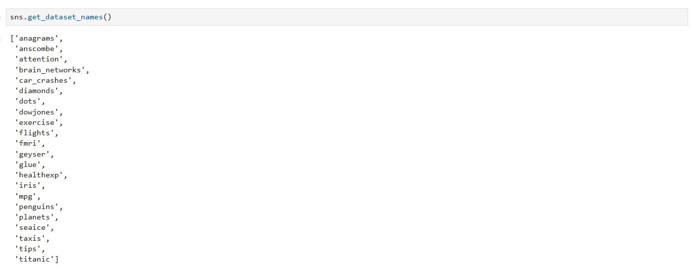
Seaborn also has several datasets already built in. When using these datasets. To see them, use the get_dataset_names method:
sns.get_dataset_names()
There are some interesting ones to look at, but we’ll use a dataset of restaurant tips.
We’ll load the data into a Pandas dataframe:
tips = sns.load_dataset("tips")
Dataframes are organized into columns similar to a spreadsheet. We’ll get an overview of the data with the head method:
tips.head()
Plotting Histograms With Seaborn
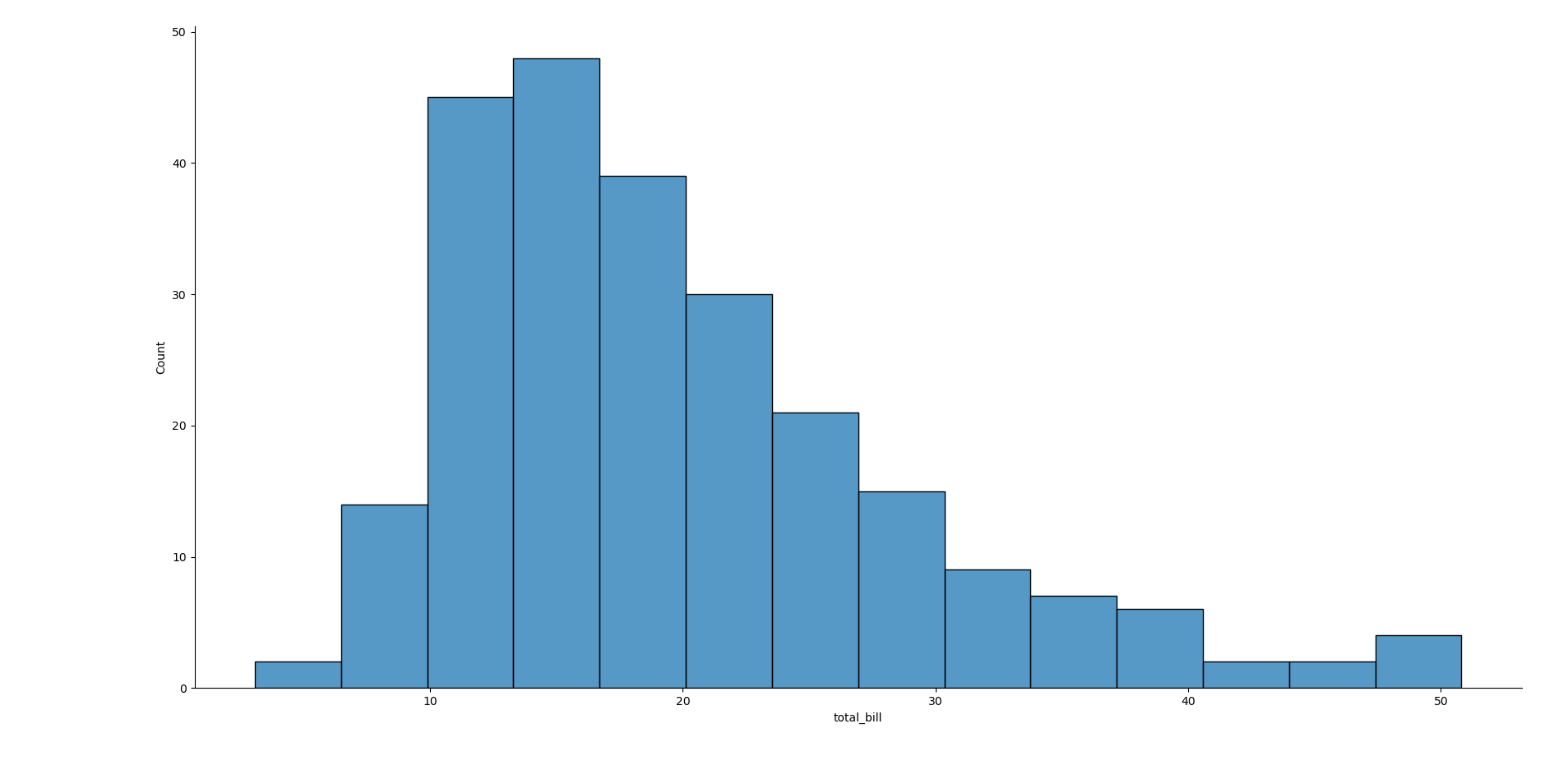
One useful basic graph is the histogram, which shows how the values of a dataset are distributed. Let’s look at the histogram of the total amount of these restaurant checks, the “total_bill” column, with the displot method:
sns.displot(x="total_bill",data=tips)
You can see that it almost looks like a bell-shaped normal distribution curve, though the tail is skewed to the right, with the peak more toward the left. The “data=” field is a convenience function when working with dataframes without having to type out “tips[“column”]” every time. The name of the dataframe is the source of the data.
Making Scatter Plots
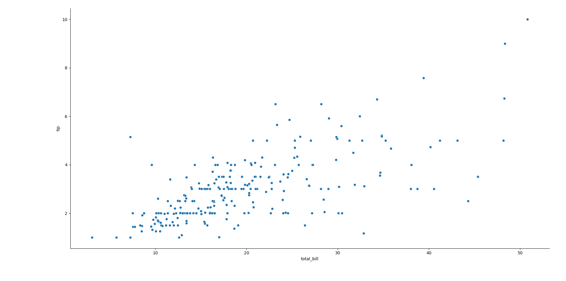
One useful thing to visualize in a dataset is to see if the columns have a relationship with each other. A good way to do this is a scatter plot that plots the values of one column against the other. Let’s plot the total bill vs the tip:
sns.relplot(x="total_bill",y="tip",data=tips)
The x-axis is again the total bill and the y-axis is the tip amount.
Plotting Linear Regressions
If you looked closely at the scatterplot, you may have noticed that you could have drawn a straight line through the values. This means that there appears to be a positive linear relationship since the tip amount rises as the amount of the total bill increases.
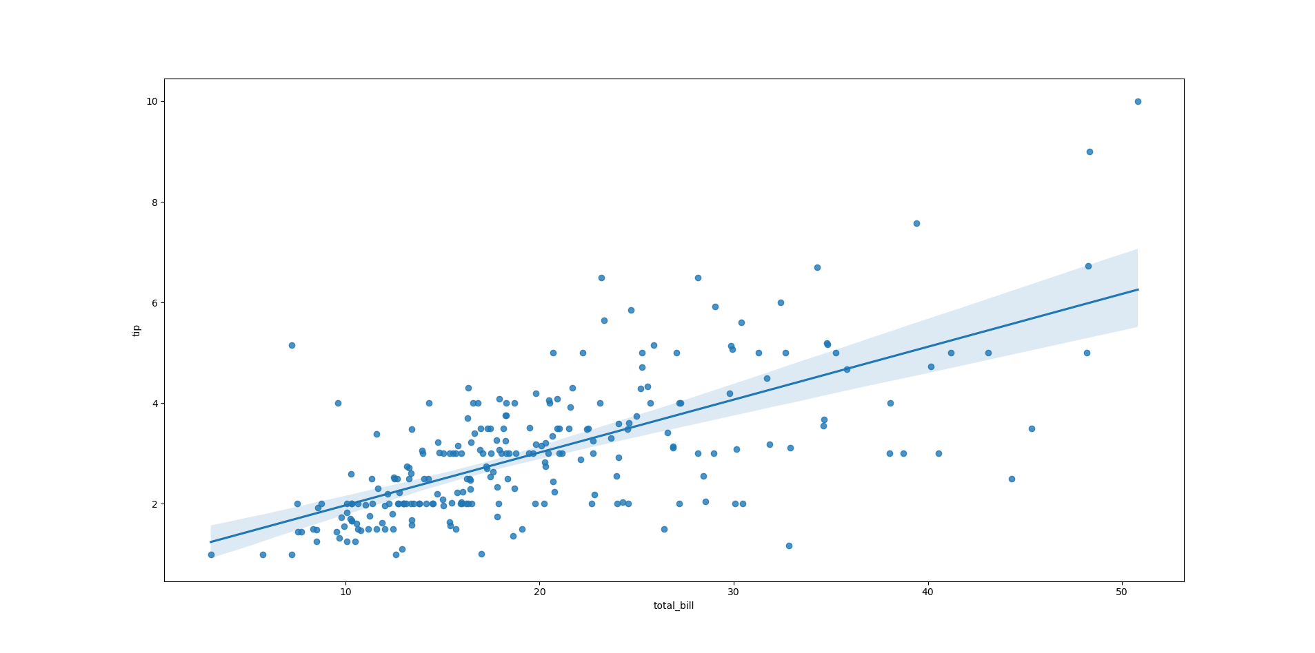
We can plot a regression line through this scatter plot by using the regplot method:
sns.regplot(x="total_bill",y="tip",data=tips)
You’ll see a plot similar to the scatterplot we did earlier but with a line, our model of the linear relationship, drawn over it. This is called an “ordinary least-squares regression.”
There’s also a shaded area above and below the line. This represents a confidence interval, because a linear regression always contains some uncertainty in how it would fit over the data points.
You can fit more than just straight lines, but can model curves this way, but that’s beyond the scope of this article. This tutorial is just scratching the surface of how you can visualize and explore data with Python and Seaborn.


