Amazon’s Kindle range has been championing the E Ink market for some time. So when E Ink-based “paper tablets” started making an appearance, it felt as though it would only be a matter of time until Amazon got involved there too.
With the Kindle Scribe, it’s done exactly that, launching a much bigger Kindle than previous models, but equipping it with the ability to take notes, make to-do lists or sketch using a stylus.
Our quick take
On the whole, it’s a good first effort from Amazon’s Kindle team. There is room to grow, of course, especially on the notebook and productivity front.
All the areas where it lacks could – conceivably – be added to using software updates in the future. Handwriting recognition and conversion to text is one feature we’d love to see, as is the ability to choose from a larger selection of notebook page styles for better versatility. It’d be great to have integration with Dropbox/Google Drive or other cloud storage services for easy document access too. These are all areas the ReMarkable 2 excels.
It’s generally a good all-round experience, but with those areas that it needs working on, it definitely feels a bit like the first-generation product that it is. At least on the software side.
From a hardware and feature perspective, it’s well made, it’s got enough features to make it genuinely useful and the fact it has a sharp screen with front lighting and a pen included as standard makes it comparatively good value for money. Plus, you get access to Amazon’s massive library of content, which can never be overlooked.

Amazon Kindle Scribe – 4.0 / 5
| FOR | AGAINST |
|---|---|
|
|
SQUIRREL_12864320
Design
- 196 x 229 x 5.8mm
- 433 grams
- Type-C port
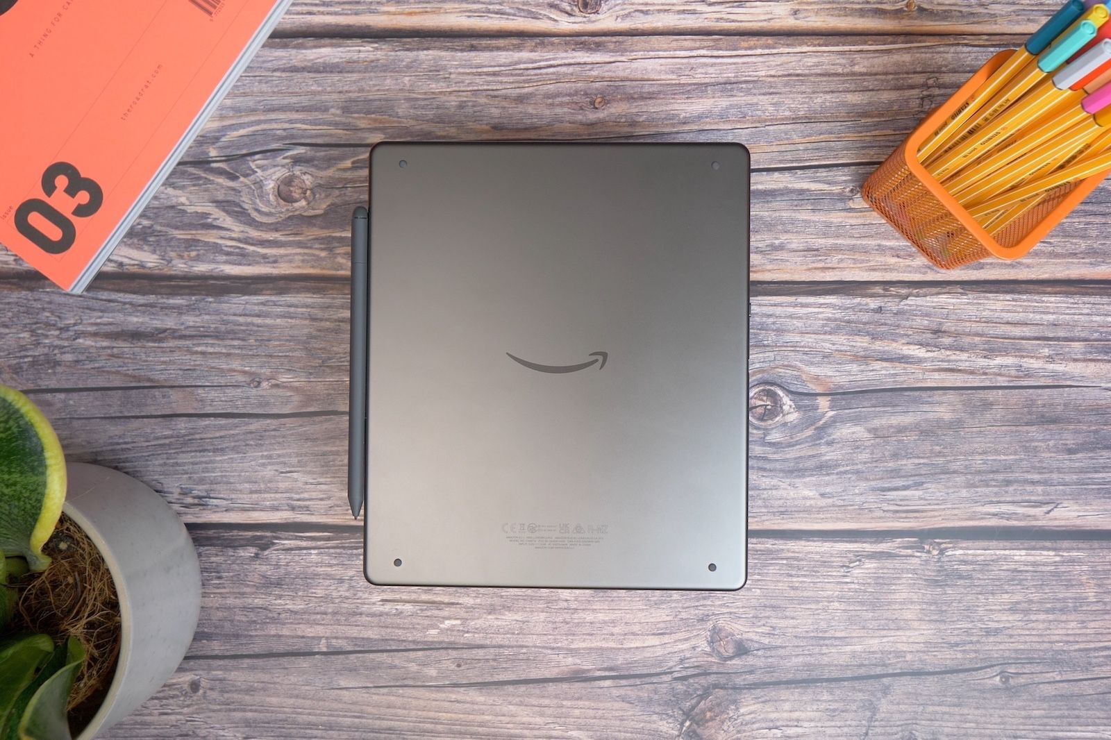
There’s no denying that the Kindle Scribe is Amazon’s biggest Kindle yet. Given its functionality and purpose, that’s to be expected. It’s roughly the height and width of a regular full-size tablet but is incredibly slim at just 5.8mm thick.
It’s thinner than pretty much any smartphone or tablet and has a rear made of aluminium. What’s more, it joins Amazon’s other hardware in being made predominantly from recycled materials. The aluminium on the back is 100-per cent recycled, while the plastics are 48-per cent recycled – even the packaging is 99-per cent recycled card.
There’s a sense of simplicity and practicality to the design too. As well as being slim, the case features very little in the way of buttons or ports, just like other Kindles. There’s a single power/wake button next to a USB Type-C port on one side of the tablet, and nothing else.
Like the Kindle Oasis, one side of the display’s bezels is much larger than the other two. Unlike the Kindle Oasis, it doesn’t feature physical buttons for turning pages. However, it does give you a handy place to rest a thumb, to grip when reading, or you can rest the side of your hand on it while writing, away from the display area.
It’s a handy space to have, and since the interface rotates with the tablet, you can have it on the right or the left side, so it doesn’t matter if you’re left or right-handed.
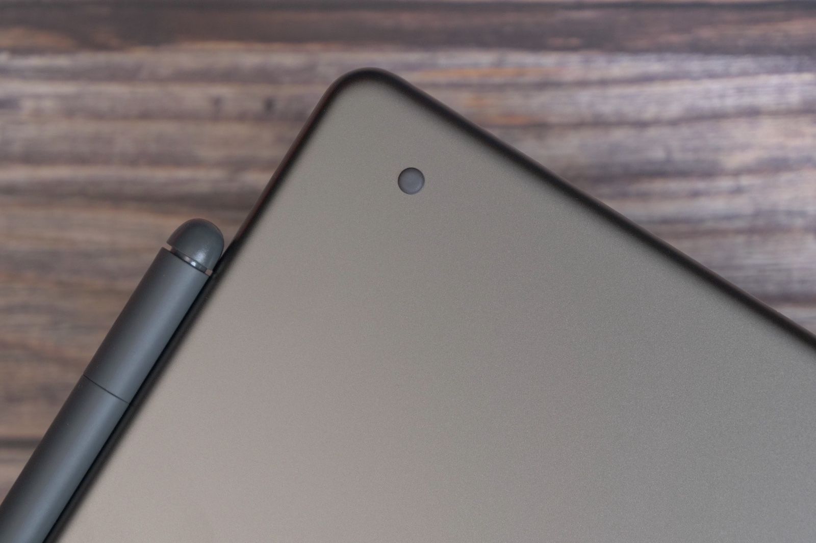
Another nice touch is the rubber feet on the back of the tablet. There are four: one in each corner, designed so you can rest it down on a surface – like a desk or a table – and press down on it, without scuffing the metal on the back or having it slip around. It stays in position thanks to those tiny grippy dots.
Its size is a little restrictive at times, of course. Especially if you’re planning to use it as a reader. It takes up a lot more space in a bag and weighs more than any other Kindle, and that means it’s not quite as comfortable to sit and read with in bed at night. It’s not easy to hold one-handed, which is a disadvantage compared to the much smaller Kindle models. However, you can just rest it on your knees if needed and – if you have any of the official cases – you can angle it upwards or even stand it upright.
Display and reading
- 10.2-inch E Ink display
- Paper-like texture touchscreen
- 300ppi pixel density
- 16 LED front light with warm light
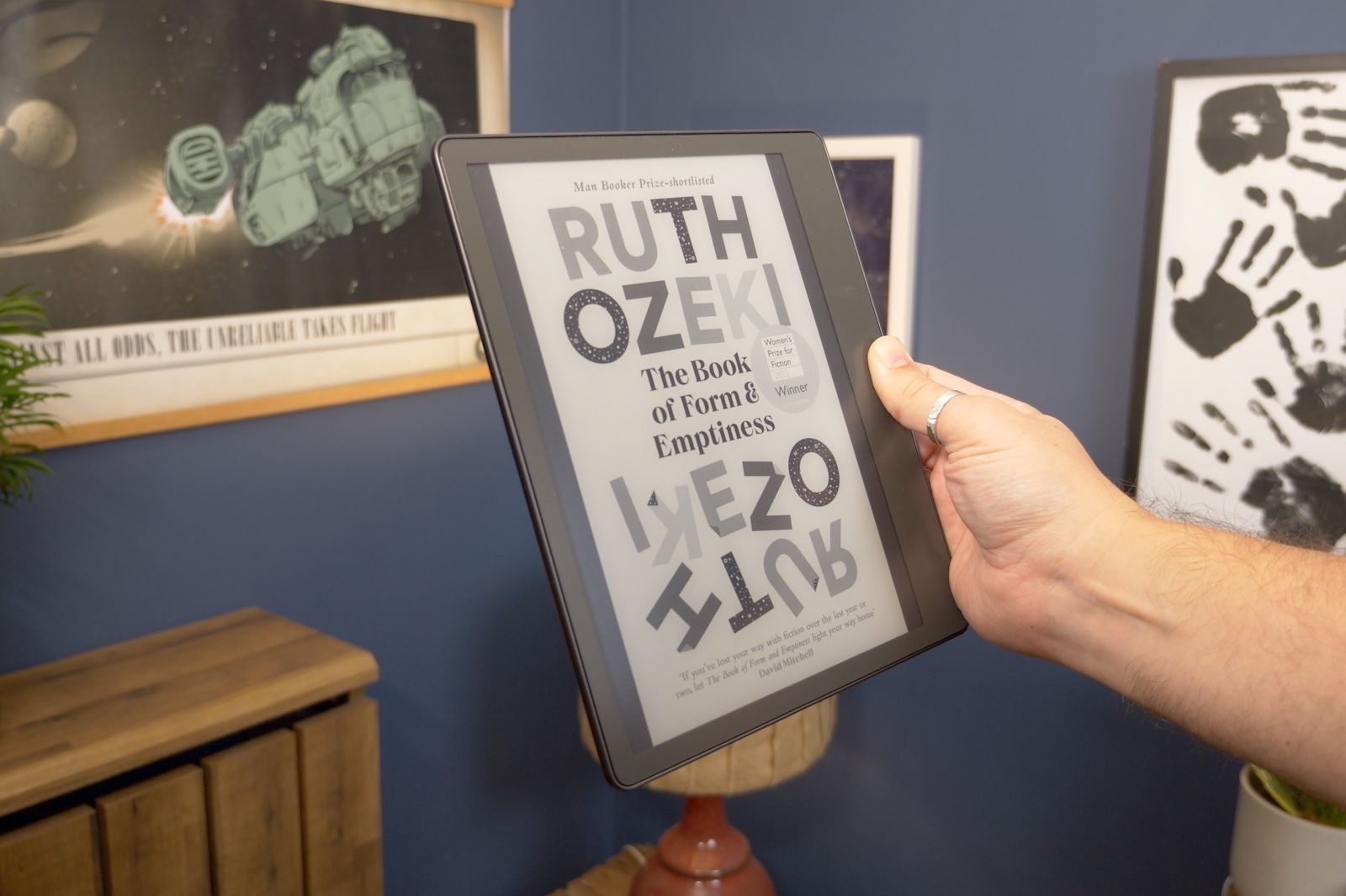
On the display side, the Kindle Scribe has all the benefits of a modern-day Kindle. Its sharpness – at 300ppi – matches that of all recent other Kindle models, and ensures that any text is crisp and clean.
It has all the latest lighting abilities too, which means a front light system that’s capable of adjusting itself automatically to match the lighting in the room. With this feature switched on we rarely found ourselves needing to adjust it manually. It seemed to do a good job of ensuring there was just enough light to read clearly when light levels in the room dropped or ensuring it wasn’t too bright when reading at night time in the dark.
In really bright environments you don’t need the lighting at all thanks to the E Ink display’s transflective properties, which make it more visible the more ambient light there is.
It also features the adjustable warmth feature, so you can filter out blue light in degrees and make it more orange, which is helpful at night time. You can even schedule it to come on at sunset and switch off at sunrise or set it to activate or deactivate at set times every day.
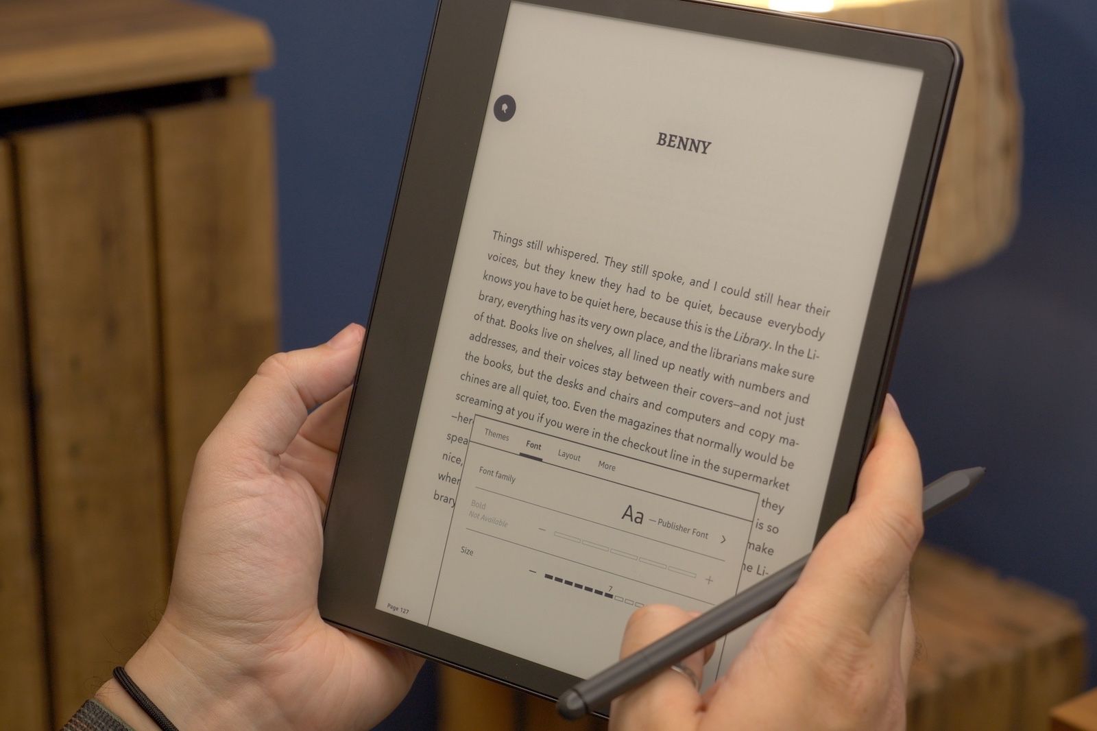
One of the advantages of having a big screen like this for reading is that it allows a wide degree of adjustment when it comes to font sizes. There are 14 to choose from, plus five levels of boldness/thickness and the usual selection of font families. There’s the classic Bookerly, Amazon’s Ember font, Baskerville, Helvetica and others, including the OpenDyslexic font for those with dyslexia, and Publisher Font. This last one shows the text in the style it was printed in the physical books.
Note-taking experience
- Premium or basic pen
- Notebook templates
- ‘Send to Kindle’ service for PDFs, web pages etc.
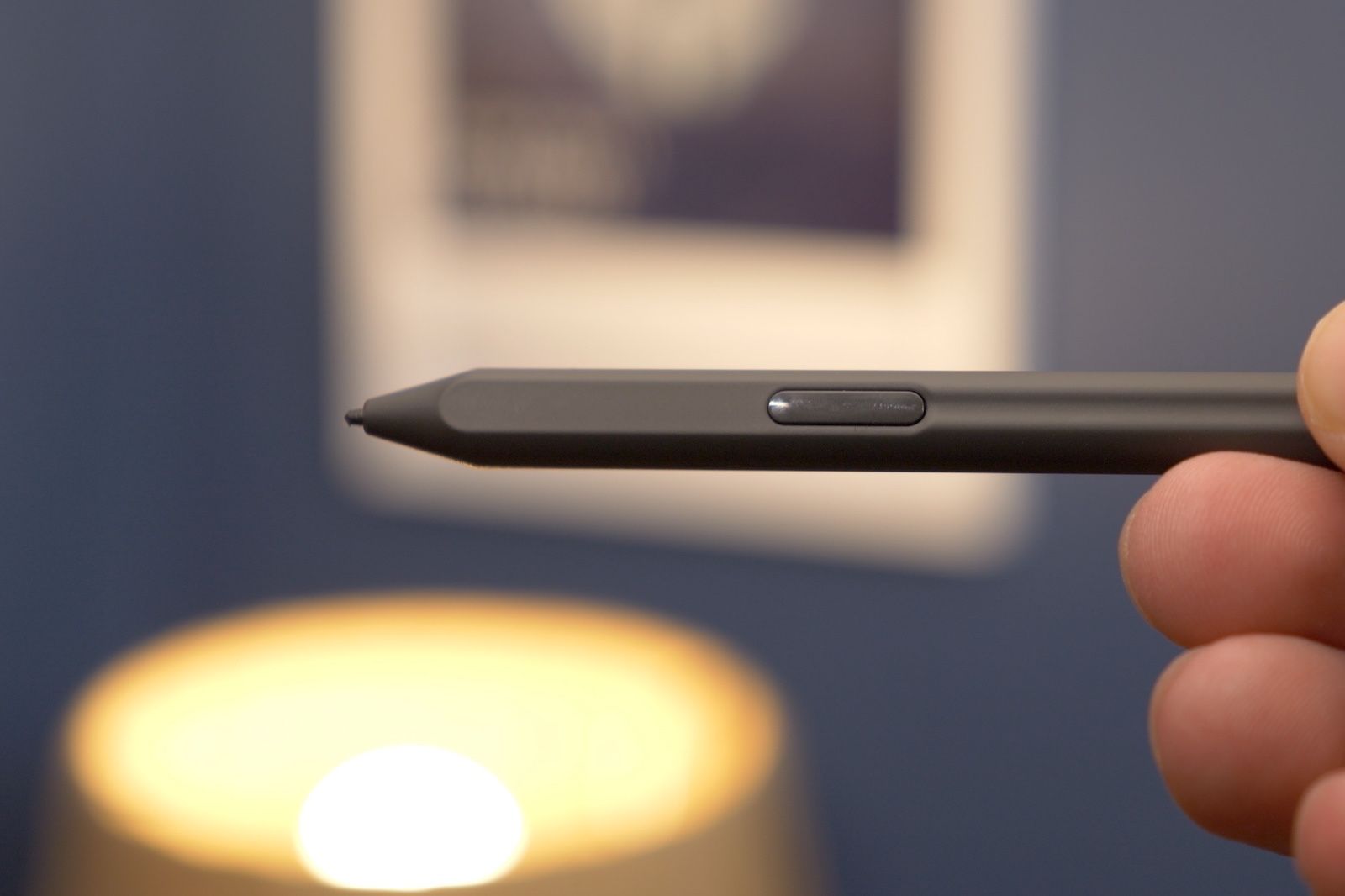
When you buy a Kindle Scribe – whether you get the entry-level model or spend extra – you get a stylus. There’s a basic pen option and a premium pen, the latter offers a shortcut button on the side and an ‘eraser’ on the top end. While you can erase what you write on the screen using on-screen options, we’d definitely recommend spending the extra and getting the premium option for ease of use.
It magnetically attaches to the side of the tablet for storage, and the magnets grip onto the pen pretty well, although, with enough accidental force you can detach it easily. Since it doesn’t need charging, we think it makes more sense to grab a case with the Scribe and use the included pen holder to keep your pen from going missing.
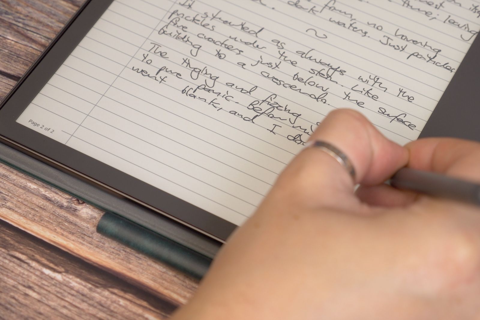
When it comes to the actual writing experience, the Scribe is really good. Like the ReMarkable, it does well at mimicking that feeling of writing on paper. The surface of the tablet is smooth but not shiny, so when you write on it, you get that slight bit of friction you need to replicate the paper feel, as well as the sound to go with it.
Although E Ink doesn’t offer really fast refresh rates, the response and speed of the animation are still fast enough that it feels natural enough. So when you’re writing you don’t get that jarring effect that sometimes comes with slow refresh, or less responsive displays. It’s not instant like ink or lead on paper, but it’s fast enough that it doesn’t leave you hanging or make the experience feel unnatural.
There’s lots to like about the software approach to handwriting too, although still plenty of room for Amazon to improve its offering. You get a few different methods for handwriting, as in, various areas that you can use it.
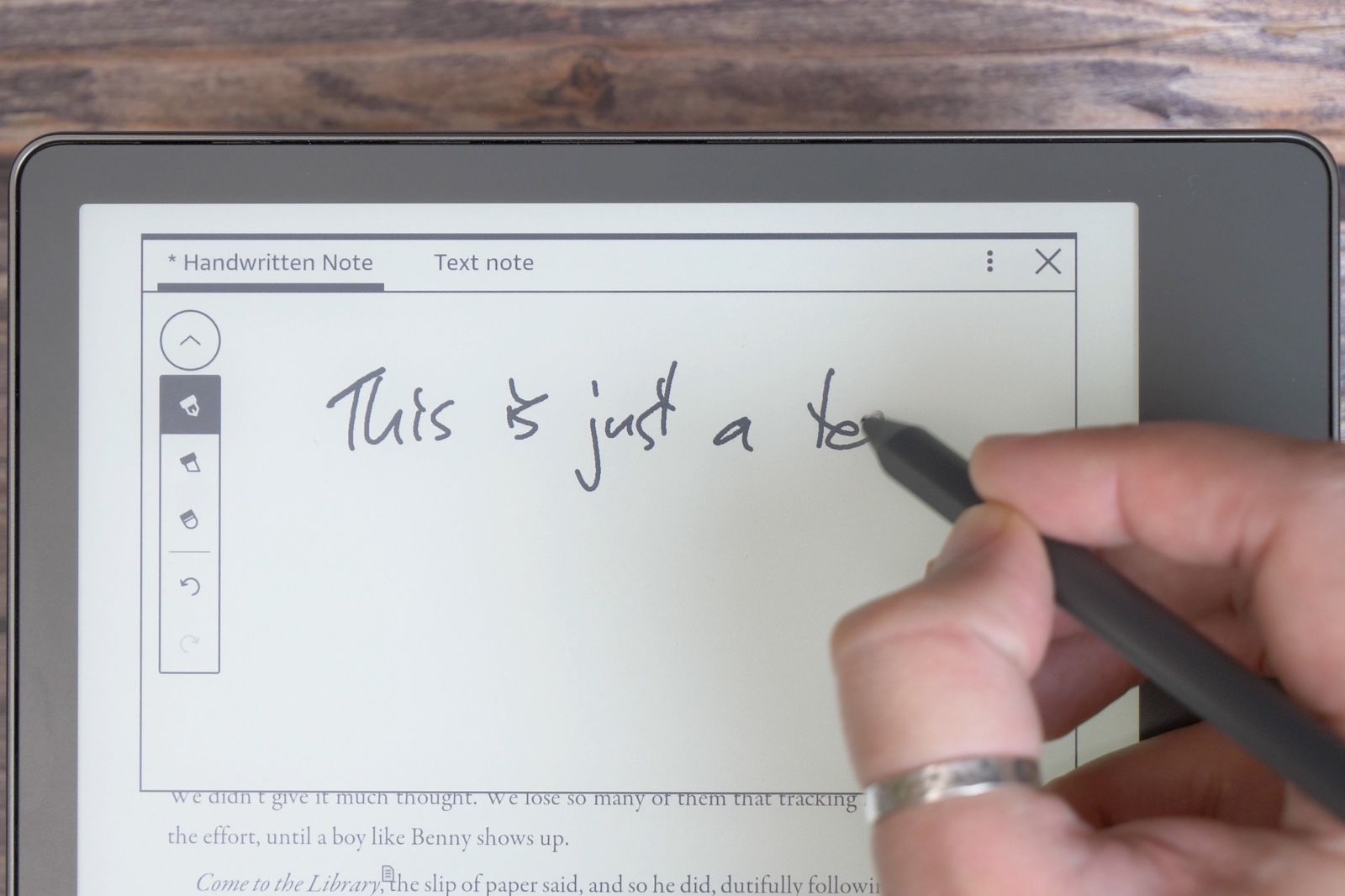
First off, if you’re reading one of the many books in the Kindle library, you can add handwritten notes to any page or section of a book. So if you’re someone who likes to jot down thoughts and observations while reading, or you need to for study purposes, you can.
Just tap on the note icon in the floating window on the screen, tap on the area of the page you want to add a note and then another window appears on screen for you to either handwrite or add a text note using an onscreen virtual keyboard. Sadly there’s no option to automatically convert handwriting to text. So you have to choose either or.
For quicker access to this feature – if you have the Premium Pen – you can set the shortcut button so that when you press and hold it, then tap the screen it automatically creates a sticky note on the area of the page you’ve selected.
Then, if you need to find notes you’ve written afterwards you can simply open the book with them in – tap near the top bar and tap the notebook icon and it’ll show you any notes you’ve made in that particular work of literature. We’d love to see a feature added where you could see a global collection of all notes, from all books, but sadly that doesn’t appear to be available in the software at the moment.
Of course, you can also create and manage a number of different bespoke notebooks, away from your book library. You can create any number of notebooks with a few different book template styles to choose from. There are basic ruled notebooks, as well as a bulleted to-do list, a daily planner, a storyboard template and even a sheet music option. You – of course – also get blank, grid and dotted sheets.
It’s a good start from Amazon and means you get arguably all the most common templates you need, but compared to the ReMarkable 2 offering, it’s lacking. That tablet has many more different styles to choose from and – unlike Amazon’s Kindle – actually tells you what they are in the interface, and organises them by purpose. We’d like to see Kindle Scribe’s offerings expanded to make it more competitive.
Similarly, there’s no third-party cloud file storage integration. So you can’t just log in to your Google Drive or Dropbox and have it sync any compatible files and documents in your Kindle Scribe library.
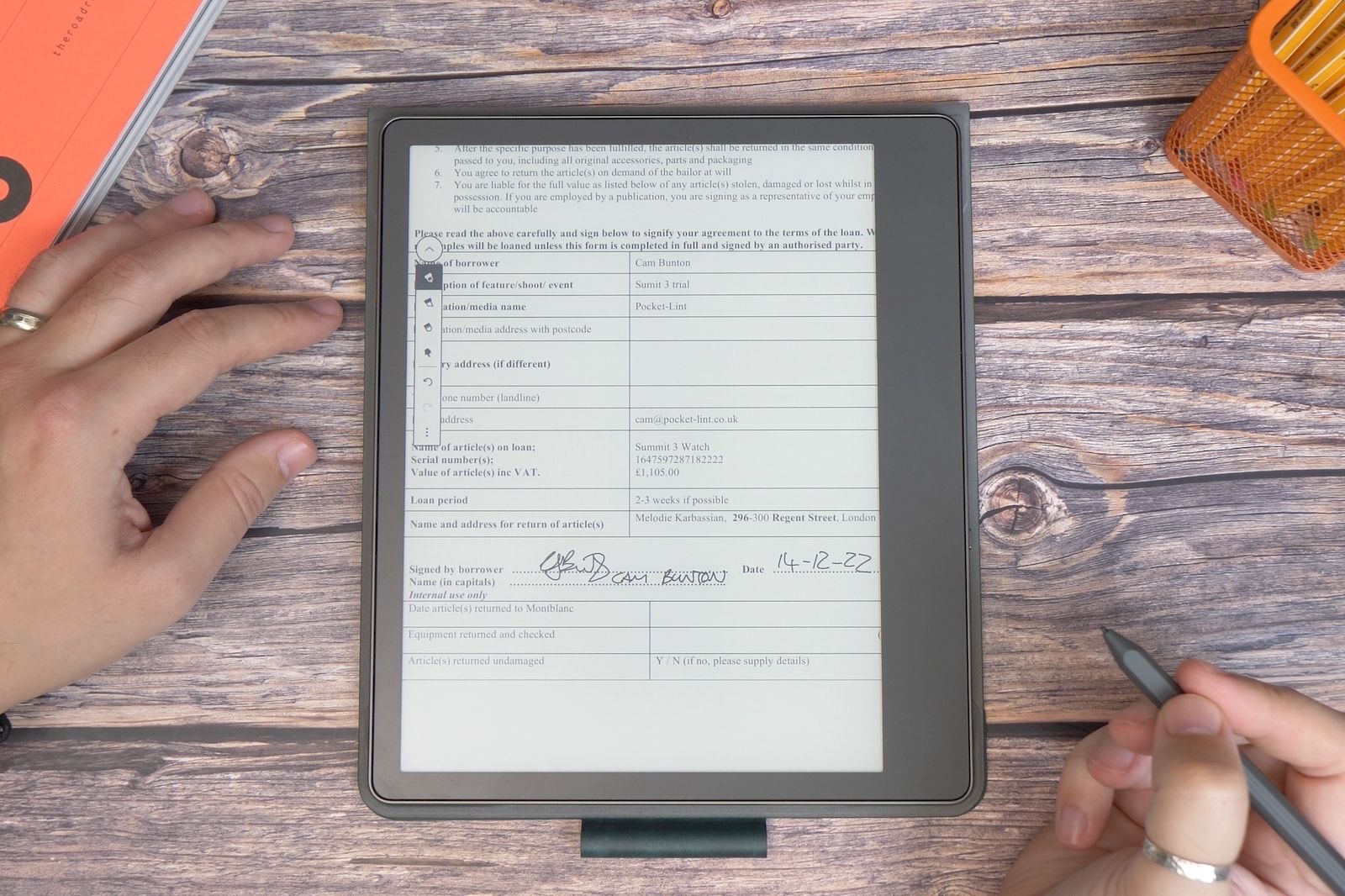
That’s not to say you can’t have documents on there at all. You can, using the ‘send to Kindle’ feature either in the Kindle app on your phone or using the web browser uploader. It’s easy enough to use and does mean that if you have any documents that need signing or annotating, and sending on to others, you can do it on the Kindle Scribe. Drive, Dropbox or other cloud service integration would make it feel a bit more convenient though.
Artists aren’t really catered for with the Scribe either, you don’t get the option for different pencils or shading pens within the software. That’s more than likely due to the nature of E Ink limitations. It’s not a display type that’s all that well optimised for drawing beyond basic sketching, but it would still be nice to see additional pen or pencil styles. At the moment, you get one pen (which you can adjust the thickness of), a highlighter and an eraser. That’s all.
Storage, books, connectivity
- 16GB, 32GB and 64GB storage
- Wi-Fi and Bluetooth connectivity
- Months of battery life (reading) or weeks (writing)
The biggest advantage of having a big Kindle is that it has a big battery. And that means it outlasts every other Kindle on the market when it comes to reading time. In fact, Amazon says you can get “months”, or 12 weeks (based on half an hour of reading per day). That’s longer than the current longest-lasting Paperwhite which can do about 10 weeks.
That battery life is shortened when you use the handwriting functionality, but still, it’s long enough even then. It can last about three weeks on a full charge if you use handwriting for half an hour per day. Short version: you’re not going to have to worry about battery life.
Like other high-end Kindles, you get Wi-Fi for downloading files and books. You also get Bluetooth support, which means you can listen to audiobooks using your earbuds if you want. With three options for storage, there’s a lot of flexibility in options here too. There’s 16GB, 32GB or 64GB.
SQUIRREL_12864320
To recap
Kindle’s first reading and writing tablet is a strong start from Amazon, but still has room to improve its usefulness. With more pen and notebook styles, and better third party service integration, it could be a killer device.
