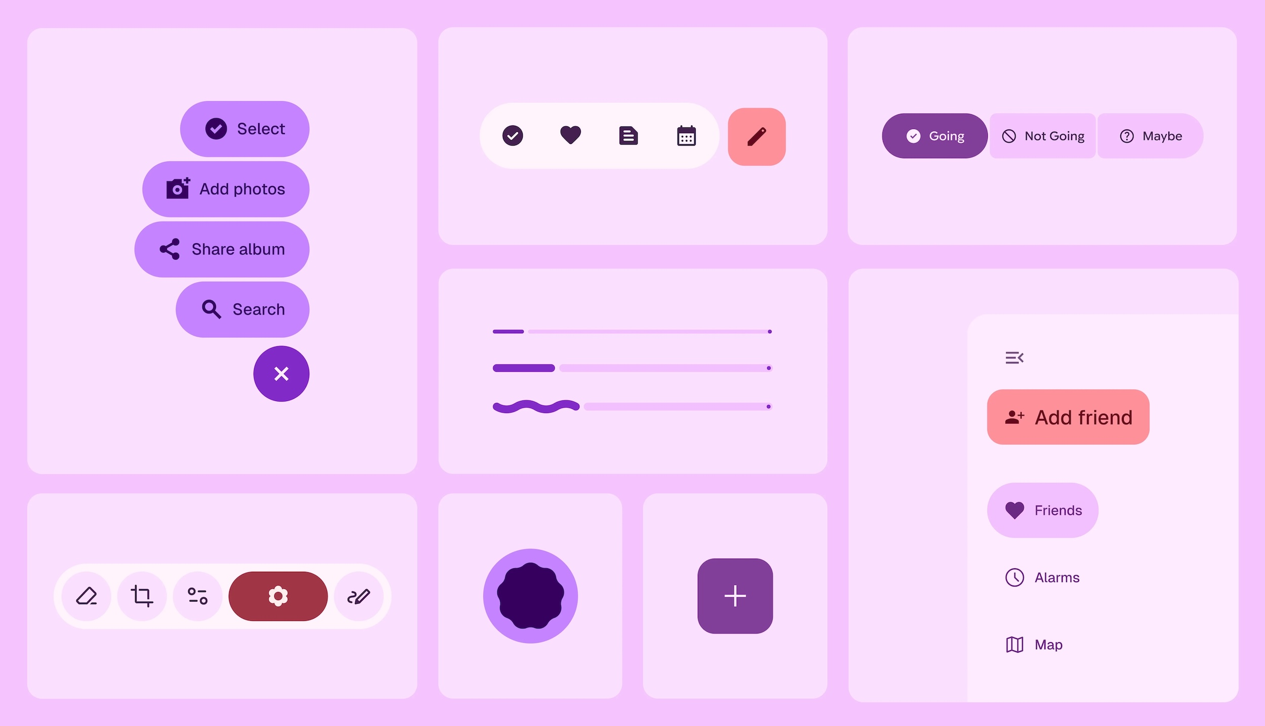
It’s time for Android to get a bit of a facelift. As was previously leaked (accidentally) by Google itself, “Material 3 Expressive” is a pretty big design overhaul that’s all about making your devices even more personal, fluid, and helpful at a glance.
For years, Android has championed personalization. “Material You” took that to a new level, and Material 3 Expressive looks to take it even further. Google is clear that this isn’t just a fresh coat of paint—it’s a fundamental shift designed to make your device truly yours. There are new ways to inject your style and personality, smoother interactions that feel natural, and information that’s (hopefully) right there when you need it.
One of the coolest things you’ll notice is how much more fluid everything feels. Material 3 Expressive brings in more natural, springy animations that are designed to bring a “moment of delight.” When you swipe away a notification, the ones next to it subtly react to your drag, and when you flick it away, you get a satisfying little haptic nudge. You’ll find these little touches all over the place, whether you’re swiping away apps in the Recents screen, adjusting the volume, or pulling down the notification shade. The shade itself even has a subtle blur effect now, too.
Speaking of the shade, you can now cram more of your most-used actions, like the flashlight and Do Not Disturb, into your Quick Settings. And you won’t have to dig through a pile of notifications to find what’s important, thanks to the new Live Updates feature. This lets you track the progress of things like your Uber Eats order right there in the notification shade. Real-time updates from delivery, rideshare, and navigation apps are pushed front and center so you don’t miss them.
Material 3 Expressive also brings updated dynamic color themes that adapt to your wallpaper, responsive components that adjust to different screen sizes, and enhanced typography that makes everything easier to read. These visual choices should eventually be consistent across Google apps like Google Photos and Gmail.
The refresh extends to your wrist, too. Material 3 Expressive on Wear OS is designed with the round display in mind. Scrolling animations trace the curve of the screen, and as you scroll through lists, items become larger as they come to the wider center part of the screen. The dynamic color-theming is coming to Wear OS as well, so the color you pick for your watch face will apply throughout the entire system. You’ll also find “glanceable buttons” that stretch to hug the display, saving space and making them easier to tap.
These design improvements are coming to Android 16 and Wear OS 6 devices, and they’ll be available first on Pixel devices later this year. However, will other Android devices ever see this new design? If past versions of Android are evidence, it would seem unlikely. Regardless, Material 3 Expressive is looking good.
Source: Google

Related
Google’s Massive Android Redesign Looks Great, But Who Will See It?
Google got a bit ahead of itself and accidentally published a blog post about the massive upcoming Android redesign. It looks fresh, modern, and playful—perfect for the current design trends. But there’s a big problem: will enough people actually get to see it?


