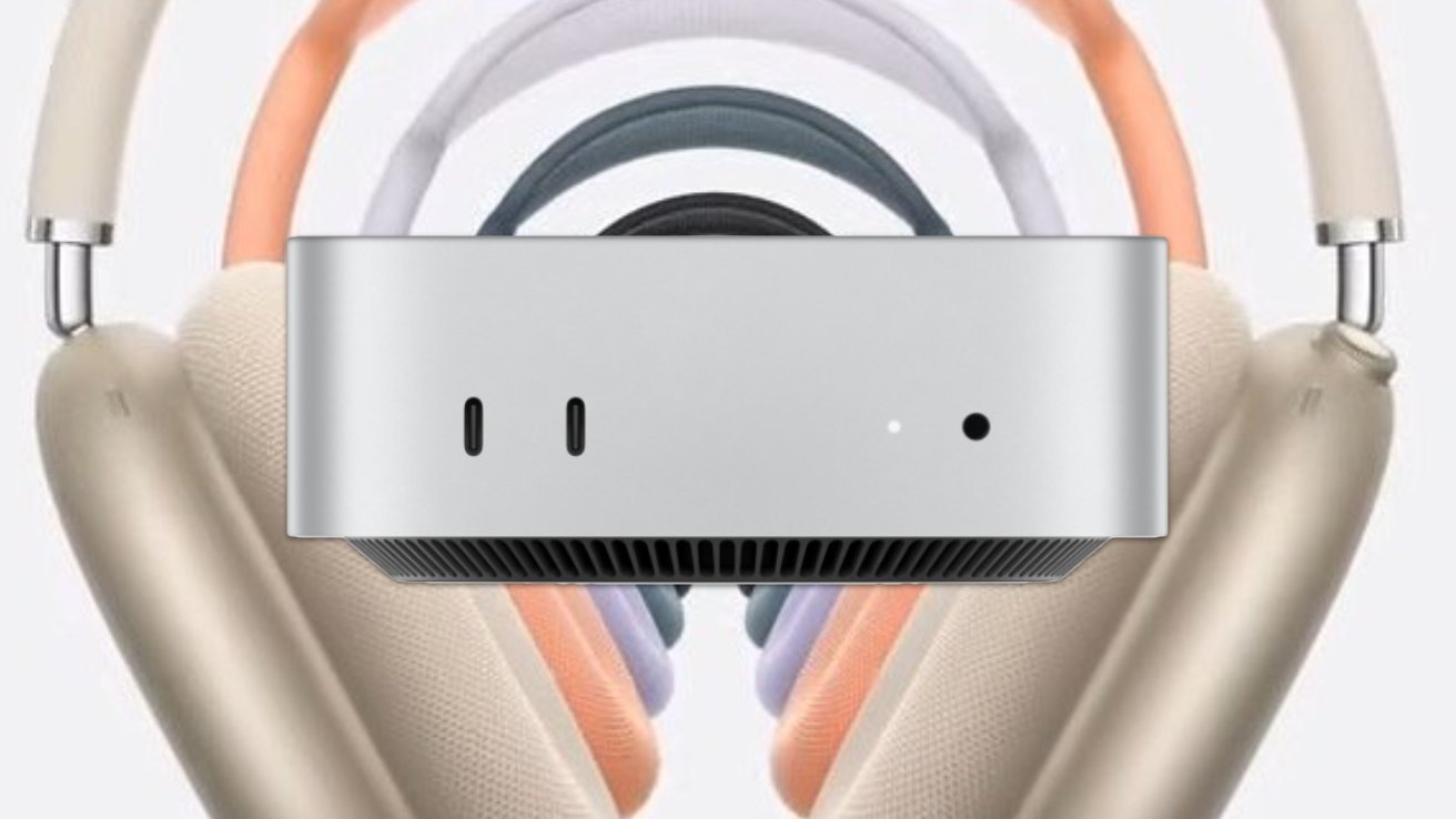
Apple’s 2024 Mac mini stashes the power button underneath, a bold move that executives say aligns with user habits, even if it’s left some fans scratching their heads.
The company’s latest Mac mini is significantly downsized — about half the size of its predecessor. The overhaul makes it more compact and gave Apple’s designers challenges in laying out external features.
Apple’s Vice Presidents, Greg Joswiak, Apple’s Senior Vice President of Worldwide Marketing, and John Ternus, Senior Vice President of Hardware Engineering, explained to IThome. They emphasized that the compact form factor still makes it easy to access the button by tucking a finger underneath to press it.
On previous Mac mini models, the power button was located on the back panel of the device. It was positioned alongside other ports and connections, making it easily accessible without having to move the device.
One of the biggest reasons for the seemingly out-of-the-way placement is how infrequently most users actually use the power button. “Honestly, most people almost never use the power button on a Mac,” one of the executives remarked.
That may sound surprising, but it makes sense in the context of how Macs are typically used. Many Mac owners rarely power off their devices completely, relying instead on sleep mode. As a result, reaching for the power button isn’t a daily or even weekly task for most users.
However, some users have expressed concerns about the practicality of the new placement, especially in scenarios where physical access to the button is necessary. The need to lift or tilt the device to press the button could be inconvenient in cluttered or tight spaces.
Third-party button hacks
The Mac community has responded with innovative solutions to this design change. For instance, engineer Ivan Kuleshov created a 3D-printed lever mechanism that allows users to press the power button without lifting the Mac mini.
Apple has consistently pushed boundaries with minimalist, user-centric designs, and the 2024 Mac mini is no different. For those eyeing the 2024 Mac mini, this power button relocation will initially feel unfamiliar.
However, it’s unlikely to impact daily use. As Apple sees it, once a Mac mini is set up, users will hardly think about its power button at all, especially since the device’s sleep mode will handle most power needs.
In the end, Apple’s power button decision is a practical response to the device’s smaller size. While it might be one of the more subtle design shifts Apple has made, it reinforces the company’s focus on efficiency and modern design principles.
So, if you’re considering the New Mac mini, don’t let the power button placement throw you off — Apple has made it clear that you’ll barely need it anyway.


