

Sometimes in tech, it doesn’t pay to rock the boat, a lesson Apple learned the hard way after it introduced a wild new design change to mobile Safari with iOS 15. Apple at WWDC revealed that Safari would be getting a complete UI overhaul. Some of the changes, which included placing the URL bar on the bottom of the display, generated a lot of pushback from the developer community.
The good news, though, is that iOS 15 is still in beta. In other words, the final release version is still a few weeks away. Consequently, Apple is still tweaking and fine-tuning the final product. In turn, the recent iOS 15 beta 6 release provides users with the ability to enjoy a more standard Safari experience. Put simply, Apple isn’t forcing everyone to use Safari’s new UI design.

What was the iOS 15 Safari issue?
Amidst all the iOS 15 features, the new mobile Safari was easily the most controversial. Especially when you consider that people have been using Safari for years, an abrupt UI change was bound to create a stir.
The main issue is that the URL bar in the new iteration of Safari floats at the bottom of the display. While Apple implemented this change to improve one-handed use, many users found the change unsettling.
Apple writes:
Reimagined for the way we browse today, the new tab bar maximizes your screen space and stays out of the way as you scroll and explore. It’s easily reachable at the bottom, so you can navigate and jump between tabs with just your thumb.
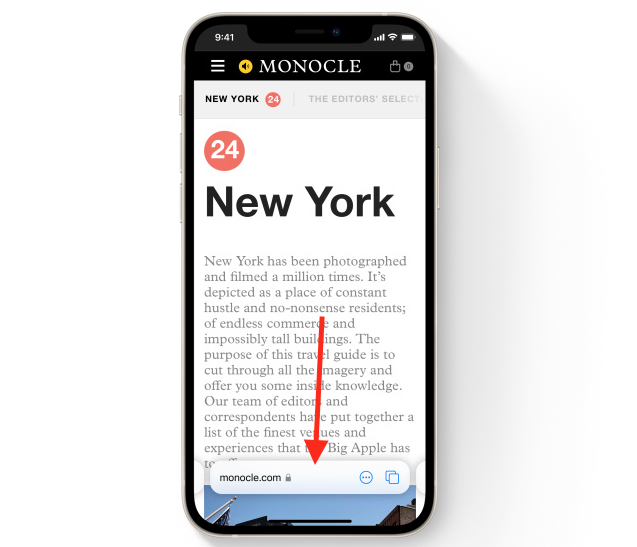
A photo of what the new design looks like can be seen below:
In some instances, the URL bar would hover over important information on a website and render it inaccessible. An example from Federico Viticci is viewable below:
Just another day being unable to order takeout because iOS 15 Safari’s bottom bar makes this checkout button untappable.
thanks Safari for not letting me have that bruschetta 😢 pic.twitter.com/e23YTYzGM6
— Federico Viticci (@viticci) July 22, 2021
The backlash was immense
All across social media, the backlash against the new mobile Safari design in iOS 15 was immense. Many people were quick to call the design terrible and a step backward. And, it’s worth noting, there were other Safari features in iOS 15 that Apple ultimately walked back as well, including the curious removal of dedicated Reload and Share buttons.
Apple is thankfully addressing concerns
Apple is clearly going for a more minimal aesthetic with mobile Safari this year, but sometimes too much minimalism can result in a subpar user experience. In early betas, for instance, the Reload button on a website was only accessible by long-pressing near the URL bar. While minimalist, this isn’t something most ordinary users would be able to figure out on their own. At a certain point, stripping away or hiding features becomes more confusing than minimalist.
Apple is slated to release iOS 15 later next month and, it stands to reason, that Apple will implement any number of additional tweaks before the final version ships in September. Incidentally, iOS 15 has several interesting features that Apple didn’t even have time to cover at WWDC. You can check out a list of some of these features over here.


