When plotting data or designing a spreadsheet, you will likely turn to Microsoft Excel or Google Sheets without considering Apple’s Numbers app. You’re not alone—many Mac users prefer those applications over Apple’s version.
But you shouldn’t overlook Numbers’ capabilities, which can offer similar features to Excel or Sheets. Here are five advanced spreadsheet functions Apple’s Numbers app provides.
1
Conditional Formatting
Conditional formatting in Numbers allows you to change a cell’s appearance based on specific criteria, primarily by altering its color to make key data stand out. This feature helps you quickly identify important information without manually scanning each cell to determine what meets the criteria and what doesn’t.
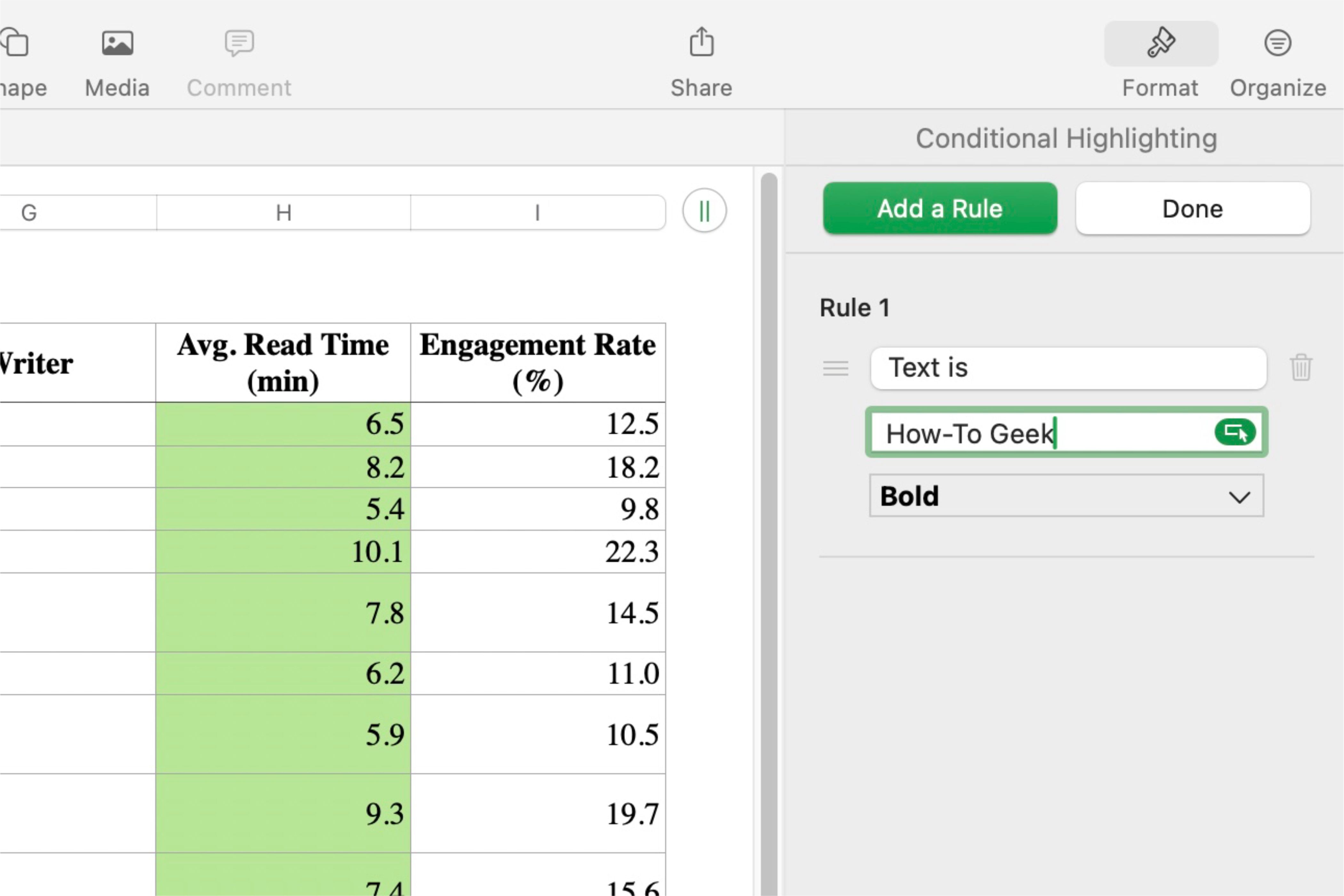
To apply conditional formatting, select the cells you want to modify, click the “Format” icon (the paintbrush) in the top right corner, navigate to the “Cell” category, and click “Conditional Highlight…” at the bottom of the options. This will allow you to set the rules for the selected cells.
Numbers provides various rule options, including conditions based on numbers, dates, text, duration, or even the cell’s value. Don’t be misled by the five main categories—each contains numerous rule templates to suit your needs. You can choose from preset conditions like “greater than,” “text is not,” or other specific criteria.
Once you select a rule, enter the criteria the cell must meet—such as a number threshold or a specific word. Then, choose how the cell appears when the condition is met using a list of preset formatting options.
For further customization, Numbers allows you to create cell visuals from scratch rather than relying on preset options. You can select specific text colors and cell fills or adjust formatting elements like bold, italics, underline, or strikethrough effects, depending on the visual style you want to achieve.

Related
Apple Numbers Is the Best Mac App You’re Not Using
It’s a productivity powerhouse and it’s completely free.
While multiple rules can be applied to different selections of cells, a single cell can only be affected by one rule at a time. If a new rule conflicts with an existing one, the original rule takes priority until it is removed. Additionally, different selections will only display their assigned rules. For example, selecting one row or column will show its unique rules, while another spreadsheet section will reveal a different set.
Conditional formatting is a powerful tool for organizing and analyzing data efficiently. With its user-friendly design and customizable options, it enhances productivity by instantly making critical information stand out.
2
Data Formatting
Data formatting in Numbers ensures a consistent and accurate presentation of information, improving readability and reducing errors in calculations and data analysis. It also allows for seamless conversion between formats in group settings.
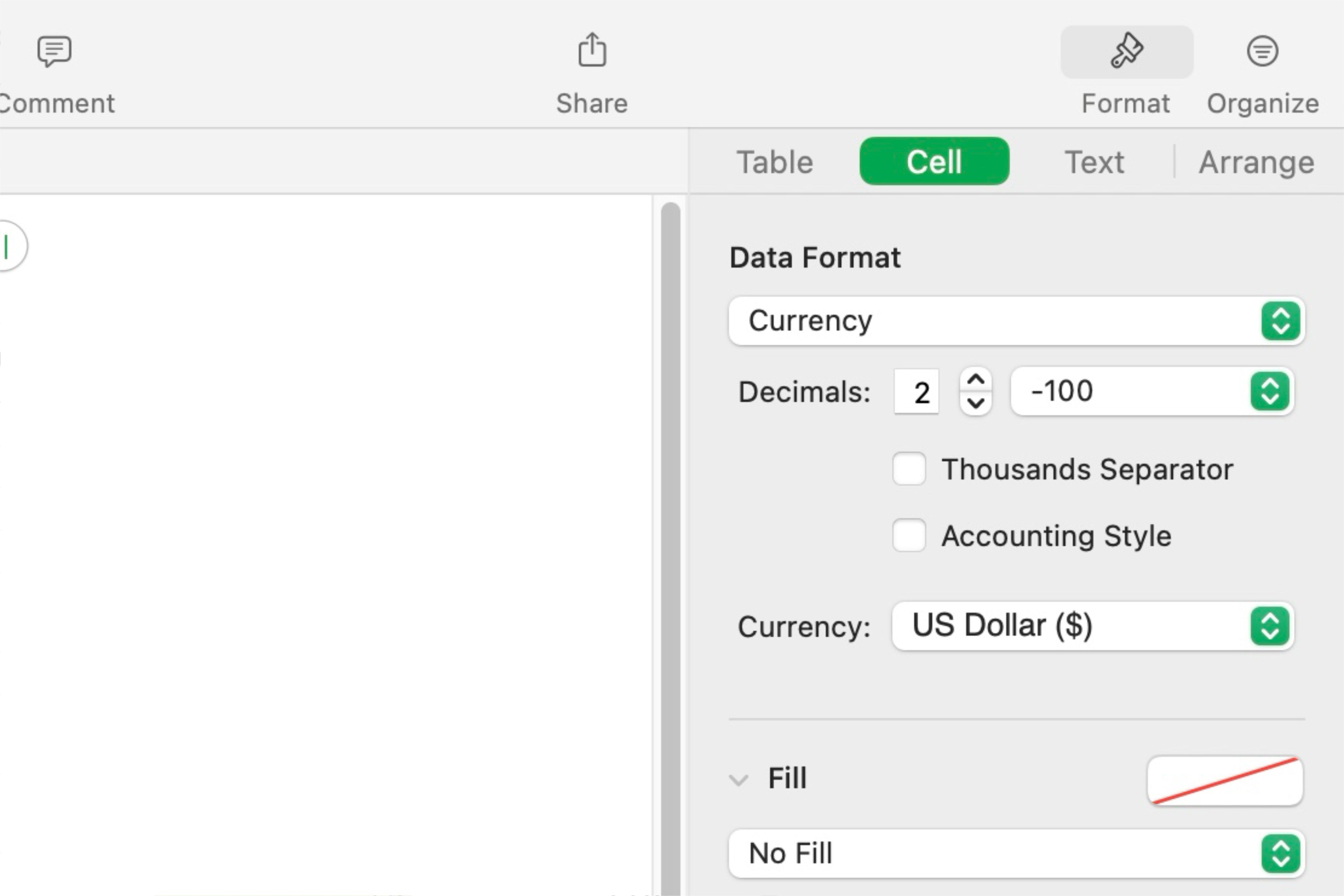
To apply data formatting, select the cells you alter, then click “Format” (the paintbrush icon) in the upper right corner. From the menu, select “Cell,” then click the drop-down menu under “Data Format.”
Ensure you select the appropriate option based on the data type. For example, if the data represents spending amounts, selecting “Currency” will format it correctly, whereas choosing “Date & Time” would be inaccurate.
Changing a number’s format to another numerical category will convert, but the result may not always be suitable. For instance, converting purchase amounts to percentages will apply the change, but the values may not display as intended.
Data formatting allows you to easily transform existing information into the desired format. Whether adjusting decimal placement, changing date formats, or converting decimals into percentages, it provides a seamless way to modify data individually or in bulk, improving readability and comprehension.
3
Data Validation
Data validation is a feature that allows you to control the type of data entered into a cell. By setting rules for acceptable input, you can improve accuracy, prevent errors, and maintain consistency in your spreadsheets.
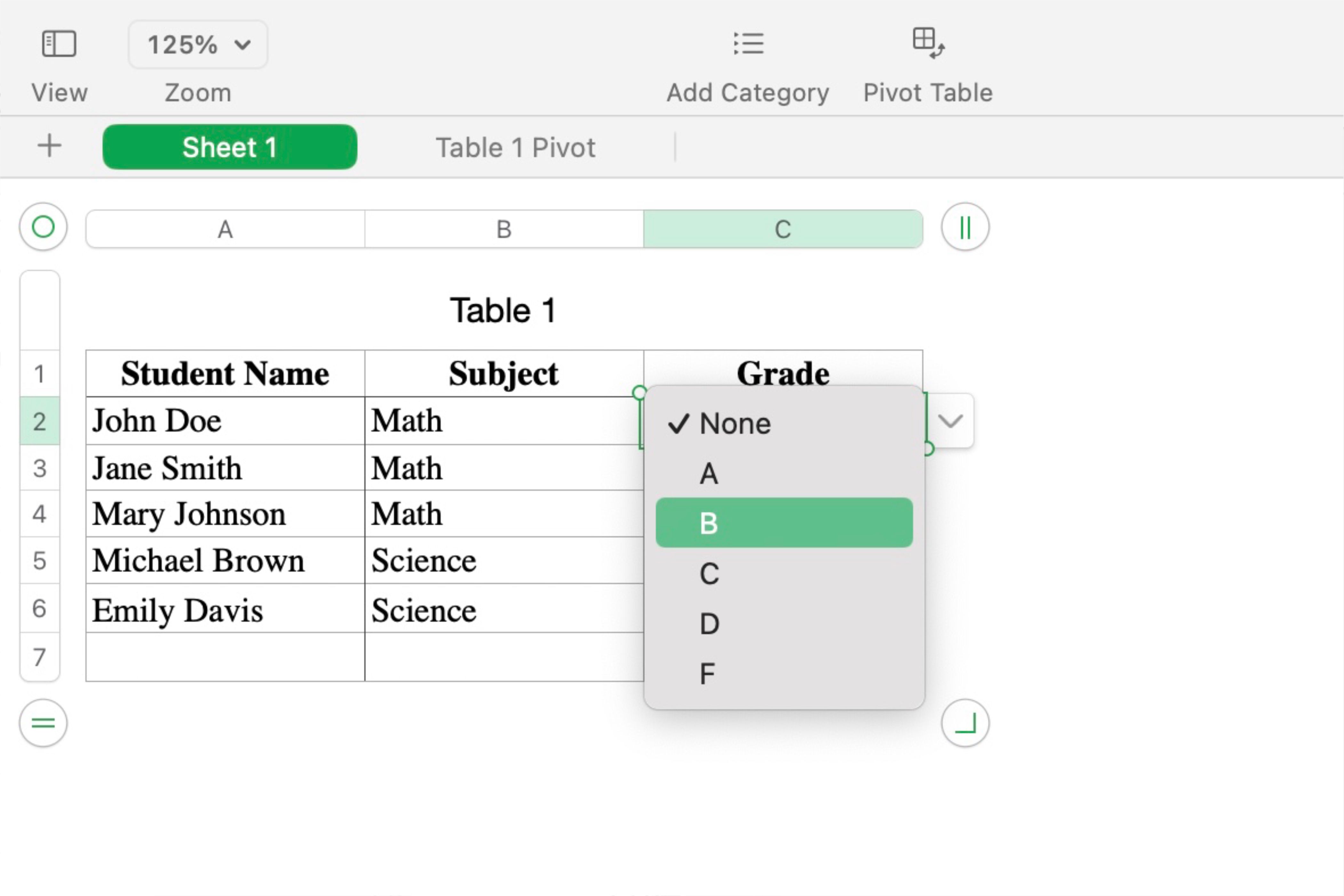
There are several types of data validation tools you can set up in Numbers. These include number range, which ensures a number falls within a specific range; text length, which restricts the number of characters entered; dropdown list, which allows users to choose from a predefined list of options; and date range, which ensures the date entered falls within a specified range. Additionally, you can create custom formulas to put together more advanced rules.
To use data validation, select the cells you want to apply rules to and then click “Format” (the paintbrush icon) in the upper right corner of the screen. Next, click the “Cell” option and select the dropdown menu under “Data Format.”

Related
8 Common Apple Numbers Spreadsheet Functions and Features You Should Master
By mastering the basics, you can count on Numbers.
This tool is handy for entering repeating information across different cells. For example, it’s ideal for teachers entering grades, as it provides a dropdown menu to select the appropriate grade for each student. Data validation is also helpful for people entering product codes and numbers, ensuring they input exactly ten characters—no more, no less.
4
Pivot Tables
Pivot tables in Numbers offer a simple and intuitive way to summarize, group, and analyze large datasets without complex formulas. These interactive and customizable features provide quick insights into key metrics, allowing you to experiment with different views, filter data, and explore details for a more comprehensive analysis.
While pivot tables are widely used in Microsoft Excel, many may not realize they can also be utilized in Apple Numbers. Surprisingly, the underlying functionality is quite similar in both applications.
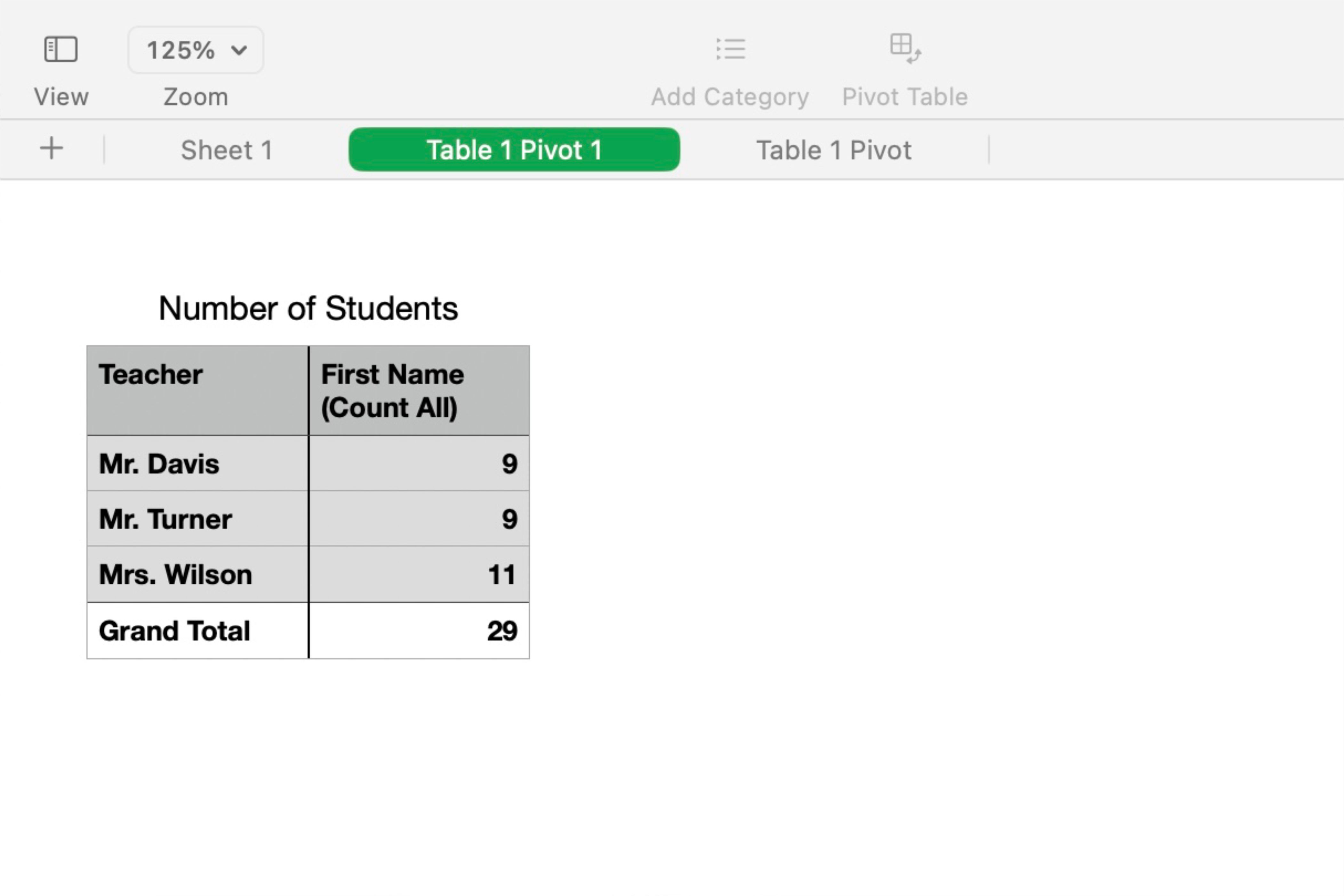
To create a pivot table in Numbers, select the data you want to analyze and go to the “Organize” option in the app’s toolbar. Select “Create Pivot Table” from the dropdown menu and choose whether to add it to the current sheet or create a new one. After selecting a topic, you can rearrange and explore the data from various views from the pivot table.
Although pivot tables may seem intimidating initially, they become easier once you understand how they work. To start, drag the data you want to analyze from the “Fields” box into one of three designated boxes: Columns, Rows, or Values.
Columns and Rows organize the data into separate categories, while the Values box displays a sum based on the data you drag into the associated column or row. For example, if your spreadsheet includes student names, grades, and teachers, you can use a pivot table to find how many students named “John” are in the fifth grade.
Pivot tables simplify the analysis of large datasets by allowing you to gather the necessary information quickly without multiple steps. They provide concise organization and summarization of data, helping you identify patterns and insights with minimal effort and time.
5
Interactive Graphs
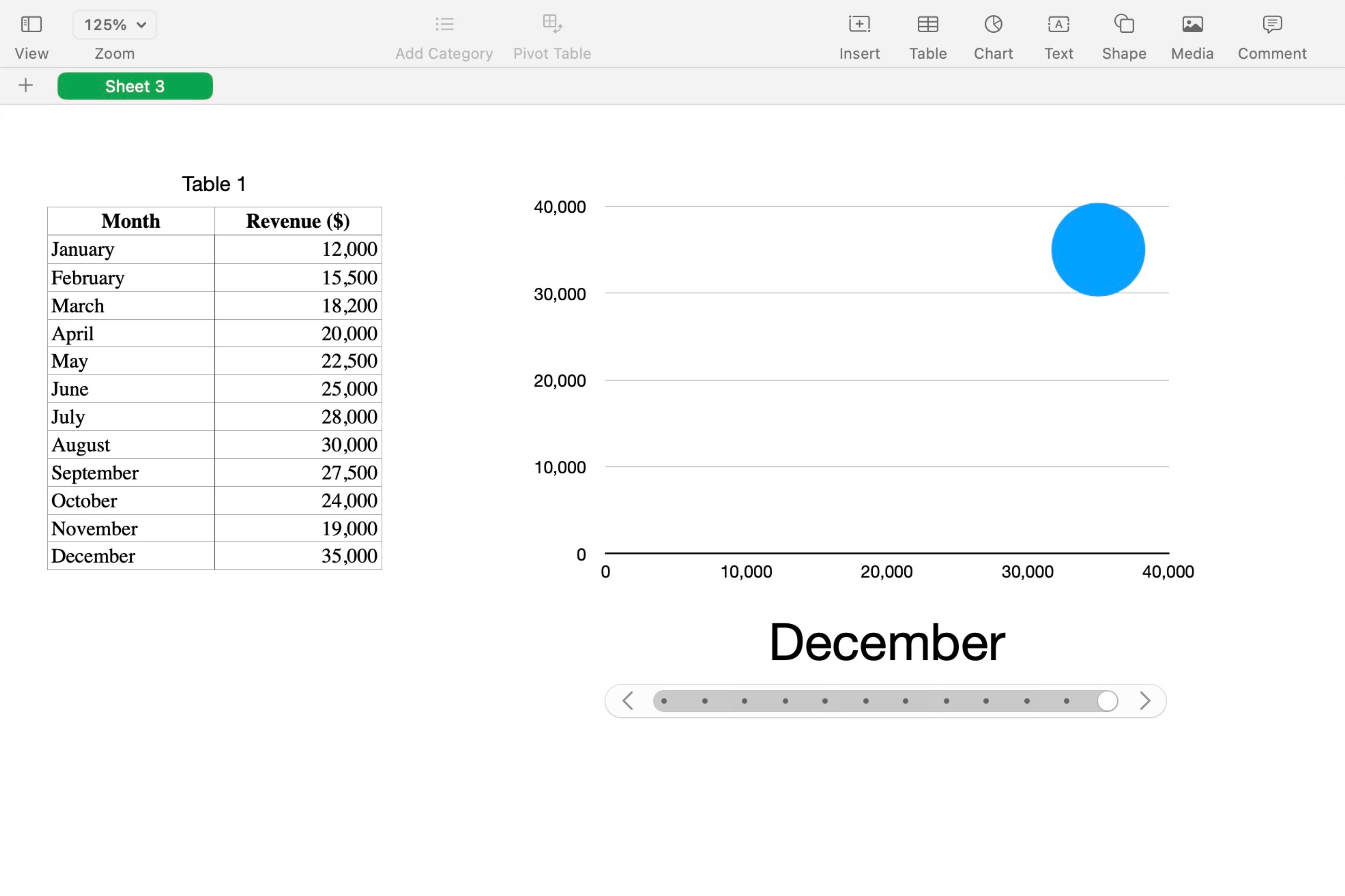
Having numbers and letters in a spreadsheet might seem dull, but you can transform it into a visually appealing and engaging experience with interactive graphs. With a few keyboard taps and mouse clicks, you can turn your spreadsheets into dynamic visualizations.
To create an interactive graph, select your data range in the spreadsheet, click the “Chart” button from the toolbar, and then go to the “Interactive” tab. Once there, choose a chart type from the options, such as a bar chart or scatter plot, and select a color scheme to match.
Once you’ve chosen your chart, it will appear beside your data. You can use the sliders at the bottom to filter or navigate different data categories. As you move the slider, the graph transitions smoothly into its new form, avoiding jarring jumps that make it easier to analyze data across different categories or time ranges.
Related
7 Things Apple Numbers Does Better Than Google Sheets
Google Sheets isn’t the only free spreadsheet app in town.
If you prefer buttons instead of a slider, you can modify these settings in the chart’s options. You can also adjust how the data is presented directly from these settings.
Additionally, if you plan on using the graph for a slideshow, you can copy and paste the interactive chart into Keynote to showcase it visually. This is great for highlighting differences in detailing factors when presenting to clients.
Interactive graphs are the way to go if you want to make your spreadsheet data stand out more when presenting it. They provide another visual representation of the same data, making it easier to digest and understand.
Realistically, Numbers isn’t the first app most people think of when creating a spreadsheet. However, it’s still an excellent tool for the job.
Numbers is a great choice if you’re in the Apple ecosystem and want a user-friendly spreadsheet app. While some features may take time to find, the effort is worthwhile.


