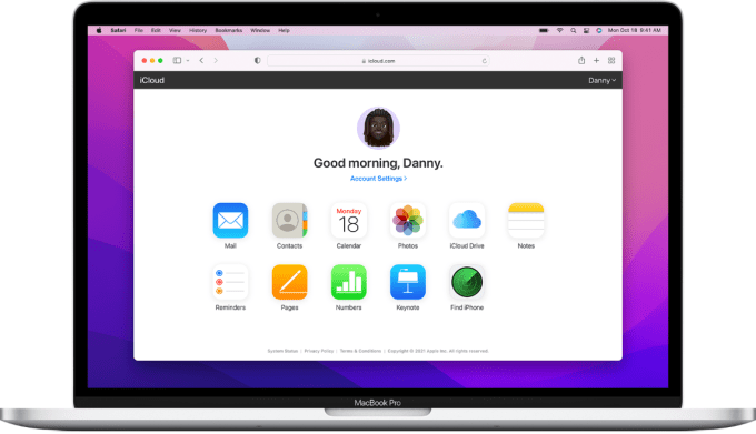
Apple has finally launched a redesigned iCloud website with apps appearing as widget-styled tiles instead of icons. People might be used to accessing iCloud through native apps on their iPhones, iPads or Mac, but this is a welcome change for folks who use the website to quickly access photos, documents, notes and reminders or delete some of the unused files to free up space.
The iCloud website is also particularly useful for people who use a different computer at work, or for people who have an iPhone and a Windows laptop. You don’t have to install any app to access and edit your notes from a computer, for instance.
As MacRumors noted, the company has been testing the new design with app tiles for a few weeks, and now it is rolling it out for all users. ICloud site’s legacy design just showed app icons when you logged in, now it shows details under app tiles such as recent reminders, notes, documents, pages and photos. There is even a launcher tile with app icons to quickly access some of the apps.

The iCloud website’s legacy design. Image Credits: Apple
With the new design, you can create a new page document, a reminder, a note, a keynote presentation or a numbers spreadsheet by clicking on the + sign on the top menu bar.
The grid icon on the menu bar lets you access apps. It also hosts options for checking your storage and to change your plan. The website layout is now customizable. When you click on the “Customize” button, you’ll see the widgets shaking — just like on iPhone or iPad — so that you can move them around or remove them.


