

Whether you’re presenting a slideshow to your executives, clients, or peers, you want to convey your message clearly and successfully. Unfortunately, many mistakes can be made when creating PowerPoint presentations.
From hard-to-read fonts to colors that hurt the eyes of your audience, here are some best practices to keep in mind for your next PowerPoint slideshow.
Choose the fonts wisely
Using a fancy, dramatic, or even whimsical font can be tempting. But you must consider the readability of the font. You want your audience to easily see your headings and bullet points. Consider the two basic font styles: serif and sans serif.
Serif fonts are more decorative, have a classic appearance, and are frequently used in print publications. Each letter has a stroke that extends from a point in the letter. Popular serif styles include Times New Roman, Garamond, Georgia, and Baskerville.

Sans serif fonts are more precise, have a clean appearance, and are frequently used in digital publications. Each letter is clear-cut without wings or curves at its points. Popular sans serif styles include Arial, Verdana, Tahoma, and Calibri.
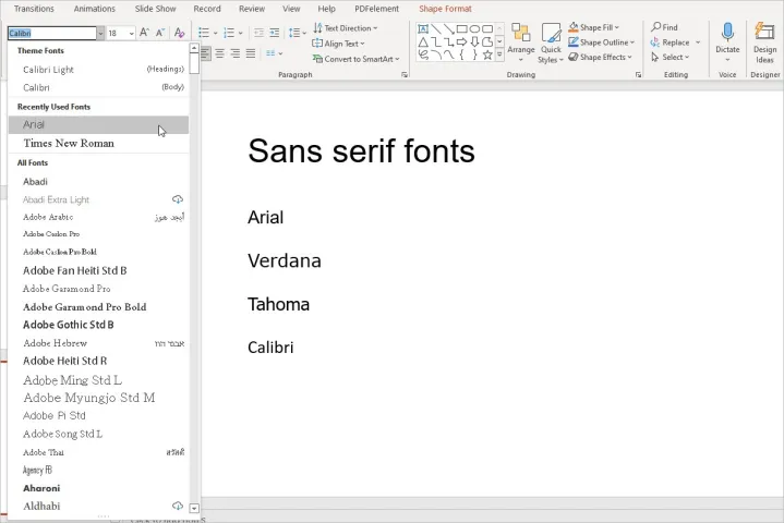
Because of the extended strokes, serif fonts can appear a bit blurry on a screen. This makes a sans serif font the favored choice. The bottom line is that you should remain consistent and use the same type, serif or sans serif, for all fonts in the slideshow.
Select pleasing colors
The colors you use in your PowerPoint presentation can be just as important as the content. You want to use those that enhance the appearance of the slideshow, not distract or give your audience a headache.
As Robert Lane explains in his article about combining colors in PowerPoint, mixing red and blue or red and green can cause eye strain. Plus, red and green mixtures are difficult to see for those with color blindness.
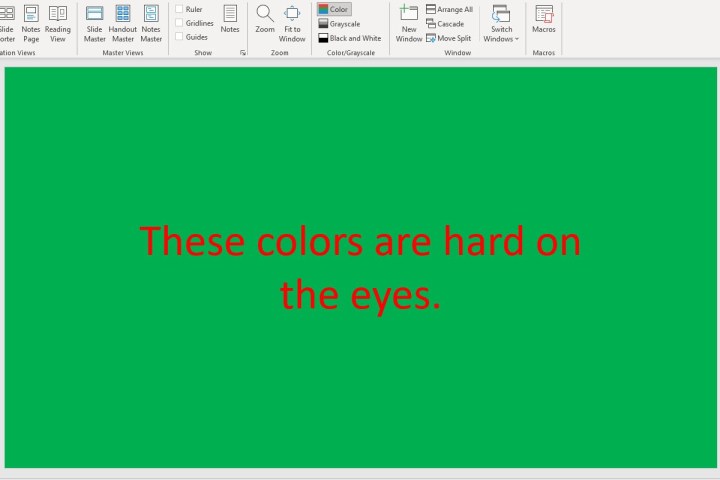
The article mentions that warm colors like reds, oranges, and yellows are eye-catching, whereas cool colors like blues, greens, and purples draw less attention. Additionally, lighter colors are more noticeable than dark.
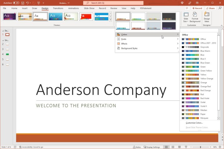
One of the easiest ways to choose the colors for your presentation is to use a built-in theme. Select the Design tab and you’ll see a collection of Themes in the ribbon.
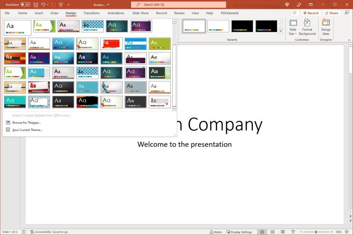
Once you select a theme, you can then use the Variants section to choose a different color scheme. Each scheme includes eight complementing colors. You can also pick the font style you want to use in the Variants drop-down menu.
Tip: You can also check out the Design Ideas if you need help with the layouts for your slides.
Don’t overuse animations and effects
Animations can be attention-grabbing additions to a slideshow. But if you overuse or misuse them, they can be detrimental to your presentation and actually turn off viewers. The best thing to do is consider your audience and slideshow’s purpose.
For instance, if you are presenting the slideshow to a classroom of 8-year-old students, animations can grab and hold their attention more than simple images or words. However, if you’re presenting to your company’s executive team or board of directors, animations can come across as unprofessional.
If you really want to include animations, make them subtle or purposeful. As an example, you may want to expand on each bullet point in your list. You can create an animation to display the bullet points one by one and only when you click.
To do this, select the first bullet point, go to the Animations tab, and choose the Appear effect. Then, in the Timing section of the ribbon, choose On click in the Start drop-down list. Do the same for each bullet point in your list.
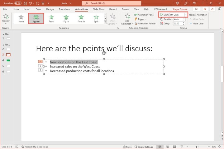
This creates a simple animation that benefits your presentation. It doesn’t distract but instead keeps your audience focused on your current talking point.
Use a standard presentation rule
What is the 10/20/30 rule of PowerPoint? What is the five-by-five rule? What about the 5/5/5 and seven-by-seven rules? Rules, rules, rules. These are different standards that many recommend using when it comes to creating PowerPoint presentations.
- The 10/20/30 rule: Have no more than 10 slides, a presentation no longer than 20 minutes, and a font size no smaller than 30 points.
- The five-by-five rule: Have no more than five words per line and five lines per slide.
- The 5/5/5 rule: Have no more than five words per line, five lines per slide, and five text-heavy slides in a row.
- The seven-by-seven rule: Have no more than seven words per line and seven lines per slide.

What each of these rules basically means is: Keep it simple.
The first rule, 10/20/30, is a good rule to follow for your overall presentation. While it may not always be possible, the more succinct a presentation, the more successful it will be.
The last three rules are helpful ones to follow when you’re adding text to your slides. As you know, presentations are visual. Using too much text means your audience is reading more than watching.
Hopefully, these best practices will help you create a memorable and effective slideshow. For other ways to enhance your presentation, look at how to add audio to the slides or how to include music in PowerPoint.
Editors’ Recommendations


