I want to preface this by saying that I don’t use Spotify anymore, so I have no personal horse in this race. But it’s been a hot topic recently, and not for any good reason. In case you haven’t heard, Spotify has debuted an all-new design coming soon to its mobile apps. For now, the Windows desktop client seems to be alright. But considering anyone using a PC will either have an Android phone or an iPhone if you’re a Spotify customer you’re going to be affected by it.
Spotify’s design changes have been likened to Instagram and TikTok, which says to me that they’re trying to be more like a social media platform than a music service. Trying to maximize the amount of time your eyes, rather than just your ears spend on it. I get it. Businesses need to make money.
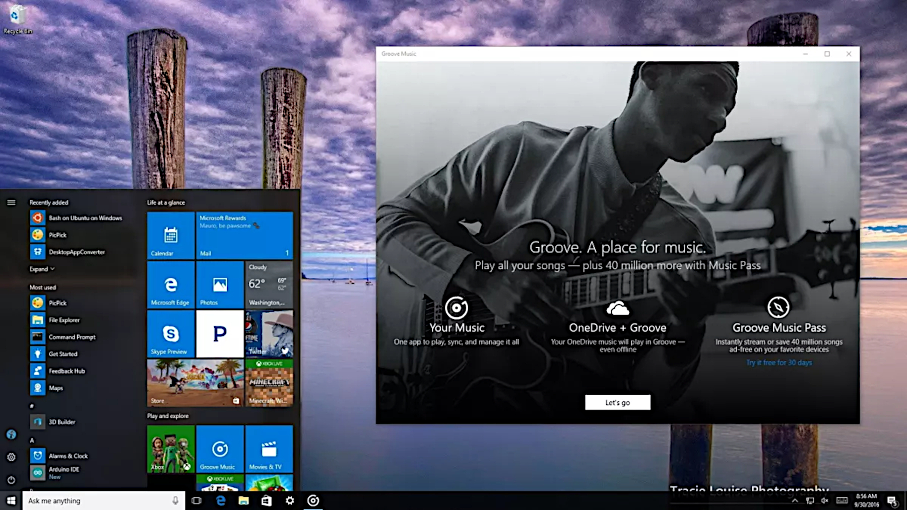
But I’m an old-fashioned kind of music listener, and all of this just sounds awful to me. Honestly, I’m still pining for the lost Groove Music service, one of many products sent to Microsoft’s big tech graveyard long ago. It had everything I wanted. It had music, and a simple, clean-looking app. No fluff. Why can’t we just have that again?
Groove Music was so underrated

The reason I got into using Xbox Music, later to become Groove Music, was naturally Windows Phone. With spotty support for the established music services of the time, I simply gravitated to Microsoft’s own. OK, I also enjoyed MixRadio (RIP), too, but as a complement, not a replacement.
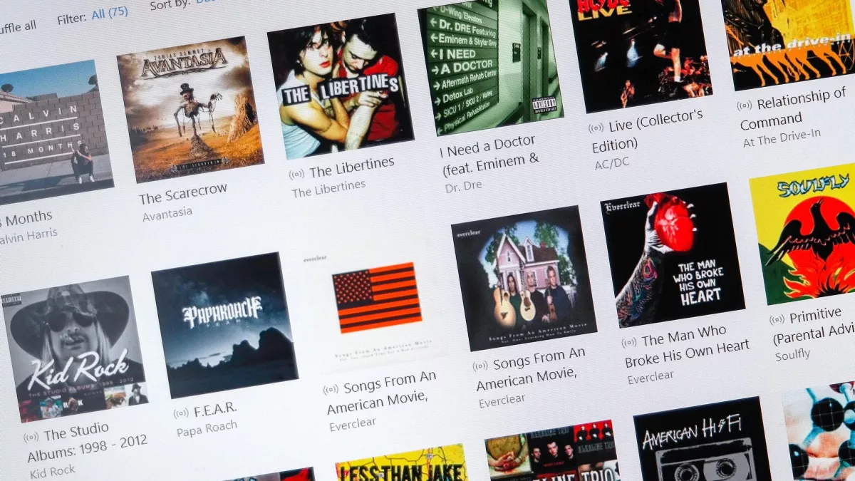
Microsoft’s music service was seriously underrated, though. Whatever it was called at the time, it was just a good service. Naturally, on Windows phones, both Xbox Music and Groove Music perfectly mirrored the overall system UI. But they weren’t cluttered up with junk. The apps were clean, well laid out, good-looking, and just nice to use. And that applied across platforms. The remnants of the Windows app might now just be “Media Player” but still, I miss it.
The music selection was always great, too, in my opinion. I’ve never judged a music streaming service on which has the biggest library. What matters is finding the music I want to listen to, and Groove never failed in that regard. It was a music service for listening to music. That’s all I ever wanted. It’s all I want right now.
Why does everything have to be a social app?

Microsoft won’t bring back Groove Music, no matter how much I, or anyone else who has fond memories of it, wants it. So we have to make the best alternative choice. For me, that was Apple Music because it’s about the closest I could settle on (and I use an iPhone so it was easy.)
The reason I couldn’t go back to Spotify was initially that it was pushing podcasts so hard, along with just seemingly ignoring whatever I actually wanted to listen to. Apple Music doesn’t have podcasts built in, which is perfect because I don’t want that. But it also has a good handle on recommending good music to me.
But this Spotify redesign is a bigger indictment of where everything seems to be going these days. With the explosion of services like TikTok and features like stories, it feels like everything wants to be the same. The same social space fighting to keep your eyeballs on it.
Do we need video, short form or otherwise pushed on us at every single turn? Do we need to open every app and see stories front and center?
No. We don’t. Just let us listen to music in peace.


