

When I learned how to use tables in Microsoft Excel, it totally transformed how I work with data. Even if you think you already know everything there is to know about Excel tables, hopefully, you’ll pick up some additional tips in this guide!
Convert Data Into an Excel Table
Before you convert your Excel data into a table, make sure you have column headers along the top row. This will make dealing with and using the data much more straightforward down the line.

Then, select all the cells you want to convert, including your column headers. Alternatively, if your range is contiguous (in other words, all the cells are next to each other with no blank columns or rows), simply select one cell in the data. Then, in the Insert tab on the ribbon, click “Table,” or use the Microsoft Excel keyboard shortcut, Ctrl+T.

Related
The Best Excel Keyboard Shortcuts I Use as a Power User
The key to excelling in your spreadsheet work.

Now, in the Create Table dialog box, double-check that the whole range is selected, make sure “My Table Has Headers” is checked, and click “OK.”

Your data is now a formatted Excel table, with filter buttons added to your column headers.

Change the Table Design
Once your table is created, it’s time to adjust its layout. When you select any cell in your newly created table, the Table Design tab appears on the ribbon. Open this tab to see the different options.
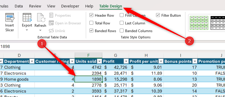
First, click the down arrow in the Table Styles group to choose from the different layout options. In my case, I’ve gone for the medium plum style.
Next, head to the Table Style Options group in the Table Design tab to see several checkboxes.

- Header Row: If you checked “My Table Has Headers” in the Create Table dialog box, leave Header Row checked.
- Total Row: Checking this option adds an extra row to the bottom of your table where you can add column totals (more on this soon).
- Banded Rows: Enable this option to make it easier to read across the table’s rows. This is especially useful if you have lots of columns.
- First Column: This applies formatting to the left-most column in your table, essentially turning this column into row headers.
- Last Column: This applies formatting to the right-most column in your table, which is handy if it contains overall or summary figures.
- Banded Columns: Check this option to help people follow columns downward. I would advise that you check either Banded Rows or Banded Columns—checking both could cause confusion and make the table look untidy.
- Filter Button: This option adds filter arrows to the header row.
After checking “Total Row,” decide which columns you want to be totaled by selecting the relevant cell in the total row, clicking the down arrow, and selecting one of the aggregation options.

If you apply a filter to one of the columns, only the values on display in the table will contribute to the totals in the total row.
The final adjustment you should make in the Table Design tab is to give your table a name. By default, Excel tables are called Table1, Table 2, Table3, and so on. However, changing the table name makes your spreadsheet more navigable, helps people using screen readers, and makes formulas easier to understand if they reference data in the table.
Related
To rename a table, head to the Properties group of the Table Design tab, and replace the default name with something more relevant.

Table names must start with a letter, underscore, or backslash, with the remaining characters being letters, numbers, periods, or underscores. They must also be unique, can’t contain a space, and mustn’t have the same name as an existing cell reference, like A1.
Don’t Freeze the Top Row
When working with large datasets in Excel, you might be used to freezing the top row, so that when you scroll down, the column headers remain visible.
However, one of the many benefits of formatting your data as an Excel table is that you don’t have to take this step. Instead, providing you checked “My Table Has Headers” in the Create Table dialog box and one of the cells in the table is selected, when you scroll down, the letters above your spreadsheet that represent the columns (A, B, C, and so on) automatically turn into your table column headers. This works even if the column headers aren’t in the first row.

Notice, also, how these column headers also display the filter buttons, meaning you don’t have to scroll to the top of your worksheet to change what your table displays.
Use the Filter Buttons
I’ve already mentioned the filter buttons in Excel tables several times in this guide, and that’s because they’re a real time-saver. In short, the filter buttons make it easy to narrow your data to the most relevant information, saving you from having to search through your rows and columns manually.
The filter buttons give you different options depending on the type of data you have in each column. For example, the filter button for column D—which contains text—offers various text filters, like searching for values that begin or end with certain characters.

On the other hand, when I click the filter button in a column containing numbers, the filters change accordingly.

As well as the options to sort a column in ascending or descending order or filter by color, there’s also a search field in the filter drop-down, which helps you speed up the filtering process even further.

Click “OK” once you have typed your filter search query and checked or unchecked the relevant options to apply the filter.
Another nifty trick is to filter a column based on a selected value. In this example, I only want to display employees in the electronics department. To do this, I can right-click a cell containing the word “Electronics,” and in the Filter menu, click “Filter By Selected Cell’s Value.”

Filter With Slicers
While the filter buttons are great ways to organize and arrange your data, an even easier way to do this is by adding slicers, especially if a particular column is more likely to be filtered than the others.

Related
In this example, let’s say the CEO is most interested in the profit made by employees in different departments and which people are the best candidates for promotion. You can make the CEO’s life much easier by adding slicers for these three columns.
With any cell in the table selected, click “Insert Slicer” in the Table Design tab on the ribbon.

Next, check the columns for which you want to add slicers, and click “OK.”

Now, click and drag the slicers to reposition or resize them, or open the “Slicer” tab on the ribbon to see more options. You can also right-click a slicer and click “Slicer Settings” to further customize this advanced filtering tool.

You and your CEO can now use the slicers to quickly filter data in the Excel table. In this example, the slicers are set to display employees in the beauty and clothing departments who have the potential for promotion to a higher role, and because those selections are colored blue, it’s easy to see how the data is filtered.

Hold Ctrl when selecting elements in a slicer to display them all at the same time, or press Alt+C to clear all selections in the slicer.
Add Columns and Rows
Adding a column to the right or a row to the bottom of a formatted Excel table is satisfyingly simple. In this example, as soon as I typed “Score” into cell K1 and pressed Enter, Excel expanded the table’s dimensions to capture the new column. This means I don’t need to apply any manual formatting to the new data.

Similarly, when I added another employee ID to cell A32, not only did Excel expand the table downwards, but it also duplicated any formulas I had created in previous rows.

If you prefer to prepare the new columns and rows before adding the data, click and drag the table’s fill handle right or downward. If you use this method, remember to name each new column by adding a header in the first row.
You can also add a new row or column between existing data by right-clicking the row or column header, and clicking “Insert,” safe in the knowledge that the table formatting will be applied automatically to these new data entry points.

Clicking “Insert” on a column adds a new column to the left, while clicking “Insert” on a row adds a new row above.
Make Column-Based Calculations
Another benefit of formatting your data as an Excel table is that performing calculations between the columns becomes much easier and quicker.
Let’s assume you have the table in the screenshot below, and your aim is to calculate the profit per unit by dividing the values in the Profit column by the values in the Units Sold column.

To do this, in cell G2, type =, select cell F2, type a forward slash (/), and select cell E2. As you do this, notice how Excel inserts the column headers—also known as structured references—into your formula, rather than direct cell references, and this is why it’s important to have named column headers in your table:
=[@Profit]/[@[Units sold]]


Related
Everything You Need to Know About Structured References in Excel
Use table and column names instead of cell references.
The square parentheses are Excel’s way of indicating that it’s using a structured reference, and the @ symbol (also known as the intersection operator) means that the calculation will be applied respectively to each row within the table.
When you press Enter, the remaining cells in the Profit Per Unit column adopt the formula.

Structured references are easier to create, read, and parse than direct references, and they remain loyal to the relevant columns, even if extra columns are added. What’s more, because the whole column is referenced in the formula by its header, the calculation will automatically apply to any new rows you add.
Even more impressively, if you rename one of the column headers, the structured reference adapts to accommodate this change. In this example, the Units Sold column has been renamed “Units,” and the formula in the Profit Per Unit column reflects this update.

Structured references work whether you’re working within or outside the table, meaning you can easily reference the table and its columns from anywhere in the workbook.
Here, I’ve inserted extra rows above my table, as I want to calculate the total profit here rather than at the bottom to avoid having to scroll down each time. Another benefit of performing this calculation outside the table is that it ignores any filters. This means I could choose to insert a total row at the bottom that calculates only what is displayed and a grand total outside the table that calculates all the data.

Now, in cell F2, I will type:
=SUM(
Then, when I hover my cursor over the Profit column header, it turns to a black down arrow, indicating that it’s ready to select the whole column.
At this point, when I click, Excel will add a structured column reference to the formula. However, this time, because the formula is outside the table, it also references the table name (Employee_Data):
=SUM(Employee_Data[Profit]
This is why it’s crucial you name your table in the Properties group of the Table Design tab on the ribbon. When I close the rounded parentheses and press Enter, the calculation is complete.

To avoid using your mouse in this process, after typing =SUM(, start typing the table name, and press Tab when it appears in the tooltip list.

Then, with the table name added to the formula, add a square bracket to see a list of the columns in the table, use the arrow keys to select the relevant label, and press Tab again to add it to the formula.

Finally, close the square and rounded parentheses, and press Enter.
Once you’ve created your table, you can go one step further and convert it into a PivotTable to adjust how the data is visualized, generate comprehensive data summaries, and perform complex analyses. What’s more, you can then produce PivotCharts, handy if you’re looking to create a dashboard containing all your key performance indicators.


