Back in September, Google announced a Material You redesign of desktop Chrome that’s now more widely rolling out.
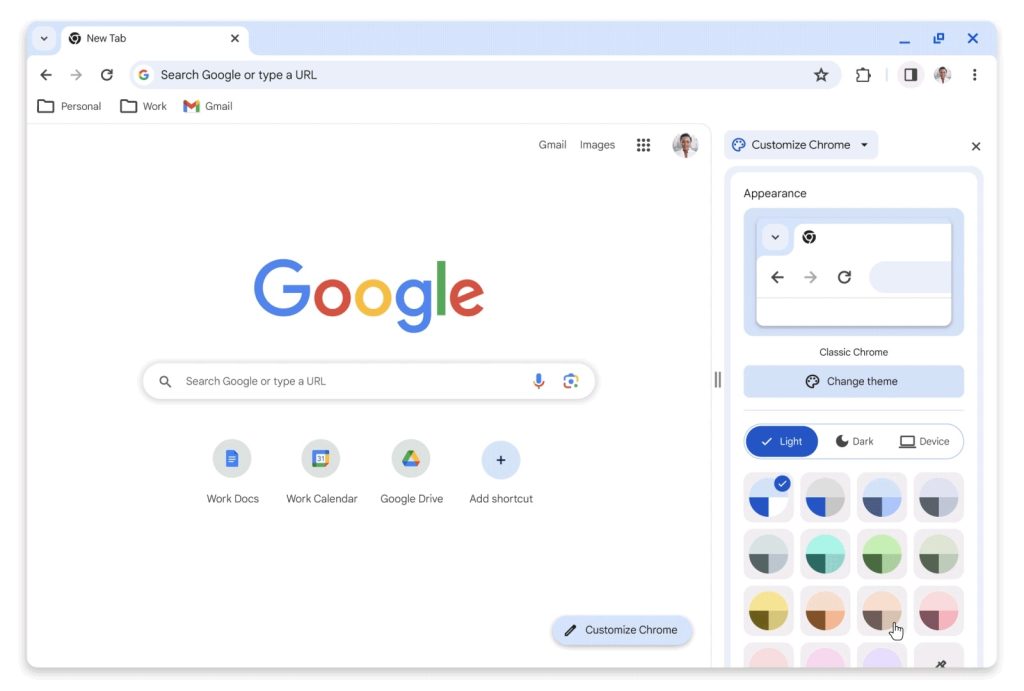
The last visual revamp happened in 2018 with the Google Material Theme. This one, which coincides with the browser’s 15th birthday, introduces the Material You design language from Android and the web with a lot of rounded corners, like the side panel, while the tab strip, address bar, and bookmarks get taller.
The Omnibox (where you enter URLs and search) no longer shows a lock icon at the very left, given the widespread adoption of HTTPs. Instead, the new icon is meant to emphasize that tapping will give you various site controls and other information.
Other changes include outline-style icons (that are hollow inside) with a focus on improving legibility. The most significant example is in the three-dot overflow menu, where each item is paired with an icon that helps make the list feel less dense. The menu items have also been reordered, and there’s a sub-menu for your signed-in Google Account.
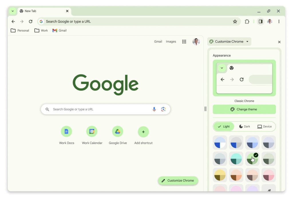
Meanwhile, color plays a big role in this Material You redesign with new palettes “that better complement your tabs and toolbar.” On the New Tab Page (which now displays frequently visited sites/favicons in a row), tap “Customize Chrome” to play around with the different hues. (Turn off dark mode for the best result.)
Overall, Chrome’s general layout has not changed. On the Mac, one complaint I have with the redesign is how there is not enough padding between the current tab and the Chrome window in the strip at the top.
In recent days, updating Google Chrome to the latest version 119 release on Mac, Windows, and Linux introduced this Material You redesign. We’re not seeing a wide rollout on ChromeOS just yet, though Material You is already live in other parts of the operating system.
More on Google Chrome:
FTC: We use income earning auto affiliate links. More.


