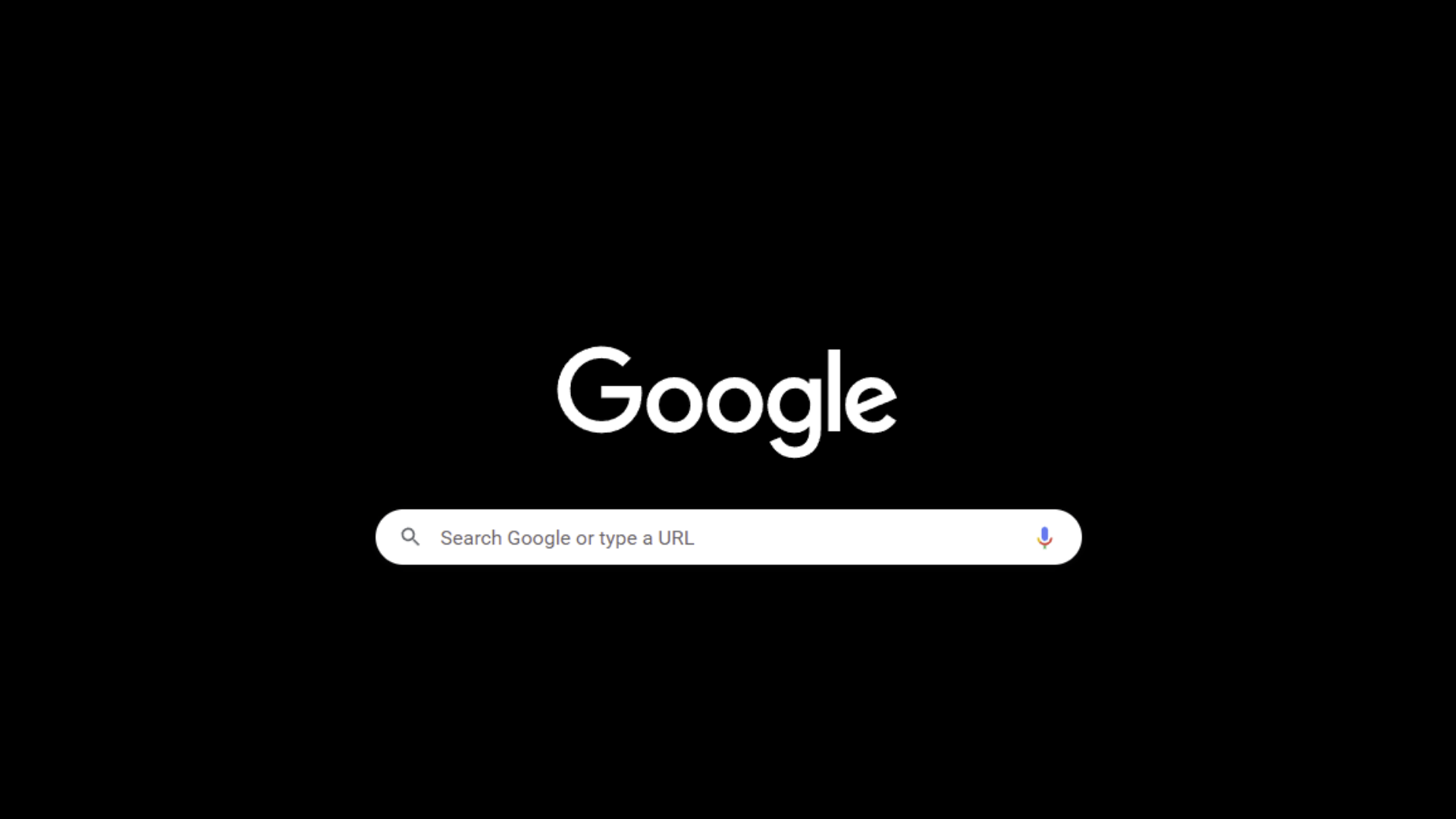
Google could soon make its dark mode even darker with some of the search engine’s users reporting that the gray Dark Theme is now pitch black.
The change was first spotted by 9to5Google though it’s possible you haven’t noticed any differences. That’s because Google appears to be A/B testing its two dark modes, some users are stuck with the gray while others are able to make the search engine go full-on goth.
Reaction online appears mixed – some users love the true black dark mode while others find it jarring when they click onto light-colored webpages. We’ll have to see which version of the dark theme Google settles on, but most likely it will appeal to both sides by offering a Dark and Darker Theme respectively.
If you want to see which version of Google’s Dark Theme you’ve been assigned, you’ll want to head to Google.com then search for anything (we’d recommend TechRadar). Once the results flash up you can find a gear icon in the top right corner of the page, click it, and under appearance, you opt for either the Light or Dark Theme.
Right now though, there’s currently no way to choose one of the Dark Themes over the other (Google will decide for you), but there is a way to experience the darker dark mode in a small way.
For those of you using the Google Chrome browser, you can head into Settings and then Appearance. At the top of this page’s menu, you should then see a Theme option. Clicking on it will take you to the Chrome Web Store where you can choose a new theme – specifically, you want to look for the Just Black option.
Once set up, your Chrome tabs should turn darker, and your Google.com homepage will take on the new darker dark mode’s black appearance.
If you then use the search bar tool, however, your results will take you to a page colored in whichever version of dark mode Google chose for you.
We hope the option to choose your preferred Google Dark theme will arrive soon.


