Having been a user of the original HomePod ever since it launched, I was so happy to see Apple announce its return last month.
I just got my new Midnight HomePods on Friday, replacing my existing stereo pair of Space Gray models. Here’s some hands-on impressions of what’s changed compared to the original …
On the whole, the new HomePod is the same as the old HomePod. It costs the same, sounds the same, and works the same.
It’s a bit of a mystery why Apple discontinued it in March 2021, only to revive it in almost the exact same form roughly two years later.
There’s not much new here to convince you to buy, if you didn’t get one first time round. But there are some changes to speak of. Here’s a look at the big – and the small – differences:
The new Midnight color is darker and bluer than Space Gray
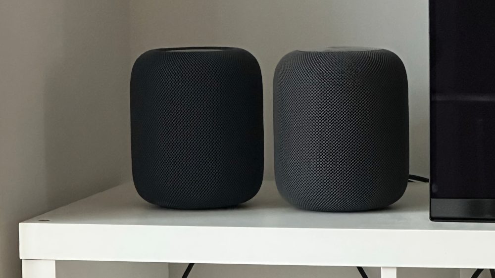
There is a noticeable visual difference between the old Space Gray and the new Midnight color options. Similar to the Apple Watch look, the HomePod in Midnight has a slight blue tinge and appears darker than Space Gray in most daytime lighting conditions. In bright light, it appears dark blue-ish, but still neutral enough. In darkness, they look the same. It’s minor, but I like the new color more – the extra blackness in tone is appreciated and looks nicer next to my black OLED TV.
In time, I hope the big HomePod gets the same array of color options as the mini. (The mini debuted with the same white and space gray at launch, and Apple added orange, blue, and yellow choices about a year after launch.)
The new top surface is a mini step back
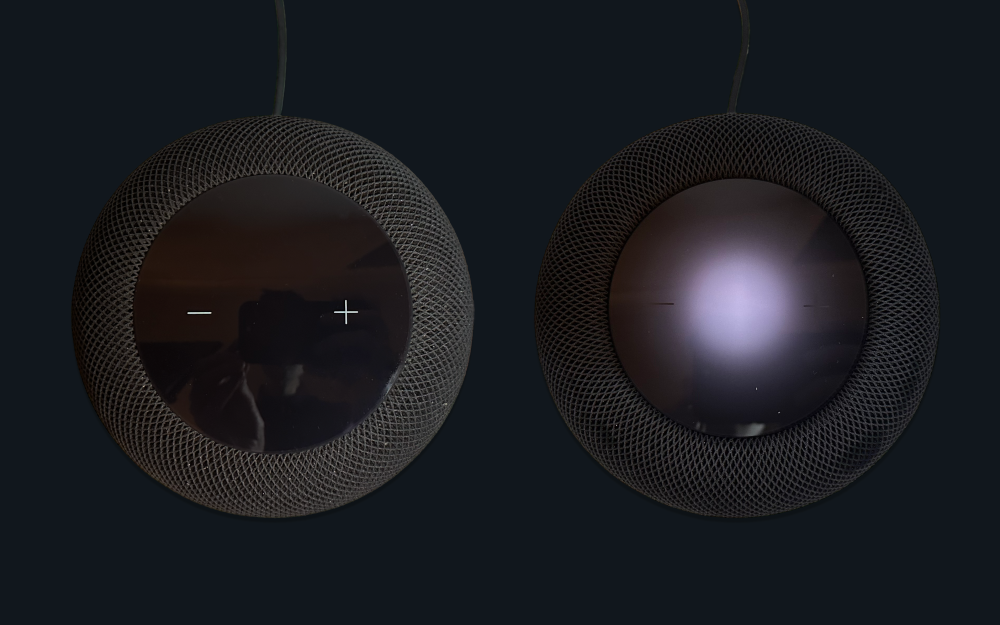
The new HomePod adopts the top surface design first seen on the HomePod mini — just bigger. On the old HomePod, the plus and minus volume buttons light up. On the new HomePod, they are simply etched markings into the top surface. While music is playing, a small white circular glow in the center of the surface provides illumination so the etchings are just barely visible. But if you didn’t know they were there, you wouldn’t spot them.
While Siri is listening to your request, the whole surface lights up with the multicolor orb effect. In this state, the volume buttons stand out… but you don’t usually need to adjust the volume when Siri is talking. I also think the inset panel looks less premium overall, as it doesn’t feel as unified with the seamless mesh surround.
A little smarter thanks to sensor and chip upgrades
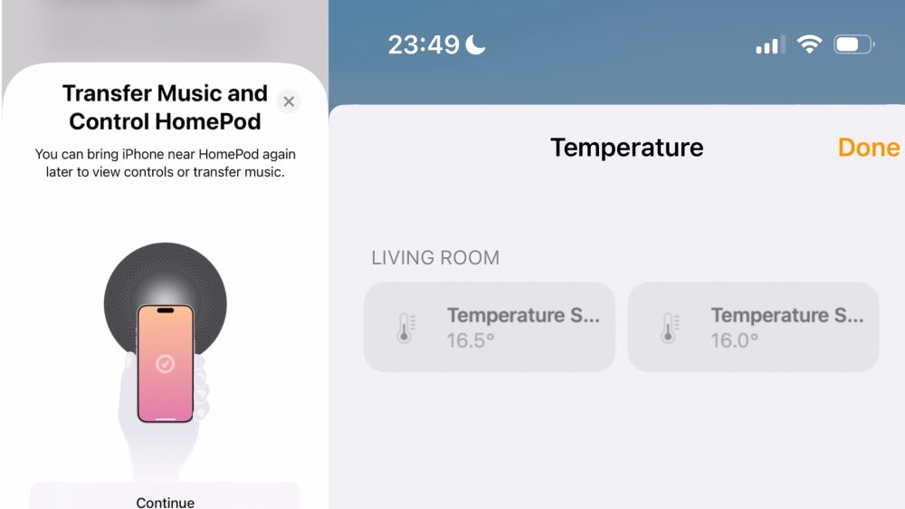
The new U1 chip allows for a smooth Handoff experience – just bring your iPhone close and the HomePod panel appears automatically to transfer music. The original HomePod offered a simpler version of this feature that relied on Bluetooth to detect proximity — nowhere near as accurate or responsive as the ultra-wide band version. The HomePod now also has a Thread radio inside, useful for controlling newer HomeKit (and Matter) accessories that run over Thread.
Temperature and humidity sensors are also a welcome convenient addition (also now exposed on HomePod mini). These sensor readings show up automatically in the Home app after some initial calibration; what is slightly weird is that even when used as a stereo pair, each HomePod unit reports its own temperature and humidity. This means you get two numbers for the same room, perhaps only off by half a degree or so. It would make more sense if both readings were averaged together for you and presented as one result metric.
Sound quality and Siri seem the same
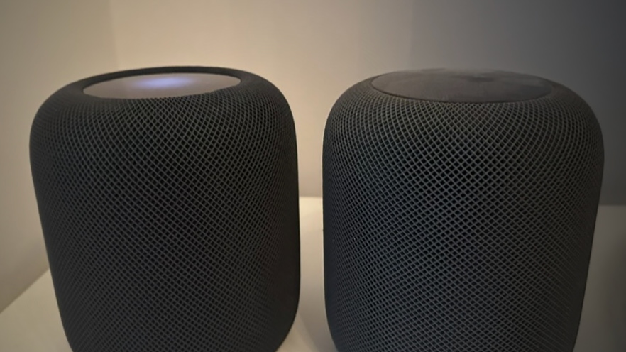
While it does seem this incarnation was designed in a way that it is cheaper for Apple to produce, it does not manifest itself in the end-user experience. The HomePod works and sounds essentially identical to the first-generation model. I have been doing side-by-side listening tests with many songs over the weekend, and I couldn’t tell a difference between them. The 16.3 tuning promotes vocals more, which is a good change and reduces the bass boominess when listening to podcasts or dialogue in TV shows.
The far-field microphones are just as impressive as always. For better or worse, the responsiveness to Siri requests also appears unchanged. As before, the HomePod isn’t doing much local processing so the speed mostly depends on the Apple backend and your local network connectivity. (You can check Wi-Fi signal strength for a particular HomePod in the Home app details screen.)
The detachable power cord is a useful tweak
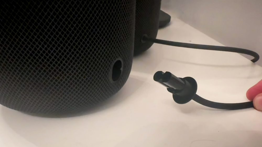
Finally, a welcomed tweak is that the power cord is now readily detachable. If you are putting your HomePod on a cabinet or a shelf, the detachability means it is so much easier to trail the cord through cable management holes, and plug it into the actual HomePod unit afterwards. It’s also a standard plug size, so you can buy replacements if the cord gets damaged and I expect third-party accessory makers to sprout up to offer longer and shorter cable lengths, and maybe a battery-powered portable dock.
Hope for the Apple smart home ecosystem
Quirks and all, I am thrilled that Apple is investing in the big(get) speaker market again. It will never be the biggest seller — the mini price and feature set is more closely aligned with what most people want. Just like Amazon has the Echo Studio, and Google has the Google Home Max, Apple has the HomePod.
But whereas Google and Amazon have a plethora of different models in all sorts of shapes and sizes, Apple now has two. Crucially, I hope Apple has larger ambitions for its product line. This is hopefully the start, not the end, of a family of Apple smart home accessories.
FTC: We use income earning auto affiliate links. More.
