

Microsoft Excel is arguably the greatest spreadsheet application from Redmond, and there’s a good reason so many number crunchers use it for all of their number crunching needs. While using Microsoft Excel is fine for simple spreadsheets to track expenses or build calendars, it comes into its own when you need to slice and dice and then present complex data. Here, we show you how to create a pivot table in Excel to take advantage of one of the application’s most powerful tools.
Before we start, just what exactly are pivot tables good for? Simply put, pivot tables let you look at the same data in different ways and from different angles, to make it easier to perform in-depth analysis and to spot important trends. When you’re evaluating sales results, for example, you may want to look at an individual person, a specific product, or a specific timeframe. With a pivot table, you can create one pool of information and then easily change your focus from one thing to another — an analysis that would be tedious to perform manually.
Pivot tables are now functional in all current versions of Excel, whether you paid for the software or use Microsoft Office/365 for free.
Step 1: Prepare your data
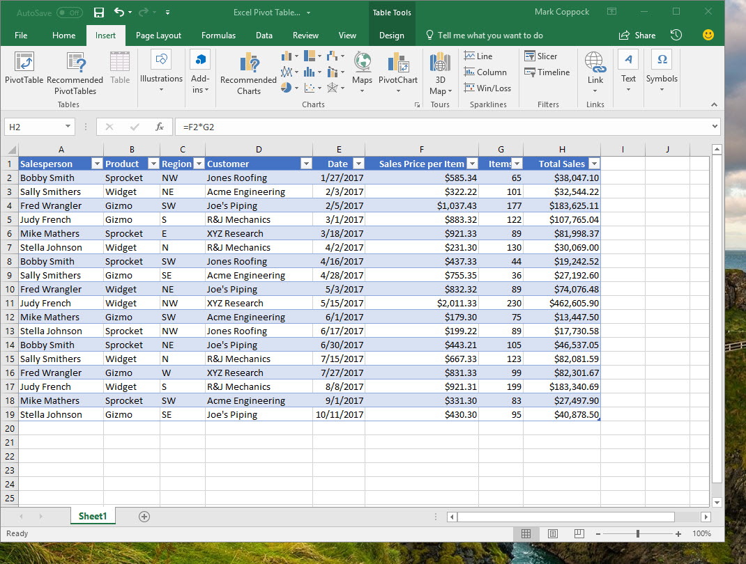
Perhaps the most important step in using Excel pivot tables is to carefully organize your data. The easiest way to do this is to use Excel tables, which let you add rows that will be included with your pivot table whenever you hit refresh. But at the very least, you want your data to be in tabular form with informative column headers and with consistent data within columns. Consider adding a new column of data if they’re available and will improve the resulting pivot table.
For example, let’s say that you want to analyze sales information for your company. You have six salespeople who sell three products across a number of regions. Your products are tailored for each customer and so pricing varies. Here’s a sample table with fictional information to give you an idea of how data can be organized with a pivot table in mind.
The table was created simply by first entering the data, then selecting the entire range, and then going to Insert > Table. Again, you don’t have to take this step but it’s recommended if you want to add more rows of data later and make it easier to update your pivot table.
Mark Coppock/Digital Trends
Step 2: Try a recommendation
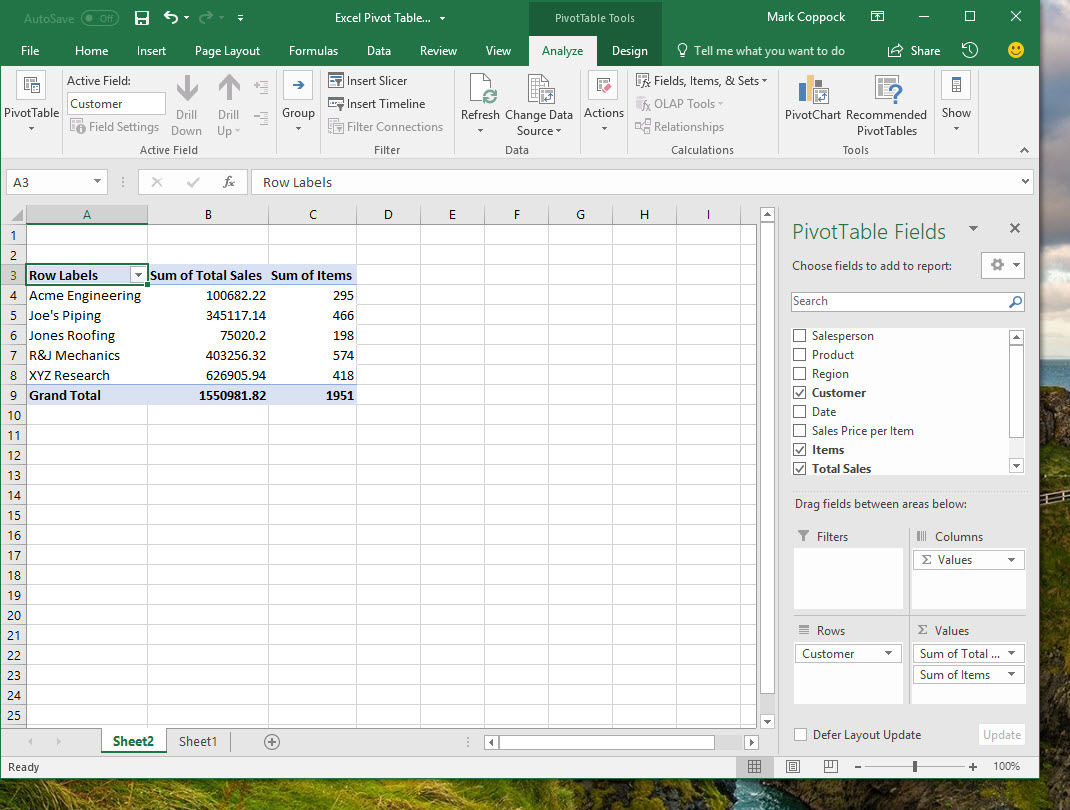
Excel is full of nifty tricks to make working with data easier, and whenever possible it will try to guess what you want to accomplish and then automatically carry out a few steps. This helpful nature is demonstrated here by the Recommended PivotTables tool, which takes a look at your data and offers up some logical options on how to analyze and present things.
To use a recommended pivot table, simply go to Insert > Recommended PivotTables. Excel will present a few options for you to consider. In our example, Excel offers to create 10 different pivot tables that take a look at a number of different angles on our sales data. Note that how you label your columns matters; Excel reads these headers and offers up recommendations that make the most sense. If you want to look at sales prices, for example, don’t use the term “cost,” because Excel will base its recommendation accordingly.
One recommendation is “Sum of Total Sales by Customer.” If we choose that option, then Excel will proceed to create the pivot table.
Notice that the pivot table is displaying only the data that’s pertinent to our present analysis. On the right-hand side, you’ll find the criteria that Excel used to create it in the PivotTable Fields dialog. We’ll cover what each of these field means in the next section on customization.
Step 3: Customize your pivot table
Each of the items in this dialog is important to determine how your pivot table will work. Click the configuration cog to alter this dialog’s look to whatever works best for you.
Fields selection
Here, you are choosing which columns to include in your pivot table. How that data will populate in the pivot table is determined by the type of data that it represents — Excel will figure out for you whether to add a column to your pivot table or add the field’s data within the table. For example, if you select “Items,” Excel assumes you want to add the number of items for each customer.
Mark Coppock/Digital Trends
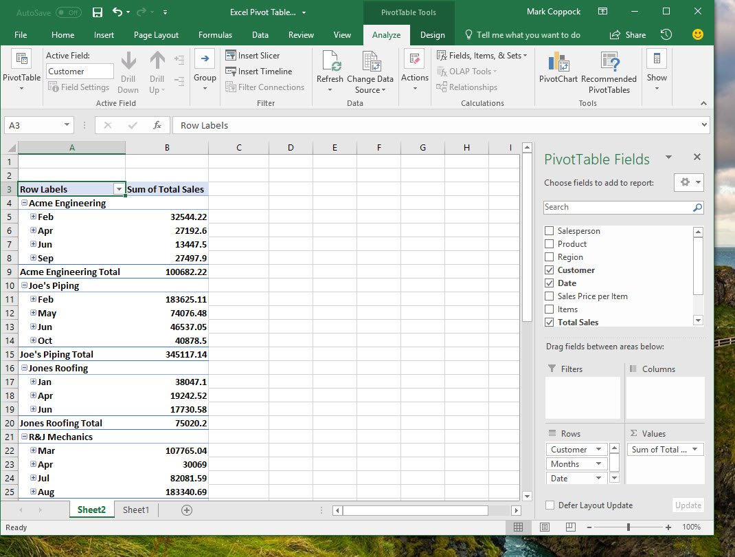
On the other hand, if you select “Date,” Excel places the data into the table and organizes the sales by when they occurred.
Mark Coppock/Digital Trends
As you’re working on your own pivot tables, you can experiment to see how added and removing fields affects the data that’s displayed. You’ll find that Excel does a great job of making selections that make sense, but you can also change things around if Excel’s choices don’t make sense.
Filters
Drag items from the fields selection list into the “Filters” section if you want to limit which data is shown. For example, if you drag “Customer” into the “Filters” section, you can easily show only the data from one or a selection of customers.
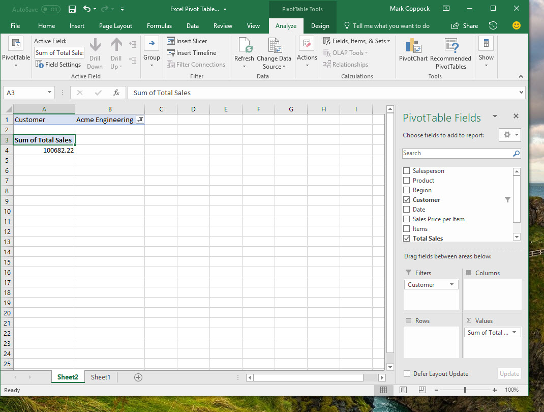
Mark Coppock/Digital Trends
Columns
By dragging fields into the “Columns” section, you can expand how your data is being reported. Again, when you drag a field into this section, Excel will try to figure out how you want the data presented. For example, if you drag “Date” into the “Columns” section, then Excel will display the sales as summarized for the most logical timeframe, which in this case is per month. This would be helpful if your primary concern was how much was sold on a monthly basis with an eye on customer purchasing patterns.
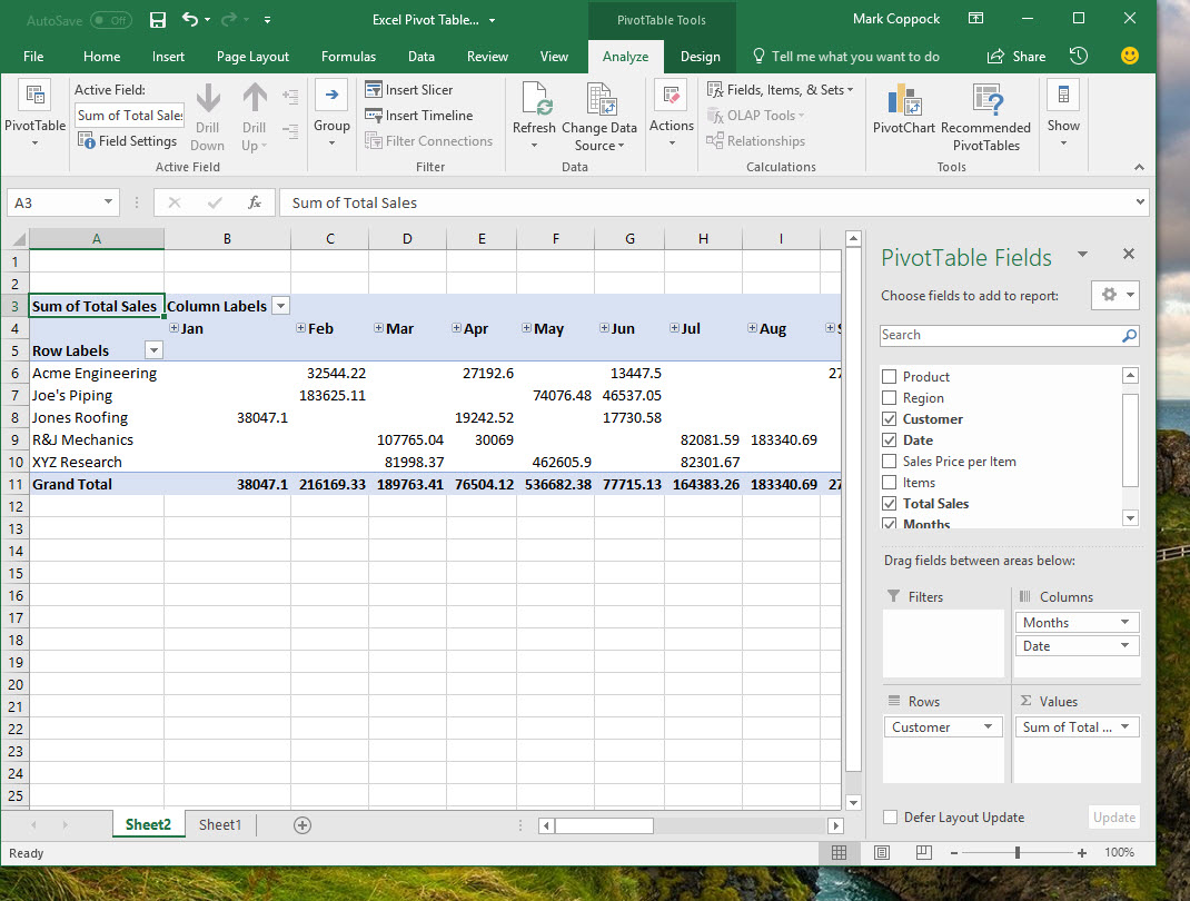
Mark Coppock/Digital Trends
Rows
Similarly, you can drag fields into the “Rows” section to embed different data into pivot table rows. Again, if we drag “Date” into the “Rows” section, Excel will break out the sales by customer per month, but the data will be summarized by customer and not by month as in the previous example. In this case, you’re mostly worried about how much you sold to each customer, but you also want to spot any time-based trends.

Mark Coppock/Digital Trends
Values
Finally, the “Values” section determines how you’re analyzing your data. In all of our examples so far, we’ve been looking at total sales. If you click on the down arrow key in this section, you can configure your value field settings to look at a different numerical calculation.

Mark Coppock/Digital Trends
For example, let’s say you want to look at sales averages instead of total sales. You would simply select “Average” in the value field settings dialog. You can also set the number format so that the results make the most sense.
Mark Coppock/Digital Trends
Now, instead of considering total sales by customer, and then calculating a grand total, we’re looking at average sales by company and then average sales across the company. This would be helpful in evaluating which customers are above or below average in sales, for example, and therefore which deserve the most (or least) attention. In our example, perhaps Acme Engineering and Jones Roofing don’t merit as much sales attention as the others.
Clearly, pivot tables offer a slew of options to make slicing and dicing your data easy. The trick to using pivot tables effectively is to decide exactly what you want to see before you start applying options. You also want to make sure that your data corresponds to how you’ve laid out your table and how you’ve named your headers. The more careful you are in setting things up, the more effective your pivot tables will be.
Step 4: Create your own pivot tables from scratch
Once you’ve played around with the pivot table feature and gained some understanding of how the various options affect your data, then you can start creating a pivot table from scratch. The process is similar to using a recommendation, only you go to Insert > PivotTable and then manually select your data as your first step.
In our case, that means selecting Table1, but we could also select a range of data or pull from an external data source. We can also decide if we want to create a new worksheet or place the pivot table next to our data at a certain location on the existing worksheet.
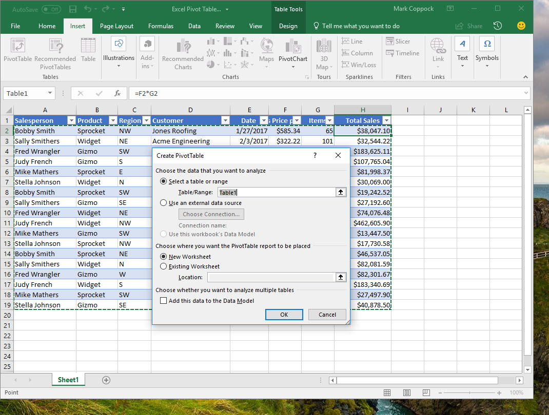
Mark Coppock/Digital Trends
Once we’ve made our selection, we’re presented with a blank pivot table and our PivotTable Fields dialog.
Mark Coppock/Digital Trends
Creating our own pivot table is then just a simple matter of selecting fields and determining how we want the data calculated and displayed. Let’s say we want to see how salespeople performed per month, with a grand total of sales for the year. We would select the “Salesperson,” “Date,” and “Total Sales” fields, drag the “Salesperson” field to the “Filters” section, and configure the values to display as currency. Excel automatically adds the relevant date items to the “Rows” section and assumes that we want to see sums.
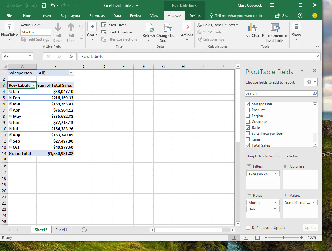
Mark Coppock/Digital Trends
By default, Excel will show all of the data for all salespeople. We can also select a single salesperson to see just his or her data. In this case, we see that Judy French had sales in only three months, even though her sales totals were significant. That could mean that her sales process was longer because she was going after whales instead of fishes — a valuable conclusion, if accurate. Perhaps investing in an assistant to help Judy close her sales more quickly would be a good idea.
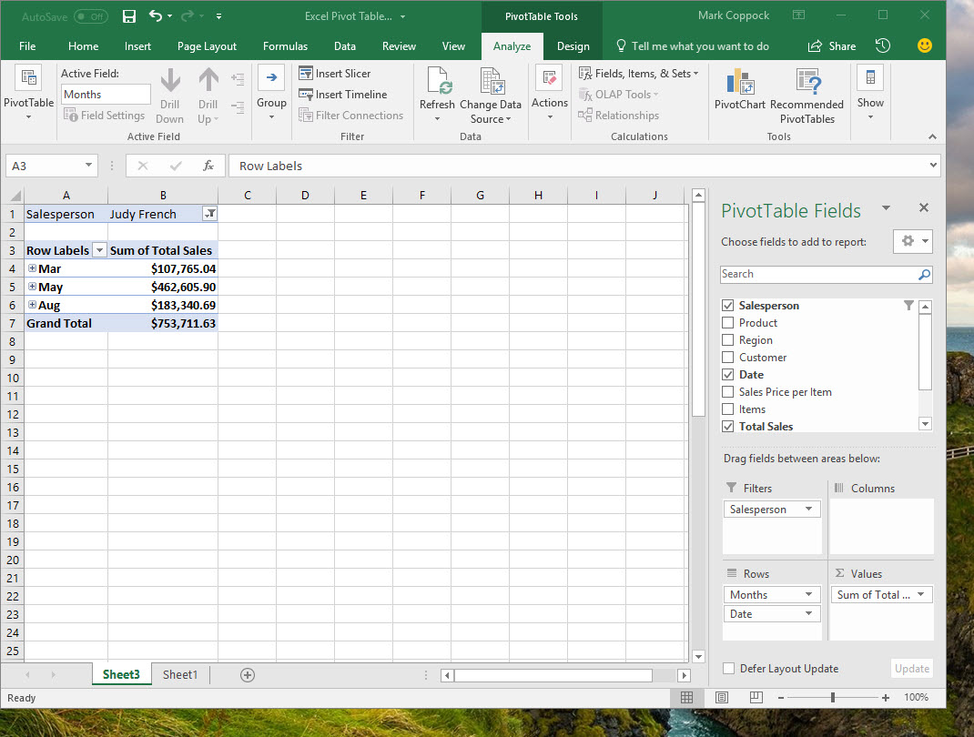
Mark Coppock/Digital Trends
Step 5: Invest in some learning
If you want to get really good at using Excel pivot tables, invest some time in learning a bit more about how it uses the various data types. Microsoft offers its own training resources and there are a host of third-party trainers to consider.
Generally, though, this means digging into Excel in a way that’s beyond the scope of this guide. Nevertheless, hopefully you now see how pivot tables can be a powerful tool in analyzing your data, and it’s relatively easy to get started as long as you have your data configured into the right kind of table. And we can’t stress enough how important it is to know what you want to accomplish with your pivot table before you begin.
Pivot tables is one of the most advanced features in Excel. If you want to learn more about the software, check our list of the best Microsoft Excel tips and tricks.


