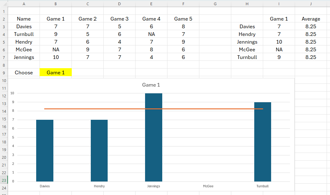
If you want to impress your friends and colleagues, you can make an Excel chart change based on a drop-down box you have added to your sheet. There are different ways you can achieve this, but we prefer the following method because it’s easier to locate any issues if something goes wrong.
We’re going to use a table of data containing five soccer players’ names and their game rating for five games as we talk you through the process.
Step 1: Create a Drop-down List
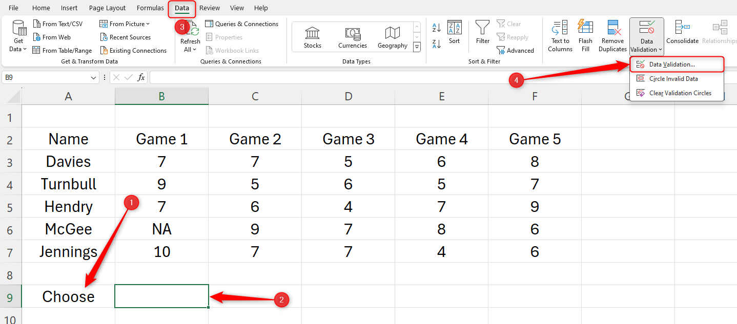
The first step is to create the drop-down list that will make your chart dynamic. Start by typing an action word in the cell next to where your drop-down will go. In our example, we’ll put the drop-down in cell B9, so we’ll type our action word in cell A9. Then, click the cell where your drop-down will go, head to the Data tab on the ribbon, and click “Data Validation” in the Data Tools group.
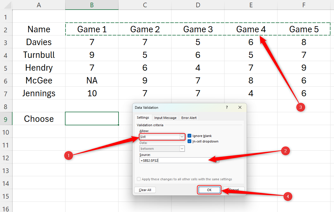
In the Data Validation window, choose “List” under Allow. Then, click in the “Source” field box and highlight the column headings in your table (the data that will be shown in the drop-down list you’re creating). In our example, we want to choose the game numbers, as in the chart we are going to create later, we want to see the players’ ratings for each game. Then, click “OK.”
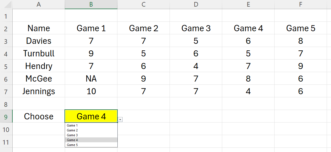
You will now see a drop-down list showing the data you selected when you click the arrow. We’ve also formatted our Choose cell to make it stand out.
Step 2: Create a Data Retrieval Table
We now need to create a second table that is separate from our raw data but pulls information from it when we adjust the drop-down menu we have created. The chart we create later on will be created using the information in this data retrieval table.
From this point, we’ll call the main data table
Table 1
, and the data retrieval table
Table 2
.
Highlight the row titles in Table 1, press Ctrl+C, and use Ctrl+V to copy the list where you want Table 2 to be.
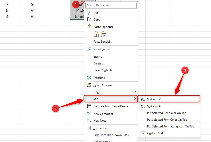
Select and right-click the pasted data, hover over “Sort,” and click “Sort A To Z.”
To continue creating Table 2, you need to give the next column a heading. The data that appears in Table 2 will be dictated by what you select in your drop-down box, so in the cell where you want the heading to go, type = and click the drop-down cell. In our case, we want our heading in cell I2, and in that cell, we will type = and click cell B9.
Press Enter to see the column heading in Table 2 adopt the drop-down selection. Try changing the drop-down selection to see the column heading in Table 2 change.
We now need to extract the relevant data from Table 1 to Table 2 using INDEX and MATCH. This is the most complex part of the process, but let’s break it down so that you can work through the process more easily. Here’s the synax:
=INDEX(a,MATCH(b,c,0),MATCH(d,e,0))
where
- a is all the data in Table 1 (excluding the row and column headings),
- b is the first value we’re looking up in Table 2,
- c is the range of values in the first column in Table 1,
- d is the column heading in Table 2, and
- e represents the data column headings in Table 1.
Make sure cell references
a
,
c
,
d
, and
e
are absolute references by pressing F4 on your keyboard after selecting each reference. Otherwise, your formula will not work when you complete the rest of the data in Table 2.
Let’s see this in action.
In cell I3, we want to tell Excel to look in Table 1 and pull a value to Table 2 through the INDEX function.
=INDEX
We now need to open the parenthesis and tell Excel where the data is in Table 1. To do this, highlight all the data in Table 1, but not the column and row headings. Press F4 to make this an absolute reference, and add a comma.
=INDEX($B$3:$F$7,
The next step is to tell Excel to match the data in Table 2 with what we have in Table 1. Type MATCH, open a new parenthesis, and click the first entry in the first column of Table 2. In our case, that’s Davies in cell H3. Add a comma.
=INDEX($B$3:$F$7,MATCH(H3,
Next, Excel needs to know what it will use as its reference to look up in Table 1. In our case, it’s the data from cell A3 to cell A7 (the names of the players), so highlight this range, press F4, and then add a comma. Then, type 0 (zero) to tell Excel that we’re looking for an exact match, and close the parentheses. Add another comma.
=INDEX($B$3:$F$7,MATCH(H3,$A$3:$A$7,0),
Now, we must repeat the MATCH process for the data that will change when we select a different option in the drop-down. In our case, that’s the game number, so after typing MATCH into our formula for a second time, we will click I2, press F4, and add a comma.
=INDEX($B$3:$F$7,MATCH(H3,$A$3:$A$7,0),MATCH($I$2,
And again, we need to tell Excel where to find that data in Table 1. In our example, that’s cells B2 to F4. Don’t forget to press F4 after you’ve referenced these cells. Then, add a comma, a 0, and close the two parentheses together. Finally, press Enter.
=INDEX($B$3:$F$7,MATCH(H3,$A$3:$A$7,0),MATCH($I$2,$B$2:$F$2,0))
Now, click and drag the handle in the bottom-right corner of the cell where you’ve just typed your formula to automatically fill out the rest of the data in Table 2.
Try changing your drop-down option to a different value and see the data change in Table 2, and check that it aligns with the information in Table 1. Remember that we sorted the first column in Table 2 alphabetically, so check carefully, as the first column in Table 1 will be in a different order!
Now that Table 2 successfully changes depending on our drop-down selection, we’re ready to create the chart.
Step 4: Insert and Format Your Chart
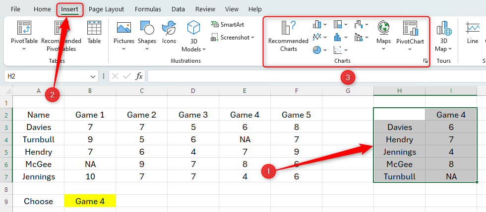
Highlight all the data in Table 2 (including the column and row headers), open the “Insert” tab, and choose a chart that works for you.
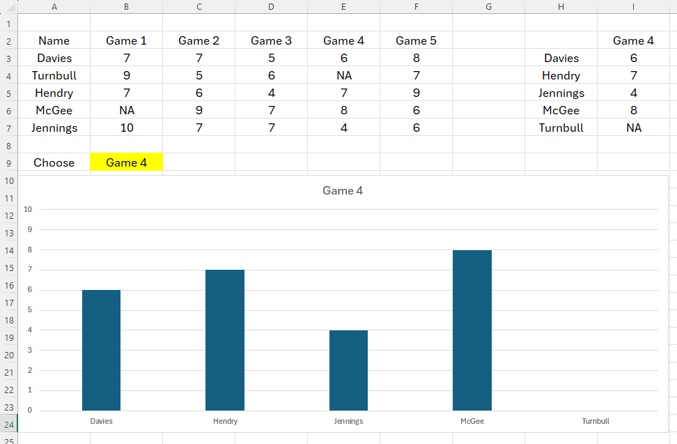
We’ve gone with a simple 2D column chart.
Format the chart to appear as you wish, and again, play with your drop-down to see Table 2—and, consequently, your chart—adjust to your selection. You’ll also see your chart title change.
Step 5: Add an Average Line to Your Chart
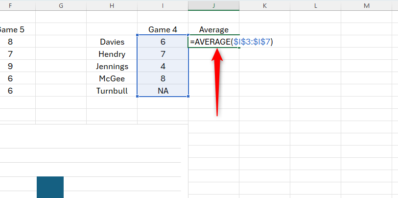
To add an average line to the chart, you need to add more data to Table 2. Add another column heading to Table 2, and call it Average.
Now, use the AVERAGE function to capture the average of the selected data. In our case, we’ve selected game 4, so we want to find the average rating among all five players for this game. To do this, type
=AVERAGE
in the first cell of this new column, and then select the data in the previous column. Press F4 to make this an absolute reference, and then close the parentheses and press Enter.
Then, use the AutoFill handle to click and drag the formula down to the bottom of the column.
We now want to add the average data to our chart.
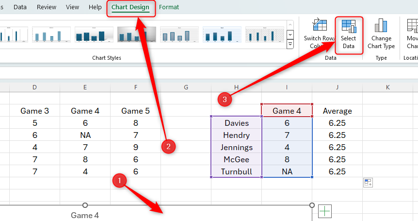
Click anywhere towards the edge of your chart and click “Chart Design” on the ribbon. Then, head to the Data group and click “Select Data.”
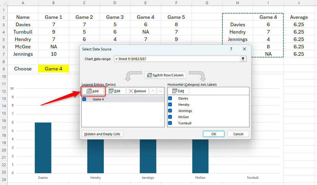
In the Select Data Source window, click “Add.”
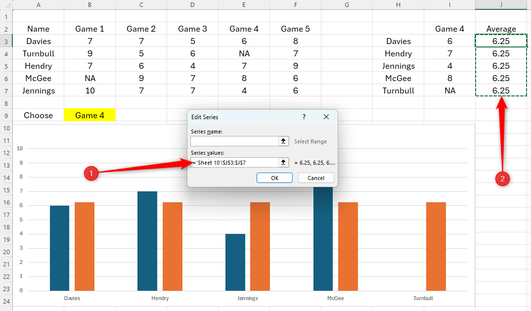
Then, in the Edit Series window, clear the Series Values field, and then select the data in the Average column of Table 2. Click “OK,” and you will see the average appear as an additional bar in your chart.
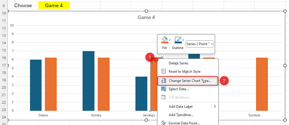
To change this average data to a line over your existing bars, right-click one of the new bars and click “Change Series Chart Type.”
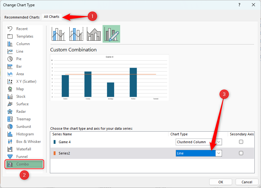
Open the “All Charts” tab, click “Combo” in the menu on the left, and change the average data series to “Line.”
Click OK to see the outcome, and change the drop-down choice to see your chart change dynamically!
You can then format your line so that it stands out in the way that you want it to.
Now that you’ve achieved that impressive, dynamic chart, check out some ways to make it stand out even more.


