I test many tech products, explore them from weird angles, and write about them for a living. It’s a privilege, but every now and then, things get boring, and you start wishing for something that breaks the mold of being extraordinary. That’s when I discovered the Pebble Cosmos Engage, an Apple Watch Ultra lookalike that fares a little too well at being a copycat. It looks like an Apple Watch Ultra, acts like an Apple Watch Ultra, and only costs around $50.
As the headline goes, it blew me away, but not entirely with how good it is. This smartwatch (aka a glorified fitness band) also bewildered me with limitations and weirdness that made me wonder why I pitched this story in the first place. The Pebble Cosmos Engage surprised me in a few pleasant aspects, and then give me a headache in all kinds of weird ways.
Imitation done really, really well

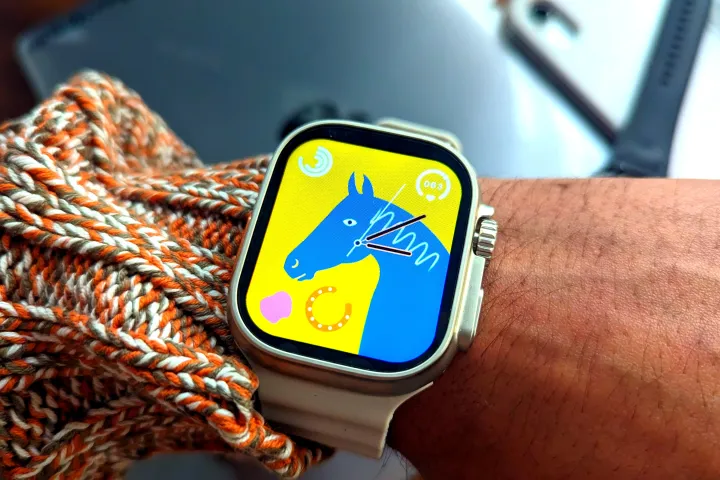
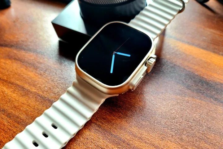
So, let’s address the elephant in the room. The design is a brazen imitation of the Apple Watch Ultra, but thankfully, it doesn’t feel like your usual Chinese knockoff gizmo.
Even the unboxing experience is rewarding, as Pebble ships two alcohol-based wipes and a screen protector right in the retail package. For a smartwatch that’s 16 times cheaper than the Apple Watch Ultra, the Pebble Cosmos Engage took me by surprise.
In fact, the build quality is terrific. There are no gaps alongside the frame edges, the surface finish is well done, the buttons — especially the rotating Digital Crown — offer nice tactile feedback, and the silicone strap is tidy as well.
Everything looks extremely polished. The zinc alloy chassis rocks a matte finish that is smooth but doesn’t get smudged. Of course, it has the same color tone as its premium inspiration.
Pebble has also copied things on the underside, using the same shape and outlines for the biosensor stack, and color scheme for the surrounding plastic material. The build is IP67-certified, which again hit me as a pleasant surprise.
For a smartwatch that’s 16 times cheaper than the Apple Watch Ultra, the Pebble Cosmos Engage took me by surprise.
But if you look closely, there are a few differences. Instead of four screws in each corner that you see on the Apple Watch Ultra, the Pebble Cosmos Engage deviates with cute floral stars surrounded by three concentric rings.
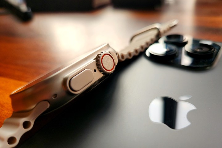
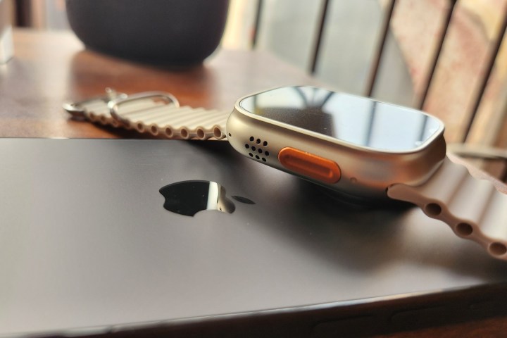
There are indentations on the corners of the Pebble Cosmos Engage, but unlike the Apple Watch Ultra, there’s no triple mic array, siren, or depth gauge on the copycat.
Pebble even stayed loyal to the strap size, fitting a 49mm band on its Apple Watch Ultra imitation. Going a step further, Pebble has also generously aped Apple’s Trail Loop and Ocean-style bands. I haven’t tried the latter, but it looks like a true replica of what Apple offers.
It’s quite funny that Apple’s official bands for its pricey smartwatch cost nearly twice that of the Pebble Cosmos Engage. And that’s just for the U.S. market. In India, the bands sell at a 125% higher asking price compared to the Pebble wearable.
A handful of good (and bad) surprises
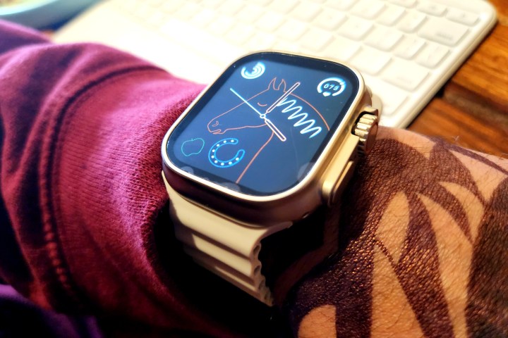
I was also pleasantly startled by the screen. It’s a 1.95-inch panel with a resolution of 380 x 385 pixels. It’s not the most pixel-dense panel I’ve seen on a smartwatch, and definitely nowhere close to what Apple serves. The display offers a peak brightness of 600 nits, which was enough to display the on-screen contents even under broad daylight without any legibility issues. But the Pebble wearable doesn’t really need to touch the same pixel-density figures as its inspiration.
That’s because it runs pretty barebones software, which barely offers any semblance of graphical goodness. So modest is the demand from the pixels that the screen even struggles with scaling a photo imported from your camera roll without crushing the colors. I set my own face as a wallpaper, and the watch turned me into somewhat of a square-faced alien.
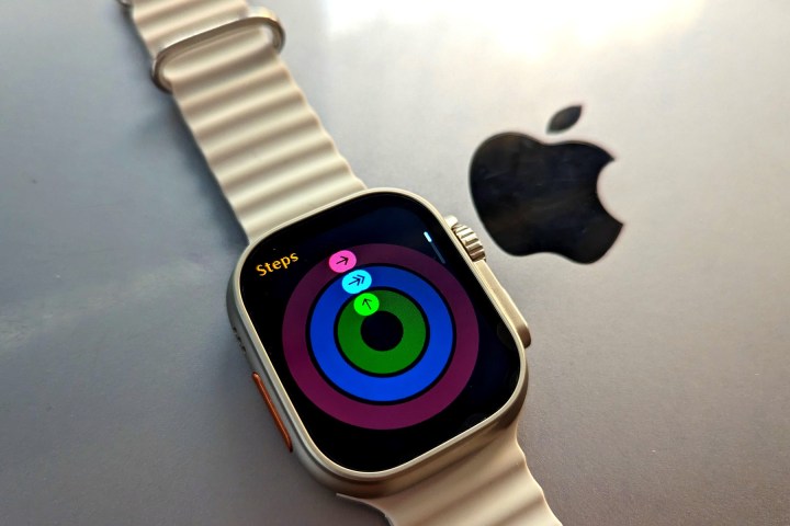
On the positive side, the speaker and mic array is clear enough for voice calls. There are over a dozen activity modes for keeping a track of workouts, but I don’t trust all of them. I tried rope skipping, but the watch logged them in my daily footstep count.

When I first set up the device and strapped it to my wrist, it had logged about eight hours of sleep already. The heart rate sensor does a decent job. When compared to a medical-grade device, there was a negligible deviation in my heart rate reading and approximately 2-3% variation in SpO2 reading.
But don’t read too much into that accuracy. Even when the watch was lying idle on the table, both the app and the watch face were showing 85bpm as my heart rate, and it kept changing, too.
It can even measure a table’s heart rate and blood pressure.
Notably, the smartwatch lists a feature called “blood pressure monitoring” and has a dedicated app for it. It’s funny to see, especially since Apple and Samsung haven’t figured out smartwatch-based blood pressure monitoring yet.
I measured the blood pressure value by enabling it in the M2 Wear app and got a reading that said 122/81 mm/Hg. Except, it was not real. The watch was not on my wrist, but sitting on the charging puck in a powered-off state. Needless to say, it’s absolutely bogus and misleading marketing on Pebble’s behalf.
A true Apple Watch Ultra this is not
Even more annoying is the notification control system. The Pebble device only shows notifications for calls and messages. On the app side, you only get support for WhatsApp, WeChat, QQ, Facebook, Twitter, Skype, Line, WhatsApp, KakaoTalk, and Instagram. And the alerts you do get are basic, as you only get to see the text part.
You don’t get support for even work-critical apps like Gmail, or navigation options like Google Maps. Plus, most of these supported apps were of no use to me. On the positive side, the lack of app support meant I didn’t get alerts from the bajillion apps that I installed on my phone.
But there are a few more annoyances. The M2 Wear app needs to be always running in the background to show SMS alerts on the smartwatch. If you clear all your background apps, the Bluetooth automatically disconnects, and you will have to manually enable it on the watch to sync the messages and other data.
Talking about apps, the companion app – called M2 Wear – is the most terrible app of its kind that I’ve used so far. Right from the start, it looks like an assignment project for a freshman-year software development student, who didn’t even bother to check the basic language and formatting after writing the first draft.
For example, you come across terms like “Whatsapp reminds” and “WeChat reminder” on the same notification control page. There are settings that are in Chinese, while the rest of the toggles on the same page are in English.
Then there are the privacy policy terms. The M2 Wear app is developed by a Chinese company named Shenzhen United Power Technology. Under the data agreement terms, it says that the app can collect information like name, date of birth, gender, address, phone number, email address and passwords, IP address, personal identification document, “facial features,” and precise location, among other health-related information.
I am not convinced why an app as barebones as the M2 Wear would need so much information about me. Another inexplicable rule mentioned in the documents is that logging out of your M2 Wear account is an irreversible process, which means if you log out of your account in situations like changing a phone or performing a reset, all your data is gone. Moreover, if you forget your smartwatch unlock password, there’s no way to recover it. The only recourse you get is performing a hard reset on the smartwatch.
Why would you even want this?
The Pebble Cosmos Engage is a deceptively well-made smartwatch that has no right to look and feel as refined as it does at $50. If you’ve been enamored by the Apple Watch Ultra’s looks but can’t quite convince yourself to shell out that high asking price, the Pebble offering is not a bad choice, as long as you don’t seek all those fancy health-centric features.
Alternatively, if you’ve been dreaming about a dirt-cheap fitness tracker that can tell you the date and time, buzz your wrists for important alerts, and send sedentary alerts when you’ve been sitting for too long, the Pebble Cosmos Engage is the best-looking option in the market.
Just don’t always trust it with health metrics, especially that blood pressure measurement and sleep tracking part. The companion app is terrible, but at least the smartwatch UI looks clean. Being able to handle calls and control music playback is also a bonus.
For $50, the Pebble Engage Cosmos does a lot, but I’m not quite sure if I can call it a fitness band replacement, primarily because of the tracking inaccuracies.
If you’re someone who just wants a screen on your wrist without any of the legitimate smartwatch hassles, the Pebble Cosmos Engage is a terrific value at $50. For anything smart and fitness-centric, get a proper fitness tracker, or save more for one of our best smartwatch picks. And if you really want something that looks like an Apple Watch Ultra, you may be better off creating your own Frankenstein version.
Editors’ Recommendations


