iOS 18.2 is a huge release for users. New Apple Intelligence features are a major highlight, but so too is the Mail app, which gets its biggest redesign ever. Here’s everything that’s new.
New Mail app looks more like Messages
When you open Apple’s Mail app on iOS 18.2, the redesign is almost immediately evident. Your mailboxes screen will look the same as always, but opening an inbox reveals some big changes.

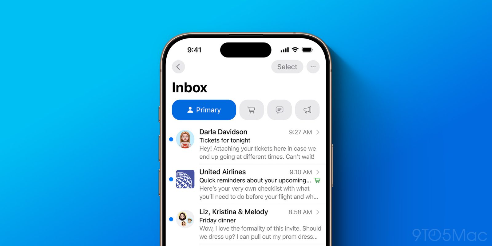
Aesthetically, Apple is now emphasizing contact photos for senders as part of your inbox. Where you used to just see a bunch of text, now there’s color and imagery to go with it. Basically, emails in your inbox look a lot like threads in the Messages app, with a contact photo on the left.
This change ties in with Apple’s new Branded Mail tools for businesses. A business can now upload their logo to have it used as the contact photo not only in Mail, but also the Phone app, and in the Apple Pay interface when making contactless payments. But if a business hasn’t done that yet, place icons from Apple Maps get applied here instead.
Categories bring major changes to how your inbox works
More significant than the addition of contact photos, iOS 18.2 also brings a fundamental change to how your inbox works.
Apple Mail now automatically divides your inbox into four categories. Here are their titles and descriptions.
- Primary: Find the messages that matter most in Primary and organize everything else.
- Transactions: Keep track of your orders, including shipping and delivery notices, bundled by sender.
- Updates: Stay updated with a place for everything, including newsletters and alerts.
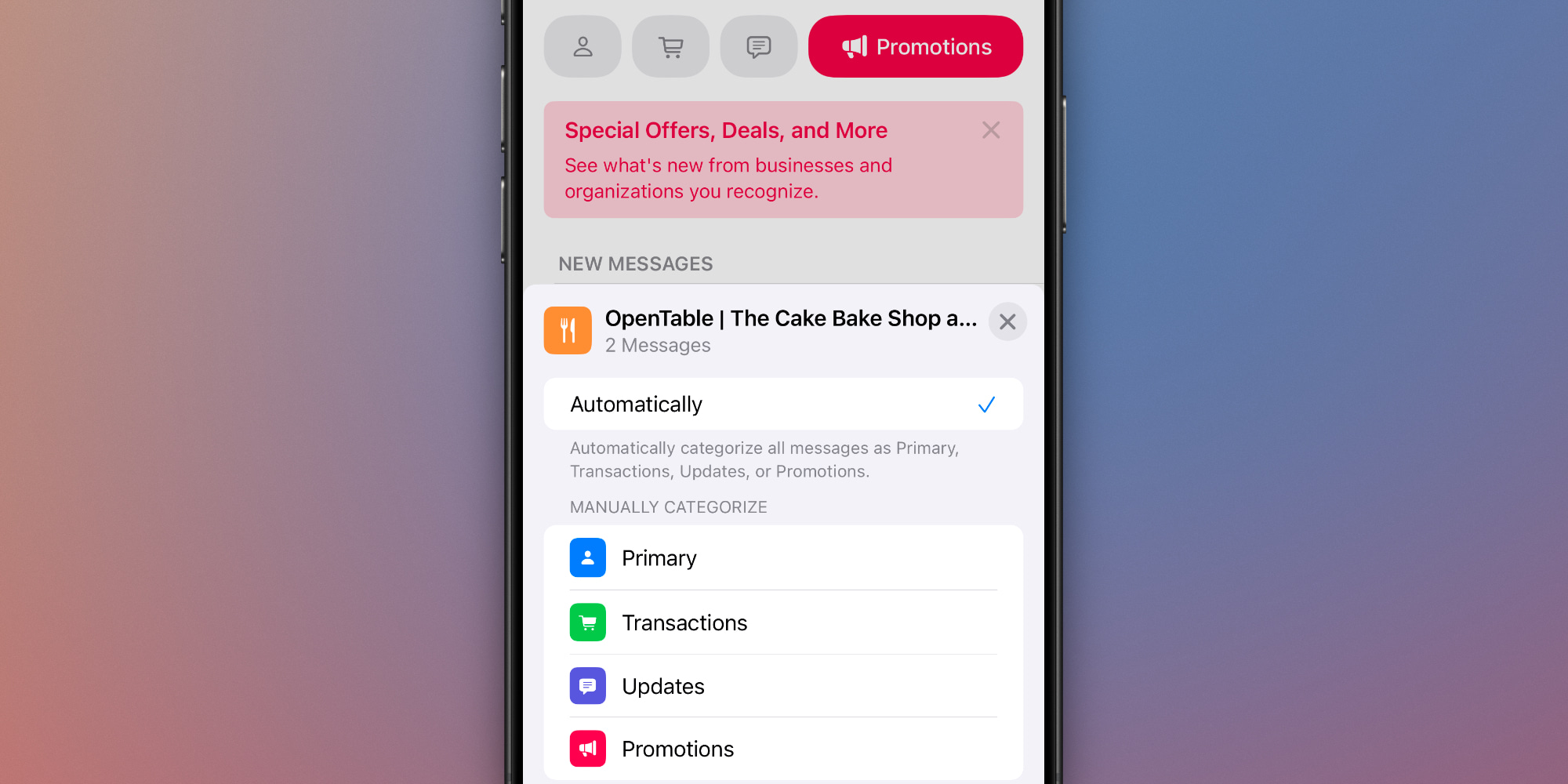
- Promotions: See what’s new from businesses and organizations you recognize.
Emails are automatically sorted as they’re received, and each category is subdivided into two sections: ‘New Messages’ and ‘Older Messages.’
In a nice touch, you can optionally set Mail’s notification badge count to only reflect the number of new messages in your Primary category, or opt to keep it the same as before, with all messages counted.
Training Mail’s system, or bypassing it altogether

If Apple’s categorization system places messages in a category you don’t like, you can make manual adjustments that stick moving forward. There’s an option to automatically send messages from a given sender to a category of your choice, rather than letting Apple’s system choose for you.
Here’s some more good news: if you’re not a big fan of the new category system, there are two ways to get your old unified inbox back.
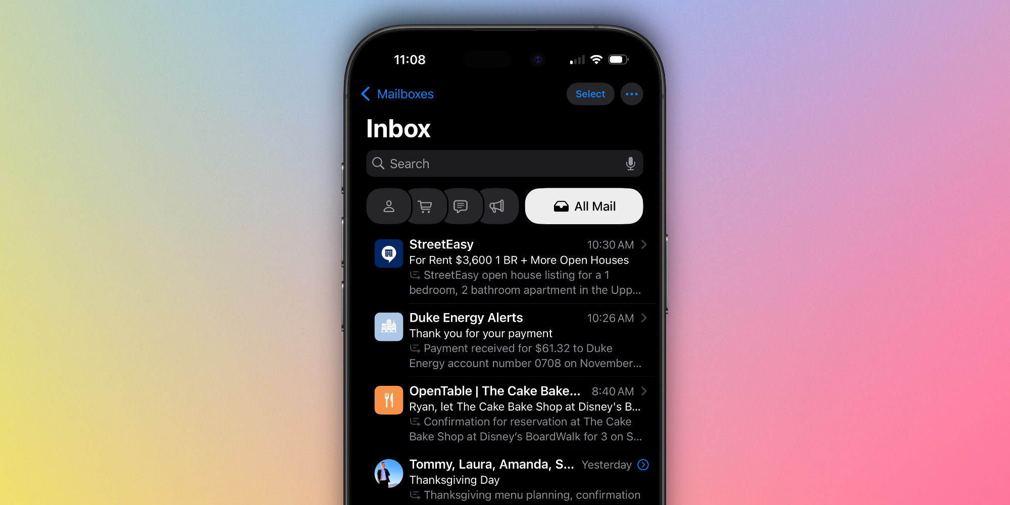
- By default, the Mail app only shows the four listed categories. But there’s a hidden ‘All Mail’ view that still exists. No matter which inbox category you’re viewing, you can swipe left to go to the ‘All Mail’ view.
- Or, if you want to disable categories altogether, tap the three dots in the top-right corner to switch from Categories to List View instead. This will put your inbox sorting back to its pre-iOS 18.2 form.
Consolidating messages in a Digest view

Finally, there’s one more noticeable change to how your inbox behaves.
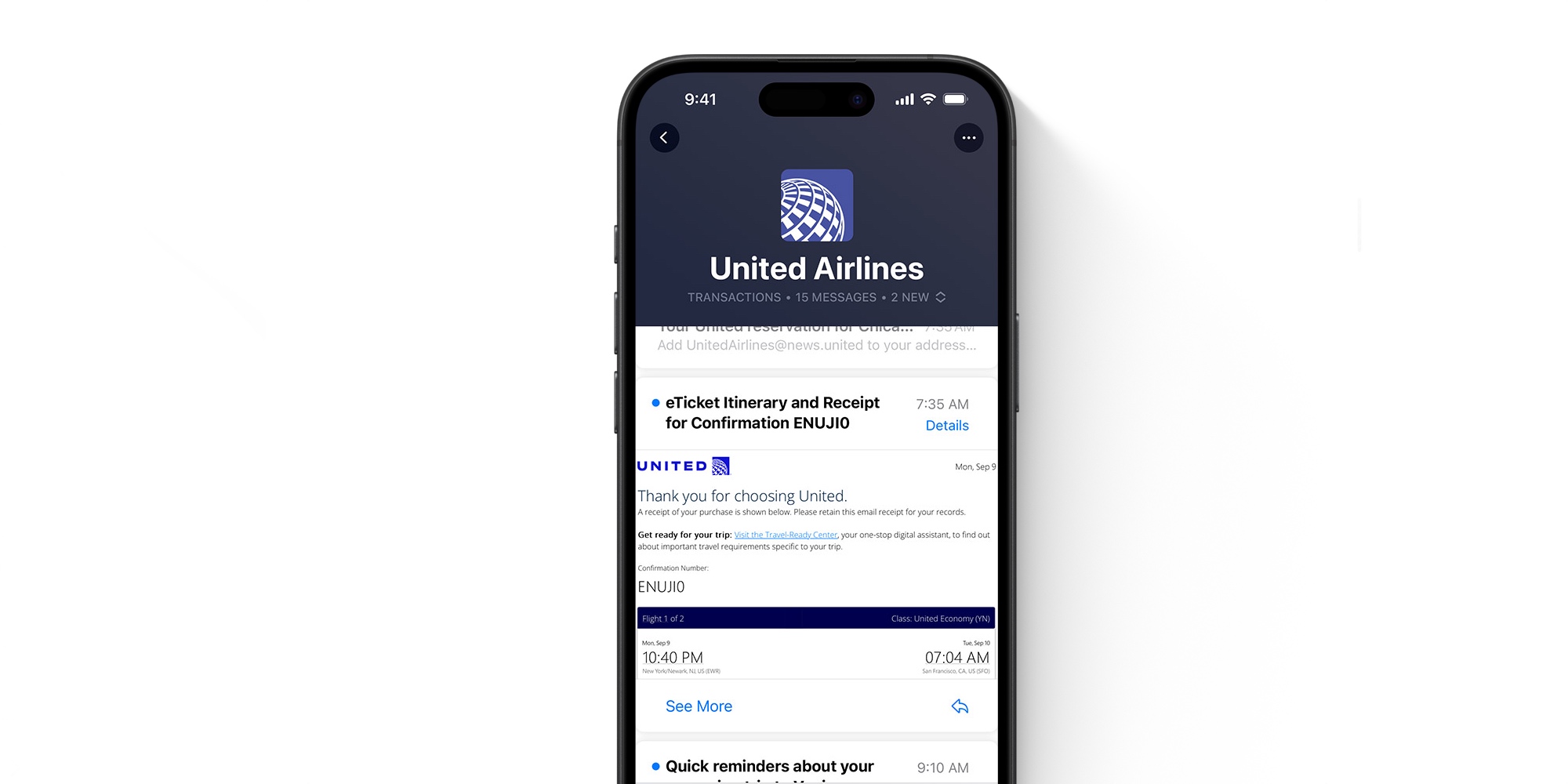
While the ‘All Mail’ view will actually show you every individual message, the Mail app’s four new category sections seek to further streamline your inbox.
They do this by grouping messages from the same sender together and providing a new ‘Digest view,’ as seen above. But as with most of iOS 18.2’s new features, you can disable this behavior if you’d like.
iOS 18.2 Mail app wrap-up
Mail is one of the rare iPhone apps that’s extremely popular, yet historically hasn’t received many updates from Apple. But iOS 18.2’s redesign changes that.
I’ve really enjoyed using the new Mail app in the iOS 18.2 beta, but I’m also glad Apple has provided tools to disable many of the changes if they don’t quite work for you. Now that Mail has been redesigned for iPhone, though, I’m ready to see these changes come to the iPad and Mac as well.
What do you think of Mail’s redesign? Let us know in the comments.
Best iPhone accessories
FTC: We use income earning auto affiliate links. More.


