The latest video from Jon Prosser offers easily the most extensive look yet at iOS 19’s rumored new design. And if the video’s mockups prove accurate come WWDC, it seems Apple may have found a winning formula to guides its design: striking a careful balance between fresh and familiar.
Balance of fresh and familiar looks key to iOS 19’s design
When rumors of iOS 19 introducing a major design overhaul started spreading, it seemed like the same tired annual tradition.
Every year, whispers circulate that iOS is getting its first proper redesign since iOS 7.
This year though, the growing number of rumors make it seem like a certainty.
And Prosser’s new video provides the best glimpse yet at what that new design might entail.
One of my chief takeaways from the video has to do with balance.
Apple redesigning iOS is a risky move.
While the average reader of this site gets excited for big change, for most iPhone users it’s a scary thing. I suspect Apple still gets plenty of complaints about iOS 18’s Photos app redesign.
But Prosser’s mockups seem to show Apple striking a delicate balance between fresh and familiar—a winning formula in my book.
Examples of Apple’s apparent iOS 19 formula
You can see this balance with the new app icon designs, which are still squircles but carry a new look nonetheless.
Where it’s especially evident, though, is iOS 19’s app navigation.
Recent Apple app designs have showed a tendency to remove the traditional tab bar for navigation.
Photos did this last year, but tab bars are also missing from all of Apple’s last five iOS apps:
These recent designs hint at wider spread changes to iOS 19 apps.
Personally, I suspect ditching the tab bar in more Apple apps would be a big problem with users.
In apps like Apple Music, TV, News, the App Store, and more, tab bars have long been a fixture.
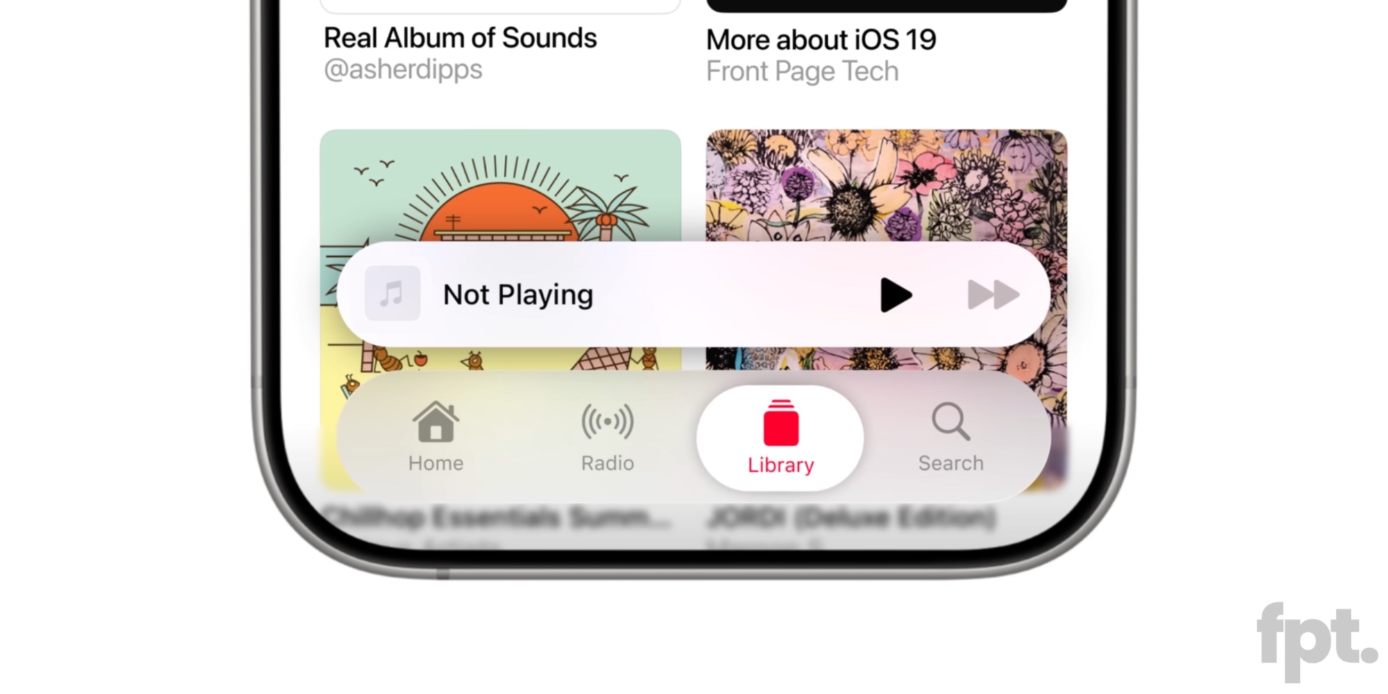
But Prosser’s mockups show Apple retaining tab bars for certain apps, while giving them a fresh look and flexibility.
Here’s a mockup of the iOS 19 Music app, which shows a search bar at the bottom, next to a new button.

That button in the lower-left corner is where the app’s tabs live, so tapping it pulls them into view.

In my view, this new design does three things really well:
- tab bars look fresh and new, but still work the same
- they leave space for new nav elements, like search
- and they get out of the way when you don’t need them
Of course, I can’t render full judgment until I actually try out this new design on my iPhone.
But my early impression is very positive. Apple gets to retain existing functionality, make search easier to reach, and still provide a fun new look.
iOS 19 design leaks: wrap-up
Prosser’s mockups show various elements of iOS 19 that similarly feel familiar, yet with a fresh shine to them. And I suspect this approach will prove a hit with Apple’s users.
Radically changing how the iPhone works could be a disaster for Apple. Many users would likely revolt.
But making everything work similarly, with some changes and a fresh feel? That sounds like a winning formula.
What do you make of the latest iOS 19 design leaks? Let us know in the comments.
Best iPhone accessories
FTC: We use income earning auto affiliate links. More.


