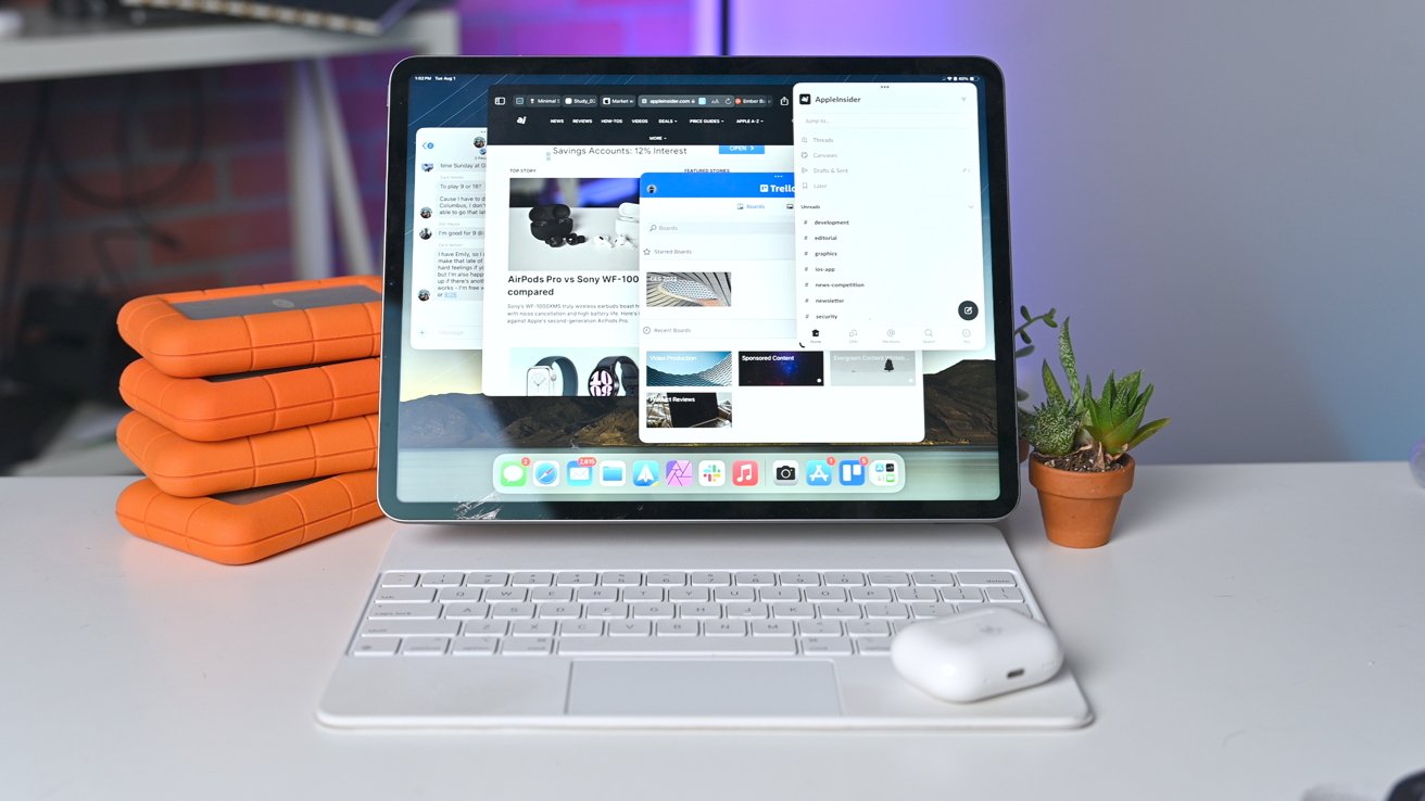
Apple has been putting in the work in its attempt to make the iPad more powerful, and the new changes with iPadOS 17 and Stage Manager make it closer than ever to a Mac replacement.
After largely ignoring Stage Manager on iPadOS 16, we’ve decided to give the feature a second chance. We’ve been using it regularly since the first iPadOS 17 beta with promising results.
Apple has breathed fresh life into the feature. Not with any radical overhaul, but by delivering long-overdue features that make it less constricting and more user-friendly.
The Stage Manager improvements, combined with other major iPadOS upgrades have made the iPad feel more powerful than it has in the past.
What’s new with Stage Manager on iPadOS 17
When Stage Manager launched with iPadOS 16, it was a bit of a mess. Online pundits quickly pointed out the terrible performance, lack of supported devices, and other glaring issues the feature faced prior to release.
It was no surprise when Apple delayed the feature as it committed to improving it and expanding device support. The changes found in iPadOS 17 are more substantial yet, and are enough to make the feature truly useful.
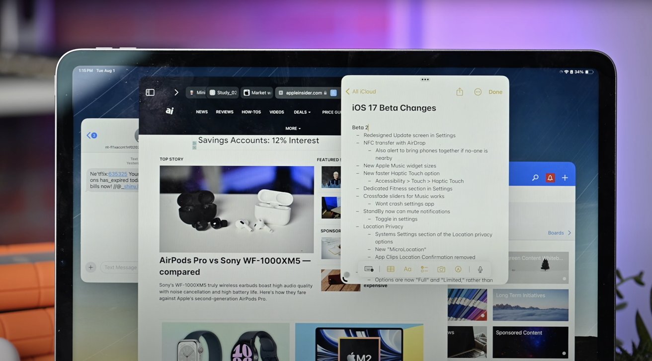
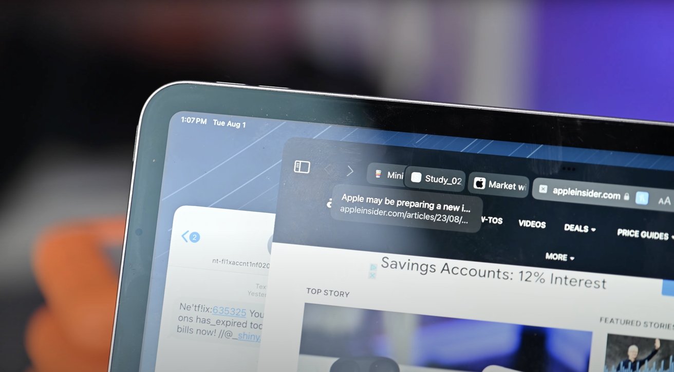
Windows inside Stage Manager move more fluidly than before, making it feel more natural. Almost all windows can be resized more freely, too.
Quite often before apps would be stuck in an iPhone-sized shape, but now they can take on almost any size. That’s true, even if they look bad.
We encourage giving the user a choice, and if a window looks like garbage, they change it to another size. It’s still not perfect — more on that in a moment — but a big improvement overall.
Finally, Apple added the ability to shift-click an app icon to open another window in the existing stage. This has been a feature on macOS for a while and helps bring them closer to feature parity.
Stage Manager in iPadOS 17 is still held back by nagging issues
While Stage Manager has gotten better enough to warrant using it more regularly, it also has helped highlight some of the remaining issues. With daily use, a few nagging annoyances stick out to us that we’d love to see Apple address.
We’ve primarily been using Stage Manager on our iPad Pro with the Magic Keyboard attached, but occasionally we’ve connected it to our external monitor. In these situations, the five app-limit Apple has imposed feels too small.
On a large 32-inch display, there is room for more apps to be running, especially things like lists of notes or a running Twitter feed. On the new iPad Pro, we know it’s capable since it’s running the same M2 processor found in the MacBook Air.
Apple also puts this buffer around the display’s edge, making the usable space smaller and feels closed in. It’s a solid 20 pixels on all sides, and on a smaller display, that is valuable space.
Even on the 12.9-inch iPad, we’d love to see the apps go not only to the edges, but expand past them. Think about on the Mac how you can drag a window past the edge of the display, leaving only a small portion remaining.
We do this to get more space or to look at other apps. If you drag an app past the iPad’s borders, it just slides back into the frame as soon as you let go.
Then there are the times when modals take over the display. If you open the AirPlay menu, you can’t do anything else until you choose your AirPlay output or the modal will automatically be dismissed.
Sometimes this menu takes a second to populate, so it would be preferable to open the modal, scroll on another app or interact with another app, then return to the AirPlay menu.
It’s not dissimilar from how iOS used to have a volume indicator that took over the entire display. Odd vestiges of a mobile, small-screen OS.
The biggest takeaway is that Stage Manager isn’t well connected to the rest of the operating system. It’s still opened manually from Control Center and invokes a disjointed user experience.
Plenty more good features in iPadOS 17 for productivity power users
As we’ve been testing Stage Manager, there’ve been several other quality-of-life improvements Apple has delivered that we already feel like we can’t live without.
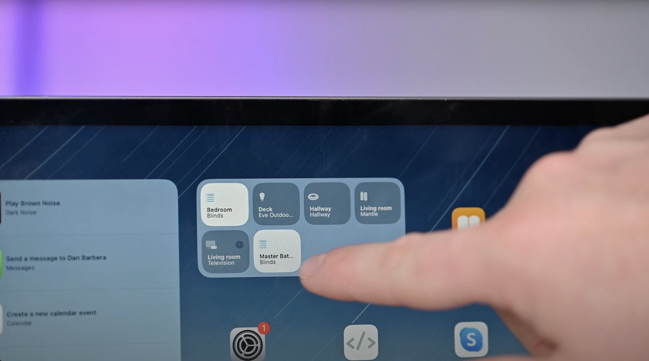
When we go back to the Home Screen, there are now interactive widgets. We’re waiting for developers to update their apps post-release, but so far we’ve just become accustomed to controlling our HomeKit accessories this way without ever opening an app.
Apple has added widgets to the Lock Screen, just as with iOS. Our workflow usually entails working inside of Stage Manager, pushing to the top to open up Notifications which now shows all our Lock Screen widgets.
We can check in on the weather, see Health updates, and see News headlines. Just as with the widgets, this will only get better as devs get to push out app updates.
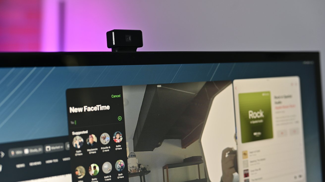
As iPadOS opens up, external cameras and microphones are now supported. When we connected our Clarity Pro 27-inch display that’s eqipped with a built-in camera, it instantly turned on once we opened FaceTime.
Our iPad sits on our desk but the Clarity Pro’s camera is well-positioned at eye level for a more natural on-camera appearance.
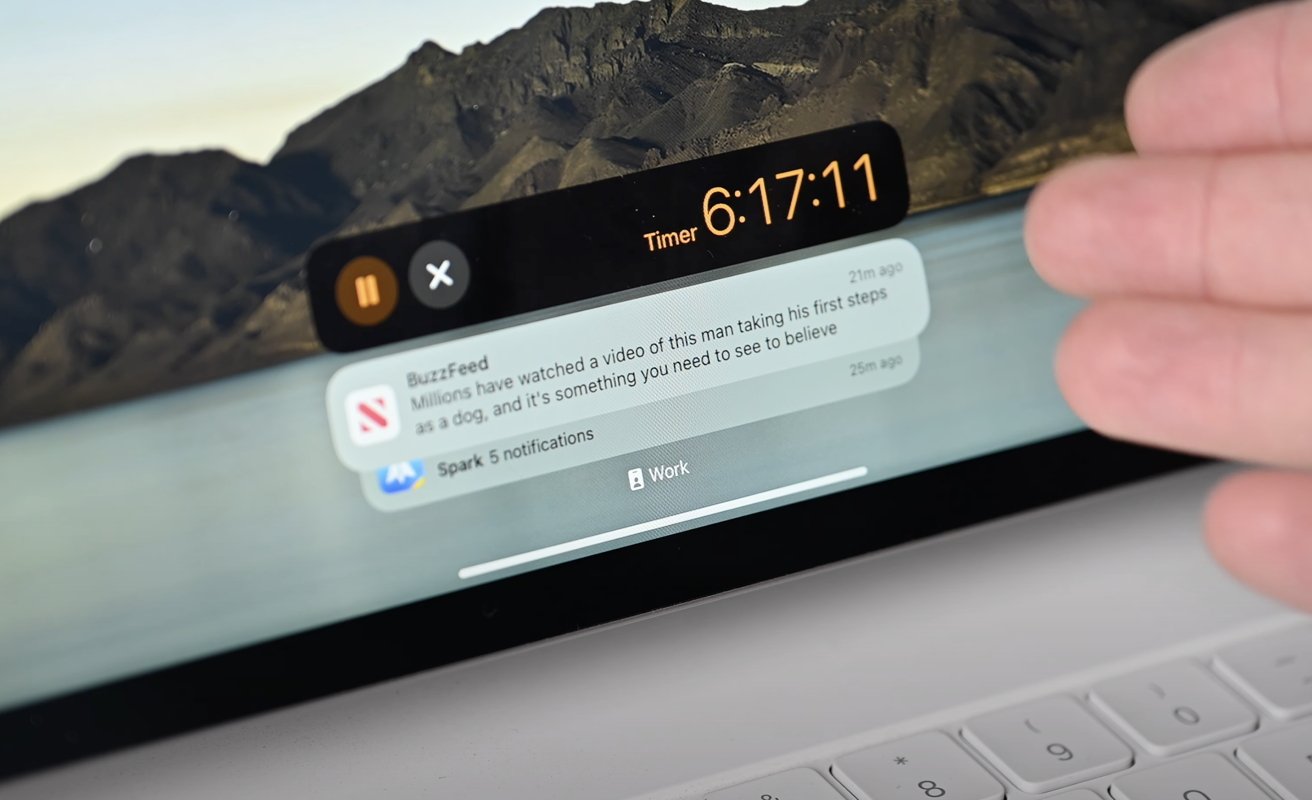
Lastly, the Lock Screen is now home to Live Activities. See an ongoing timer, flight status, or food order, all from your Lock Screen. This feature probably should have cone last year as it did on iOS, but we’ll take late over never.
Almost enough
Using iPadOS this year feels very different from years past. We certainly wouldn’t call it an overhaul by any means, but it has been enough improvements to make the portable tablet more adept at getting work done.
The iPad’s most glaring shortcoming has been multitasking, something we take for granted while using a Mac. Stage Manager in iPadOS 17 has started tearing down some of the barriers that previously boxed us in.
For many, the iPad already could replace a Mac. We don’t think this is going to necessarily swing the needle significantly further, but it’s certainly a good step in the right direction.


