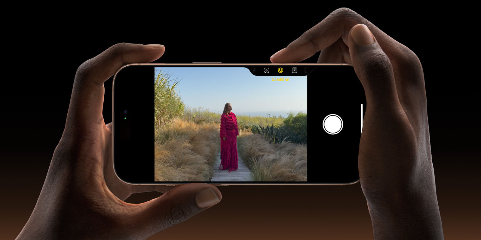
Two of the iPhone 16 designers have spoken on the Cool Hunting Design Tangents podcast, sharing some of the thinking behind the development of the new Camera Control button.
Senior product designer Rich Dinh said that he’s worked on the iPhone since the original model, but they still approach each generation afresh …
Dinh is joined by human interface designer Johnny Manzari.
Dinh starts out by saying that he has personally appreciated the biggest benefit of Camera Control – being able to grab the phone and start shooting immediately.
I also have two little kids, a two and a half year old and a six year old, and they both do the funniest stuff, but, um, having camera control, being able to Get you up and running and capture that video. I mean, I, I have videos that, uh, just probably wouldn’t have been captured otherwise.
Manzari said much of his own photography had shifted from DSLRs to the iPhone, and that’s also been influenced by family.
When my daughter who’s in high school now was little, you know, I was using a lot more traditional camera equipment back then. And over the years, it’s really shifted to iPhone. And it’s been really nice to leave that sort of equipment, um, behind. It’s just much easier to hang out with your kids when you’re not bringing a lot of equipment with you […]
You can give the camera to a small child and they can take a great photograph, but you can also give it to a professional photographer who is an award winning photographer, and they can use that same tool, but push on it, take it to the next level, elevate the entire experience and create.
They said the starting point behind the Camera Control button was asking what they could do so that people would always catch special moments.
We didn’t set off thinking how and when can we add that button? We set off asking the question, how can we get closer to one of our visions in the camera experience, which is never missing a moment?
They naturally said that a lot of thought went into the specific design of the button.
[We were] thoughtful in all the little details […] The button is flush. And so from the day to day use, we’re hoping that the phone feels very much like your, your phone today in terms of how you grip it and handle it. But we’ve added a little chamfer in there to give that really lovely half press and full press experience […]
We wanted to make sure that it was capable of IP68 water resistance and kind of lived up to that iPhone level of durability. And so you have Sapphire, you have stainless steel trim, and on the iPhone 16, you have aluminum around it. And all of those things also have to be color matched.
The tech involved is completely new for Apple.
So this is a combination of using a force sensor and a capacitive sensor on this mechanical button, which is an Apple first. We’ve never really done that before, but it unlocks all these new experiences.
You can listen to the episode in Apple Podcasts.
Image: Apple
FTC: We use income earning auto affiliate links. More.


