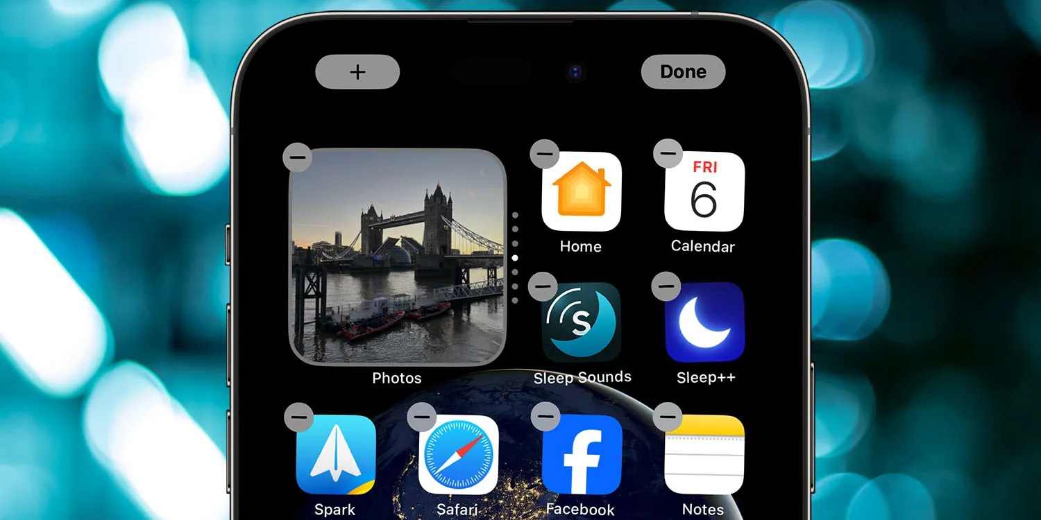
You know something’s bad when you’re about to write a feature request and then realise you already did do, more than a year go. Some 18 months after I asked Apple to fix the awful iPhone jiggle mode, nothing has changed, so consider this my renewed plea.
It was travel which brought it to mind last time, while this time around it was just doing a small rejig of my Home screen to remove a couple of apps I use less frequently, replacing them with ones I now use more often …
They say that travel brings new perspectives, and that’s absolutely true for anyone visiting Argentina. But in my case, it’s also so far generated two feature requests for Apple.
Yesterday, I asked for universal OCR capability across all apps for instant translation. But spending a month in another country has also underlined the absolute user-interface disaster that is the process of rearranging your apps on an iPhone.
This is nothing new, of course: it’s been a truly horrible process forever. In an effort to minimize the need for it, my approach to date has been to have context-based home screens.
My main home screen is for the apps I use most frequently when I’m at home. The next screen has those apps I use most frequently when out and about in London. Another screen is apps I use while actually traveling – airline apps, FlightRadar24, Hotels.com, and so on.
But there are a number of apps I’m using so frequently here that it makes sense to have them on my main home screen. This includes Azimo (the cheapest way to get cash here), Translate, and Maps. I now have everything set up the way I want it, but boy was it a pain!
It’s easy to accidentally drag an app past the screen you want. Or into the wrong position. Or accidentally create a folder.
If your home screen is full, then adding a new app will knock an existing one – which you may still want on the main screen – onto the next one. So the workaround I use is to first drag out the ones I don’t want to keep, before adding the ones I do.
In theory, you can move multiple apps at once, but I find this super-fiddly, so it really doesn’t make the process much easier.
The whole process is so bad I often put off any significant reorganizing I want to do, and most of the time it’s simply not worth the hassle to rejig things on a temporary basis. What I’d like to see Apple do is go back to the drawing board on this one, and create a process that is a UI dream rather than the current nightmare.
What are your thoughts? Would you reorganize your apps more frequently if the process were made much easier? Let us know in the comments.
FTC: We use income earning auto affiliate links. More.


